These cookies are required for the website to run and cannot be switched off. Such cookies are only set in response to actions made by you such as language, currency, login session, privacy preferences. You can set your browser to block these cookies but this might affect the way our site is working.
These cookies are usually set by our marketing and advertising partners. They may be used by them to build a profile of your interest and later show you relevant ads. If you do not allow these cookies you will not experience targeted ads for your interests.
These cookies enable our website to offer additional functions and personal settings. They can be set by us or by third-party service providers that we have placed on our pages. If you do not allow these cookies, these services may not work properly.
These cookies allow us to measure visitors traffic and see traffic sources by collecting information in data sets. They also help us understand which products and actions are more popular than others.

The Ultimate Guide to Data Visualization

Data visualization is important because it breaks down complex data and extracts meaningful insights in a more digestible way. Displaying the data in a more engaging way helps audiences make sense of the information with a higher chance of retention. But with a variety of charts and graphs, how can you tell which is best for your specific content and audience?
Consider this your ultimate guide to data visualization. We’re breaking down popular charts and graphs and explaining the differences between each so that you can choose the best slide for your story.
Charts vs. graphs
We know that numbers don’t lie and are a strong way to back up your story, but that doesn’t always mean they’re easy to understand. By packaging up complex numbers and metrics in visually appealing graphics you’re telling your audience exactly what they need to know without having to rack their brain to comprehend it. Graphs and charts are important in your presentation because they take your supporting statistics, and story, and make them more relatable.
Charts present data or complex information through tables, infographics , and diagrams, while graphs show a connection between two or more sets of data.
A histogram is a visual representation of the distribution of data. The graph itself consists of a set of rectangles— each rectangle represents a range of values (called a "bin"), while the height corresponds to the numbers of the data that fall within that range.
Histograms are oftentimes used to visualize the frequency distribution of continuous data. Things such as measurements of height, weight, or time can all be organized in the graph. They can also be used to display the distribution of discrete data, like the number of shoes sold in a shoe department during any given period of time.
Histograms are a useful tool for analyzing data, as they allow you to quickly see the shape of the data distribution, the location of the central tendency (the mean or median), and the full spread of the data. They’re a great chart that can also reveal any changes in the data, making it easier to digest.
Need to add a little visual interest to your business presentation? A bar graph slide can display your data easily and effectively. Whether you use a vertical bar graph or horizontal bar graph, a bar graph gives you options to help simplify and present complex data, ensuring you get your point across.
Use it to track long-term changes.
Vertical bar graphs are great for comparing different groups that change over a long period of time. Small or short-term changes may not be as obvious in bar graph form.
Don’t be afraid to play with design .
You can use one bar graph template slide to display a lot of information, as long as you differentiate between data sets. Use colors, spacing, and labels to make the differences obvious.
Use a horizontal graph when necessary.
If your data labels are long, a horizontal bar graph may be easier to read and organize than a vertical bar graph.
Don’t use a horizontal graph to track time.
A vertical bar graph makes more sense when graphing data over time, since the x-axis is usually read from left to right.
Histograms vs. bar graphs
While a histogram is similar to a bar graph, it groups numbers into ranges and displays data in a different way.
Bar graphs are used to represent categorical data, where each bar represents a different category with a height or length proportional to the associated value. The categories of a bar graph don’t overlap, and the bars are usually separated by a gap to differentiate from one another. Bar graphs are ideal when you need to compare the data of different categories.
On the other hand, histograms divide data into a set of intervals or "bins". The bars of a histogram are typically adjacent to each other, with no gaps, as the bins are continuous and can overlap. Histograms are used to visualize the shape, center, and spread of a distribution of numerical data.
A pie chart is a circular graph (hence the name ‘pie’) that’s used to show or compare different segments — or ‘slices’ — of data. Each slice represents a proportion that relates to the whole. When added up, each slice should equal the total. Pie charts are best used for showcasing part-to-whole relationships. In other words, if you have different parts or percentages of a whole, using a pie chart is likely the way to go. Just make sure the total sum equals 100%, or the chart won’t make a lot of sense or convey the message you want it to. Essentially, any type of content or data that can be broken down into comparative categories is suitable to use. Revenue, demographics, market shares, survey results — these are just a few examples of the type of content to use in a pie chart. However, you don’t want to display more than six categories of data or the pie chart can be difficult to read and compare the relative size of slices.
Donut Charts
A donut chart is almost identical to a pie chart, but the center is cut out (hence the name ‘donut’). Donut charts are also used to show proportions of categories that make up the whole, but the center can also be used to display data. Like pie charts, donut charts can be used to display different data points that total 100%. These are also best used to compare a handful of categories at-a-glance and how they relate to the whole. The same type of content you’d use for a pie chart can also work for a donut chart. However, with donut charts, you have room for fewer categories than pie charts — anywhere from 2 to 5. That’s because you want your audience to be able to quickly tell the difference between arc lengths, which can help tell a more compelling story and get your point across more efficiently.
Pie charts vs. donut charts
You may notice that a donut chart and a pie chart look almost identical . While a donut chart is essentially the same as a pie chart in function, with its center cut out, the “slices” in a donut chart are sometimes more clearly defined than in a pie chart.
When deciding between a pie chart or a donut chart for your presentation, make sure the data you’re using is for comparison analysis only. Pie and donut charts are usually limited to just that — comparing the differences between categories. The easiest way to decide which one to use?
The number of categories you’re comparing. If you have more than 4 or 5 categories, go with a pie chart. If you have between 2 and 4 categories, go with a donut chart. Another way to choose? If you have an extra data point to convey (e.g. all of your categories equal an increase in total revenue), use a donut chart so you can take advantage of the space in the middle.
Comparison charts
As its name implies, a comparison chart or comparison graph draws a comparison between two or more items across different parameters. You might use a comparison chart to look at similarities and differences between items, weigh multiple products or services in order to choose one, or present a lot of data in an easy-to-read format.
For a visually interesting twist on a plain bar chart, add a data comparison slide to your presentation. Our data comparison template is similar to a bar graph, using bars of varying lengths to display measured data. The data comparison template, however, displays percentages instead of exact numbers. One of the best things about using Beautiful.ai’s data comparison slide? You can customize it for your presentation. Create a horizontal or vertical slide, remove or add grid lines, play with its design, and more.
Gantt charts
A Gantt chart , named after its early 20th century inventor Henry Gantt, is a birds-eye view of a project. It visually organizes tasks displayed over time. Gantt charts are incredibly useful tools that work for projects and groups of all sizes.
It’s a type of bar chart that you would use to show the start and finish dates of several elements of a project such as what the project tasks are, who is working on each task, how long each task will take, and how tasks group together, overlap, and link with each other. The left side of a Gantt chart lists each task in a project by name. Running along the top of the chart from left to right is a timeline. Depending on the demands and details of your project, the timeline may be broken down by quarter, month, week, or even day.
Project management can be complex, so it’s important to keep your chart simple by using a color scheme with cool colors like blues or greens. You can color code items thematically or by department or person, or even highlight a single task with a contrasting color to call attention to it. You can also choose to highlight important tasks using icons or use images for other annotations. This will make your chart easier to read and more visually appealing.
Additional tips for creating an effective Gantt chart slide .
Use different colors
How many colors you use and how you assign them is up to you. You might choose one color to represent a specific team or department so that you can see who is responsible for which tasks on your chart, for example.
Set milestones
Don’t forget to set milestones where they make sense: deadlines required by clients or customers, when a new department takes over the next phase of the project, or when a long list of tasks is completed.
Label your tasks
When used with a deliberate color scheme, labeling your tasks with its project owner will prevent confusion and make roles clear to everyone.

Jordan Turner
Jordan is a Bay Area writer, social media manager, and content strategist.
Recommended Articles
Communicating accounting data across the org in a way everyone will understand, create 3 powerful charts in under 3 minutes, how to use a flowchart, a beginners guide to data visualization (hot tips for creating stand-out charts).

What Is Data Visualization: Brief Theory, Useful Tips and Awesome Examples
- Share on Facebook
- Share on Twitter
By Al Boicheva
in Insights , Inspiration
4 years ago
Viewed 11,978 times
Spread the word about this article:

Updated: June 23, 2022
To create data visualization in order to present your data is no longer just a nice to have skill. Now, the skill to effectively sort and communicate your data through charts is a must-have for any business in any field that deals with data. Data visualization helps businesses quickly make sense of complex data and start making decisions based on that data. This is why today we’ll talk about what is data visualization. We’ll discuss how and why does it work, what type of charts to choose in what cases, how to create effective charts, and, of course, end with beautiful examples.
So let’s jump right in. As usual, don’t hesitate to fast-travel to a particular section of your interest.
Article overview: 1. What Does Data Visualization Mean? 2. How Does it Work? 3. When to Use it? 4. Why Use it? 5. Types of Data Visualization 6. Data Visualization VS Infographics: 5 Main Differences 7. How to Create Effective Data Visualization?: 5 Useful Tips 8. Examples of Data Visualization
1. What is Data Visualization?
Data Visualization is a graphic representation of data that aims to communicate numerous heavy data in an efficient way that is easier to grasp and understand . In a way, data visualization is the mapping between the original data and graphic elements that determine how the attributes of these elements vary. The visualization is usually made by the use of charts, lines, or points, bars, and maps.
- Data Viz is a branch of Descriptive statistics but it requires both design, computer, and statistical skills.
- Aesthetics and functionality go hand in hand to communicate complex statistics in an intuitive way.
- Data Viz tools and technologies are essential for making data-driven decisions.
- It’s a fine balance between form and functionality.
- Every STEM field benefits from understanding data.
2. How Does it Work?
If we can see it, our brains can internalize and reflect on it. This is why it’s much easier and more effective to make sense of a chart and see trends than to read a massive document that would take a lot of time and focus to rationalize. We wouldn’t want to repeat the cliche that humans are visual creatures, but it’s a fact that visualization is much more effective and comprehensive.
In a way, we can say that data Viz is a form of storytelling with the purpose to help us make decisions based on data. Such data might include:
- Tracking sales
- Identifying trends
- Identifying changes
- Monitoring goals
- Monitoring results
- Combining data
3. When to Use it?
Data visualization is useful for companies that deal with lots of data on a daily basis. It’s essential to have your data and trends instantly visible. Better than scrolling through colossal spreadsheets. When the trends stand out instantly this also helps your clients or viewers to understand them instead of getting lost in the clutter of numbers.
With that being said, Data Viz is suitable for:
- Annual reports
- Presentations
- Social media micronarratives
- Informational brochures
- Trend-trafficking
- Candlestick chart for financial analysis
- Determining routes
Common cases when data visualization sees use are in sales, marketing, healthcare, science, finances, politics, and logistics.
4. Why Use it?
Short answer: decision making. Data Visualization comes with the undeniable benefits of quickly recognizing patterns and interpret data. More specifically, it is an invaluable tool to determine the following cases.
- Identifying correlations between the relationship of variables.
- Getting market insights about audience behavior.
- Determining value vs risk metrics.
- Monitoring trends over time.
- Examining rates and potential through frequency.
- Ability to react to changes.
5. Types of Data Visualization
As you probably already guessed, Data Viz is much more than simple pie charts and graphs styled in a visually appealing way. The methods that this branch uses to visualize statistics include a series of effective types.
Map visualization is a great method to analyze and display geographically related information and present it accurately via maps. This intuitive way aims to distribute data by region. Since maps can be 2D or 3D, static or dynamic, there are numerous combinations one can use in order to create a Data Viz map.
COVID-19 Spending Data Visualization POGO by George Railean
The most common ones, however, are:
- Regional Maps: Classic maps that display countries, cities, or districts. They often represent data in different colors for different characteristics in each region.
- Line Maps: They usually contain space and time and are ideal for routing, especially for driving or taxi routes in the area due to their analysis of specific scenes.
- Point Maps: These maps distribute data of geographic information. They are ideal for businesses to pinpoint the exact locations of their buildings in a region.
- Heat Maps: They indicate the weight of a geographical area based on a specific property. For example, a heat map may distribute the saturation of infected people by area.
Charts present data in the form of graphs, diagrams, and tables. They are often confused with graphs since graphs are indeed a subcategory of charts. However, there is a small difference: graphs show the mathematical relationship between groups of data and is only one of the chart methods to represent data.

Infographic Data Visualization by Madeline VanRemmen
With that out of the way, let’s talk about the most basic types of charts in data visualization.

They use a series of bars that illustrate data development. They are ideal for lighter data and follow trends of no more than three variables or else, the bars become cluttered and hard to comprehend. Ideal for year-on-year comparisons and monthly breakdowns.

These familiar circular graphs divide data into portions. The bigger the slice, the bigger the portion. They are ideal for depicting sections of a whole and their sum must always be 100%. Avoid pie charts when you need to show data development over time or lack a value for any of the portions. Doughnut charts have the same use as pie charts.

They use a line or more than one lines that show development over time. It allows tracking multiple variables at the same time. A great example is tracking product sales by a brand over the years. Area charts have the same use as line charts.
Scatter Plot

These charts allow you to see patterns through data visualization. They have an x-axis and a y-axis for two different values. For example, if your x-axis contains information about car prices while the y-axis is about salaries, the positive or negative relationship will tell you about what a person’s car tells about their salary.
Unlike the charts we just discussed, tables show data in almost a raw format. They are ideal when your data is hard to present visually and aim to show specific numerical data that one is supposed to read rather than visualize.

Data Visualisation | To bee or not to bee by Aishwarya Anand Singh
For example, charts are perfect to display data about a particular illness over a time period in a particular area, but a table comes to better use when you also need to understand specifics such as causes, outcomes, relapses, a period of treatment, and so on.
6. Data Visualization VS Infographics
5 main differences.
They are not that different as both visually represent data. It is often you search for infographics and find images titled Data Visualization and the other way around. In many cases, however, these titles aren’t misleading. Why is that?
- Data visualization is made of just one element. It could be a map, a chart, or a table. Infographics , on the other hand, often include multiple Data Viz elements.
- Unlike data visualizations that can be simple or extremely complex and heavy, infographics are simple and target wider audiences. The latter is usually comprehensible even to people outside of the field of research the infographic represents.
- Interestingly enough, data Viz doesn’t offer narratives and conclusions, it’s a tool and basis for reaching those. While infographics, in most cases offer a story and a narrative. For example, a data visualization map may have the title “Air pollution saturation by region”, while an infographic with the same data would go “Areas A and B are the most polluted in Country C”.
- Data visualizations can be made in Excel or use other tools that automatically generate the design unless they are set for presentation or publishing. The aesthetics of infographics , however, are of great importance and the designs must be appealing to wider audiences.
- In terms of interaction, data visualizations often offer interactive charts, especially in an online form. Infographics, on the other hand, rarely have interaction and are usually static images.
While on topic, you could also be interested to check out these 50 engaging infographic examples that make complex data look great.
7. Tips to Create Effective Data Visualization
The process is naturally similar to creating Infographics and it revolves around understanding your data and audience. To be more precise, these are the main steps and best practices when it comes to preparing an effective visualization of data for your viewers to instantly understand.
1. Do Your Homework
Preparation is half the work already done. Before you even start visualizing data, you have to be sure you understand that data to the last detail.
Knowing your audience is undeniable another important part of the homework, as different audiences process information differently. Who are the people you’re visualizing data for? How do they process visual data? Is it enough to hand them a single pie chart or you’ll need a more in-depth visual report?
The third part of preparing is to determine exactly what you want to communicate to the audience. What kind of information you’re visualizing and does it reflect your goal?
And last, think about how much data you’ll be working with and take it into account.
2. Choose the Right Type of Chart
In a previous section, we listed the basic chart types that find use in data visualization. To determine best which one suits your work, there are a few things to consider.
- How many variables will you have in a chart?
- How many items will you place for each of your variables?
- What will be the relation between the values (time period, comparison, distributions, etc.)
With that being said, a pie chart would be ideal if you need to present what portions of a whole takes each item. For example, you can use it to showcase what percent of the market share takes a particular product. Pie charts, however, are unsuitable for distributions, comparisons, and following trends through time periods. Bar graphs, scatter plots,s and line graphs are much more effective in those cases.
Another example is how to use time in your charts. It’s way more accurate to use a horizontal axis because time should run left to right. It’s way more visually intuitive.
3. Sort your Data
Start with removing every piece of data that does not add value and is basically excess for the chart. Sometimes, you have to work with a huge amount of data which will inevitably make your chart pretty complex and hard to read. Don’t hesitate to split your information into two or more charts. If that won’t work for you, you could use highlights or change the entire type of chart with something that would fit better.
Tip: When you use bar charts and columns for comparison, sort the information in an ascending or a descending way by value instead of alphabetical order.
4. Use Colors to Your Advantage
In every form of visualization, colors are your best friend and the most powerful tool. They create contrasts, accents, and emphasis and lead the eye intuitively. Even here, color theory is important.
When you design your chart, make sure you don’t use more than 5 or 6 colors. Anything more than that will make your graph overwhelming and hard to read for your viewers. However, color intensity is a different thing that you can use to your advantage. For example, when you compare the same concept in different periods of time, you could sort your data from the lightest shade of your chosen color to its darker one. It creates a strong visual progression, proper to your timeline.
Things to consider when you choose colors:
- Different colors for different categories.
- A consistent color palette for all charts in a series that you will later compare.
- It’s appropriate to use color blind-friendly palettes.
5. Get Inspired
Always put your inspiration to work when you want to be at the top of your game. Look through examples, infographics, and other people’s work and see what works best for each type of data you need to implement.
This Twitter account Data Visualization Society is a great way to start. In the meantime, we’ll also handpick some amazing examples that will get you in the mood to start creating the visuals for your data.
8. Examples for Data Visualization
As another art form, Data Viz is a fertile ground for some amazing well-designed graphs that prove that data is beautiful. Now let’s check out some.
Dark Souls III Experience Data
We start with Meng Hsiao Wei’s personal project presenting his experience with playing Dark Souls 3. It’s a perfect example that infographics and data visualization are tools for personal designs as well. The research is pretty massive yet very professionally sorted into different types of charts for the different concepts. All data visualizations are made with the same color palette and look great in infographics.

My dark souls 3 playing data by Meng Hsiao Wei
Greatest Movies of all Time
Katie Silver has compiled a list of the 100 greatest movies of all time based on critics and crowd reviews. The visualization shows key data points for every movie such as year of release, oscar nominations and wins, budget, gross, IMDB score, genre, filming location, setting of the film, and production studio. All movies are ordered by the release date.

100 Greatest Movies Data Visualization by Katie Silver
The Most Violent Cities
Federica Fragapane shows data for the 50 most violent cities in the world in 2017. The items are arranged on a vertical axis based on population and ordered along the horizontal axis according to the homicide rate.

The Most Violent Cities by Federica Fragapane
Family Businesses as Data
These data visualizations and illustrations were made by Valerio Pellegrini for Perspectives Magazine. They show a pie chart with sector breakdown as well as a scatter plot for contribution for employment.

PERSPECTIVES MAGAZINE – Family Businesses by Valerio Pellegrini
Orbit Map of the Solar System
The map shows data on the orbits of more than 18000 asteroids in the solar system. Each asteroid is shown at its position on New Years’ Eve 1999, colored by type of asteroid.

An Orbit Map of the Solar System by Eleanor Lutz
The Semantics Of Headlines
Katja Flükiger has a take on how headlines tell the story. The data visualization aims to communicate how much is the selling influencing the telling. The project was completed at Maryland Institute College of Art to visualize references to immigration and color-coding the value judgments implied by word choice and context.

The Semantics of Headlines by Katja Flükiger
Moon and Earthquakes
This data visualization works on answering whether the moon is responsible for earthquakes. The chart features the time and intensity of earthquakes in response to the phase and orbit location of the moon.

Moon and Earthquakes by Aishwarya Anand Singh
Dawn of the Nanosats
The visualization shows the satellites launched from 2003 to 2015. The graph represents the type of institutions focused on projects as well as the nations that financed them. On the left, it is shown the number of launches per year and satellite applications.

WIRED UK – Dawn of the by Nanosats by Valerio Pellegrini
Final Words
Data visualization is not only a form of science but also a form of art. Its purpose is to help businesses in any field quickly make sense of complex data and start making decisions based on that data. To make your graphs efficient and easy to read, it’s all about knowing your data and audience. This way you’ll be able to choose the right type of chart and use visual techniques to your advantage.
You may also be interested in some of these related articles:
- Infographics for Marketing: How to Grab and Hold the Attention
- 12 Animated Infographics That Will Engage Your Mind from Start to Finish
- 50 Engaging Infographic Examples That Make Complex Ideas Look Great
- Good Color Combinations That Go Beyond Trends: Inspirational Examples and Ideas

Add some character to your visuals
Cartoon Characters, Design Bundles, Illustrations, Backgrounds and more...
Like us on Facebook
Subscribe to our newsletter
Be the first to know what’s new in the world of graphic design and illustrations.
- [email protected]
Browse High Quality Vector Graphics
E.g.: businessman, lion, girl…
Related Articles
47 amazing marketing website design ideas, red alert: strong brand name wanted, best logo creator tools & generators: fast, easy, cost-effective, the best websites to hire freelance designers, top graphic design trends 2019: fresh hot & bold, check out our infographics bundle with 500+ infographic templates:, enjoyed this article.
Don’t forget to share!
- Comments (2)

Al Boicheva
Al is an illustrator at GraphicMama with out-of-the-box thinking and a passion for anything creative. In her free time, you will see her drooling over tattoo art, Manga, and horror movies.

Thousands of vector graphics for your projects.
Hey! You made it all the way to the bottom!
Here are some other articles we think you may like:
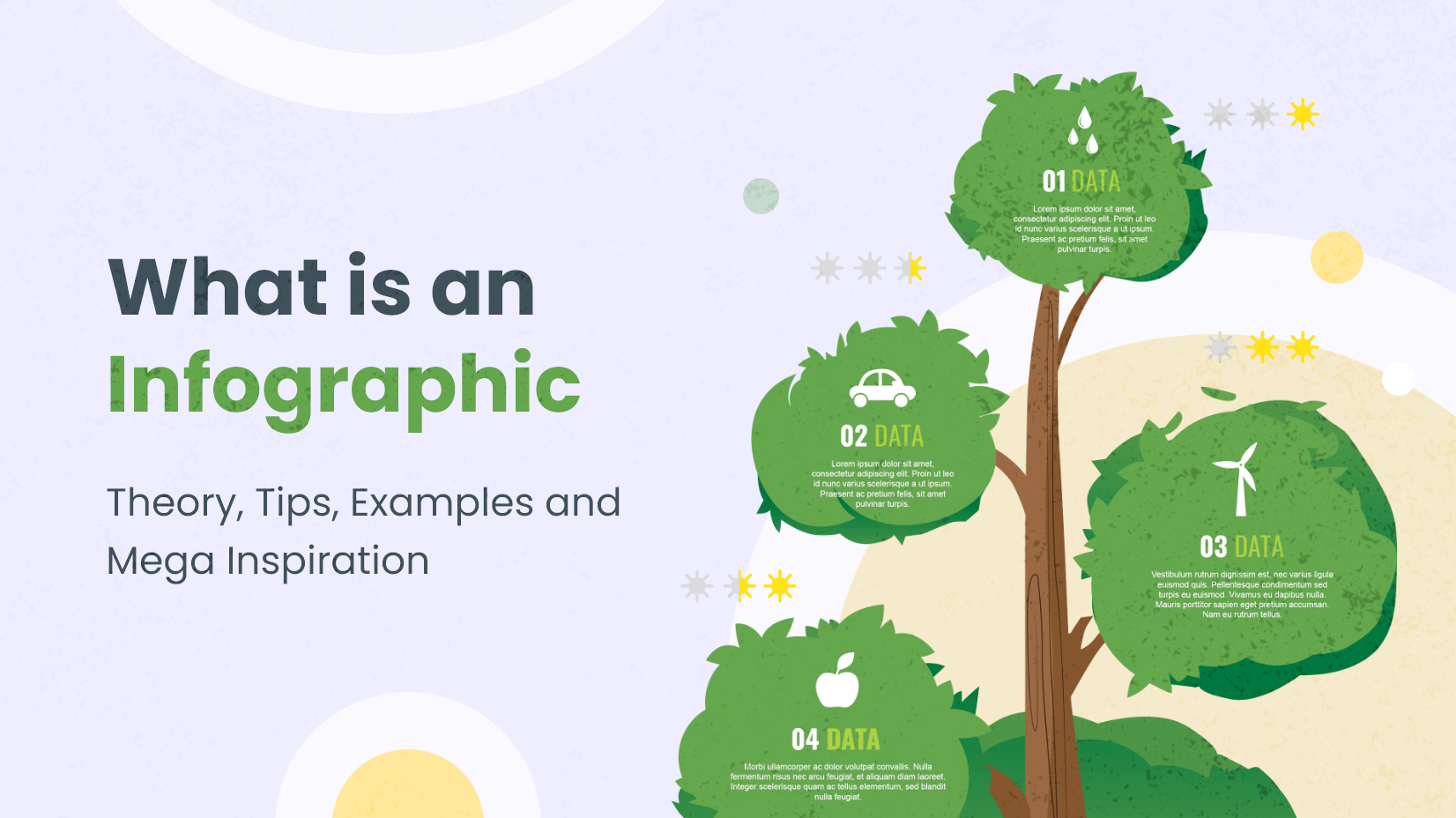
What is an Infographic [Theory, Tips, Examples and Mega Inspiration]
by Al Boicheva

PowerPoint Version History and Evolution To This Day [2022]
by Nikolay Kaloyanov

Free Vectors
Where to find free vector images for commercial use.
by Iveta Pavlova
Looking for Design Bundles or Cartoon Characters?
A source of high-quality vector graphics offering a huge variety of premade character designs, graphic design bundles, Adobe Character Animator puppets, and more.

Data visualization is the representation of data through use of common graphics, such as charts, plots, infographics and even animations. These visual displays of information communicate complex data relationships and data-driven insights in a way that is easy to understand.
Data visualization can be utilized for a variety of purposes, and it’s important to note that is not only reserved for use by data teams. Management also leverages it to convey organizational structure and hierarchy while data analysts and data scientists use it to discover and explain patterns and trends. Harvard Business Review (link resides outside ibm.com) categorizes data visualization into four key purposes: idea generation, idea illustration, visual discovery, and everyday dataviz. We’ll delve deeper into these below:
Idea generation
Data visualization is commonly used to spur idea generation across teams. They are frequently leveraged during brainstorming or Design Thinking sessions at the start of a project by supporting the collection of different perspectives and highlighting the common concerns of the collective. While these visualizations are usually unpolished and unrefined, they help set the foundation within the project to ensure that the team is aligned on the problem that they’re looking to address for key stakeholders.
Idea illustration
Data visualization for idea illustration assists in conveying an idea, such as a tactic or process. It is commonly used in learning settings, such as tutorials, certification courses, centers of excellence, but it can also be used to represent organization structures or processes, facilitating communication between the right individuals for specific tasks. Project managers frequently use Gantt charts and waterfall charts to illustrate workflows . Data modeling also uses abstraction to represent and better understand data flow within an enterprise’s information system, making it easier for developers, business analysts, data architects, and others to understand the relationships in a database or data warehouse.
Visual discovery
Visual discovery and every day data viz are more closely aligned with data teams. While visual discovery helps data analysts, data scientists, and other data professionals identify patterns and trends within a dataset, every day data viz supports the subsequent storytelling after a new insight has been found.
Data visualization
Data visualization is a critical step in the data science process, helping teams and individuals convey data more effectively to colleagues and decision makers. Teams that manage reporting systems typically leverage defined template views to monitor performance. However, data visualization isn’t limited to performance dashboards. For example, while text mining an analyst may use a word cloud to to capture key concepts, trends, and hidden relationships within this unstructured data. Alternatively, they may utilize a graph structure to illustrate relationships between entities in a knowledge graph. There are a number of ways to represent different types of data, and it’s important to remember that it is a skillset that should extend beyond your core analytics team.
Use this model selection framework to choose the most appropriate model while balancing your performance requirements with cost, risks and deployment needs.
Register for the ebook on generative AI
The earliest form of data visualization can be traced back the Egyptians in the pre-17th century, largely used to assist in navigation. As time progressed, people leveraged data visualizations for broader applications, such as in economic, social, health disciplines. Perhaps most notably, Edward Tufte published The Visual Display of Quantitative Information (link resides outside ibm.com), which illustrated that individuals could utilize data visualization to present data in a more effective manner. His book continues to stand the test of time, especially as companies turn to dashboards to report their performance metrics in real-time. Dashboards are effective data visualization tools for tracking and visualizing data from multiple data sources, providing visibility into the effects of specific behaviors by a team or an adjacent one on performance. Dashboards include common visualization techniques, such as:
- Tables: This consists of rows and columns used to compare variables. Tables can show a great deal of information in a structured way, but they can also overwhelm users that are simply looking for high-level trends.
- Pie charts and stacked bar charts: These graphs are divided into sections that represent parts of a whole. They provide a simple way to organize data and compare the size of each component to one other.
- Line charts and area charts: These visuals show change in one or more quantities by plotting a series of data points over time and are frequently used within predictive analytics. Line graphs utilize lines to demonstrate these changes while area charts connect data points with line segments, stacking variables on top of one another and using color to distinguish between variables.
- Histograms: This graph plots a distribution of numbers using a bar chart (with no spaces between the bars), representing the quantity of data that falls within a particular range. This visual makes it easy for an end user to identify outliers within a given dataset.
- Scatter plots: These visuals are beneficial in reveling the relationship between two variables, and they are commonly used within regression data analysis. However, these can sometimes be confused with bubble charts, which are used to visualize three variables via the x-axis, the y-axis, and the size of the bubble.
- Heat maps: These graphical representation displays are helpful in visualizing behavioral data by location. This can be a location on a map, or even a webpage.
- Tree maps, which display hierarchical data as a set of nested shapes, typically rectangles. Treemaps are great for comparing the proportions between categories via their area size.
Access to data visualization tools has never been easier. Open source libraries, such as D3.js, provide a way for analysts to present data in an interactive way, allowing them to engage a broader audience with new data. Some of the most popular open source visualization libraries include:
- D3.js: It is a front-end JavaScript library for producing dynamic, interactive data visualizations in web browsers. D3.js (link resides outside ibm.com) uses HTML, CSS, and SVG to create visual representations of data that can be viewed on any browser. It also provides features for interactions and animations.
- ECharts: A powerful charting and visualization library that offers an easy way to add intuitive, interactive, and highly customizable charts to products, research papers, presentations, etc. Echarts (link resides outside ibm.com) is based in JavaScript and ZRender, a lightweight canvas library.
- Vega: Vega (link resides outside ibm.com) defines itself as “visualization grammar,” providing support to customize visualizations across large datasets which are accessible from the web.
- deck.gl: It is part of Uber's open source visualization framework suite. deck.gl (link resides outside ibm.com) is a framework, which is used for exploratory data analysis on big data. It helps build high-performance GPU-powered visualization on the web.
With so many data visualization tools readily available, there has also been a rise in ineffective information visualization. Visual communication should be simple and deliberate to ensure that your data visualization helps your target audience arrive at your intended insight or conclusion. The following best practices can help ensure your data visualization is useful and clear:
Set the context: It’s important to provide general background information to ground the audience around why this particular data point is important. For example, if e-mail open rates were underperforming, we may want to illustrate how a company’s open rate compares to the overall industry, demonstrating that the company has a problem within this marketing channel. To drive an action, the audience needs to understand how current performance compares to something tangible, like a goal, benchmark, or other key performance indicators (KPIs).
Know your audience(s): Think about who your visualization is designed for and then make sure your data visualization fits their needs. What is that person trying to accomplish? What kind of questions do they care about? Does your visualization address their concerns? You’ll want the data that you provide to motivate people to act within their scope of their role. If you’re unsure if the visualization is clear, present it to one or two people within your target audience to get feedback, allowing you to make additional edits prior to a large presentation.
Choose an effective visual: Specific visuals are designed for specific types of datasets. For instance, scatter plots display the relationship between two variables well, while line graphs display time series data well. Ensure that the visual actually assists the audience in understanding your main takeaway. Misalignment of charts and data can result in the opposite, confusing your audience further versus providing clarity.
Keep it simple: Data visualization tools can make it easy to add all sorts of information to your visual. However, just because you can, it doesn’t mean that you should! In data visualization, you want to be very deliberate about the additional information that you add to focus user attention. For example, do you need data labels on every bar in your bar chart? Perhaps you only need one or two to help illustrate your point. Do you need a variety of colors to communicate your idea? Are you using colors that are accessible to a wide range of audiences (e.g. accounting for color blind audiences)? Design your data visualization for maximum impact by eliminating information that may distract your target audience.
An AI-infused integrated planning solution that helps you transcend the limits of manual planning.
Build, run and manage AI models. Prepare data and build models on any cloud using open source code or visual modeling. Predict and optimize your outcomes.
Unlock the value of enterprise data and build an insight-driven organization that delivers business advantage with IBM Consulting.
Your trusted Watson co-pilot for smarter analytics and confident decisions.
Use features within IBM Watson® Studio that help you visualize and gain insights into your data, then cleanse and transform your data to build high-quality predictive models.
Data Refinery makes it easy to explore, prepare, and deliver data that people across your organization can trust.
Learn how to use Apache Superset (a modern, enterprise-ready business intelligence web application) with Netezza database to uncover the story behind the data.
Predict outcomes with flexible AI-infused forecasting and analyze what-if scenarios in real-time. IBM Planning Analytics is an integrated business planning solution that turns raw data into actionable insights. Deploy as you need, on premises or on cloud.
How to choose the right data visualization
Posted by: mike yi, mel restori.
Data visualizations are a vital component of a data analysis, as they have the capability of summarizing large amounts of data efficiently in a graphical format. There are many chart types available , each with its own strengths and use cases. One of the trickiest parts of the analysis process is choosing the right way to represent your data using one of these visualizations.
In this article, we will approach the task of choosing a data visualization based on the type of task that you want to perform.
Common roles for data visualization include:
- showing change over time
- showing a part-to-whole composition
- looking at how data is distributed
- comparing values between groups
- observing relationships between variables
looking at geographical data
The types of variables you are analyzing and the audience for the visualization can also affect which chart will work best within each role. Certain visualizations can also be used for multiple purposes depending on these factors.
Charts for showing change over time
One of the most common applications for visualizing data is to see the change in value for a variable across time. These charts usually have time on the horizontal axis, moving from left to right, with the variable of interest’s values on the vertical axis. There are multiple ways of encoding these values:

- Bar charts encode value by the heights of bars from a baseline.
- Line charts encode value by the vertical positions of points connected by line segments. This is useful when a baseline is not meaningful, or if the number of bars would be overwhelming to plot.
- A box plot can be useful when a distribution of values need to be plotted for each time period; each set of box and whiskers can show where the most common data values lie.
There are a number of specialist chart types for the financial domain, like the candlestick chart or Kagi chart.
Charts for showing part-to-whole composition
Sometimes, we need to know not just a total, but the components that comprise that total. While other charts like a standard bar chart can be used to compare the values of the components, the following charts put the part-to-whole decomposition at the forefront:

- The pie chart and cousin donut chart represent the whole with a circle, divided by slices into parts.
- A stacked bar chart modifies a bar chart by dividing each bar into multiple sub-bars, showing a part-to-whole composition within each primary bar.
- Similarly, a stacked area chart modifies the line chart by using shading under the line to divide the total into sub-group values.
A host of other more intricate chart types have also been developed to show hierarchical relationships. These include the Marimekko plot and treemap.
Charts for looking at how data is distributed
One important use for visualizations is to show how data points’ values are distributed. This is particularly useful during the exploration process, when trying to build an understanding of the properties of data features.

- Bar charts are used when a variable is qualitative and takes a number of discrete values.
- A histogram is used when a variable is quantitative, taking numeric values.
- Alternatively, a density curve can be used in place of a histogram, as a smoothed estimate of the underlying distribution.
- A violin plot compares numeric value distributions between groups by plotting a density curve for each group.
The box plot is another way of comparing distributions between groups, but with a summary of statistics rather than an estimated distributional shape.
Charts for comparing values between groups
Another very common application for a data visualization is to compare values between distinct groups. This is frequently combined with other roles for data visualization, like showing change over time, or looking at how data is distributed.

- A bar chart compares values between groups by assigning a bar to each group.
- A dot plot can be used similarly, except with value indicated by point positions instead of bar lengths. This is like a line chart with the line segments removed, eliminating the ‘connection’ between sequential points. Also like a line chart, a dot plot is useful when including a vertical baseline would not be meaningful.
- A line chart can be used to compare values between groups across time by plotting one line per group.
- A grouped bar chart allows for comparison of data across two different grouping variables by plotting multiple bars at each location, not just one.
- Violin plots and box plots are used to compare data distributions between groups.
- A funnel chart is a specialist chart for showing how quantities move through a process, like tracking how many visitors get from being shown an ad to eventually making a purchase.
- Bullet charts are another specialist chart for comparing a true value to one or more benchmarks.
One sub-category of charts comes from the comparison of values between groups for multiple attributes. Examples of these charts include the parallel coordinates plot (and its special case the slope plot), and the dumbbell plot.
Charts for observing relationships between variables
Another task that shows up in data exploration is understanding the relationship between data features. The chart types below can be used to plot two or more variables against one another to observe trends and patterns between them.

- The scatter plot is the standard way of showing the relationship between two variables.
- Scatter plots can also be expanded to additional variables by adding color, shape, or size to each point as indicators, as in a bubble chart .
- When a third variable represents time, points in a scatter plot can be connected with line segments, generating a connected scatter plot .
- Another alternative for a temporal third-variable is a dual-axis plot , such as plotting a line chart and bar chart with a shared horizontal axis.
- When one or both variables being compared are not numeric, a heatmap can show the relationship between groups. Heatmaps can also be used for purely numeric data, like in a 2-d histogram or 2-d density curve.
Charts for looking at geographical data
Sometimes, data includes geographical data like latitude and longitude or regions like country or state. While plotting this data might just be extending an existing visualization onto a map background (e.g. plotting points like in a scatter plot on top of a map), there are other chart types that take the mapping domain into account. Two of these are highlighted below:

Right: Cartogram of US Population from census.gov
- A choropleth is like a heatmap that colors in geopolitical regions rather than a strict grid.
- Cartograms take a different approach by using the size of each region to encode value. This approach necessitates some distortion in shapes and topology.
Closing thoughts
Choosing the right chart for the job depends on the kinds of variables that you are looking at and what you want to get out of them. The above is only a general guideline: it is possible that breaking out of the standard modes will help you gain additional insights. Experiment with not just different chart types, but also how the variables are encoded in each chart. It’s also good to keep in mind that you aren’t limited to showing everything in just one plot. Often it is better to keep each individual plot as simple and clear as possible, and instead use multiple plots to make comparisons, show trends, and demonstrate relationships between multiple variables.
- Business Essentials
- Leadership & Management
- Credential of Leadership, Impact, and Management in Business (CLIMB)
- Entrepreneurship & Innovation
- Digital Transformation
- Finance & Accounting
- Business in Society
- For Organizations
- Support Portal
- Media Coverage
- Founding Donors
- Leadership Team

- Harvard Business School →
- HBS Online →
- Business Insights →
Business Insights
Harvard Business School Online's Business Insights Blog provides the career insights you need to achieve your goals and gain confidence in your business skills.
- Career Development
- Communication
- Decision-Making
- Earning Your MBA
- Negotiation
- News & Events
- Productivity
- Staff Spotlight
- Student Profiles
- Work-Life Balance
- AI Essentials for Business
- Alternative Investments
- Business Analytics
- Business Strategy
- Business and Climate Change
- Creating Brand Value
- Design Thinking and Innovation
- Digital Marketing Strategy
- Disruptive Strategy
- Economics for Managers
- Entrepreneurship Essentials
- Financial Accounting
- Global Business
- Launching Tech Ventures
- Leadership Principles
- Leadership, Ethics, and Corporate Accountability
- Leading Change and Organizational Renewal
- Leading with Finance
- Management Essentials
- Negotiation Mastery
- Organizational Leadership
- Power and Influence for Positive Impact
- Strategy Execution
- Sustainable Business Strategy
- Sustainable Investing
- Winning with Digital Platforms
6 Data Visualization Examples To Inspire Your Own

- 12 Jan 2017
Data informs virtually every business decision an organization makes. Because of this, it’s become increasingly important for professionals of all backgrounds to be adept at working with data.
While data can provide immense value, it’s important that professionals are able to effectively communicate the significance of the data to stakeholders. This is where data visualization comes into play. By transforming raw data into engaging visuals using various data visualization tools , it’s much easier to communicate insights gleaned from it.
Here are six real-world examples of data visualization that you can use to inspire your own.
What Is Data Visualization?
Data visualization is the process of turning raw data into graphical representations.
Visualizations make it easy to communicate trends in data and draw conclusions. When presented with a graph or chart, stakeholders can easily visualize the story the data is telling, rather than try to glean insights from raw data.
There are countless data visualization techniques , including:
- Scatter plots
The technique you use will vary based on the type of data you’re handling and what you’re trying to communicate.
6 Real-World Data Visualization Examples
1. the most common jobs by state.

Source: NPR
National Public Radio (NPR) produced a color-coded, interactive display of the most common jobs in each state in each year from 1978 to 2014. By dragging the scroll bar at the bottom of the map, you’re able to visualize occupational changes over time.
If you’re trying to represent geographical data, a map is the best way to go.
2. COVID-19 Hospitalization Rates

Source: CDC
Throughout the COVID-19 pandemic, the Centers for Disease Control and Prevention (CDC) has been transforming raw data into easily digestible visuals. This line graph represents COVID-19 hospitalization rates from March through November 2020.
The CDC tactfully incorporated color to place further emphasis on the stark increase in hospitalization rates, using a darker shade for lower values and a lighter shade for higher values.
3. Forecasted Revenue of Amazon.com

Source: Statista
Data visualizations aren’t limited to historical data. This bar chart created by Statista visualizes the forecasted gross revenue of Amazon.com from 2018 to 2025.
This visualization uses a creative title to summarize the main message that the data is conveying, as well as a darker orange color to spike out the most important data point.
4. Web-Related Statistics

Source: Internet Live Stats
Internet Live Stats has tracked web-related statistics and pioneered methods for visualizing data to show how different digital properties have ebbed and flowed over time.
Simple infographics like this one are particularly effective when your goal is to communicate key statistics rather than visualizing trends or forecasts.
5. Most Popular Food Delivery Items

Source: Eater
Eater, Vox’s food and dining brand, has created this fun take on a “pie” chart, which shows the most common foods ordered for delivery in each of the United States.
To visualize this data, Eater used a specific type of pie chart known as a spie chart. Spie charts are essentially pie charts in which you can vary the height of each segment to further visualize differences in data.
6. Netflix Viewing Patterns

Source: Vox
Vox created this interesting visualization depicting the viewing patterns of Netflix users over time by device type. This Sankey diagram visualizes the tendency of users to switch to streaming via larger device types.

Visualizing Data to Make Business Decisions
The insights and conclusions drawn from data visualizations can guide the decision-making and strategic planning processes for your organization.
To ensure your visualizations are relevant, accurate, and ethical, familiarize yourself with basic data science concepts . With a foundational knowledge in data science, you can maintain confidence in your data and better understand its significance. An online analytics course can help you get started.
Are you interested in improving your data science and analytical skills? Download our Beginner’s Guide to Data & Analytics to learn how you can leverage the power of data for professional and organizational success.
This post was updated on February 26, 2021. It was originally published on January 12, 2017.
What Is Data Visualization and Why Is It Important? A Complete Introduction
They say a picture is worth a thousand words, and this is especially true for data analytics.
Data visualization is all about presenting data in a visual format, using charts, graphs, and maps to tell a meaningful story. It’s a crucial step in the data analysis process—and a technique (or art form!) that all areas of business can benefit from.
In this guide, we’ll tell you everything you need to know about data visualization (also known as data viz). We’ll explain what it is, why it matters, some of the most common types, as well as the tools you can use to create them.
This guide is ideal for anyone who wants to present, communicate, and share data-driven insights.
If you’d like to learn more data analytics skills, try this free data short course .
- What is data visualization?
- Why is data visualization important?
- When should you visualize your data?
- Different types of data visualization and when to use them
- Top data visualization tools
- Best practices and principles for effective data visualization
- Getting started with data visualization
So: What is data visualization? Let’s start with a definition.
1. What is data visualization? A definition
Data visualization is the graphical or visual representation of data. It helps to highlight the most useful insights from a dataset, making it easier to spot trends, patterns, outliers, and correlations.
Imagine you’re presented with a spreadsheet containing rows and rows of data. You probably won’t be able to decipher the data without delving into it, and it’s unlikely that you’ll be able to spot trends and patterns at first glance.
Now imagine seeing the same data presented as a bar chart, or on a color-coded map. It’s much easier to see what the data is telling you, right?
That’s the whole point of data visualization. It makes insights visible to the naked eye, so that virtually anyone can see and understand what’s going on. When done well, data visualization tells a story.
This storytelling aspect is crucial as it makes your data actionable. There’s a huge difference between simply having lots of data versus actually understanding how to use it to drive actions and decisions—and data visualization bridges that gap.
There are two broad categories of data visualization: exploration and explanation. Let’s take a look at those now.
What are the two main types of data visualization? Exploration vs. explanation
We’ll look at specific types of data visualization later on, but for now, it’s important to distinguish between exploratory and explanatory data visualization.
In a nutshell, exploratory data visualization helps you figure out what’s in your data, while explanatory visualization helps you to communicate what you’ve found. Exploration takes place while you’re still analyzing the data, while explanation comes towards the end of the process when you’re ready to share your findings.
Exploration
When faced with a new dataset, one of the first things you’ll do is carry out an exploratory data analysis . This is where you investigate the dataset and identify some of its main features, laying the foundation for more thorough analysis.
At this stage, visualizations can make it easier to get a sense of what’s in your dataset and to spot any noteworthy trends or anomalies. Ultimately, you’re getting an initial lay of the land and finding clues as to what the data might be trying to tell you.
Explanation
Once you’ve conducted your analysis and have figured out what the data is telling you, you’ll want to share these insights with others.
These could be key business stakeholders who can take action based on the data, for example, or public audiences who have an interest in your topic area.
Explanatory data visualizations help you tell this story, and it’s up to you to determine which visualizations will help you to do so most effectively. We’ll introduce some of the most common types of data visualization (and when to use them) in section four.
Want to learn more about data visualization, and try your hand at creating visualizations of your own? Give this free introductory tutorial a go. We’ll show you, step by step, how to create bar charts, line graphs, and more for a real dataset in Google Sheets.
2. Why is data visualization important?
The importance of effective data visualization is rooted in the importance of data analytics in general.
We’re living in an increasingly data-rich world; at the start of 2020, the digital universe comprised approximately 44 zettabytes of data . For perspective, one zettabyte is roughly equal to a trillion gigabytes. By 2025, it’s estimated that around 463 exabytes of data will be created every 24 hours across the globe. An exabyte is equivalent to one billion gigabytes. Basically, we’re producing tons and tons of data all the time.
Data analytics allows us to make sense of (at least some of) that data. From a business perspective, it enables companies to learn from the past and plan ahead for the future. In fields like healthcare, it can help to improve patient care and treatment. In finance and insurance, it can help to assess risk and combat fraudulent activity. Essentially, we need data analytics in order to make smart decisions—and data visualization is a crucial part of that.
Data visualization helps us to understand what certain data is telling us, presenting it in a way that’s accessible to a range of audiences—not just data experts. It’s how you bridge the gap between your expertise as a data analyst or data scientist, and those people who can use or act upon the insights you discover.
A line graph and a bar chart taken from the Fitbit app.
The advantages and benefits of effective data visualization at a glance
Data visualization allows you to:
- Get an initial understanding of your data by making trends, patterns, and outliers easily visible to the naked eye
- Comprehend large volumes of data quickly and efficiently
- Communicate insights and findings to non-data experts, making your data accessible and actionable
- Tell a meaningful and impactful story, highlighting only the most relevant information for a given context
Now we know what data visualization is and why it matters, let’s take a look at when and why you might need to visualize your data.
3. When should you visualize your data?
Aside from exploratory data visualization which takes place in the early stages, data visualization usually comprises the final step in the data analysis process . To recap, the data analysis process can be set out as follows:
- Define the question: What problem are you trying to solve?
- Collect the data: Determine what kind of data you need and where you’ll find it.
- Clean the data: Remove errors, duplicates, outliers, and unwanted data points—anything that might skew how your data is interpreted. You can learn more about data cleaning (and how to do it) in this guide .
- Analyze the data: Determine the type of data analysis you need to carry out in order to find the insights you’re looking for.
- Visualize the data and share your findings: Translate your key insights into visual format (e.g. graphs, charts, or heatmaps) and present them to the relevant audience(s).
Essentially, you visualize your data any time you want to summarize and highlight key findings and share them with others. With that in mind, let’s consider what kinds of insights you can convey with data visualizations.
What is data visualization used for?
Within the broader goal of conveying key insights, different visualizations can be used to tell different stories. Data visualizations can be used to:
- Convey changes over time: For example, a line graph could be used to present how the value of Bitcoin changed over a certain time period.
- Determine the frequency of events: You could use a histogram to visualize the frequency distribution of a single event over a certain time period (e.g. number of internet users per year from 2007 to 2021). Learn how to create a histogram in this guide .
- Highlight interesting relationships or correlations between variables: If you wanted to highlight the relationship between two variables (e.g. marketing spend and revenue, or hours of weekly exercise vs. cardiovascular fitness), you could use a scatter plot to see, at a glance, if one increases as the other decreases (or vice versa).
- Examine a network: If you want to understand what’s going on within a certain network (for example, your entire customer base), network visualizations can help you to identify (and depict) meaningful connections and clusters within your network of interest.
- Analyze value and risk: If you want to weigh up value versus risk in order to figure out which opportunities or strategies are worth pursuing, data visualizations—such as a color-coded system—could help you to categorize and identify, at a glance, which items are feasible.
So far, we’ve taken a rather broad, high-level look at data visualization. Now let’s drill down to some specific types of data visualization and when to use them.
An example of data visualization, as seen in the Fitbit app.
4. How to visualize your data: Different types of data visualization (and when to use them)
There are many different options when it comes to visualizing your data. The visualization you choose depends on the type of data you’re working with and what you want to convey or highlight. It’s also important to consider the complexity of your data and how many different variables are involved. Not all types of data visualization lend themselves to elaborate or complex depictions, so it’s important to choose a suitable technique.
Before we explore some of the most common types of data visualization, let’s first introduce five main data visualization categories.
Five data visualization categories
When considering the different types of data viz, it helps to be aware of the different categories that these visualizations may fall into:
- Temporal data visualizations are linear and one-dimensional. Examples include scatterplots, timelines, and line graphs.
- Hierarchical visualizations organize groups within larger groups, and are often used to display clusters of information. Examples include tree diagrams, ring charts, and sunburst diagrams.
- Network visualizations show the relationships and connections between multiple datasets. Examples include matrix charts, word clouds, and node-link diagrams.
- Multidimensional or 3D visualizations are used to depict two or more variables. Examples include pie charts, Venn diagrams, stacked bar graphs, and histograms.
- Geospatial visualizations convey various data points in relation to physical, real-world locations (for example, voting patterns across a certain country). Examples include heat maps, cartograms, and density maps.
With those categories in mind, let’s explore some of the most common types of data visualization.
Five common types of data visualization (and when to use them)
In this section, we’ll introduce some useful types of data visualization. We’ll also point you to our more comprehensive guide where you can learn about additional data visualization methods and how to use them.
1. Scatterplots
Scatterplots (or scatter graphs) visualize the relationship between two variables. One variable is shown on the x-axis, and the other on the y-axis, with each data point depicted as a single “dot” or item on the graph. This creates a “scatter” effect, hence the name.
Source: displayr.com
Scatterplots are best used for large datasets when there’s no temporal element. For example, if you wanted to visualize the relationship between a person’s height and weight, or between how many carats a diamond measures and its monetary value, you could easily visualize this using a scatterplot.
It’s important to bear in mind that scatterplots simply describe the correlation between two variables; they don’t infer any kind of cause-and-effect relationship.
2. Bar charts
Bar charts are used to plot categorical data against discrete values.
Categorical data refers to data that is not numeric, and it’s often used to describe certain traits or characteristics. Some examples of categorical data include things like education level (e.g. high school, undergrad, or post-grad) and age group (e.g. under 30, under 40, under 50, or 50 and over).
Discrete values are those which can only take on certain values—there are no “half measures” or “gray areas.” For example, the number of people attending an event would be a discrete variable, as would the number of sales made in a certain time period (think about it: you can’t make “half a sale” or have “half an event attendee.”)
Source: chartio.com
So, with a bar chart, you have your categorical data on the x-axis plotted against your discrete values on the y-axis.
The height of the bars is directly proportional to the values they represent, making it easy to compare your data at a glance.
3. Pie charts
Just like bar charts, pie charts are used to visualize categorical data.
However, while bar charts represent multiple categories of data, pie charts are used to visualize just one single variable broken down into percentages or proportions. A pie chart is essentially a circle divided into different “slices,” with each slice representing the percentage it contributes to the whole.
Thus, the size of each pie slice is proportional to how much it contributes to the whole “pie.”
Imagine you have a class of thirty students and you want to divide them up based on what color t-shirt they’re wearing on a given day.
The possible “slices” are red, green, blue, and yellow, with each color representing 40%, 30%, 25%, and 5% of the class total respectively. You could easily visualize this using a pie chart—and the yellow slice (5%) would be considerably thinner than the red slice (40%)! Pie charts are best suited for data that can be split into a maximum of five or six categories.
4. Network graphs
Not all data is simple enough to be summarized in a bar or pie chart. For those more complex datasets, there are a range of more elaborate data visualizations at your disposal—network graphs being one of them.
Network graphs show how different elements or entities within a network relate to one another, with each element represented by an individual node. These nodes are connected to other, related nodes via lines.
Source: networkofthrones.wordpress.com
Network graphs are great for spotting and representing clusters within a large network of data.
Let’s imagine you have a huge database filled with customers, and you want to segment them into meaningful clusters for marketing purposes. You could use a network graph to draw connections and parallels between all your customers or customer groups.
With any luck, certain clusters and patterns would emerge, giving you a logical means by which to group your audience.
5. Geographical maps
Geo maps are used to visualize the distribution of data in relation to a physical, geographical area.
For example, you could use a color-coded map to see how natural oil reserves are distributed across the world, or to visualize how different states voted in a political election. Maps are an extremely versatile form of data visualization, and are an excellent way of communicating all kinds of location-related data.
Some other types of maps used in data visualization include dot distribution maps (think scatterplots combined with a map), and cartograms which distort the size of geographical areas to proportionally represent a given variable (population density, for example).
Source: pmfias.com
Here, we’ve introduced just a handful of data visualization types. If you want to learn more, check out our complete guide to different types of data visualization and when to use them .
5. Top data visualization tools
When it comes to creating informative, eye-catching visualizations, there are plenty of tools at your disposal.
When choosing a tool, it’s important to consider your needs in terms of the kinds of visualizations you want to create, as well as your own technical expertise; some tools will require coding knowledge, while others are more suited to non-technical users.
In this section, we’ll briefly introduce some of the most popular data visualization tools. If you’re on the market for a data viz tool and want a more thorough comparison, this guide to the seven best data visualization tools will help you. For now, here are our top three data viz tools to get familiar with:
- Plotly: Open-source software built on Python. Plotly is ideal if you’ve got some coding knowledge and want to create highly customizable visualizations.
- D3.js: A free, open-source data viz library built using JavaScript. As with Plotly, you’ll need some programming knowledge in order to use this data viz tool.
- Tableau: Perhaps one of the most popular data analytics tools , Tableau is known for its user-friendliness—you don’t need any coding knowledge to create beautiful visualizations in Tableau. And, unlike some other BI tools, it’s good at handling large volumes of data.
Before deciding on a tool, it’s worth trying out a few options. The good news is that there are plenty of data viz tools on the market— as well as a number of free tools —allowing you to create beautiful and informative visualizations—even if you’re a newcomer to the field.
What are data dashboards?
Dashboards are another useful tool for data tracking and visualization. A data dashboard essentially allows you to keep track of multiple data sources, visualizing them in one single location for easy viewing.
A common example is the Google Analytics dashboard , which displays a whole host of visualizations on one page—a geo map showing where your website visitors are located, for example, or a pie chart showing what percentage of your users access your website using specific devices.
If you want multiple stakeholders to be able to access and view certain data insights, a dashboard can help you to create a single hub with easy-to-understand visualizations.
A snapshot of a data dashboard, taken from Google Analytics.
6. What are some data visualization best practices?
Data visualization truly is an art form—but the goal is always, first and foremost, to provide valuable information and insights.
If you can do this by way of beautiful visualizations, you’re onto a winner. So, when creating data visualizations, it’s important to adhere to certain best practices.
These will help you strike the right balance, keeping your audience engaged and informed. Here’s how to excel at data visualization.
1. Define a clear purpose
Like any data analytics project, it’s important to define a clear purpose for your data visualizations.
What are the priorities in terms of what you want to convey and communicate? What should your audience take away from your visualization? It’s essential to have this defined from the outset; that way, you can ensure that you’re only presenting the most valuable information—and giving your audience something they can use and act upon.
2. Know your audience
The purpose of data visualization is to communicate insights to a specific audience, so you’ll want to give some thought to who your audience is and how familiar they are with the information you’re presenting.
What kind of context can you provide around your visualizations in order to help your audience understand them? What types of visualization are likely to be most accessible to this particular group of people? Keep your audience in mind at all times.
3. Keep it simple
When creating visualizations, it’s often the case that less is more.
Ultimately, you want your visualizations to be as digestible as possible, and that means trimming away any unnecessary information while presenting key insights clearly and succinctly. The goal is to keep cognitive load to a minimum—that is, the amount of “brainpower” or mental effort it takes to process information.
Even if the data is complex, your visualizations don’t have to be, so strive for simplicity at all times.
4. Avoid distorting the data
You should strive to present your findings as accurately as possible, so avoid any kind of visual “tricks” that could bias how your data is perceived and interpreted.
Think about the labels you use, as well as how you scale your visualizations. For example, things like “blowing up” certain data segments to make them appear more significant, or starting your graph axis on a number other than zero are both bad practices which could mislead your audience. Prioritize integrity and accuracy!
5. Ensure your visualizations are inclusive
Last but by no means least, make sure that your visualizations are accessible and inclusive.
Think about how colors, contrasts, font sizes, and the use of white space affect the readability of your visualization. Is it easy for your users to distinguish between the data and see what’s going on, regardless of whether they have twenty-twenty vision or a visual impairment?
Inclusivity and accessibility are central to good data visualization, so don’t overlook this step.
7. Getting started with data visualization
By now, you hopefully have a good understanding of what data visualization is and why it matters.
Of course, the best way to get to grips with it is to see it in action. Check out our round-up of some of the most beautiful and informative data visualization examples from around the web.
Keen to give it a go yourself? Why not download a free dataset and see what you can do! If you’d like to learn it more, then check out this list of data visualization courses out there to try.
Data visualization is an excellent skill to have, whether you’re forging a career in the data industry or just want to share valuable insights with your colleagues. If you are pursuing a career as a data analyst or data scientist, be sure to include data visualizations in your data portfolio —it’s something that employers will be looking out for.
CareerFoundry’s Data Visualizations with Python course is designed to ease you into this vital area of data analytics. You can take it as a standalone course as well as a specialization within our full Data Analytics Program, you’ll learn and apply the principles of data viz in a real-world project, as well as getting to grips with various data visualization libraries.
Want to learn more? Try your hand at this free, introductory data analytics short course , and check out the following guides:
- What is data quality and why is it important?
- What is web scraping? A beginner’s guide
- An introduction to multivariate analysis
What Is Data Visualization and Why Is It Important?
The sheer amount of data generated today means we need new ways to understand what’s happening in order to take action faster. Every click, transaction, subscription, loyalty card swipe, and social media interaction contributes to a digital footprint that continues to grow exponentially. The result? A massive explosion of data that is revolutionizing the way we live and work. Data visualization, in particular, plays a critical role in presenting data in a meaningful and understandable format. By using a visual representation of data , it’s much easier to identify patterns, trends, and relationships that may not be immediately apparent when sifting through large data sets.
Here’s what we’ll cover in this guide to data visualization:
- Data Visualization Definition
Benefits of Data Visualization
Why data visualization is important .
- Types of Data Visualization and Examples
- Evaluating Data Visualization Tools
- Take the Next Step and Start Analyzing With Data Visualization
Data Visualization Definition
Data visualization is the process of transforming raw data into visual formats, such as charts, graphs, or maps, to help identify patterns, trends, and insights that might not be apparent from numerical data alone.
Additionally, it enables data to be more accessible, understandable, and impactful, especially when communicating with stakeholders, investors, or team members who may not be familiar with the data.
For example, data visualization could help:
- In retail, gaining insights into customer behavior, purchase patterns, and product performance.
- In finance, monitoring market trends, tracking portfolio performance, and conducting risk analysis.
- In public health, showing the geographical distribution of outbreaks and helping track the spread of infectious diseases.
- In supply chain industries, tracking inventory levels, monitoring logistics operations, and optimizing resource allocation.
- In sports, evaluating player performance, game strategies, and match statistics.
- In education, tracking student performance, analyzing learning outcomes, and identifying areas for improvement.
Data visualization has several benefits for businesses including: the ability to process information faster, identify trends at scale, and make data more digestible. Companies regularly use data to make decisions, and through data visualization, can find insights quickly and move to action. Data visualization specifically helps with the following:
- Visualizing patterns and relationships
- Storytelling, including specifically data storytelling
- Accessibility to information
Exploration
Let’s take a look at each of these benefits in detail.
Visualize patterns and relationships
Data visualization constitutes an excellent method for the discernment of interconnections and patterns amidst vast collections of information. For example, a scatter plot can be used to display the relationship between two variables, such as the correlation between temperature and sales. This enables users to understand the relationship and identify trends and outliers more quickly and easily.
Read a guide of Sigma’s visual library.

Storytelling
Your audience, whether it's coworkers or clients, want to hear a coherent story from your data. Storytelling with data cannot be done successfully without visualizations. Colorful charting and dynamic pivots are just as important as characters and plots are in a traditional story, so using them to communicate information makes data that much more engaging and memorable for audiences. Data can be complex and convoluted for some audiences, so data storytelling is an approach to convey important information effectively through a captivating narrative. Good visualizations are a vital part of that narrative.
For example, if an analyst is investigating the performance of e-commerce sales for their retail company over time, they may leverage several data sources such as spreadsheets, calculations, code, etc. to do so. However, when they report these new insights to their stakeholders, the analyst will need to summarize and communicate their findings in a digestible way.
An easy way the analyst could do this is by using the data to create a map of the U.S. with a color gradient overlaying every state that is lighter or darker based on its total sales volume. This visual story tells the least and most successful retail locations at a glance.

Accessibility / Easily Share Information
Data visualization serves as an invaluable mechanism for the facilitation of accessibility, allowing for the communication of information amongst individuals, even for those who may not usually engage with data , which broadens the audience.
Visualizations help simplify complex information by leveraging people’s ability to naturally recognize patterns. A viewer typically does not have to be taught that bigger means more and that smaller means less. In a case where an analyst wants to highlight the difference in scale between one product’s profitability vs. another, a bar chart can clearly show the user which product is more profitable and by how much, making it easy for even non-technical team members to understand and compare the performance of different products.
Exploration is a key component of successful data visualization. The more flexible charting and dashboarding is, the more follow-up questions end users can ask directly of their data. For example, an interactive dashboard can be used to explore retail sales data over time, enabling users to filter and drill down into the data to identify trends and patterns.
Data visualization exploration is often associated with the concept of “drill downs.” Drill downs in data visualization refer to the process of starting with an overview of data and then narrowing the focus to more specific aspects of it. As an example, one might start with a visualization of global climate data and drill down to data about a specific country, a specific state, a specific city, or even a specific neighborhood within that city. Each drill down reveals more precise, detailed, and nuanced information.
The main goal of data visualization is that it helps unify and bring teams onto the same page. The human mind is wired to grasp visual information more effortlessly than raw data in spreadsheets or detailed reports. Thus, graphical representation of voluminous and intricate data is more user-friendly. Data visualization offers a swift and straightforward method to communicate ideas in a universally understood format, with the added benefit of enabling scenario testing through minor modifications.
By translating information into visual form, it ensures everyone, irrespective of the complexity of the data or the depth of the analysis, can share a unified understanding. Any industry can benefit from using data visualization, because pretty much every industry relies on data to power it. That includes finance, marketing, consumer goods, education, government, sports, history, and many more. Another thing to keep in mind is that data visualization can be a double-edged sword. For example, charts can be manipulated and skewed to force a desired outcome. Ungoverned, static, desktop tools can become the wild west in suggesting an inaccurate outcome “proven by data.” Even in the cases where the visualization builder is acting in good faith, there are still pitfalls to watch out for. Always be considerate of:
- Individual outliers having an outsized impact, skewing the visual direction of a chart
- The need for for business users to see the underlying data
- Allowing for transparency down to row-level detail in data sets

Types of Data Visualizations & Examples
There is a long list of types of data visualization techniques and methods that can be used to represent data. While no type of data visualization is perfect, we’ll walk through different examples and when to apply each one.
We’ll be looking at:
- Line charts and area charts
- Scatter plots
- Pivot tables
- Box-and-whisker plots
- Sankey charts
Tables, although more commonly thought of as a data source, can also be considered a type of data visualization. Especially when conditional formatting is applied to the table’s rows and columns, the data within the table becomes more visually engaging and informative. With conditional formatting, important insights and patterns can be highlighted, making it easier for viewers to identify trends and outliers at a glance. Additionally, tables offer a structured and organized way to present information, allowing for a comprehensive comparison of data points, which further enhances data understanding and analysis. For example, Sigma’s UI is based on a spreadsheet-like interface, which means almost everything in Sigma begins in a table format. That said, you can also create visual tables that display a smaller amount of data in order to tell a clearer story. In data visualization, tables are a simplified way of representing this interface.
When to use tables:
- For detailed numeric comparisons, or when precision of data is key
- For displaying multidimensional data; tables can handle this complexity quite well
When to avoid tables:
- When patterns, trends, or relationships need to be highlighted at a glance
- When dealing with large amounts of data

Pie charts —similar to stacked bar charts—are useful for displaying categorical data, such as market share or customer demographics. Pie charts are often used to display data that can be divided into categories or subgroups, and to show how each category or subgroup contributes to the whole. For example, a pie chart could be used to show the proportion of sales for different product categories in a given period of time, or the percent of a company's revenue broken down by various regions.
When to use pie charts:
- You want to display a proportion or percentage of a whole
- You’re visualizing only seven categories or less
When to avoid pie charts:
- You’re visualizing more than seven categories
- You want to compare something with more details, rather than just proportion
- You want to display and pinpoint exact values

A bar chart, or bar graph, constitutes a variety of graphs that employ rectangular bars to depict data. These bars can be oriented either horizontally or vertically, with their extent being directly proportional to the numerical values they are intended to embody. Predominantly utilized for juxtaposing data across disparate categories or illustrating shifts in data over temporal progressions, bar charts offer a straightforward, yet potent means of conveying information visually. They frequently function as the initial tool in the exploratory process of data investigation.
When to use bar charts:
- Emphasizing and contrasting different sets of data, making the disparities or similarities between categories clear
- To display a subset of a larger dataset
When to avoid bar charts:
- When a particular field encompasses an overwhelming variety of data types
- When the differences between fields are too subtle, or when these differences exist on different scales, as it could lead to confusion or misinterpretation
Line Charts & Area Charts

Line charts and area charts are two types of charts that are commonly used to visualize data trends over time. A line chart, also called a line graph, is a distinct type of graphical representation that exhibits information in the form of a multitude of data points, which are interconnected by unbroken lines. These line charts are typically employed to demonstrate transformations in data over a certain duration, where the horizontal axis symbolizes time, and the vertical axis signifies the values under scrutiny. Furthermore, they can serve to juxtapose several series of data within the same chart, or to graphically illustrate predicted time periods.
For example, a line chart can be used to visualize a company's stock prices over the course of a year. Similarly, an area chart can be used to visualize the temperature changes over a day.
When to use line charts:
- When you’re displaying time-based continuous data
- When you have multiple series or larger datasets
When to avoid line charts:
- When you have smaller datasets, bar charts are likely a better way to present the information
- Avoid when you need to compare multiple categories at once

When to use area charts:
- When you want to display the volume of the data you have
- When comparing data across more than one time period
When to avoid area charts:
- Avoid if you need to compare multiple categories, as well as when you need to examine the specific data value
Scatter Plots

A scatter plot , also called a scatter chart or scatter graph, is a specialized form of chart that demonstrates the correlation between two distinct variables by mapping them as a succession of individual data points. Each data point denotes a combined value of the two variables, with its specific placement within the chart dictated by these values.
Scatter charts prove instrumental in discerning patterns and trends within data, and they also help us understand how strong and in what direction the relationship is between two variables. They also serve as effective tools for identifying outliers, or those data points that deviate significantly from anticipated values based on the pattern displayed by other data points. These charts find widespread use across a range of fields including, but not limited to, statistics, engineering, and social sciences, for the purpose of analyzing and visualizing intricate data sets. In the realm of business, they are frequently utilized to identify correlations between different variables, for instance, examining the relationship between marketing outlays and resultant sales revenue. For example, a scatter plot might be used to visualize the relationship between the age and income of a group of people. Another example would be to plot the correlation between the amount of rainfall and the crop yield for a particular region.
When to use scatter plots:
- Highlight correlations within your data
- They are useful tools for statistical investigations
- Consider scatter plots to reveal underlying patterns or trends
When to avoid scatter plots:
- For smaller datasets, scatter plots may not be optimal
- Avoid scatter plots for excessively large datasets to prevent unintelligible data clustering
- If your data lacks correlations, scatter plots may not be the best choice
Pivot Tables
While pivot tables may not be what first comes to mind for data visualization, they can give important context with hard numbers and provide strong visual indicators through formatting. Pivot tables can also be enhanced with conditional formatting to provide color scales that make performance trends more visible. Data bars can also be added to cells to run either red or green for positive and negative values.
When to Use Pivot Tables:
- Cohort analysis performance trends or portfolio analysis with a mix of positive and negative values
What Not to Use Pivot Tables:
- When your dataset is too large to get a good understanding of the whole
- When data can easily be summarized with a bar chart instead

An example of a pivot table, where colors are used to show positive or negative progress on a company’s portfolio. The user can pivot the table to show multiple categories in different ways.
A heat map is a type of chart that uses color to represent data values. It is often used to visualize data that is organized in a matrix or table format. The color of each cell in the matrix is determined by the value of the corresponding data point. Heat maps are best used when analyzing data that is organized in a two-dimensional grid or matrix.
For example, a heat map can be used to visualize a company's website traffic, where the rows represent different pages on the website, and the columns represent different periods of time.
When to use heat maps:
- When you need to visualize the density or intensity of variables
- When you want to display patterns or trends over time or space
When to avoid heat maps:
- When precise values are needed; heat maps are better at showing relative differences rather than precise values
- When working with small data sets
A tree map is a type of chart that is used to visualize hierarchical data. It consists of a series of nested rectangles, where the size and color of each rectangle represent a different variable. Tree maps are best used when analyzing data that has a hierarchical structure.
For example, a tree map can be used to visualize the market share of different companies in an industry. The largest rectangle would represent the entire industry, with smaller rectangles representing the market share of each individual company.
When to use tree maps:
- When you want to visualize hierarchical data
- When you need to illustrate the proportion of different categories within a whole
When to avoid tree maps:
- When exact values are important
- When there are too many categories
Box-and-Whisker Plots

Box plots are useful for quickly summarizing the distribution of a dataset, particularly its central tendency and variability. For example, a box-and-whisker plot can be used to visualize the test scores of a group of students.
Colloquially recognized as a box-and-whisker plot, a box plot is a distinct form of chart that showcases the distribution of a collection of numerical data through its quartile divisions. Box plots serve as efficient tools for rapidly encapsulating the distribution of a dataset, specifically its central propensity and variability.
A box-and-whisker plot consists of a rectangle (the "box") and a pair of "whiskers" that extend from it. The box embodies the middle 50% of the data, with the lower boundary of the box signaling the first quartile (25th percentile) and the upper boundary of the box indicating the third quartile (75th percentile). The line situated within the box signifies the median value of the data. The whiskers project from the box to the minimum and maximum values of the data, or to a designated distance from the box referred to as the "fences." Any data points that reside outside the whiskers or fences are categorized as outliers and are plotted as individual points. When to use box plot charts:
- When you want to display data spread and skewness
- When showcasing the distribution of data, including the range, quartiles, and potential outliers
- When comparing multiple groups or categories side-by-side; they allow for easy comparison of different distributions.
When to avoid box plot charts:
- If you need to show more detail, since box plots focus on a high-level summary
- When individual data points are important to the story you’re telling
- When your audience isn’t familiar with them, since they can sometimes be less intuitive than other types of visualizations
A histogram is a type of chart that displays the distribution of a dataset. It consists of a series of vertical bars, where the height of each bar represents the number of observations in a particular range. Histograms are best used when analyzing continuous data. It’s used the most when you want to understand the frequency distribution of a numerical variable, like height, weight, or age. For example, a histogram can be used to visualize the distribution of heights in a population. Read more about building histograms in Sigma here.
When to Use a Histogram:
- When understanding the shape of a distribution; for example, whether it’s symmetric, skewed to the left or right, or bimodal
- When identifying outliers, like which data points are significantly different from the rest of the data
- When comparing distribution of a variable across different groups, such as males and females, or different age groups.
- To set boundaries for data ranges; for example, you might use a histogram to determine what constitutes a "normal" or "abnormal" value for a particular variable
When to Avoid a Histogram:
- When you need to look at multiple dimensions at the same time
- If your data isn’t all on the same scale
Sankey Charts

We end our guide with the controversial Sankey chart. A Sankey chart is a type of diagram that illustrates the movement or transfer of data, resources, or quantities through various stages of a system or process. Common applications of Sankey charts include visualizing complex sequences like energy usage, material distribution, or even a website's user journey. The structure of the chart includes nodes and links—with nodes representing the starting points, endpoints, or intermediate steps, and links depicting the transition of quantities or data between these nodes.
The thickness of the links in a Sankey chart directly corresponds to the volume of data or resources being moved, offering an intuitive comparison of the relative sizes of these transfers. They can be invaluable for recognizing inefficiencies, bottlenecks, or potential areas for enhancement in a system or process. These charts serve as a powerful tool for communicating complex information in a straightforward and comprehensible way. However, if there are too many nodes or links, Sankey charts can become cluttered and challenging to interpret, hence their use should be considerate and targeted.
When to use Sankey charts:
- When you want to show the data as part of a process
When to avoid Sankey charts:
- When it starts to feel too confusing, which can quickly happen when there are too many nodes or links
- When you need to see exact values, it might not be the most intuitive option.
Evaluating Data Visualization Tools
Data visualization tools have become increasingly popular in recent years, with a wide variety of options available to choose from. However, determining which tool best suits your needs can be challenging with so many options. When evaluating data visualization tools, there are several key questions to consider:
- What are your goals and needs? It's crucial to clearly understand your goals and needs before selecting a data visualization tool. Are you looking to explore your data, communicate a specific message, or both? Understanding your objectives will help you choose the right tool for your project.
- What features do you require? Different data visualization tools come with different features. Before selecting a tool, you should consider what features you need to achieve your goals. For example, do you require interactive capabilities or the ability to create custom visualizations?
- Where will your data come from? The source of your data is another critical factor to consider when selecting a data visualization tool. Some tools are better suited for specific types of data, such as structured or unstructured data, while others may require specific file formats or data storage solutions.
- Where will you need to see your data? Different data visualization tools may be more suitable for specific platforms or devices. For example, some tools may be optimized for mobile devices, while others are designed for desktop computers or specific web browsers. You may also be interested in embedding visualizations elsewhere , such as internal applications or external portals.
- Where would you like to publish your visualization? Finally, consider where you would like to publish your visualization. Some tools may provide built-in publishing capabilities, while others may require you to export your visualization to a separate platform. Selecting a tool that supports your publishing needs is important to ensure your visualization reaches your intended audience.
By considering these key questions, you can evaluate different data visualization tools and select the one that best meets your needs.
Read a side-by-side comparison of Sigma against similar BI tools.
Take the Next Step & Start Analyzing With Data Visualization
Data visualization is a powerful tool for understanding and communicating complex data. While there are many data visualization tools on the market, Sigma offers an intuitive and familiar spreadsheet interface that allows users to easily explore, analyze, and collaborate on their data.
Explore Sigma’s capabilities and start transforming your data today via a free trial of Sigma .
Related resources
.webp)
This is the default text value
Watch on-DEMAND DEMOS
ATTEND AN EVENT
Get a free trial
INTERACTIVE DEMOS
JOIN THE COMMUNITY
SCHEDULE A CALL
ATTEND A LIVE LAB
SEE WORKBOOK EXAMPLES
JOIN THE SIGMA COMMUNITY
All resources
- Blog Articles
- Use Cases & Examples
- Guides & Resources
- Dashboard Templates
- Case Studies
- Testimonials
What is data visualization
Why use data visualization, the advantages and benefits of good data visualization, principles of successful data visualization, how to choose a chart type, how to tell the visual story, designing the dashboard, why data visualization is important, reporting and visualization software tools comparison, looker studio by google, google sheets, key takeaways, what is data visualization: definition, principles, examples, tools.
Vlada Malysheva , Creative Writer @ OWOX

Top 30 Handpicked Google Looker Studio Dashboards for Marketers
65% of people are visual learners , making data visualization an effective way to communicate information.
When Excel spreadsheets aren’t enough to connect the dots between your data and there’s no possibility to involve data or digital analyst to get the report quickly, data visualization software tools and tools is what you need to become data-savvy.

In this article, which was last updated in January 2024, we’ll show you what data visualization techniques are available, how to visualize data correctly, which tools can be used for engaging and interactive visualizations without any help from developers or data professionals, and how to choose a tool that suits your specific needs.
The definition of data visualization is the visual representation of your data. With the help of charts, maps, and other graphical elements these tools provide a simple and comprehensible way to clearly see and easily discover insights and patterns in your data.
Data visualization is the graphical representation of data using visual elements such as charts, graphs, and maps.
It is a way to communicate complex information in a visual and intuitive manner, making it easier for people to understand and analyze the data. By transforming raw data into visual representations, data visualization allows patterns, trends, and insights to be easily identified and interpreted.
Data visualization is also a powerful storytelling tool. Visual storytelling helps to uncover hidden patterns, relationships, and correlations that may not be apparent, or not visible in raw data. Through visualizations, data can be presented in a way that is engaging, impactful, and memorable, enabling effective communication and data-driven decision-making .
Data visualization is not limited to a specific field or industry. It's not only about marketing data and is used in various domains such as business, finance, healthcare, education, or journalism. In business, data visualization is used to analyze sales trends, key performance indicators, and present business metrics. In healthcare, it is used to visualize patient data, monitor disease outbreaks, and analyze medical research. In journalism, it is used to create better stories and increase reach and consumption.
If you want your Facebook post to be read by as many people as possible, what will you do? You’ll add an interesting visual. This trick works perfectly with reports too. Data-driven visuals attract more attention, are easier to understand, and assist in getting your message across to the audience quickly.
With the help of descriptive graphics and dashboards, even difficult information can be clear and comprehensible.
Why is that?
Most people are visual learners. So if you want the majority of your partners, colleagues, and clients to be able to interact with your data, you should turn boring charts into beautiful graphics. Here are some noteworthy numbers, based on research, that confirm the importance of visualization:
- People get 90% of information about their environment from the eyes.
- 50% of brain neurons take part in visual data processing.
- Pictures increase the wish to read a text up to 80%.
- People remember 10% of what they hear, 20% of what they read, and 80% of what they see.
- If a package insert doesn’t contain any data illustrations, people will remember 70% of the information. With pictures added, they’ll remember up to 95%.
With OWOX BI , your data is collected, normalized, attributed & prepared for reporting.
Use our templates to get reports built in minutes, or use your data to prepare the data for any report you need and visualize it in Looker Studio (formerly Google Data Studio), Google Sheets or the BI tool of your choice. Save 70+ hours on data preparation every month and automate your entire digital marketing reporting.
Relevant visualization brings lots of advantages for your business:
- Fast decision-making. Summing up data is easy and fast with graphics, which let you quickly see that a column or touchpoint is higher than others without looking through several pages of statistics in Google Sheets or Excel... or even a database or a CRM or CMS system.
- More stakeholders are involved. Most people are better at perceiving and remembering information presented visually and delivered on time in a visual-appealing format.
- Higher level of involvement. Beautiful and bright graphics with clear messages attract readers’ attention.
- Better understanding. Perfect reports are transparent not only for technical specialists, analysts, and data scientists but also for CMOs, CEOs and other C-levels or managers, and help each and every worker make decisions in their area of responsibility.
The first thing to do before creating any chat is to check all information for accuracy and consistency.
For example, if the scaling factor is 800%, whereas the average is 120–130%, you should check where this number is coming from. Maybe it’s some kind of an outlier that you need to delete from the graph so it doesn’t skew the overall picture: 800% downplays the difference between 120% and 130%. This kind of outlying data in a report can lead to incorrect decisions made.
To increase the chances of success in marketing, the right message should be delivered to the right person at the right time.
The same three rules are applied for data visualization:
- Choose the right chart to visualize the answer to specific question based on your goal.
- Confirm that the message to deliver the result of your report suits your audience (the stakeholder).
- Use an appropriate design for the chart to deliver that message.
If your message is timely but the chat or graphic isn’t dynamic, or it provides incorrect insights. or the design is not attractive, then you won’t achieve the results you were dreaming of.
If you choose the wrong chart or graph, your readers will be confused or interpret or read the results incorrectly. That’s why before creating a report with charts, it’s important to decide what data you want to visualize and for what purpose, for example:
- To compare different data points
- To show data distribution : for instance, which data points are frequent and which are not
- To show the structure of something with the help of data
- To follow the connections, references or correlation between data points
Let’s have a look at the most popular types of charts and the goals they can help you achieve.
1. Line chart
A line chart is a type of data visualization that uses a series of data points connected by straight lines. It is commonly used to show the relationship between two variables over a continuous period of time. Foe example, the x-axis represents the time or the independent variable, while the y-axis represents the value or the dependent variable.
By plotting the data points and connecting them with lines, the line chart provides a visual representation of how the values change over time.

Pros of Line Charts
One of the main advantages of line charts is their ability to display trends and patterns in data . They make it easy to identify the overall direction of change, whether it is increasing, decreasing, or remaining stable.
Line charts also allow for the comparison of multiple data series on the same chart, making it simple to analyze the correlation between different variables .
Additionally, line charts are visually appealing and easy to understand, making them accessible to a wide range of audiences.
Cons of Line Charts
However, line charts also have some limitations. They are most effective when used with continuous data, such as time series data, and may not be suitable for categorical or discrete data .
Line charts can become cluttered and confusing if there are too many data points or series plotted on the chart. They may also not be the best choice for displaying data with irregular or inconsistent intervals. It is important to consider these factors when deciding whether to use a line chart for data visualization.
Use cases of Line Charts
The best use cases for line charts include analyzing sales or revenue data over time , tracking website traffic or user engagement metrics , visualizing stock market trends, or monitoring changes in weather patterns.
Line charts are particularly useful when there is a need to understand the overall trend or pattern in the data and identify any significant changes or anomalies. They are also effective for presenting data to a non-technical stekholders, as they provide a clear and really easy and intuitive representation of the data.
2. Bar chart
Type of diagram that represents data using rectangular bars is called bar chart. Each bar corresponds to a specific metric or variable, while its length or height represents the value associated with that metric.
Bar charts are typically used to compare different metrics or track changes over time providing simplicity and versatility.
Horizontal bar charts are often used when you need to compare lots of data sets or to visually emphasize the distinct advantage of one of the data sets.
Vertical bar charts display how data points change over time — for example, how the annual company profit has changed over the past few years.

Pros of Bar Charts
Bar charts are ease of read and consume, no background in data analysis is required.
The clear and straightforward presentation of data in bar charts allows for quick insights and understanding.
Additionally, bar charts can accommodate large datasets and display multiple variables simultaneously (and stay usable).
Cons of Bar Charts
Continuous data, such as temperature measurements over time, may not be as suitable for bar charts.
Bar charts may also not be the best choice for displaying complex relationships or correlations between variables, as they primarily focus on comparing values within categories.
Use cases of Bar Charts
Some common use cases include sales analysis, market research, financial reporting, and survey results. For example, a bar chart can be used to compare the market share of different companies in a specific industry , or to visualize the responses to a survey question with multiple answer options.
A bar chart can also represent the sales figures of different products in a given month , with each bar representing a product or a category, and its height indicating the sales quantity. This visual representation allows for easy comparison and identification of trends or patterns in the data.
The of bar charts make them a valuable tool for data visualization in various domains.
3. Histogram
A histogram is often mistaken for a bar chart due to their visual similarities, but the goals of these charts are different.
A histogram shows the distribution of a dataset across a continuous interval or a definite time period. It is a graphical representation of the frequency of data values in different intervals or bins. The x-axis of a histogram represents the range of values in the dataset, divided into equal intervals, while the y-axis represents the frequency or count of data values falling within each interval. The height of each bar in the histogram corresponds to the frequency of data values in that interval. This chart provides a visual summary of the underlying data distribution.

Unlike a histogram, a bar chart doesn’t show any continuous interval; each column displays a category of its own. It’s easier to demonstrate the number of purchases in different years with the help of a bar chart.
If you want to know the number of order beween $10 and 100, $101 and 200, $201 and 300, etc. of purchases, it’s better to choose a histogram. The histogram will show you the frequency of orders falling within each price range, allowing us to identify patterns such as a normal distribution, skewed distribution, or outliers.
Histogram allows you to quickly identify the central tendency, spread, and shape of the dataset. Histograms are particularly useful when dealing with large datasets or continuous data, as they provide a visual summary without overwhelming the viewer with individual data points.
What are the limitation of the histogram?
First, the choice of bin size or interval width can impact the interpretation of the data. A smaller bin size can provide more detailed information but may also result in a cluttered or noisy chart . At the same time, a larger bin size can oversimplify the data distribution .
Second, histograms may not be suitable for datasets with categorical or ordinal variables , as they require numerical data to create meaningful intervals.
4. Pie chart
A pie chart is a type of data visualization that displays shares of each value in a data set.
It is divided into slices, where each slice represents a proportion or percentage of the whole. The size of each slice is determined by the value it represents in relation to the total value of the data set. Pie charts are commonly used to show the distribution or composition of a categorical variable.

Pie chart visually displays the relative proportions of different categories within a data set. It allows viewers to quickly grasp the overall distribution of the data and easily compare the sizes of different categories.
The angles of the slices in the pie chart represent the proportions of the categories, making it easy to understand the relationship between the parts and the whole. For instance, what percentage of general sales is attributed to each product category?
Pie charts are particularly useful when dealing with data that has a small number of categories or when the emphasis is on comparing the parts to the whole. They can also be useful for highlighting a specific category or identifying outliers.
The biggest pie chart limitation is that they can become difficult to interpret when there are too many categories or when the differences between the categories are small. It can be challenging to accurately compare the sizes of the slices, especially if they are similar in magnitude.
Additionally, pie charts do not easily don't represent the trends over time. Pie charts are commonly used in business and marketing to represent market share, customer demographics, or product sales by category. Pie charts are also used in survey data to display the distribution of responses for multiple-choice questions. Overall, pie charts are most effective when the data is simple, the categories are distinct, and the emphasis is on comparing the parts to the whole.
5. Scatter plot
A scatter plot chart displays the relationship between two numerical variables . It uses a Cartesian coordinate system, where each data point is represented by a dot or marker on the chart.
The x-axis represents one variable, while the y-axis represents the other variable. By plotting the data points on the chart, you can visually analyze the correlation or pattern between the variables.

The scatter plot chart allows you to identify trends, clusters, or outliers in the data.
Additionally, scatter plots can be used to detect any patterns or irregularities in the data distribution.
The main limitation is that it can only represent two variables at a time. If there are more than two variables to analyze, additional charts are required. Also, scatter plots may not be suitable for large datasets, as the overlapping data points can make it difficult to make decisions based on the chart accurately.
For example, with the help of a scatter plot, you can find out how the conversion rate changes depending on the size of the product discount.
6. Bubble chart
This is an interesting chart that allows you to compare two parameters by means of a third.
It is a variation of a scatter plot, where the size of the bubbles is used to convey additional information. The bubble chart is particularly useful when visualizing three variables, as it allows for the representation of two continuous variables on the x and y axes, while the size of the bubbles represents the third variable. This makes it easy to identify patterns and relationships between the variables in a single chart.

Bubble chat allows you to display large amounts of data in a visually appealing and intuitive way. By using different colors or shades, you can also incorporate a fourth variable into the chart, further enhancing the information conveyed. The size of the bubbles provides a quick visual cue, allowing for easy comparisons between data points.
Additionally, the bubble chart can be interactive, allowing users to hover over or click on the bubbles to reveal more detailed information.
Basically, the main drawback of the bubble charts is that the size of the bubbles can sometimes be misleading, as it may not accurately represent the magnitude of the data point. This can be mitigated by scaling the size of the bubbles appropriately or by providing a clear legend or scale.
Also, it is important to strike a balance between the number of data points and the readability of the chart.
The best use cases for bubble charts are situations where you want to visualize relationships between three variables.
For example, you can use a bubble chart to show the relationship between the price, size, and number of orders of different products. It can also be used to compare data across different categories or groups, such as comparing the revenue, market share, and growth rate of different companies in an industry.
Bubble charts are particularly effective when the size of the bubbles is meaningful and provides valuable insights into the data.
7. Geo chart
The geo chart is a simple one. It’s used when you need to demonstrate a certain data distribution across regions, countries, and continents.

By visualizing data on a map, a geo chart provides a clear and intuitive way to understand spatial patterns and user behavior. For example, a geo chart can show shopping frequency across countries, GDP per capita by country, or election results by region. It allows viewers to quickly grasp the variations and disparities between different locations. Basically, geo chart works best if metric dimension is geographical.
By mapping data onto a familiar geographic locations, it becomes easier for viewers to interpret and remember the information.
Since a geo chart relies on colors or patterns to represent data, it is important to choose appropriate color schemes and legends to avoid confusion or bias. Furthermore, a geo chart may not be suitable for displaying complex or detailed data, as the level of granularity is often limited to the size and boundaries of the regions on the map. It is important to carefully select the level of detail and aggregation that best suits the purpose of the report.
For example, when analyzing sales data, a geo chart can show the distribution of sales across different regions , helping businesses identify potential markets or areas of improvement.
Overall, geo charts are particularly effective when the spatial dimension of the data is crucial for decision-making or storytelling.
The second important thing that you have to take into account while working with visualization is choosing the right message for the audience . The information you talk about, the story you tell in the report should be clear and informative for your readers.
Here’s a chart that was awarded the prestigious Data Journalism Award.

For people who aren’t familiar with the background to the story, this chart looks like a picture made by a three-year-old. However, when you find out a little bit more about it, you can see the huge amount of work done by its authors.
Charles Seife and Peter Aldhous, Buzzfeed News editors, used the R language to visualize flight data obtained by FBI and DHS agents as part of air surveillance. Specifically, this chart shows flights above the house and mosque of those responsible for the mass shooting in December 2015 in San Bernardino, California.
While choosing the parameters you want to visualize on one chart, you have to confirm that they can be combined. Some combinations just aren’t logical, though at first sight the information correlates perfectly. Here’s an example of such a chart with a faulty correlation. It shows that the number of people who drowned by falling into a pool correlates with the number of Nicolas Cage films.

The next things you should take into account when creating a chart are the scale and scope. People are used to the fact that measurements on axes start from the bottom and from the left. If you change the direction of measurement, it will confuse an inattentive audience. Although we should mention that reversing the measurement is possible when used as a tactical maneuver, as in this example:

At first sight, it may seem that the number of murders committed using firearms has been decreasing over the years. In fact, it’s the opposite, as the scale starts from the top. Perhaps the author of the chart did this on purpose to decrease the negative response to the results shown.
A suitable scale also makes your chart clearer. If a report shows data points that are too close and you can’t see any movement, try to change the scale. Start the measurements not from zero or divide the scale into smaller parts and the picture will clear up.

Before giving a report to the stakeholder, make sure that the chart loads fast. Slow loading kills all your efforts.
For example, if you’re visualizing data in Google Sheets, most likely your data is stored on the same page or on the next page and doesn’t come from a third-party source.
But when you create a report in Looker Studio (ex. Data Studio) or Power BI, data will be imported from somewhere else. In this case, you have to pay close attention to the source accessibility and the data flow rate. Otherwise, you’ll see a sad looking picture when there’s a chart template but data hasn’t been loaded.
Remember, the golden rule when you're crafting your chart design is to keep it simple.
When you're tasked with putting together a standard report, don’t fret about making it look fancy. You don't need to dress it up.
Avoid any extra elements that only clutter the chart: too many colors and structures, 3D volume, shadows, gradients, etc.

The simpler a chart is - the easier it is for the readers to understand the information you want to share.
Don’t make your visualizations too small, and don’t put all charts on the same dashboard page. It’s considered bad style to use more than three types of charts on one slide or the same dashboard page. If you really need so many chart types, put them on different pages, or make a clear separation, so it’s easy to understand them.
Don’t be afraid to experiment. If you have a task that's not typical, perhaps your solution should also be non-standard. In the infographic below, we can see the wing movement patterns of different animals. The dynamic visualization is totally relevant.
Let’s have a look at some data visualization tools examples and discuss how to choose the right one for your goals.
Visualizing data is an undeniable benefit in any niche, and it doesn’t matter if you’re building a career in marketing, design, retail or anything else.
Making information easy to consume and quickly make smart decisions is one of the keys to finding growth zones and developing your business.
When your colleagues would see the visual charts outlining the current state of the main metrics for you, it’s easier to make sure that all of the team members are on the same page and everyone understands the strong and weak points of the current strategy.
While visualizing reports itself cannot fix the issues, it gives you the wheel to drive the car, to make the necessary changes and improve the KPIs.
Nowadays, there are lots of data visualization and reporting tools on the market. Some of them are paid, others are available for free. Some of them work fully on the web, others can be installed on a desktop but work online, and others are offline only.
Best Reporting Tools
We’ve crafted a list of 10 most popular reporting and data visualization software:
1. Google Spreadsheets
Explore BigQuery Data in Google Sheets
Bridge the gap between corporate BigQuery data and business decisions. Simplify reporting in Google Sheets without manual data blending and relying on digital analyst resources availability
2. Looker Studio (ex. Google Data Studio)
3. Tableau
4. Power BI
6. QlikView
7. R Studio
8. Visual.ly
First six tools and services are created by companies specializing in visualization.
Numbers seven through ten are quite interesting tools, mostly free and online. They offer non-standard types of data visualization and may offer new ways of approaching your business information.
How to select a reporting tool
What to look for when choosing a reporting tool:
- Start from the goals and tasks you want to accomplish. For example, a major trend on the market nowadays is dynamic reports. If a tool cannot work with dynamic reports, that’s a strike against it.
- Consider the amount of money you’re ready to pay. If your team is big enough and every employee has to work with the visualization tool, then the cost per user may be a stop sign.
- Decide who will use the tool and how:
- Is there a possibility for group editing?
- How simple is it to start working with the tool?
- Is the interface user-friendly?
- Is there a possibility to create a report without any knowledge of programming?
For example, R Studio is a great service, especially for searching for trends and building attribution and correlation models. But if you are not familiar with coding, you won't be able to connect any specific libraries, and it would be difficult for you to start working with R Studio.
We'll dive deeper into a few services and guide you through their pros & cons, as well as the main features and advantages. But before we start, let us explain how dynamic data visualization and dynamic reports differs.
Dynamic reports refer to the possibility to import data from different sources in real time.
For example, Looker Studio (formerly Google Data Studio) doesn’t have dynamic reports in place. Let’s say we’ve connected a Looker Studio request from Google BigQuery and then changed something in this request. To record these changes in the report, we need to at least refresh the page.
However, if we add or delete some fields in Google BigQuery (not just change the logic of the calculation but change the table structure), then Looker Studio would show an error. You’ll have to rebuild the dashboard to get the visualizations in place.
Dynamic visualization concept refers to the possibility to look at summary statistics over different dates during one session.
For example, in Google Analytics 4 you can change the time period and get statistics for the date range you need.
OWOX BI is a comprehensive analytics platform that covers everything from data collection and streaming to attribution modeling and reporting. With OWOX BI, companies get a complete view of their marketing activities across various channels, empowering advertising specialists to optimize their ad spending and achieve better ROI.

3 whales of data management and analysis
OWOX BI Pipelines facilitates seamless data collection from various advertising platforms, CRMs, and website builders, enabling organizations to consolidate all their data in one place in order to have a data source of truth and gain better insights.
OWOX BI Streaming is a cookieless real-time user behavior tracking system, ensuring privacy compliance with regulation and extending the lifespan of cookies. Marketers can accurately track the entire conversion journey, find the true sources of conversions , and gain a deeper understanding of customer behavior.
OWOX BI Transformation saves time on data preparation (avg. of 70 hours per month). With pre-built low- or no-code transformation templates (based on 100’s delivered projects across multiple industries), businesses can quickly produce trusted datasets for reporting , modeling, and operational workflows:
- Sessionization: Group on-site events into sessions to find conversion sources
- Cost data blending: Merge ad cost data across channels to compare campaign KPIs in a single report
- Attribute ad costs to sessions to measure cohorts and pages' ROI;
- Create cross-device user profiles across different devices
- Identify new and returning user types for accurate analysis
- Apply a set of attribution models : Choose from standard attribution models like First-Click, LNDC, Linear, U-shape, and Time Decay, or create a custom Machine Learning Funnel-based attribution model
- Use modeled conversion for cookieless measurements and conversion predictions
- Prepare data for marketing reports in minutes
Lastly, OWOX BI integrates with visualization tools like Looker Studio, Tableau, or Power BI, enhancing data-driven decision-making by building customizable reports & keeping the data always up-to-date.
OWOX BI Advantages & Benefits
- No technical background, coding experience or knowledge of SQL is required.
- Simple and user-friendly interface: you can collect all of the data and generate reports using our dashboard templates and customize what matters for you the most.
- If you want to working with your data in Google Sheets, you can easily export an aggregated dataset from BigQuery to Google Sheets with our reports add-on .
- You can copy SQL queries generated by OWOX BI.
- You can then modify those queries or use them, for example, to automate a data-based report in Google Sheets or BigQuery.
- You retain complete control over access to that data .
- You can merge digital marketing data with CRM/CMS data.
- Full transperancy.
Note: For enterprise customers, OWOX BI expert team will set up a data model tailored to your business. You’ll be able to evaluate the impact of all marketing efforts — both online and offline.
Types of data you can use
User actions on your site:
- You can set up the collection of raw data from the site in Google BigQuery using OWOX BI Streaming.
- Or you can use the native standard export from Google Analytics 360 or Google Analytics 4 to Google BigQuery.
Transactions Data:
- Google Analytics → Google BigQuery
- Google Sheets → Google BigQuery
- CRM → Google BigQuery
Advertising campaign costs:
- Advertising services → Google Analytics 4
- Advertising services → Google BigQuery
- Other marketing tools → Google BigQuery
Looker Studio, also known as data studio allows you to connect data sources, easily build charts, reports and add elements to visualize and share reports with colleagues in a way that’s similar to other Google products.
Advantages:
- Free (with paid version announced in 2023)
- More than 860 connectors to the data sources that are easy to integrate
- Allows to use data from several sources via one dashboard
- Convenient to share reports
Looker Studio is a free tool with 21 native connectors provided by Google:
- Connect to your Looker semantic models.
- Connect to Google Analytics 4 reporting views.
- Connect to Google Ads performance report data.
- Connect Google Sheets .
- Connect to BigQuery tables and custom queries.
- Connect to AppSheet app data.
- File Upload - Use CSV ( comma-separated values ) files.
- Connect to Amazon Redshift .
- Connect to Campaign Manager 360 data.
- Connect to MySQL databases.
- Connect to Display & Video 360 report data.
- Connect to Microsoft SQL Server databases.
- Connect to PostgreSQL databases.
- Connect to Search Console data.
- Connect to YouTube Analytics data.
and more...
They’re checked, approbated, work well, and perfectly suit to the most common reporting tasks.
There are also connectors provided by Google partners, though you have to understand that connectors can be presented by developers with different skill levels and there’s no guarantee they’ll perform correctly.

By the way, if you want to see any Facebook or Yahoo Gemini statistics in reports built in Looker Studio, you can import ad cost data into Google BigQuery with OWOX BI. While you may lose some of the important data with other data connectors, with our Facebook Ads to Google BigQuery pipeline you receive complete data ready for analysis and reporting from your Facebook account.
You can also merge your Facebook Ads data with the advertising cost data from Google Ads, Twitter Ads, and LinkedIn ads and get a helicopter view of your marketing performance and optimize your cross-channel budget easily.
Automate your digital marketing reporting
Manage and analyze all your data in one place! Access fresh & reliable data with OWOX BI — an all-in-one reporting and analytics tool
We also have a ready-to-use dashboard templates of our own that we want to share.
We've prepared a comprehensive Looker Studio dashboard template gallery with ready-to-use templates so that you can quickly create a guide to your business results, KPIs and performance.
The first is a All-in-one Performance Dashboard . With this dashboard, you can find all of the basic metrics and metrics to stay on top of your advertising and marketing performance and achieve the desired ROI.

All-in-one Digital marketing Dashboard
Another dashboard template we'd like to share is the Digital Marketing Paid Channels KPI dashboard , which is segmented by data sources (shown in detail). In other words, it shows filtered data on Facebook marketing campaigns, etc.
Those are the dashboard templates. Make a copy, change the data sources to your own, and use them to build beautiful reports based on your data.
One of the recent Looker Studio updates adds the possibility to filter information by view. For example, you can compare data points over the current period and the previous year.
One more interesting update allows you to change the type of an already created chart, graph or element. Earlier, when changing a chart, you had to delete it and create a new one.
Useful links:
- Webinar: Mastering Marketing KPIs
- Google Looker Studio dashboard template gallery
Mastering Marketing KPIs: How to Evaluate Your Marketing Performance
You'll learn how you can effectively evaluate your marketing performance to fuel your business growth.

Marketing Ninja @ OWOX
This is one of the two most popular data reporting tools (together with Microsoft Excel) that’s used by any marketing specialist at least once. The Google Sheets interface is quite simple and easy-to-use, especially for those who just starting analytics out.
- Flexible — supports dynamic parameters, vlookups, pivot tables, formulas, app scripts etc.
- Easy to integrate with data sources (but not so easy to automate updates)
- Convenient to share reports via links
The charts and reports types in Google Sheets are the same as that is in Looker Studio.

Conditional Formatting
Conditional formatting in Google Sheets allows users to apply formatting rules to cells based on specific conditions .
These conditions can be based on the cell's value, text, or even a formula . By using conditional formatting, users can visually highlight important data, identify trends , and make their spreadsheets more visually appealing and easier to understand.
For example, let's say you have a sales report in Google Sheets and you want to highlight all the cells that have sales numbers above a certain threshold . With conditional formatting, you can set a rule that applies a different background color to those cells automatically. This makes it easier to quickly identify the high-performing sales figures without manually scanning through the entire spreadsheet.

Pivot Tables
Perhaps the main advantage of Google Sheets as your go-to reporting tool is pivot tables.
Pivots allow users to summarize and analyze significant amounts of data. They are used to transform raw flat table data or data sets into insights by organizing and summarizing it in an easy and structured relatively small table.
With Pivot tables you can quickly explore data from different perspectives, change columns and rows, sort values, identify patterns , and uncover trends or anomalies . They are particularly useful for data aggregation tasks.
For example , let's say you have a spreadsheet with sales data for a company. The data includes columns for product names, sales dates, sales quantities, and sales amounts . By creating a pivot table, you can easily summarize this data to answer questions like: ' What are the total sales amounts for each product? ' or ' What are the average sales quantities by month? '
Pivot tables allow you to group and aggregate data based on different criteria , such as product , sales date , or any other relevant attribute.

VLOOKUP formula
VLOOKUP is a function in Google Sheets that stands for vertical lookup . It is used to search for a specific value in the leftmost column of a range of cells, and then return a corresponding value from a different column in the same row . Vlookup is commonly used to find and retrieve data from large datasets or tables.
Imagine having a list of products and their corresponding prices. You can use VLOOKUP to search for a specific product name in the leftmost column, and then retrieve the price of that product from a different column in the same row.
This can be useful for tasks such as pricing analysis.
The syntax of the VLOOKUP function in Google Sheets is as follows: =VLOOKUP(search_key, range, index, is_sorted).
The search_key is the value you want to search for, the range is the range of cells where the search will be performed, the index is the column number from which the corresponding value should be returned, and the is_sorted is an optional parameter that specifies whether the range is sorted in ascending order or not.
Everything about VLOOKUP in Google Sheets

BigQuery <> Google Sheets
If you want to get data from BigQuery to visualized in Google Sheets, there is a Google sheets extension that allows you to query data directly from Google BigQuery and build reports based on the imported data.
Basically, you can request any data stored in your Google BigQuery project directly from the Sheets interface.
Simplify BigQuery Reporting in Sheets
Easily analyze corporate data directly into Google Sheets. Query, run, and automatically update reports aligned with your business needs
Cohort Analysys
Last but not least, we wanted to share with you one of our favorite reports for Google Sheets — the cohort analysis report .
Cohort analysis is a powerful analytical technique used to understand the behavior and common details of a specific group of individuals over time.
It involves dividing a larger audience into smaller groups, or cohorts , based on a common characteristic or event. These cohorts are then analyzed to identify patterns and trends that can help businesses make informed decisions and improve their strategies.
The most common case of cohort analysis in marketing is to track the behavior of customers who made their first purchase in a particular month . By analyzing this cohort, businesses can determine the retention rate, average purchase value, and lifetime value of these customers. This information can be valuable in identifying the most effective marketing channels, optimizing customer acquisition strategies, and improving customer loyalty.

Additionally, you can read our detailed guide to cohort analysis in Google Analytics 4 and Google Sheets, where we provide very detailed instructions. We’ve also hosted a webinar on cohort analysis .
Finally, we want to share some useful links and books on data visualization:
- Edward Tufte, The Visual Display of Quantitative Information
- Stephen Few, Big Data, Big Dupe
- «The Joy of Stats» (documentary film)
Visualization services can help you make your reports visually appealing and comprehensive, you can highlight valuable insights in your data easily.
If you want to keep up with the pace of modern business, adding visual storytelling and data exploration to your reports will allow you to accelerate the process of decision-making.
If you still don’t know which of all data visualization tools would fit your business needs, book a free demo to discuss your specific situation with our data experts and discover the ideal solution designed for you.

Gain clarity for better decisions without chaos
No switching between platforms. Get the reports you need to focus on campaign optimization
How can I create effective data visualizations?
What are some popular data visualization tools, what are the benefits of data visualization.
Don't forget to share post!
You might also like

The Role of Business Dashboards: Real-life Examples for Practical Use

Google Data Studio Templates for Marketers: The Ultimate Guide

BigQuery to Looker Studio: A New Approach to Dynamic Visualization and Report Automation

30 Best Marketing Dashboard Examples and Templates [2023]

Now You See Me! What is CPA Fraud and How to Fight it

Top 5 Tools for Advertising Reporting

Dashboards for businesses: Why you need one and top services for building it
2,000 companies rely on us

Summary .
Not long ago, the ability to create smart data visualizations (or dataviz) was a nice-to-have skill for design- and data-minded managers. But now it’s a must-have skill for all managers, because it’s often the only way to make sense of the work they do. Decision making increasingly relies on data, which arrives with such overwhelming velocity, and in such volume, that some level of abstraction is crucial. Thanks to the internet and a growing number of affordable tools, visualization is accessible for everyone—but that convenience can lead to charts that are merely adequate or even ineffective.
By answering just two questions, Berinato writes, you can set yourself up to succeed: Is the information conceptual or data-driven? and Am I declaring something or exploring something? He leads readers through a simple process of identifying which of the four types of visualization they might use to achieve their goals most effectively: idea illustration, idea generation, visual discovery, or everyday dataviz.
This article is adapted from the author’s just-published book, Good Charts: The HBR Guide to Making Smarter, More Persuasive Data Visualizations.
Not long ago, the ability to create smart data visualizations, or dataviz, was a nice-to-have skill. For the most part, it benefited design- and data-minded managers who made a deliberate decision to invest in acquiring it. That’s changed. Now visual communication is a must-have skill for all managers, because more and more often, it’s the only way to make sense of the work they do.
Partner Center
- Data Visualizations
- Most Recent
- Presentations
- Infographics
- Forms and Surveys
- Video & Animation
- Case Studies
- Design for Business
- Digital Marketing
- Design Inspiration
- Visual Thinking
- Product Updates
- Visme Webinars
- Artificial Intelligence
15 Data Visualization Examples to Inspire You [2024 Update]
![15 Data Visualization Examples to Inspire You [2024 Update]](https://visme.co/blog/wp-content/uploads/2021/05/data-visualization-examples-header-wide.png "a visual representation of your data")
Written by: Nayomi Chibana
Looking for the best data visualization examples to inspire your own?
In this post, we’ve put together a list of amazing data visualization examples created by top designers and companies, including BBC and Nikon.
You’ll learn:
- What data visualization is and why it matters
- The different types of data visualization
- Top data visualization examples to learn from
Ready? Let’s get started.
Here’s a short selection of 8 easy-to-edit data visualization templates you can edit, share and download with Visme. View more templates below:

15 Great Examples of Data Visualization to Inspire You
What is data visualization, what are the types of data visualization, example #1: daily routines by podio, example #2: the year in news by echelon insights, example #3: u.s. age pyramid by pew research center, example #4: infographics by marion luttenberger, example #5: map of the internet by ruslan enikeev, example #6: universcale by nikon, example #7: 100 years of rock by concert hotels, example #8: here is today by whitevinyl, example #9: coffee by bizbrain, example #10: are we alone by bbc, example #11: ged viz by the ged project, example #12: out of sight, out of mind by pitch interactive, example #13: data breaches by information is beautiful, example #14: budget puzzle by the new york times, example #15: earth by cameron beccario.
Data visualization is the graphical representation of data or information. Visualizing data with the help of charts, graphs, maps or dashboards can make it easier to understand statistical numbers and identify patterns within the data.
So, why is data visualization important? Here's why.
We’re literally drowning in data. Everyday, 2.5 quintillion bytes of data are created . This is the equivalent of 90% of the world’s information--created in the last two years alone.
Now this is what we call “big data.” We have more data than we know what to do with, so it’s time now to organize and make sense of it all.
This is where data visualization comes into the picture. In the seismic shift awaiting us, referred by some as the Industrial Revolution of Data , we have to get better and more efficient at creating innovative data visualization that make the complex easy to understand.
In the hopes of inspiring your own work, we’ve compiled 15 data visualizations that will not only blow your mind, they will also give you a clearer understanding of what makes a good visualization--and what makes a bad one.
Hey marketers! Need to create scroll-stopping visual content fast?
- Transform your visual content with Visme’s easy-to-use content creation platform
- Produce beautiful, effective marketing content quickly even without an extensive design skillset
- Inspire your sales team to create their own content with branded templates for easy customization
Sign up. It’s free.

Data visualization can take many different shapes and forms.
In this section, we’ll take a look at the various types of data visualization that are commonly used by all kinds of professionals, marketers, educators, researchers and students.
Type #1: Charts
Charts represent information in a graphical format. This information could be numerical or text-based, and can be represented in the form of a graph, table or diagram.
Some popular charts types include:
- Pyramid charts
- Funnel charts
- Area charts
- Radar charts
Charts are used in virtually every field, and shared in both print and digital form. They are excellent tools for making data understandable, and make it easier for readers to identify patterns, trends and relationships within data sets.
Type #2: Graphs
Graphs are very specific types of charts. Their primary purpose is to graphically represent numerical or quantitative data so it’s easier to understand.
There are many different types of graphs. The graph that you choose to use should depend on the nature of your data and the purpose of your visualization.
Below is a summary of the most common types of graphs:

Customize this template and make it your own! Edit and Download
Bar graphs, or bar charts, are used to compare discrete sets of data.
For example, you can use a bar graph to show the average salaries of men and women in the United States, or the average smartphone sales of different brands.
Bar graphs can be horizontal or vertical, depending on the data and design needs.
Line Graphs

Line graphs, or line charts, are used to visualize data that changes over time or with changes in temperature.
For example, you can use a line graph to show the growth of a country’s GDP over the last ten years, or the number of viral infection cases registered depending on the average temperature.
Circle Graphs (Pie Charts)
More commonly known as pie charts, circle graphs are used to represent parts of a whole. Each “slice” in a pie chart depicts a part, and all the slices in a pie chart add up to the whole.
Pie charts are mostly used to visualize demographics or population characteristics, and can get cluttered when there are too many “slices” in a data set.
Type #3: Maps
Another type of data visualization is a map, which you can use to depict geographic or location-based information.
For example, you can use an interactive map to show the distribution of COVID-19 cases in the United States, similar to how the map template below does:
Other ways to use maps include highlighting countries or regions in the world with the help of different colors.
This type of map visualization is also called a Choropleth map. Below is a Choropleth map template you can customize for your own use.

Type #4: Infographics
Infographics are excellent tools for visualizing data and text-based information. They can be printed, shared on social media or added within blog posts.
Here’s an example of an infographic template that visualizes data:

What makes infographics so special is they are incredibly versatile and can work with almost any type of data in virtually every field.
For example, you can create an informational infographic listing the symptoms of COVID-19, or a research infographic summarizing the most important statistics on presentations .
People love to share infographics because they’re visually appealing, can pack a whole lot of information into a single graphic, and can drive traffic to your website.
Type #5: Dashboards
Dashboards use a variety of charts, graphs, radials and progress bars to visualize data related to a particular topic in one place.
You might come across dashboards in the analytics sections of marketing, sales and other business software .
Here’s an example of what a dashboard can look like:

Create your own dashboard in minutes with Visme Get Started For Free
Dashboards can be very useful for summarizing key metrics and providing an overview of performance or progress. They’re sort of like digital, visual reports you can create for practically any topic or purpose.
Visme lets you create dashboards of your own with the help of customizable data widgets , such as radials, progress bars, thermometers, gauges and more.
Type #6: Tables
Last but not least, tables are effective data visualization tools for presenting any kind of data in an organized way.
They’re widely used in research papers and journals, and can even be used as part of your documents or infographics — provided that they’re designed to look clean and attractive.
Here’s an example of a table used in one of our document templates:

Tables are plainer than most other data visualization types, but can sometimes be the right way to go if you want to display data in a simple and professional manner.

The interactive piece The Daily Routines of Famous Creative People is a perfect example of a data visualization that combines all the necessary ingredients of an effective and engaging visual.
It combines reams of data into a single page; it uses color to easily distinguish trends; it allows the viewer to get a global sense of the data; it engages users by allowing them to interact with the piece; and it is surprisingly simple to understand in a single glance.

The Year in News is a good example of how an expertly executed data visualization can reveal patterns and trends hiding beneath the surface of mountains of data. By analyzing 184.5 million Twitter mentions, Echelon Insights was able to provide a bird’s eye view of what America was talking about in 2014.
As another example, the team at classic gaming site Solitaired began visualizing engagement data based on the total number of solitaire games played. Through these visualizations, they immediately saw that users who played 3 solitaire games or more had a strong likelihood of being repeat visitors.
This U.S. age pyramid created by the Pew Research Center is a noteworthy example of how shifts and trends over time can be effectively communicated through the use of well-executed animation.
Not only does this type of data visualization pack a whole lot of information into a single visual--23 bar charts were combined into a single GIF composite--it can be easily shared on social media and embedded anywhere.

With so many data visualizations out there nowadays, it can be hard to find a unique angle that hasn’t been explored already. Not the case, though, with this wonderfully imaginative series of infographics created by designer Marion Luttenberger .
Using real-life images as the basis of his infographics, Luttenberger was able to craft an entire annual report for an organization that provides aid to drug addicts in Austria — and still communicate the organization’s mission clearly and effectively.

An effective way to communicate complex ideas is by using symbols and metaphors. Take, for example, this ambitious data visualization of the Internet created by Ruslan Enikeev.
By using the metaphor of planets in a solar system, Enikeev is able to create a “Map of the Internet” that helps users visualize the relative reach and influence of every site out there. The amount of website traffic, for example, is represented by the size of the circle on the map.

One of the great strengths of data visualizations is their unsurpassed ability to put isolated pieces of information into a bigger context.
The goal of this insightful interactive piece by Nikon is to give users a sense of the size of objects, both big and small, by using comparisons. Next to the Milky way, for example, a common object such as a ball or a car seem smaller than we ever imagined.

Another hallmark of an effective data visualization is its ability to summarize a ton of information and, in the process, save you time and effort. This data visualization, for instance, represents 100 years of the evolution of rock music in a single page.
Not only does it simplify information for you — condensing a century’s worth of information into a piece that can be viewed in less than a minute — it also provides actual audio samples for each genre, from electronic blues to dark metal.

As humans, we cannot help but see the Universe and life from our own self-centered and completely unique point-of-view.
This data visualization , however, gives us some perspective on our own lives — and the events of the current day — by placing them in the larger context of time, up to the current millennium.

In line with the objective of making the complex easy to understand, this infographic provides a visual representation of a coffee bean’s journey, from bean to cup.
By breaking the process down into parts, this data visualization does its job of giving the reader bite-sized pieces of information that are easily digestible.

A good infographic will not only do the hard work of digesting complex data, it may also stimulate readers’ imagination by allowing them to conjure up different hypothetical situations and possibilities, as is done in this example.
By presenting an interactive, game-like experience, this infographic by BBC quickly engages the user and keeps them interested from beginning to end.

This infographic by the GED project takes dense material, such as indicators and figures, and presents it in a beautiful, clean and captivating format.
Not only is the design deceptively simple and functional, it also provides the user with many options for interacting with the graphic, such as adding countries, indicators and type of relation.

An effective data visualization not only conveys information in a convincing manner, it also narrates a story worth telling. This interactive data visualization by Pitch Interactive , for example, tells the story of every known drone strike and victim in Pakistan.
By distilling information into an easily understandable visual format, this infographic dramatically brings to light disturbing facts that should not go unnoticed.

This data visualization by Information is Beautiful not only has all of the previous qualities mentioned, it also allows the user to have direct access to all the original raw data.
Also, by using bubbles shaped in accordance with the size of the data breach, the viewer can get a solid overview of the data breach “landscape.”
And if viewers want to get into the details of the information, they can also go as deep or as superficially as they want by navigating the different filters and raw data.

In line with the global trend of democratizing access to information and empowering users, this data visualization by The New York Times does an excellent job of demystifying the process of balancing the national budget. By placing budget balancing in the hands of everyday users, this project taps into the power of collective thinking to solve big problems.

This piece goes beyond a common data visualization to become an educational and interactive minisite . By combining enough data and information to fill an encyclopedia into a single interactive application, this data visualization becomes a useful classroom tool for students learning about wind, ocean and weather conditions.
Now Over to You
Interactive data visualizations are unique in that they appeal to several of the five senses: to the sense of hearing through audio, the sense of sight through stunning visuals and the sense of touch through the interactive experience of clicking, hovering and scrolling through content.
While you may think that data visualizations are too costly and time consuming to produce on your own, you can explore several free tools out there that allow non-designers and non-programmers to create their own interactive content.
Visme, for example, is an online tool that allows you to create interactive charts, graphs and maps. Sign up for a free account today and start visualizing data in creative and engaging ways.
And if you want to check out additional tips and guides on becoming a better visual communicator, don't forget to visit our blog and YouTube channel .
Create beautiful charts, graphs and data visualizations with ease.

Trusted by leading brands
Recommended content for you:

Create Stunning Content!
Design visual brand experiences for your business whether you are a seasoned designer or a total novice.
About the Author
Nayomi Chibana is a journalist and writer for Visme’s Visual Learning Center. Besides researching trends in visual communication and next-generation storytelling, she’s passionate about data-driven content.
Data Visualization Dashboard: Types, Examples, And Templates
- Data visualization

Elvira Nassirova
Jun 28, 2024
Create custom dashboards or use the white-label dashboard templates with Coupler.io
Data visualization is a process of representing information in a graphical way. Ever since kindergarten, operations have been represented with images like two pigs, one giraffe, how many animals are that? Of course, when we talk about data visualization in the business world, there are no pigs or giraffes. They are replaced by graphs, bar charts, pie charts, and other clever ways that turn boring figures into presentable insights.
What is a data visualization dashboard?
A dashboard is a collection of visuals grouped in certain data points to achieve a set of goals. For example, a graph that shows the growing dynamics of leads is a visual. The dashboard would consist of the mentioned graph and other visuals to display a full picture of goal completion:
- a pie chart showing the percentage of leads per channel
- scorecards showing the number of leads and their quality
- a Geo map showing the number of lead by country
- and other graphic indicators.

Every dashboard is different and created with its purpose in mind. However, all of them exist and are created to make a manager’s life easier by providing data-driven insights.
Data visualization dashboard examples by type
Operational dashboards (+ free templates).
You can use different types of dashboards for your own business needs. Generally, there are four types of dashboards: operational, tactical, strategic, and analytical. However, we enhanced our list to give you a wider picture of what data visualization dashboards you can encounter.
Operational dashboards
Tactical dashboards, strategic dashboards, analytical dashboards.
- KPI (Key Performance Indicator) dashboards
- Scorecard dashboards
- Geographic dashboards
- Executive dashboards
- Mobile dashboards
Operational dashboards provide real-time information about the performance of day-to-day operations in an organization. They often present data in the form of graphs, charts, and tables, and can be tailored to show specific information that is relevant to the user.
Here is an example of an operational dashboard – the revenue dashboard for QuickBooks in Power BI.

Dashboards of this type are usually very detailed and are used to monitor operations with a short time horizon. You can use an operational dashboard in all areas to keep an eye on metrics.
Here is the information that may be displayed on an operational dashboard:
- Sales figures
- Production metrics
- Inventory levels
- Service levels
- Employee performance metrics
- Machine or equipment performance data
- Customer service metrics
- Website or social media metrics
Tactical dashboards are more analytical compared to operational ones and allow users to quickly identify trends and patterns.
Here is an example of a tactical dashboard: PPC monthly budget dashboard in Google Sheets.

The insights from these data analytics dashboards can be applied to tweaking strategic goals or adjusting operational goals.
For example, sales operational dashboards track how sales records of a certain product or group of products fluctuate from day to day. A sales tactical dashboard compares weekly or monthly results to their respective forecasts.
Strategic dashboards provide high-level information about the overall performance of an organization. They are typically used for KPI tracking which is critical to the success of the business.
Here is what a strategic management dashboard may look like.

Strategic dashboards are different from operational and tactical dashboards as they provide a higher level view of the organization.
A SaaS strategic management dashboard overviews customer base, lifetime value, acquisition cost, and MRR. In marketing, such a dashboard is focused on the success of marketing campaigns in terms of newly acquired customers and the costs vs. the generated sales. We’ve even created a separate blog post dedicated to marketing data visualization . Some examples of information that may be displayed on a strategic dashboard include:
- Revenue and profit margins
- Active subscriptions
- Customer satisfaction rates
- Monthly recurring revenue
- Production efficiency
Analytical dashboards provide detailed information about specific areas of the business. They are often used as an information bridge between operational and strategic levels, just like tactical management.
Unlike tactical dashboards, however, analytical ones deal with specific topics like marketing, finance, sales, etc. For instance, you can get an analysis of the acquisition funnel for an ecommerce store.

Some examples of information that may be displayed on an analytical dashboard include:
- Detailed sales figures by product or region
- Trends in customer behavior
- Production efficiency metrics
Key Performance Indicators or KPI dashboards
KPI dashboards focus on specific metrics that are important to an organization and are used to track progress toward goals. They allow you to monitor the performance of the organization and to identify areas where improvements can be made.
Here is an example of a KPI dashboard for YouTube.

KPI dashboards are different from other types of dashboards, as they focus on specific key performance indicators and on tracking progress towards specific goals.
Examples of information that may be displayed on a KPI dashboard include sales figures, production metrics, inventory levels, employee performance, customer service metrics, etc.
CRM dashboards
As the name suggests, CRM dashboards are used to better organize the customer relationship management process. For example, here is a CRM dashboard for Salesforce.

Although CRM tools usually offer some kind of native dashboards, they typically don’t give much room for customization. So it can be more practical to build a dashboard in a specialized data viz tool, such as Looker Studio or Power BI.
For more information on the topic, check our article on CRM dashboards .
Bonus: scorecard, geographic, executive, and mobile dashboards
As we mentioned above, we enhanced our list of main types of dashboards with the types that can be useful for your project. We’ll check them out in brief.
- Scorecard dashboards provide an overview of an organization’s performance across multiple metrics and are used to evaluate progress toward overall goals. They are commonly used in combination with other types of dashboards to provide a more complete picture of the organization’s performance.
- Geographic dashboards display data on a map. They are used to identify patterns and trends in data that may not be immediately apparent when looking at raw data. These dashboards can include different forms of visualizations such as points, lines, polygons, and others. Geographic dashboards are meant to visualize data with a location component such as customer locations, sales data by region, and distribution of assets.
- Executive dashboards provide a high-level overview of an organization’s performance. They are typically used by senior management to monitor the organization’s overall performance and make strategic decisions. The design of executive dashboards is supposed to make them simple, easy to read, and provide a quick snapshot of the most important information. The information that can be displayed on an executive dashboard includes revenue and profit margins, market share, employee turnover, etc.
- Mobile dashboards are designed to be accessed and viewed on mobile devices such as smartphones and tablets. These dashboards are typically used to provide on-the-go access to important information and to allow users to make decisions and take action based on the data displayed.
Dashboard design: how to make a data visualization dashboard?
Basically, there are three options for you to get a data visualization dashboard :
- Use a white label template . Such dashboard templates are usually created in spreadsheet apps like Google Sheets or data visualization tools like Looker Studio. With these templates, you get a ready-to-use dashboard with a design that you can tune for your needs. All you need to do is connect your data source to the chosen template, for example, one of the Looker Studio marketing dashboards , and enjoy it.
- Build a dashboard yourself . This is a long journey since you’ll need to choose a tool for your data visualization dashboard and build it from scratch. On one hand, you can tailor a custom solution considering all your likings. On the other hand, you’ll need to have knowledge and experience in using the particular data visualization tool and spend time on getting things done.
- Hire an expert service to tailor your data visualization dashboard . This option is the best when you lack knowledge or time to build your dashboard by hand. So, you ask an expert or group of experts to implement your ideas. As a result, you’ll get a ready-to-use solution designed by professionals in a quick way. For example, Coupler.io offers a data analytics service designed to deal with advanced data management and visualization tasks.
Different users choose different options based on their resources and requirements. Startups and small entrepreneurs tend to go with templates or the DIY method. Small to medium sized businesses can already afford to hire experts to streamline their reporting and analytics via dashboards. Large companies can also opt for third-party experts, but in most cases, they already have data analysts hired, so they can build their dashboards in-house.
Free dashboard templates to build your data visualization in minutes
Coupler.io, a reporting automation platform, provides 70+ dashboard templates that you can start using for free. They all are equipped with connectors to easily load data from your source to the dashboard. Here you will find some examples of the templates by categories.
Marketing dashboard templates
Marketing dashboard templates provide an overview of your marketing efforts. They let you track ROI, identify trends, and make data-driven decisions to optimize your marketing strategy. You can understand campaign performance and get insights into lead generation and customer engagement. Use the dashboards to assess the effectiveness of your campaigns and adjust tactics as needed.

Web analytics dashboard in Looker Studio
Use the insights based on the data from GA4 to monitor your website traffic and discover which pages resonate most with your audience.

Google Analytics dashboard for multiple properties in Looker Studio
Get a traffic overview of all your GA4 properties to monitor and compare their performance in one dashboard.

PPC multichannel dashboard in Power BI
Use a Power BI PPC dashboard for tracking and analyzing your advertising campaigns across multiple platforms.
PPC dashboard templates
PPC dashboard templates let you analyze your pay-per-click advertising campaigns. You can monitor key metrics such as click-through rates, cost per click, and conversion rates in one place. The templates help you optimize your ad spend, identify high-performing keywords, and more.

PPC monthly budget dashboard in Google Sheets
Monitor how much you spend on your ads across multiple platforms using a one-stop PPC monthly budget dashboard template.

PPC multichannel dashboard in Looker Studio
Get a comprehensive PPC reporting tool to track the performance of your campaigns launched at multiple advertising platforms.
Social media dashboard templates
Social media dashboard templates enable you to track your performance across multiple platforms. They offer insights into engagement metrics, follower growth, and content reach. This helps you understand which strategies are resonating with your audience.

TikTok analytics dashboard in Looker Studio
Get an overview of TikTok data and metrics that provide insights into how your content performs on the platform.

Instagram Business Dashboard in Looker Studio
Get an overview of your Instagram post performance, profile interactions, and demographic insights about your followers, all within a single dashboard.

YouTube dashboard in Looker Studio
Get insights into how viewers discover and interact with your videos with the help of our ready-to-go YouTube Analytics dashboard.
Project management dashboard templates
Project management dashboard templates provide a clear overview of project progress, deadlines, and resource allocation. They help you keep track of tasks, milestones, and team performance. This way, you can ensure that projects stay on schedule and within budget. These templates enhance collaboration and communication, making project management more efficient and transparent.
Time-tracking dashboard for Clockify in Looker Studio
Use a powerful Clockify analytics dashboard that provides insights into how you can increase the time efficiency of your teams.

Time-tracking dashboard for Clockify in Google Sheets
Increase your team’s productivity by analyzing how time is spent across projects and clients using the Clockify analytics dashboard for Google Sheets.

Google Calendar dashboard in Looker Studio
Use the Google Calendar dashboard to analyze your meeting-related information and derive time insights
Ecommerce dashboard templates
Ecommerce dashboard templates offer valuable insights into your online store’s performance. You can track sales, customer behavior, inventory levels, and other metrics. They help you identify trends, optimize product offerings, and improve customer satisfaction.

Shopify orders dashboard
Access the performance of your Shopify ecommerce store and uncover critical insights into how to manage your orders effectively.

Shopify sales funnel dashboard + traffic overview
Analyze your Shopify store traffic by channels, countries, and items based on the data collected from Google Analytics 4

Shopify marketing funnel dashboard + acquisition overview
Analyze the performance of the traffic to your Shopify store using data from advertising platforms and Google Analytics 4, all consolidated on a single dashboard.
Finance dashboard templates
Finance dashboard templates provide insights into cash flow, expenses, and profitability. They help you monitor financial health, forecast trends, and make informed budgeting decisions. These templates help maintain financial stability and achieve business growth.

QuickBooks revenue dashboard in Looker Studio
Get an overview of your revenue based on the data from QuickBooks and unlock in-depth insights to drive informed business decisions.

Accounts Payable Dashboard for QuickBooks in Looker Studio
Get an overview of unpaid, overdue, and paid bills grouped by vendor. The dashboard helps you prioritize payments and improve cash flow management.

Accounts Receivable Dashboard for QuickBooks in Looker Studio
See which customers accumulate unpaid and overdue invoices, analyze AR aging, and track changes over time. Get useful insights for maintaining financial health.
Sales dashboard templates
Sales dashboard templates give you a detailed view of your sales performance. You can track metrics like revenue, conversion rates, and sales pipelines. They help you identify top-performing products, monitor sales targets, and analyze team performance.

CRM dashboard for Pipedrive
Stay on top of your Pipedrive sales using our CRM dashboard which allows you to analyze your sales department’s performance.
SEO dashboard templates
SEO dashboard templates help you monitor the effectiveness of your SEO strategies. They centralize key SEO metrics, such as keyword rankings, organic traffic, and backlink profiles. With these templates, you can enhance your website’s visibility and drive more organic traffic.
CRM dashboard templates
CRM dashboard templates provide an overview of customer relationship management activities. They track lead conversion rates, customer satisfaction, sales pipelines, and other metrics. With these dashboards, you can understand customer interactions, improve service delivery, and build stronger relationships.

CRM dashboard for HubSpot
Get a complete understanding of your HubSpot sales and dive deeper into open and closed deals. Track the team performance, see how sales shape up over time, and analyze what drives your results.

CRM dashboard for Salesforce
Use our CRM dashboard for Salesforce to track key metrics, check how your sales team performs, and understand what drives your revenues.
To use them, open the template you need and go to the Readme tab in the menu on the left. For more templates, check our dashboard templates gallery .
Steps to build a data visualization dashboard yourself
Define and interview your audience
The eyes you’ll be presenting a business dashboard to affect its structure greatly. If you’re creating it for your own analysis, the sky is the limit. You can make more than one dashboard, each filled with the data you think needs to be tracked.
If you’re making it for the top managers, your choices are narrowed down. You’ll figure out sooner or later what they’re interested in, and you’ll make sure those metrics are represented in a simple way. The last thing you want is a confused manager who requires additional reports and 3-hour-long meetings just to figure out the numbers.
On the other side, there are clients. Now, the ones you already do business with want to check where’s your team at with tasks and budget. Make sure you use the early meetings to figure out what they want to know, so you can set up a standard dashboard they’ll look at each time you meet. This way, they’ll know what to expect and can track changes easily.
Finally, potential clients can take a look at a dashboard that represents your company’s success. Naturally, this type of dashboard will also be updated, but it won’t have to be altered significantly for each potential client. Create the best visual representation of your data and use it when pitching your services.
Define the dashboard’s metrics
Once you’ve established your audience, you should have a clearer picture of the metrics that will find their way to your dashboard. Sometimes, you’ll need to track the trends of CTRs, sales, website visits, or return rates. Other times, colorful pie charts of customer group scans or product variety will be needed. In any case, before getting started with data extraction and data visualization, you need to be sure what you want to show.
Choose a data visualization software
The app market offers many solutions, and soon you’ll discover the most popular ones, like Google Looker Studio, Domo, or Tableau. Here’s a piece of advice: read the reviews. You’ll get a clearer picture of what it’s like to use a certain app before even starting to compare pricing plans.
Connect your data
Whatever the purpose of your dashboard is, you’ll want it to have fresh data. Use a connector or integration to automate data load to your dashboard. Most BI tools provide native connectors. However, they are usually limited, so, you’ll likely have to find a third-party solution. Consider Coupler.io which can save you time, so you don’t have to keep updating the dashboard manually. It supports 70+ apps as data sources and 10+ destinations.
Design your data visualization dashboard
Create a layout, add visuals, format styles, and do your best to deliver the dashboard that will meet your reporting requirements. Knowing the essential data visualization best practices will be quite useful if you want to take this journey.
For step-by-step instructions on building a dashboard on your own, check our Looker Studio Tutorial: Dashboard for Beginners .
Also, check out how to build a funnel in Looker Studio .
Ask for feedback and update the dashboard if needed. The first version of your dashboard might not be the final one. Ask your managers, clients, and team members if the information on it is vital or redundant and whether it’s clear enough. After all, you can keep as many versions as you want for yourself and tweak the ones that others use as well.
Tools to help you build a data visualization dashboard
Not to repeat ourselves, but technology has advanced, and many software companies have expanded their apps to cover a wide range of customer needs. We’ll go over some popular apps that might help you with creating data visualization dashboards.
Coupler.io is a reporting automation platform to turn raw data into simple reports. It can collect your data from 70+ business apps and channel it to spreadsheets, BI tools, and data warehouses. It’s one of the best dashboard reporting tools that also allows you to transform your data, blend information from multiple sources, and automate data refresh on a schedule. So, your will dashboards will always be up-to-date.
Apart from this, Coupler.io also offers a variety of free dashboard templates, which we already discussed earlier.
This solution is especially useful if you need to visualize data from multiple sources in one dashboard. For example, here’s an ad analytics dashboard that features information from over half a dozen data sources. If you try connecting that many sources directly to Looker Studio, it will get very slow, and your dashboard will be difficult to use.

To avoid this, you can connect all your sources to Coupler.io, then use it to combine this data into one dataset, and finally, send analysis-ready data to your dashboard. In this case, technically, Looker Studio will be connected to only one data source, Coupler.io, so the performance of your dashboard won’t be affected.
Coupler.io is especially popular with ad and marketing professionals, as well as people working in sales, finance, and ecommerce.
Monday.com — This app is mostly used for project management, but they also offer pre-made templates for overviewing processes. It’s possible to create private dashboards or share them with the team. Their interactivity will save everyone precious work hours.

Microsoft Power BI — As you might imagine, this tool is among the most serious when it comes to interactive types of visualizations. Power BI allows you to create a dashboard design that will convey important metrics on a single page. You can also hover over single tiles to view more detailed data and open a report by selecting the visualization you’re interested in. Check our article on Power BI visuals for more details.

Tableau — This is one of the leading BI solutions that let you make better decisions by automating data dashboards. You can choose a cloud-based experience, follow their tutorials, and oversee key metrics in a comprehensive way.

Graphic elements of a data visualization dashboard
There is a variety of visual elements you can use to present your data in a dashboard. Here are the most common of them.
That’s a graph that shows correlations in the form of a line between the two axes (most commonly, x – time/category and y – quantity). Sometimes, it’s also called a line plot or line graph.

An area chart works in the same way as a line chart, but the area below the line or lines used is filled with a corresponding colour for emphasis.

This chart depicts numerical values with the help of horizontal or vertical bars of different colours. It’s usually used for comparisons between several categories.

This graph uses rectangles to depict the frequency of some variable/category, typically over time or with changing intervals. Unlike the bar chart, it’s not used for comparing different categories as it explores changes within one category.

Scatter plot
A scatter plot looks similar to a line chart as it depicts correlations showing them between the two axes, but it uses dots instead of a line. A scatter plot is used when you need to determine whether there are clear correlations between two variables. It’s also helpful for identifying patterns and trends.

This graph presents data as a circular diagram where the size of each “slice” shows the proportion of a specific category compared to the whole, or 100%. Pie charts are handy for depicting percentages and comparing numeric values.

Donut chart
This is a variation of a pie chart that has a hollow center. The space inside can be used for text, such as labels or hints.

Bubble chart
This one is similar to the scatter chart, but it uses circles instead of dots. This allows you to reflect an additional dimension/criterion by varying the size of the circles, or bubbles.

Waterfall chart
This chart uses bars of different colors to demonstrate how a sequence of positive and negative variables affects the outcome of a process.

Funnel chart
This type of graph represents information as a funnel and is used to visualize different stages of a sales process.

Typically, this is a table or matrix that shows numerical correlations between different categories, and each cell is assigned a specific color in accordance with the color coding principles selected. For example, green for high sale rates and red for low ones. Heatmap can also be used in the form of an actual map.

Treemaps categorize data in the form of nested rectangles, where a bigger rectangle represents a category, adjacent smaller rectangles show sub-categories, and so on. Treemaps are used to organize hierarchical data.

Candlestick chart
This type of graph is mostly used for trading and price monitoring. It’s similar to a scatter graph, but, instead of dots, it uses small rectangles – “candles”. They depict open, high, low, and close values, which are used to monitor and analyze price movements over time.

Radar chart
This chart is sometimes called a spider chart as its shape resembles cobwebs. It shows several lines or columns depicting different data categories, and those lines are arranged around a common axis in the center.

Progress bar chart
This is a variation of a bar chart, typically with horizontal bars, depicting the progress of a process over time. It’s used to track the completion of a task and its stages, as well as for planning.

Gauge chart
This visual element shows data value on a dial, which allows you to quickly assess scale and see whether goals are met. Often, there are several gauge charts in a dashboard, which is convenient for monitoring different aspects of a process.

Presents information in a grid consisting of rows and columns. For dashboard purposes, it’s better to use colors for specific rows and columns to make the table easier to read.

Shows data distribution on a map, allowing to track correlations across geographical areas. It can be in the form of a bubble map, where bubble size demonstrates the magnitude of a variable. Alternatively, it can be a choropleth map, where data is presented with colors or shades. The latter is typically used for presenting statistical data.

Scorecard / KPI indicator
Typically, this is a rectangle showing a key metric/KPI in a large font. For example, you can have a scorecard showing total revenue on the top of your dashboard.

This is a commentary or additional explanation a user sees when hovering over a specific element. It can also be a label specifying the category.

A simple symbolical visual that can represent different values or categories. It can be added to a dashboard to make reading information easier.
These are various interactive elements that allow your dashboard users to filter information and see it from different angles. These can be dropdown menus, checkboxes, calendar filters, or even a search bar.

If your dashboard uses complex color coding, a lot of icons, and so on, you can add a legend explaining what those colors or elements stand for. For example, maps are usually accompanied by a legend explaining what

We hope this list of graphic elements for a dashboard will help you build your data visualization. To select what you need, it’s best to list the types of information you want to depict and see which chart or graph can be the best fit for your goals.
What is the purpose of using a dashboard for data visualization?
The purpose of using dashboards is to present complex data in an easy-to-understand and actionable format. Dashboards provide a way to organize and display data clearly and concisely, allowing users to identify key trends, patterns, and insights quickly. This will let them make more informed decisions driven by data and improve their organization’s performance.
As with so many modern tools, data visualization dashboards are the result of technological evolution and the need to simplify processes. People who work in sales can testify that the possibilities have broadened in the past decade alone and that reporting systems can’t keep up with the amount and variety of available data. This industry isn’t the only one that has seen a significant leap in data sources. SEO specialists, UX designers, and anyone in the cryptocurrency business have many more tools and information at their disposal than ever before.
Overall, the main purpose of using data visualization dashboards is to provide an easy way to access and understand important data for the stakeholders.
The more data sources, the more places to look for information, and the room for errors is wider. If you have a spreadsheet stuffed with thousands of rows, it is difficult to read and comprehend the insights it contains. Data visualization dashboards solve this pain point by digesting the most important business metrics in a visual collage to be overviewed daily.
Let’s take a closer look at the benefits this gives you.
Data visualization: benefits of using dashboards
Let’s wrap up this topic by concluding the main benefits of using data visualization dashboards.
Help decision-makers — Managers from junior to senior levels need to overview data to make well-informed decisions. Dashboards offer visual cues that help track changes on a daily basis. The higher the management level, the more complex reports become, and it gets more difficult to keep track of important metrics.
Save company time — The reports managers need to review are usually put together by one or more team members or by the managers themselves. Creating automated dashboards saves time, as the BI apps do most of the work instead of having to drag-and-drop datasets around. The saved time can be invested in carefully assessing analyzed data and finding new ways of improving information workflows.
Improve collaboration — Most of the tools we talked about feature private and public dashboards. Data can be centralized and shared with the team and clients. This way, everyone will be on the same page, and they’ll be able to access important documents faster. The most significant issues most companies face are linked to bad communication and misplaced information. A unique view that gathers vital data visualizations can help prevent both these problems.
Preventing business-threatening issues — Avalanches can start small and become deadly and devastating. The same goes for business records that aren’t spotted on time. For example, a rising trend in manufacturing costs can eat up the company’s profits if not addressed on time. This is why it’s important to keep constant watch over metrics on an organizational, tactical, and strategic level.
Data visualization dashboard – templates, DIY, or hire an expert?
Whether to build a data visualization dashboard yourself or hire an expert depends on several factors, including your organization’s resources and the complexity of the data and dashboard.
If you have a small amount of data and the dashboard requirements are simple, you may be able to create a basic dashboard using tools like Excel, Google Sheets, Tableau Public, etc. There are also open-source libraries in Python, such as Matplotlib and Seaborn, and JavaScript libraries like D3.js that you can use to create your own custom dashboards.
However, if the data is complex and the dashboard requirements are more advanced, it may be more efficient to hire an expert service. In this case, you will be able to design and implement a dashboard that is tailored to your specific needs. Plus you’ll be provided with guidance on the best tools and techniques to use. If you don’t have the time or the expertise to build the dashboard yourself, hiring an expert can save you time and ensure that the dashboard is built correctly.
Ultimately, the choice for using dashboard templates is a balanced decision between DIY and hiring an expert.
This completes our breakdown of data dashboards and interactive visualizations! We hope it will inspire you to try creating one of your own and start analyzing data in an automated and comprehensive way.
Create custom dashboards or use the white-label templates with Coupler.io
Lead Analytics Engineer at Railsware and Coupler.io. I make data accessible and useful for everyone in a team. During the last 7 years, I built dashboards, analyzed user journeys, and even caught criminals 🕵🏿♀️ Besides data, I also like doing yoga, cooking, and hiking 🤗
Latest articles
Twitter Ads Report Templates
Dashboards , Twitter Ads
Top 5 Twitter Ads Report Templates in 2024

Borys Vasylchuk
SEO tutorials
Building Custom Dashboards with Ahrefs API

Piotr Malek
Power BI VLOOKUP
How to Perform Power BI VLOOKUP? – Explained with Examples

Olga Cheban
SEO Dashboard with URL groups
Partner dashboards , Google Search Console
Analyze Groups of Content with the Search Console Dashboard

Ivan Burban
Salesforce Reporting
Your Guide to Salesforce Reporting: Types of Salesforce Reports, Examples, and Many More

Alex Khrystiuk
Export Data from Salesforce
How to Export Data from Salesforce: CSV, Google Sheets, Excel, and Other Options Explained
Get analysis-ready data to build insightful reports!
Take your data analytics to the next level
By signing up to Coupler.io, you agree to our Privacy Policy and Terms of Use .
We use essential cookies to make Venngage work. By clicking “Accept All Cookies”, you agree to the storing of cookies on your device to enhance site navigation, analyze site usage, and assist in our marketing efforts.
Manage Cookies
Cookies and similar technologies collect certain information about how you’re using our website. Some of them are essential, and without them you wouldn’t be able to use Venngage. But others are optional, and you get to choose whether we use them or not.
Strictly Necessary Cookies
These cookies are always on, as they’re essential for making Venngage work, and making it safe. Without these cookies, services you’ve asked for can’t be provided.
Show cookie providers
- Google Login
Functionality Cookies
These cookies help us provide enhanced functionality and personalisation, and remember your settings. They may be set by us or by third party providers.
Performance Cookies
These cookies help us analyze how many people are using Venngage, where they come from and how they're using it. If you opt out of these cookies, we can’t get feedback to make Venngage better for you and all our users.
- Google Analytics
Targeting Cookies
These cookies are set by our advertising partners to track your activity and show you relevant Venngage ads on other sites as you browse the internet.
- Google Tag Manager
- Infographics
- Daily Infographics
- Popular Templates
- Accessibility
- Graphic Design
- Graphs and Charts
- Data Visualization
- Human Resources
- Beginner Guides
Blog Infographics Mastering Interactive Data Visualization + Examples
Mastering Interactive Data Visualization + Examples
Written by: Danesh Ramuthi Sep 28, 2023

Interactive Data Visualization is not just another buzzword; it’s the art of transforming raw data into beautiful, dynamic visuals. With the right visualization projects, what was once a mere image in an Excel spreadsheet can be transformed into an insightful, animated representation, making the interpretation more intuitive and engaging.
But why does this matter? In a world where time is of the essence, these creative visualization techniques offer a quick grasp of complex analytics. This is not just about creating a beautiful design; it’s about crafting a narrative that drives business insights and decision-making.
For those looking to dive deeper into this world of data artistry, tools and platforms abound. Looking to bring your data to life?
Venngage’s Infographic Maker & Chart Maker is your go-to platform for designing captivating visuals. And if you need a head start, the infographic templates & chart templates offer a range of pre-designed canvases to kickstart your visualization projects.
Click to jump ahead:
What is an interactive data visualization?
What are the benefits of using interactive data visualization, how to create interactive data visualization , 6 examples of interactive data visualization for better decision making, what are some common tools and software for creating interactive data visualizations, what are some best practices for designing effective interactive data visualizations, how do i choose the right chart or graph for my interactive data visualization.
- Interactive Data Visualization FAQs
- Bottom line
Interactive data visualization is a powerful method of presenting complex datasets in an engaging and comprehensible manner. Instead of static charts or tables, it employs dynamic visuals that allow users to interact with the information, drilling down into specifics or zooming out for broader perspectives.
These visuals can range from intricate maps and interactive bar charts to sophisticated parallel coordinate plots.
Whether it’s finance data presented on a dashboard, geospatial data on a color-coded map or inventory statistics in an animated pie chart, interactive data visualization brings the art of storytelling to the science of data analysis.
Related: What is Data Visualization? (Definition, Examples, Best Practices)
Increased engagement and user retention
By creating a dynamic, user-centric experience, interactive data visualizations captivate audiences in ways static visuals can’t. Their interactive features, combined with beautiful design elements, keep users engaged, encouraging them to explore the data more deeply. This heightened level of interaction boosts user retention, ensuring that the conveyed information leaves a lasting impression.
Easier identification of patterns and trends
One of the significant advantages of interactive visuals is their ability to simplify complex datasets. As users navigate these visualizations, they can quickly identify underlying patterns, trends and anomalies.
Adaptability to diverse audiences
Interactive data visualizations are versatile and can be tailored to suit a variety of audiences. Whether it’s an infographic data visualization for the general public, a detailed chart for data scientists or a creative map for design enthusiasts, the interactive elements can be adjusted to cater to different levels of expertise and interest.
Promotes critical thinking and inquiry
Rather than passively consuming information, users engage with interactive visualizations, asking questions and seeking answers. This active engagement stimulates critical thinking, as viewers are prompted to analyze the data, draw connections and arrive at their own insights.
Enhanced storytelling capabilities
The art of storytelling is central to effective data visualization. With interactive tools, narratives can unfold in real-time, allowing for a more immersive storytelling experience.
Features like animated transitions, dynamic color schemes and user-driven content exploration add layers to the story, turning raw data into compelling narratives that resonate with audiences.
Creating interactive data visualizations is an art that marries design with data analytics. It involves understanding the raw data, choosing the right tools to represent it, and designing it in a way that’s both engaging and informative. Here’s a step-by-step guide:
Choose the right tools
The foundation of any interactive data visualization project is the software tool you choose. Tools like Venngage, Tableau and Plotly offer a plethora of features tailored for creating dynamic visualizations.
Depending on your needs—whether it’s an intricate geospatial map, an animated bar chart or a detailed dashboard—there’s a tool out there that’s perfect for the job.
Understand your data source
Before diving into design, it’s vital to understand the nature of your data. Are you working with financial statistics, inventory counts or geospatial data? Analyze your raw data, clean any anomalies and structure it in a way that’s conducive to visualization. This step ensures that the final visualization is accurate and meaningful.
Define your visualization goals
What do you aim to achieve with your visualization? Is it to highlight trends, compare data points or tell a specific story? Defining clear goals at the outset will guide your design choices and ensure your visualization is effective in conveying the intended insight.
Design conceptual model
Once you have clarity on your goals, start sketching a conceptual model. This could be a rough diagram of how you envision the visualization, the color schemes you’d like to incorporate and how different data points will interact with each other. This design phase is where your creative energy comes to the forefront, blending aesthetics with data representation.
Implement interactivity features
Interactivity is what sets these visualizations apart. Depending on your tool of choice, explore features that allow users to filter, hover, videos, audios, add links, quizzes, comics, photos or click to uncover more details.
Test and iterate
Finally, after you’ve designed your interactive visualization, it’s time to test. Share it with peers, gather feedback and observe how users interact with it. It will offer insights into any tweaks needed, whether it’s in the design or the functionality. Iteration ensures that your visualization is both beautiful and user-friendly, achieving the perfect balance between form and function.
Related: Data Reporting: How to Create a High-Quality Data Report
In the modern decision-making landscape, mere data isn’t enough; it’s the presentation that truly matters. Interactive data visualizations offer an engaging way to interpret complex information swiftly and effectively.
Below, I have highlighted six compelling interactive data visualization examples that have been pivotal in driving informed decisions
1. Interactive Infographic Template
Infographics are visual representations of information or data designed to be easily digestible. Interactive infographics take this a step further by adding elements that users can engage with to gain deeper insights.

Instead of just passively viewing information, include links that users can hover and click to uncover more details or follow a story. Another standout elements in interactive infographic is the inclusion of high-resolution images. These crisp visuals enhance the aesthetic appeal, provide viewers with detailed insights and explore intricate details that might be overlooked in standard graphics.
The interactive nature enhances the user’s experience, making the content more memorable and engaging.

Related: Visualizing Healthcare Data With Infographics to Save Lives
Related: 7 Reasons Why You Should Use Infographics Instead of Data Design
2. Interactive Maps
Interactive maps have revolutionized the way we visualize and interact with geographical data. Going beyond the static nature of traditional maps, they embed technology to offer a dynamic user experience, enhancing the comprehension of spatial relationships and data patterns.

Whether you’re navigating a city for a specific location, exploring demographic data or visualizing climate changes, interactive maps provide a multidimensional way to explore and connect with the world around us.

Besides, by assigning specific colors to certain locations or areas, viewers can easily distinguish and categorize information based on predefined criteria. This not only simplifies the identification of specific regions or points of interest but also facilitates quicker data analysis and interpretation. Color coding serves as an intuitive tool that amplifies the communicative power of maps in the digital age.

3. Interactive Surveys
Unlike static questionnaires, interactive surveys tailor the experience by adapting in real-time to user responses, ensuring relevancy and increasing engagement.
One of the compelling interactive elements in these surveys is the inclusion of “Polls.” It provides users with an interactive avenue for gathering opinions and gauging trends.
Beyond incorporating polls, these surveys provide opportunities for users to delve deeper into specifics by allowing them to click on data points, revealing detailed information that might otherwise stay hidden.
As a result, they capture more accurate insights and offer participants a personalized touch, resonating with their individual experiences and preferences.
Surveys can be visualized in an infographic format , also known as survey infographics to visually represent this feedback, providing a snapshot that is both engaging and easy to digest.

Using such tools, businesses can sort and analyze the feedback about their clients, ensuring a continuous loop of improvement and client satisfaction.

Related: How to Visualize Survey Results Using Infographics
4. Interactive Timeline Visualization
Interactive timeline visualizations provide a dynamic way to represent events, milestones or data points chronologically. Unlike static timelines that simply list events in order, interactive timelines invite users to delve deeper into each point, offering a richer understanding of historical context, progression or causality.

By allowing users to click, scroll or hover over specific moments, they can access additional details, multimedia content or related links, transforming the traditionally linear presentation into a multidimensional exploration. The incorporation of icons further augments this interactivity, serving as visual cues or markers that can represent different categories, trends, or points of interest.

5. Interactive Bar Chart
Interactive bar charts elevate data visualization to new heights. By transforming traditional bar graphs into dynamic visual tools, users can dive deeper into the data, unearthing insights that might remain hidden in static representations.

These charts not only provide a visual breakdown of data but also ensure that users are actively engaged, making the process of data interpretation both intuitive and informative.

Their dynamic nature ensures that users, regardless of their data literacy, can extract meaningful conclusions, fostering a culture of informed decision-making.

6. Interactive Line Graph
Charting the trajectory of data over time becomes a captivating experience with interactive line graphs. These graphs, with their fluid lines connecting data points, offer a temporal exploration of trends, shifts and anomalies.
But by adding interactive elements, they transform from mere visual displays into exploratory tools, granting users the power to dissect, analyze and engage with data at their own pace and preference.

With the rise of big data, several data visualization tools and software have been developed to facilitate the creation of interactive data visualizations.
Leveraging big data in telecom through interactive data visualizations enables operators to uncover hidden patterns, customer preferences, and network performance insights, significantly enhancing decision-making and service optimization.
Web platforms like Venngage and Tableau have become favorites, offering a suite of features that allow for in-depth interactive and graphing capabilities. For those looking for open-source visualization tools, Bokeh and D3.js (a JavaScript library) offer robust frameworks for crafting beautiful visual displays of raw data.
Microsoft’s Excel remains a go-to for simpler visual tasks, while more specialized tools like Mapbox cater to geospatial data mapping needs.
Interactive data visualization stands out as a powerful tool to achieve this. Let’s explore some key data visualization tips and best practices to ensure your data is presented in an effective and interactive way, allowing users to delve deeper into the insights you wish to share.
Understand Your audience’s needs
When creating a visualization, it’s crucial to understand who will be using it. Whether your audience comprises finance experts, data scientists or the general public, ensure your design caters to their level of expertise and the insights they seek.
Optimize for user experience (UX)
User experience is paramount in data visualization. The tool or software should provide a smooth interface, intuitive interaction design and clear human-computer interaction. Whether viewing on a website or dashboard, the viewer should navigate with ease and find the information they’re looking for without hassle.
Limit overwhelming interactions
While interactivity is valuable, it’s essential not to overwhelm the user with too many options. Limiting the number of interactive elements can ensure that the viewer is not distracted from the primary message or insight you aim to convey.
Use color and design strategically
Colors can communicate trends, highlight specific data points and set the mood or energy of a visualization. However, misuse of color can mislead or confuse. It’s important to select a color palette that enhances the visualization’s clarity and aesthetic appeal.
Maintain a clear visual hierarchy
In any visualization, some data points or features are more critical than others. By establishing a visual hierarchy, you can guide viewers’ attention to the most crucial parts of your chart or map, ensuring they derive the intended message or insight.
Designing effective interactive data visualizations is not just about showcasing numbers or trends; it’s about telling a story, guiding the viewer and creating a memorable experience.
By adhering these data visualization tips for content strategy , best practices and continuously refining your approach based on feedback and emerging technologies, you can ensure that your visuals not only convey information but also inspire action and deeper understanding.
Related: How to Tell a Story With Data: A Guide for Beginners
By considering a few critical aspects of your data and objectives, you can zero in on the perfect visual representation. Here are some essential factors to keep in mind:
- Purpose and data type : Understand the nature of your raw data. For categorical data, bar charts or pie charts might be suitable. For trends over time, line graphs are often ideal.
- Complexity : For displaying high-dimensional data, techniques like parallel coordinates or networks might be more effective.
- Interactivity needed : If you need real-time data adjustments, tools that offer animated or dynamic features might be more appropriate.
- Audience : Consider the expertise of your audience. Finance professionals might be comfortable with more complex charts, while a general audience might prefer simpler graphs or infographics.
- Volume of data : Large datasets might benefit from heat maps or geospatial data tools, while smaller datasets could be effectively displayed using simple charts or tables.
- Software capabilities : Ensure that the software or tool you choose, be it Tableau, Venngage or JavaScript libraries, can handle the visualization type you have in mind.
Related: How to Choose the Best Types of Charts For Your Data
Interactive data visualization FAQs
What type of data visualizations allow users to have some control over what they see.
Interactive data visualizations empower users to have control over the data they view. Examples include dashboards with filters, draggable time sliders on line charts , zoomable maps and scatter plots where users can hover over data points for more detailed information.
Related: 10 Types Of Data Visualizations To Tell Your Story
What is the difference between static and interactive visualization?
Static visualizations are fixed images or diagrams that present data without allowing any user interaction, like a printed pie chart or bar graph . In contrast, interactive visualizations enable users to engage with the data, offering capabilities such as zooming, filtering, hovering for additional information or dynamically adjusting variables to see different views of the data.
Are there any libraries or frameworks for creating interactive data visualizations in programming languages?
Yes, there are numerous libraries and frameworks for this purpose. For instance, D3.js is a popular JavaScript library for producing dynamic, interactive visualizations in web browsers. In the Python ecosystem, Bokeh and Plotly are widely used for creating interactive plots.
What types of data can be effectively visualized interactively?
Almost any type of data can be visualized interactively. Common examples include time series data, categorical data, geospatial data, multidimensional data (like data from surveys with multiple variables), network data and hierarchical data. The key is to choose the appropriate visualization type that best represents the data and the story you aim to tell.
What are the trends and emerging technologies in interactive data visualization?
Trends in interactive data visualization include the integration of AI and machine learning for predictive visualization, augmented and virtual reality (AR/VR) visualizations for immersive experiences, real-time data streaming visualizations and the increasing importance of mobile-responsive designs. The field is also witnessing a push for greater accessibility, ensuring data visualizations are inclusive for people with disabilities.
Can interactive data visualizations be used for real-time data monitoring and analysis?
Absolutely. Many modern data visualization tools and platforms support real-time data streaming. This capability is especially valuable in domains like finance, where stock prices are monitored in real-time or in operations, where supply chain metrics or server health metrics might be tracked continuously.
How can I make my interactive data visualization accessible to people with disabilities?
To make interactive data visualizations accessible:
- Ensure proper contrast ratios for colorblind users.
- Use textures in addition to colors to represent data.
- Provide text descriptions and alt text for all visual components.
- Make the visualization navigable with keyboard-only inputs.
- Regularly test the visualization with accessibility tools to identify and rectify potential barriers.
Can I create interactive data visualizations without programming skills?
Yes, you can. There are many tools and platforms, like Tableau and Venngage which offer drag-and-drop interfaces to create interactive visualizations without requiring any coding.
These platforms cater to business professionals, analysts and others who might not have programming expertise but need to visualize and interpret data effectively.
Bottom Line
Interactive data visualization has revolutionized the way we perceive and understand vast amounts of information. From static presentations to dynamic and user-friendly interfaces, the evolution has empowered users, researchers and businesses to glean actionable insights from data.
With the availability of a variety of tools, libraries and frameworks, creating visual narratives has become more accessible, regardless of one’s programming prowess.
If you’re keen on diving into the world of interactive data visualization then, Venngage infographics maker is an excellent place to start. Create captivating visuals, tell compelling data-driven stories, and enhance your presentations, all with a few clicks.
Discover popular designs

Infographic maker

Brochure maker

White paper online

Newsletter creator

Flyer maker

Timeline maker

Letterhead maker

Mind map maker

Ebook maker

An official website of the United States government
The .gov means it’s official. Federal government websites often end in .gov or .mil. Before sharing sensitive information, make sure you’re on a federal government site.
The site is secure. The https:// ensures that you are connecting to the official website and that any information you provide is encrypted and transmitted securely.
- Publications
- Account settings
The PMC website is updating on October 15, 2024. Learn More or Try it out now .
- Advanced Search
- Journal List
- Patterns (N Y)
- v.1(9); 2020 Dec 11
Principles of Effective Data Visualization
Stephen r. midway.
1 Department of Oceanography and Coastal Sciences, Louisiana State University, Baton Rouge, LA 70803, USA
We live in a contemporary society surrounded by visuals, which, along with software options and electronic distribution, has created an increased importance on effective scientific visuals. Unfortunately, across scientific disciplines, many figures incorrectly present information or, when not incorrect, still use suboptimal data visualization practices. Presented here are ten principles that serve as guidance for authors who seek to improve their visual message. Some principles are less technical, such as determining the message before starting the visual, while other principles are more technical, such as how different color combinations imply different information. Because figure making is often not formally taught and figure standards are not readily enforced in science, it is incumbent upon scientists to be aware of best practices in order to most effectively tell the story of their data.
The Bigger Picture
Visuals are an increasingly important form of science communication, yet many scientists are not well trained in design principles for effective messaging. Despite challenges, many visuals can be improved by taking some simple steps before, during, and after their creation. This article presents some sequential principles that are designed to improve visual messages created by scientists.
Many scientific visuals are not as effective as they could be because scientists often lack basic design principles. This article reviews the importance of effective data visualization and presents ten principles that scientists can use as guidance in developing effective visual messages.
Introduction
Visual learning is one of the primary forms of interpreting information, which has historically combined images such as charts and graphs (see Box 1 ) with reading text. 1 However, developments on learning styles have suggested splitting up the visual learning modality in order to recognize the distinction between text and images. 2 Technology has also enhanced visual presentation, in terms of the ability to quickly create complex visual information while also cheaply distributing it via digital means (compared with paper, ink, and physical distribution). Visual information has also increased in scientific literature. In addition to the fact that figures are commonplace in scientific publications, many journals now require graphical abstracts 3 or might tweet figures to advertise an article. Dating back to the 1970s when computer-generated graphics began, 4 papers represented by an image on the journal cover have been cited more frequently than papers without a cover image. 5
Regarding terminology, the terms graph , plot , chart , image , figure , and data visual(ization) are often used interchangeably, although they may have different meanings in different instances. Graph , plot , and chart often refer to the display of data, data summaries, and models, while image suggests a picture. Figure is a general term but is commonly used to refer to visual elements, such as plots, in a scientific work. A visual , or data visualization , is a newer and ostensibly more inclusive term to describe everything from figures to infographics. Here, I adopt common terminology, such as bar plot, while also attempting to use the terms figure and data visualization for general reference.
There are numerous advantages to quickly and effectively conveying scientific information; however, scientists often lack the design principles or technical skills to generate effective visuals. Going back several decades, Cleveland 6 found that 30% of graphs in the journal Science had at least one type of error. Several other studies have documented widespread errors or inefficiencies in scientific figures. 7 , 8 , 9 In fact, the increasing menu of visualization options can sometimes lead to poor fits between information and its presentation. These poor fits can even have the unintended consequence of confusing the readers and setting them back in their understanding of the material. While objective errors in graphs are hopefully in the minority of scientific works, what might be more common is suboptimal figure design, which takes place when a design element may not be objectively wrong but is ineffective to the point of limiting information transfer.
Effective figures suggest an understanding and interpretation of data; ineffective figures suggest the opposite. Although the field of data visualization has grown in recent years, the process of displaying information cannot—and perhaps should not—be fully mechanized. Much like statistical analyses often require expert opinions on top of best practices, figures also require choice despite well-documented recommendations. In other words, there may not be a singular best version of a given figure. Rather, there may be multiple effective versions of displaying a single piece of information, and it is the figure maker's job to weigh the advantages and disadvantages of each. Fortunately, there are numerous principles from which decisions can be made, and ultimately design is choice. 7
The data visualization literature includes many great resources. While several resources are targeted at developing design proficiency, such as the series of columns run by Nature Communications , 10 Wilkinson's The Grammar of Graphics 11 presents a unique technical interpretation of the structure of graphics. Wilkinson breaks down the notion of a graphic into its constituent parts—e.g., the data, scales, coordinates, geometries, aesthetics—much like conventional grammar breaks down a sentence into nouns, verbs, punctuation, and other elements of writing. The popularity and utility of this approach has been implemented in a number of software packages, including the popular ggplot2 package 12 currently available in R. 13 (Although the grammar of graphics approach is not explicitly adopted here, the term geometry is used consistently with Wilkinson to refer to different geometrical representations, whereas the term aesthetics is not used consistently with the grammar of graphics and is used simply to describe something that is visually appealing and effective.) By understanding basic visual design principles and their implementation, many figure authors may find new ways to emphasize and convey their information.
The Ten Principles
Principle #1 diagram first.
The first principle is perhaps the least technical but very important: before you make a visual, prioritize the information you want to share, envision it, and design it. Although this seems obvious, the larger point here is to focus on the information and message first, before you engage with software that in some way starts to limit or bias your visual tools. In other words, don't necessarily think of the geometries (dots, lines) you will eventually use, but think about the core information that needs to be conveyed and what about that information is going to make your point(s). Is your visual objective to show a comparison? A ranking? A composition? This step can be done mentally, or with a pen and paper for maximum freedom of thought. In parallel to this approach, it can be a good idea to save figures you come across in scientific literature that you identify as particularly effective. These are not just inspiration and evidence of what is possible, but will help you develop an eye for detail and technical skills that can be applied to your own figures.
Principle #2 Use the Right Software
Effective visuals typically require good command of one or more software. In other words, it might be unrealistic to expect complex, technical, and effective figures if you are using a simple spreadsheet program or some other software that is not designed to make complex, technical, and effective figures. Recognize that you might need to learn a new software—or expand your knowledge of a software you already know. While highly effective and aesthetically pleasing figures can be made quickly and simply, this may still represent a challenge to some. However, figure making is a method like anything else, and in order to do it, new methodologies may need to be learned. You would not expect to improve a field or lab method without changing something or learning something new. Data visualization is the same, with the added benefit that most software is readily available, inexpensive, or free, and many come with large online help resources. This article does not promote any specific software, and readers are encouraged to reference other work 14 for an overview of software resources.
Principle #3 Use an Effective Geometry and Show Data
Geometries are the shapes and features that are often synonymous with a type of figure; for example, the bar geometry creates a bar plot. While geometries might be the defining visual element of a figure, it can be tempting to jump directly from a dataset to pairing it with one of a small number of well-known geometries. Some of this thinking is likely to naturally happen. However, geometries are representations of the data in different forms, and often there may be more than one geometry to consider. Underlying all your decisions about geometries should be the data-ink ratio, 7 which is the ratio of ink used on data compared with overall ink used in a figure. High data-ink ratios are the best, and you might be surprised to find how much non-data-ink you use and how much of that can be removed.
Most geometries fall into categories: amounts (or comparisons), compositions (or proportions), distributions , or relationships . Although seemingly straightforward, one geometry may work in more than one category, in addition to the fact that one dataset may be visualized with more than one geometry (sometimes even in the same figure). Excellent resources exist on detailed approaches to selecting your geometry, 15 and this article only highlights some of the more common geometries and their applications.
Amounts or comparisons are often displayed with a bar plot ( Figure 1 A), although numerous other options exist, including Cleveland dot plots and even heatmaps ( Figure 1 F). Bar plots are among the most common geometry, along with lines, 9 although bar plots are noted for their very low data density 16 (i.e., low data-ink ratio). Geometries for amounts should only be used when the data do not have distributional information or uncertainty associated with them. A good use of a bar plot might be to show counts of something, while poor use of a bar plot might be to show group means. Numerous studies have discussed inappropriate uses of bar plots, 9 , 17 noting that “because the bars always start at zero, they can be misleading: for example, part of the range covered by the bar might have never been observed in the sample.” 17 Despite the numerous reports on incorrect usage, bar plots remain one of the most common problems in data visualization.

Examples of Visual Designs
(A) Clustered bar plots are effective at showing units within a group (A–C) when the data are amounts.
(B) Histograms are effective at showing the distribution of data, which in this case is a random draw of values from a Poisson distribution and which use a sequential color scheme that emphasizes the mean as red and values farther from the mean as yellow.
(C) Scatterplot where the black circles represent the data.
(D) Logistic regression where the blue line represents the fitted model, the gray shaded region represents the confidence interval for the fitted model, and the dark-gray dots represent the jittered data.
(E) Box plot showing (simulated) ages of respondents grouped by their answer to a question, with gray dots representing the raw data used in the box plot. The divergent colors emphasize the differences in values. For each box plot, the box represents the interquartile range (IQR), the thick black line represents the median value, and the whiskers extend to 1.5 times the IQR. Outliers are represented by the data.
(F) Heatmap of simulated visibility readings in four lakes over 5 months. The green colors represent lower visibility and the blue colors represent greater visibility. The white numbers in the cells are the average visibility measures (in meters).
(G) Density plot of simulated temperatures by season, where each season is presented as a small multiple within the larger figure.
For all figures the data were simulated, and any examples are fictitious.
Compositions or proportions may take a wide range of geometries. Although the traditional pie chart is one option, the pie geometry has fallen out of favor among some 18 due to the inherent difficulties in making visual comparisons. Although there may be some applications for a pie chart, stacked or clustered bar plots ( Figure 1 A), stacked density plots, mosaic plots, and treemaps offer alternatives.
Geometries for distributions are an often underused class of visuals that demonstrate high data density. The most common geometry for distributional information is the box plot 19 ( Figure 1 E), which shows five types of information in one object. Although more common in exploratory analyses than in final reports, the histogram ( Figure 1 B) is another robust geometry that can reveal information about data. Violin plots and density plots ( Figure 1 G) are other common distributional geometries, although many less-common options exist.
Relationships are the final category of visuals covered here, and they are often the workhorse of geometries because they include the popular scatterplot ( Figures 1 C and 1D) and other presentations of x - and y -coordinate data. The basic scatterplot remains very effective, and layering information by modifying point symbols, size, and color are good ways to highlight additional messages without taking away from the scatterplot. It is worth mentioning here that scatterplots often develop into line geometries ( Figure 1 D), and while this can be a good thing, presenting raw data and inferential statistical models are two different messages that need to be distinguished (see Data and Models Are Different Things ).
Finally, it is almost always recommended to show the data. 7 Even if a geometry might be the focus of the figure, data can usually be added and displayed in a way that does not detract from the geometry but instead provides the context for the geometry (e.g., Figures 1 D and 1E). The data are often at the core of the message, yet in figures the data are often ignored on account of their simplicity.
Principle #4 Colors Always Mean Something
The use of color in visualization can be incredibly powerful, and there is rarely a reason not to use color. Even if authors do not wish to pay for color figures in print, most journals still permit free color figures in digital formats. In a large study 20 of what makes visualizations memorable, colorful visualizations were reported as having a higher memorability score, and that seven or more colors are best. Although some of the visuals in this study were photographs, other studies 21 also document the effectiveness of colors.
In today's digital environment, color is cheap. This is overwhelmingly a good thing, but also comes with the risk of colors being applied without intention. Black-and-white visuals were more accepted decades ago when hard copies of papers were more common and color printing represented a large cost. Now, however, the vast majority of readers view scientific papers on an electronic screen where color is free. For those who still print documents, color printing can be done relatively cheaply in comparison with some years ago.
Color represents information, whether in a direct and obvious way, or in an indirect and subtle way. A direct example of using color may be in maps where water is blue and land is green or brown. However, the vast majority of (non-mapping) visualizations use color in one of three schemes: sequential , diverging , or qualitative . Sequential color schemes are those that range from light to dark typically in one or two (related) hues and are often applied to convey increasing values for increasing darkness ( Figures 1 B and 1F). Diverging color schemes are those that have two sequential schemes that represent two extremes, often with a white or neutral color in the middle ( Figure 1 E). A classic example of a diverging color scheme is the red to blue hues applied to jurisdictions in order to show voting preference in a two-party political system. Finally, qualitative color schemes are found when the intensity of the color is not of primary importance, but rather the objective is to use different and otherwise unrelated colors to convey qualitative group differences ( Figures 1 A and 1G).
While it is recommended to use color and capture the power that colors convey, there exist some technical recommendations. First, it is always recommended to design color figures that work effectively in both color and black-and-white formats ( Figures 1 B and 1F). In other words, whenever possible, use color that can be converted to an effective grayscale such that no information is lost in the conversion. Along with this approach, colors can be combined with symbols, line types, and other design elements to share the same information that the color was sharing. It is also good practice to use color schemes that are effective for colorblind readers ( Figures 1 A and 1E). Excellent resources, such as ColorBrewer, 22 exist to help in selecting color schemes based on colorblind criteria. Finally, color transparency is another powerful tool, much like a volume knob for color ( Figures 1 D and 1E). Not all colors have to be used at full value, and when not part of a sequential or diverging color scheme—and especially when a figure has more than one colored geometry—it can be very effective to increase the transparency such that the information of the color is retained but it is not visually overwhelming or outcompeting other design elements. Color will often be the first visual information a reader gets, and with this knowledge color should be strategically used to amplify your visual message.
Principle #5 Include Uncertainty
Not only is uncertainty an inherent part of understanding most systems, failure to include uncertainty in a visual can be misleading. There exist two primary challenges with including uncertainty in visuals: failure to include uncertainty and misrepresentation (or misinterpretation) of uncertainty.
Uncertainty is often not included in figures and, therefore, part of the statistical message is left out—possibly calling into question other parts of the statistical message, such as inference on the mean. Including uncertainty is typically easy in most software programs, and can take the form of common geometries such as error bars and shaded intervals (polygons), among other features. 15 Another way to approach visualizing uncertainty is whether it is included implicitly into the existing geometries, such as in a box plot ( Figure 1 E) or distribution ( Figures 1 B and 1G), or whether it is included explicitly as an additional geometry, such as an error bar or shaded region ( Figure 1 D).
Representing uncertainty is often a challenge. 23 Standard deviation, standard error, confidence intervals, and credible intervals are all common metrics of uncertainty, but each represents a different measure. Expressing uncertainty requires that readers be familiar with metrics of uncertainty and their interpretation; however, it is also the responsibility of the figure author to adopt the most appropriate measure of uncertainty. For instance, standard deviation is based on the spread of the data and therefore shares information about the entire population, including the range in which we might expect new values. On the other hand, standard error is a measure of the uncertainty in the mean (or some other estimate) and is strongly influenced by sample size—namely, standard error decreases with increasing sample size. Confidence intervals are primarily for displaying the reliability of a measurement. Credible intervals, almost exclusively associated with Bayesian methods, are typically built off distributions and have probabilistic interpretations.
Expressing uncertainty is important, but it is also important to interpret the correct message. Krzywinski and Altman 23 directly address a common misconception: “a gap between (error) bars does not ensure significance, nor does overlap rule it out—it depends on the type of bar.” This is a good reminder to be very clear not only in stating what type of uncertainty you are sharing, but what the interpretation is. Others 16 even go so far as to recommend that standard error not be used because it does not provide clear information about standard errors of differences among means. One recommendation to go along with expressing uncertainty is, if possible, to show the data (see Use an Effective Geometry and Show Data ). Particularly when the sample size is low, showing a reader where the data occur can help avoid misinterpretations of uncertainty.
Principle #6 Panel, when Possible (Small Multiples)
A particularly effective visual approach is to repeat a figure to highlight differences. This approach is often called small multiples , 7 and the technique may be referred to as paneling or faceting ( Figure 1 G). The strategy behind small multiples is that because many of the design elements are the same—for example, the axes, axes scales, and geometry are often the same—the differences in the data are easier to show. In other words, each panel represents a change in one variable, which is commonly a time step, a group, or some other factor. The objective of small multiples is to make the data inevitably comparable, 7 and effective small multiples always accomplish these comparisons.
Principle #7 Data and Models Are Different Things
Plotted information typically takes the form of raw data (e.g., scatterplot), summarized data (e.g., box plot), or an inferential statistic (e.g., fitted regression line; Figure 1 D). Raw data and summarized data are often relatively straightforward; however, a plotted model may require more explanation for a reader to be able to fully reproduce the work. Certainly any model in a study should be reported in a complete way that ensures reproducibility. However, any visual of a model should be explained in the figure caption or referenced elsewhere in the document so that a reader can find the complete details on what the model visual is representing. Although it happens, it is not acceptable practice to show a fitted model or other model results in a figure if the reader cannot backtrack the model details. Simply because a model geometry can be added to a figure does not mean that it should be.
Principle #8 Simple Visuals, Detailed Captions
As important as it is to use high data-ink ratios, it is equally important to have detailed captions that fully explain everything in the figure. A study of figures in the Journal of American Medicine 8 found that more than one-third of graphs were not self-explanatory. Captions should be standalone, which means that if the figure and caption were looked at independent from the rest of the study, the major point(s) could still be understood. Obviously not all figures can be completely standalone, as some statistical models and other procedures require more than a caption as explanation. However, the principle remains that captions should do all they can to explain the visualization and representations used. Captions should explain any geometries used; for instance, even in a simple scatterplot it should be stated that the black dots represent the data ( Figures 1 C–1E). Box plots also require descriptions of their geometry—it might be assumed what the features of a box plot are, yet not all box plot symbols are universal.
Principle #9 Consider an Infographic
It is unclear where a figure ends and an infographic begins; however, it is fair to say that figures tend to be focused on representing data and models, whereas infographics typically incorporate text, images, and other diagrammatic elements. Although it is not recommended to convert all figures to infographics, infographics were found 20 to have the highest memorability score and that diagrams outperformed points, bars, lines, and tables in terms of memorability. Scientists might improve their overall information transfer if they consider an infographic where blending different pieces of information could be effective. Also, an infographic of a study might be more effective outside of a peer-reviewed publication and in an oral or poster presentation where a visual needs to include more elements of the study but with less technical information.
Even if infographics are not adopted in most cases, technical visuals often still benefit from some text or other annotations. 16 Tufte's works 7 , 24 provide great examples of bringing together textual, visual, and quantitative information into effective visualizations. However, as figures move in the direction of infographics, it remains important to keep chart junk and other non-essential visual elements out of the design.
Principle #10 Get an Opinion
Although there may be principles and theories about effective data visualization, the reality is that the most effective visuals are the ones with which readers connect. Therefore, figure authors are encouraged to seek external reviews of their figures. So often when writing a study, the figures are quickly made, and even if thoughtfully made they are not subject to objective, outside review. Having one or more colleagues or people external to the study review figures will often provide useful feedback on what readers perceive, and therefore what is effective or ineffective in a visual. It is also recommended to have outside colleagues review only the figures. Not only might this please your colleague reviewers (because figure reviews require substantially less time than full document reviews), but it also allows them to provide feedback purely on the figures as they will not have the document text to fill in any uncertainties left by the visuals.
What About Tables?
Although often not included as data visualization, tables can be a powerful and effective way to show data. Like other visuals, tables are a type of hybrid visual—they typically only include alphanumeric information and no geometries (or other visual elements), so they are not classically a visual. However, tables are also not text in the same way a paragraph or description is text. Rather, tables are often summarized values or information, and are effective if the goal is to reference exact numbers. However, the interest in numerical results in the form of a study typically lies in comparisons and not absolute numbers. Gelman et al. 25 suggested that well-designed graphs were superior to tables. Similarly, Spence and Lewandowsky 26 compared pie charts, bar graphs, and tables and found a clear advantage for graphical displays over tabulations. Because tables are best suited for looking up specific information while graphs are better for perceiving trends and making comparisons and predictions, it is recommended that visuals are used before tables. Despite the reluctance to recommend tables, tables may benefit from digital formats. In other words, while tables may be less effective than figures in many cases, this does not mean tables are ineffective or do not share specific information that cannot always be displayed in a visual. Therefore, it is recommended to consider creating tables as supplementary or appendix information that does not go into the main document (alongside the figures), but which is still very easily accessed electronically for those interested in numerical specifics.
Conclusions
While many of the elements of peer-reviewed literature have remained constant over time, some elements are changing. For example, most articles now have more authors than in previous decades, and a much larger menu of journals creates a diversity of article lengths and other requirements. Despite these changes, the demand for visual representations of data and results remains high, as exemplified by graphical abstracts, overview figures, and infographics. Similarly, we now operate with more software than ever before, creating many choices and opportunities to customize scientific visualizations. However, as the demand for, and software to create, visualizations have both increased, there is not always adequate training among scientists and authors in terms of optimizing the visual for the message.
Figures are not just a scientific side dish but can be a critical point along the scientific process—a point at which the figure maker demonstrates their knowledge and communication of the data and results, and often one of the first stopping points for new readers of the information. The reality for the vast majority of figures is that you need to make your point in a few seconds. The longer someone looks at a figure and doesn't understand the message, the more likely they are to gain nothing from the figure and possibly even lose some understanding of your larger work. Following a set of guidelines and recommendations—summarized here and building on others—can help to build robust visuals that avoid many common pitfalls of ineffective figures ( Figure 2 ).

Overview of the Principles Presented in This Article
The two principles in yellow (bottom) are those that occur first, during the figure design phase. The six principles in green (middle) are generally considerations and decisions while making a figure. The two principles in blue (top) are final steps often considered after a figure has been drafted. While the general flow of the principles follows from bottom to top, there is no specific or required order, and the development of individual figures may require more or less consideration of different principles in a unique order.
All scientists seek to share their message as effectively as possible, and a better understanding of figure design and representation is undoubtedly a step toward better information dissemination and fewer errors in interpretation. Right now, much of the responsibility for effective figures lies with the authors, and learning best practices from literature, workshops, and other resources should be undertaken. Along with authors, journals play a gatekeeper role in figure quality. Journal editorial teams are in a position to adopt recommendations for more effective figures (and reject ineffective figures) and then translate those recommendations into submission requirements. However, due to the qualitative nature of design elements, it is difficult to imagine strict visual guidelines being enforced across scientific sectors. In the absence of such guidelines and with seemingly endless design choices available to figure authors, it remains important that a set of aesthetic criteria emerge to guide the efficient conveyance of visual information.
Acknowledgments
Thanks go to the numerous students with whom I have had fun, creative, and productive conversations about displaying information. Danielle DiIullo was extremely helpful in technical advice on software. Finally, Ron McKernan provided guidance on several principles.
Author Contributions
S.R.M. conceived the review topic, conducted the review, developed the principles, and wrote the manuscript.
Steve Midway is an assistant professor in the Department of Oceanography and Coastal Sciences at Louisiana State University. His work broadly lies in fisheries ecology and how sound science can be applied to management and conservation issues. He teaches a number of quantitative courses in ecology, all of which include data visualization.
- Advertise with Us
- Cryptocurrencies
What is Big Data Visualization

There is a huge amount of data in today's information-based environment, and organizations and businesses tend to suffer under that burden. "Big Data" is something that refers to huge amounts of data coming from different sources – social media, transaction records, or sensors. Such data is so massive and complex that even traditional data processing tools fail to deal with it. That's where Big Data Visualization comes in as a way of processing raw data into visible formats for better interpretation and analysis. This article explores what Big Data Visualization is, why it matters, and how it can be harnessed most efficiently.
What is Big Data Visualization?
It is the graphical representation of big data complex and large in volume. While simple data visualization is that which involves amounts of data relatively manageable, Big Data Visualization refers to techniques and tools that have been designed to handle and make sense of very large data sets. It aims at presenting data in such a way that various patterns, trends, and insights may be brought to attention that are not easily discernible from raw data.
Big Data Visualization , therefore, transforms big volumes of data into interactive charts, graphs, maps, and dashboards. This will enable users to gain insights at a glance rather than sifting through raw data themselves. Effective visualization of complex data thus makes it more accessible and understandable, leading to better decision-making and strategic planning.
Importance of Big Data Visualization
1. Better Data Interpretation: Big Data Visualization helps to assimilate big data into picture formats that are easily interpretable. Through visualization, complex patterns and correlations become more vivid, allowing stakeholders to rapidly get an intuitive feel for what data says.
2. Improved Decision Making: Data can be rendered as graphics, which enables a decision-maker to visually identify trends, outliers, and correlations. This means they will have more informed and timely decisions, thereby drastically changing business outcomes.
3. Improved Data Analysis: The visual tools help streamline analyses through key metrics and trends. Users can then interact with the visualizations to drill down into specific data points, run alternative scenarios, and conduct what-if analyses.
4. Effective Communication: Visualization fills the gap between data scientists and non-technical stakeholders. It helps to communicate data-driven insights across teams clearly and effectively, thereby enhancing collaboration and understanding.
5. Real-Time Monitoring: Most of the Big Data Visualization tools are equipped with analytics features for real-time. This tool lets organizations monitor live data streams and make decisions based on the latest information available.
Techniques and Tools for Big Data Visualization
1. Dashboards: An amalgamation of various visualizations into one interface, allows the user to interact with several data views. The most well-known tools are Tableau and Microsoft Power BI , where the majority are described as giving a rich overview of the main points belonging to the key metrics of key business measurements.
2. Heat Maps: Heat maps are matrices that replace data values with colors. This kind of visualization can be applied whenever one is considering intensity across categories or geographic locations. For example, it can be applied to illustrate hot spots of customer activity on a website.
3. Geospatial Visualization: Geospatial visualization takes data points and plots them on geographical locations. This is quite valuable when it comes to location-based analysis, for example, sales performance in different regions and patterns in traffic.
4. Network Graphs: Network graphs show how different entities are connected and is indeed used to analyze social networks, supply chains, and other complex systems.
5. Time-Series Charts: A time-series chart plots data points over time and thus helps to identify trends and seasonal patterns. They can be used to monitor metrics for sales performance, website traffic, and stock prices.
Best Practices on Big Data Visualization
1. Define Goals: Clearly define what you want to say or questions you want to have answered prior to creating any visualizations. This allows you to ensure that your visualizations will be applied to the purposes to which you want to make some meaningful decisions.
2. Choose the Right Type of Visualization: Choose the type of visualization best suited for your data and objectives. Various types of visualizations apply under different circumstances, so choosing the right visualization for your data means you get the best possible picture of your data accordingly.
3. Data Integrity: Ensure that data being graphed is correct and timely. Otherwise, wrong data or old data may very well offer a wrong head or misleading aspects of conclusions leading to bad decisions.
4. Design for Readability: Design to be clear and simple while visualizing information. Set out to avoid cluttering and ensure that information of importance is available and prominent. Use color and design elements to highlight trends or points of interest in the data.
5. Engage with the data: Design interactive features that would allow users to drill down into further analysis of the data. What interactivity-more inclusive of filters and drill-down functionality is what enables the user to move beyond merely knowing something on a surface level into an ability to know something deeper.
Big Data Visualization will, therefore, represent a vital tool in dealing with and interpretation of massive amounts of data that are being produced in the modern digital landscape. Organizations will be able to unveil even more valuable insights that can further support better decision-making, enhance communication with the world at large, and contribute to their competitive advantage as global players or corporates by turning complex data into visual formats. As the volume and complexity of Big Data continue to grow, mastering Big Data Visualization will become indispensable to remaining competitive and making informed decisions in the new world of data.
Big Data Visualization is the graphical representation of large and complex data sets. It transforms raw data into visual formats such as charts, graphs, and maps to make it easier to analyze and interpret.
Why is Big Data Visualization important?
It helps in better data interpretation, improves decision-making, enhances data analysis, facilitates effective communication, and allows for real-time monitoring of data.
What are some common techniques used in Big Data Visualization?
Common techniques include dashboards, heat maps, geospatial visualization, network graphs, and time-series charts. Each technique is suited for different types of data and analysis.
Which tools are commonly used for Big Data Visualization?
Popular tools include Tableau, Microsoft Power BI, and other platforms that offer interactive dashboards and various visualization options to handle large data sets.
How can I ensure the effectiveness of my Big Data Visualizations?
To ensure effectiveness, define clear goals, choose the appropriate type of visualization, maintain data integrity, design for readability, and include interactive features to engage with the data more deeply.
Related Stories
IMAGES
VIDEO
COMMENTS
Some data visualization tools, however, allow you to add interactivity to your map so the exact values are accessible. 15. Word Cloud. A word cloud, or tag cloud, is a visual representation of text data in which the size of the word is proportional to its frequency. The more often a specific word appears in a dataset, the larger it appears in ...
The Power of Good Data Visualization. Data visualization involves the use of graphical representations of data, such as graphs, charts, and maps. Compared to descriptive statistics or tables, visuals provide a more effective way to analyze data, including identifying patterns, distributions, and correlations and spotting outliers in complex ...
What is data visualization? Data visualization is the graphical representation of information and data. By using visual elements like charts, graphs, and maps, data visualization tools provide an accessible way to see and understand trends, outliers, and patterns in data.Additionally, it provides an excellent way for employees or business owners to present data to non-technical audiences ...
A simple definition of data visualization: Data visualization is the visual presentation of data or information. The goal of data visualization is to communicate data or information clearly and effectively to readers. Typically, data is visualized in the form of a chart, infographic, diagram or map. The field of data visualization combines both ...
A histogram is a visual representation of the distribution of data. The graph itself consists of a set of rectangles— each rectangle represents a range of values (called a "bin"), while the height corresponds to the numbers of the data that fall within that range. ... If your data labels are long, a horizontal bar graph may be easier to read ...
Data Visualization is a graphic representation of data that aims to communicate numerous heavy data in an efficient way that is easier to grasp and understand. In a way, data visualization is the mapping between the original data and graphic elements that determine how the attributes of these elements vary. The visualization is usually made by ...
Data visualization is the representation of data through use of common graphics, such as charts, plots, infographics and even animations. These visual displays of information communicate complex data relationships and data-driven insights in a way that is easy to understand.
Data visualisation beginner's guide: a definition, examples and learning resources. Data visualisation is the graphical representation of information and data. By using visual elements like charts, graphs and maps, data visualisation tools provide an accessible way to see and understand trends, outliers and patterns in data.
Data visualization may be described as graphically representing data. It is the act of translating data into a visual context, which can be done using charts, plots, animations, infographics, etc. The idea behind it is to make it easier for us (humans) to identify trends, outliers, and patterns in data.
In this article, we will approach the task of choosing a data visualization based on the type of task that you want to perform. Common roles for data visualization include: showing change over time. showing a part-to-whole composition. looking at how data is distributed. comparing values between groups.
What is Data Visualization? Data visualization is the graphical representation of different pieces of information or data, using visual elements such as charts, graphs, or maps. Data visualization tools provide the ability to see and understand data trends, outliers, and patterns in an easy, intuitive way. Learn more about data visualization.
6 Real-World Data Visualization Examples. 1. The Most Common Jobs by State. Source: NPR. National Public Radio (NPR) produced a color-coded, interactive display of the most common jobs in each state in each year from 1978 to 2014. By dragging the scroll bar at the bottom of the map, you're able to visualize occupational changes over time.
Technique #1: Consider Your Audience. Technique #2: Choose the Right Data Visualization Tools. Technique #3: Choose Appropriate Charts and Graphs. Technique #4: Use Multiple Charts to Visualize Big Data. Technique #5: Use Color to Convey Meaning. Technique #6: Use 3D Assets. Technique #7: Incorporate Thematic Design.
A definition. Data visualization is the graphical or visual representation of data. It helps to highlight the most useful insights from a dataset, making it easier to spot trends, patterns, outliers, and correlations. Imagine you're presented with a spreadsheet containing rows and rows of data.
The main goal of data visualization is that it helps unify and bring teams onto the same page. The human mind is wired to grasp visual information more effortlessly than raw data in spreadsheets or detailed reports. Thus, graphical representation of voluminous and intricate data is more user-friendly.
This interactive data viz is a spinnable world map showing live data of where the Launch It book can be acquired. To make it more interesting, the user can change the colors of the map and shapes of the markers. 3. Hello Sun app. The Hello Sun app created by Small Multiples, is a live data viz for your phone.
With the help of charts, maps, and other graphical elements these tools provide a simple and comprehensible way to clearly see and easily discover insights and patterns in your data. Data visualization is the graphical representation of data using visual elements such as charts, graphs, and maps. It is a way to communicate complex information ...
Excel in a world that's being continually transformed by technology. Not long ago, the ability to create smart data visualizations (or dataviz) was a nice-to-have skill for design- and data-minded ...
Example #9: Coffee by BizBrain. Example #10: Are We Alone by BBC. Example #11: GED VIZ by The GED Project. Example #12: Out of Sight, Out of Mind by Pitch Interactive. Example #13: Data Breaches by Information is Beautiful. Example #14: Budget Puzzle by The New York Times. Example #15: Earth by Cameron Beccario.
A dashboard is a collection of visuals grouped in certain data points to achieve a set of goals. For example, a graph that shows the growing dynamics of leads is a visual. The dashboard would consist of the mentioned graph and other visuals to display a full picture of goal completion: and other graphic indicators.
By considering a few critical aspects of your data and objectives, you can zero in on the perfect visual representation. Here are some essential factors to keep in mind: Purpose and data type: Understand the nature of your raw data. For categorical data, bar charts or pie charts might be suitable.
Some of this thinking is likely to naturally happen. However, geometries are representations of the data in different forms, and often there may be more than one geometry to consider. Underlying all your decisions about geometries should be the data-ink ratio, 7 which is the ratio of ink used on data compared with overall ink used in a figure ...
It is the graphical representation of big data complex and large in volume. While simple data visualization is that which involves amounts of data relatively manageable, Big Data Visualization refers to techniques and tools that have been designed to handle and make sense of very large data sets. It aims at presenting data in such a way that various patterns, trends, and insights may be ...