Blog > Editable Country & world map templates for PowerPoint Presentations

Editable Country & world map templates for PowerPoint Presentations
09.24.20 • #powerpoint #template.

Exactly for that reason, we have prepared a complete PowerPoint filled with different world and country maps to download. This template serves you mappings to use right away, but also shows you how to add text, pictogram's and data to your presentation maps, in an interesting way. Of course you can change any of those slides to your preferences by adjusting the colours, forms, layouts and so on. Read our instruction to learn how to edit maps in PowerPoint. Map chart are a relatively new feature of PowerPoint - it's only available since Office 2019 or Office 365! If you also want to use your mappings in older versions of PowerPoint , the compatibility mode could be a nice solution. Office offers this mode to make it easier to work with different versions of PowerPoint without creating many problems. Click here to get more information on the official Microsoft site.
Our map template and finished PowerPoint:
- has editable mappings
- is free to use
- combines information and graphics on each slide
- is informative and clear
PowerPoint Maps Template:
Here we give you an instruction to edit the mappings of our PowerPoint template or create your own mappings for your presentation.
- insert maps
- edit layout
- select colours
- map for advanced users
Insert maps
Recently PowerPoint created the feature of creating a map in the program itself. This tool is very powerful but since it's quite new, some bugs occur from time to time. Nevertheless, here is how you quickly add a map to your slides:
- Click in the menu bar on Insert > Chart .
- A window pops up. Select Map and click OK .

- PowerPoint creates a default world map and opens a table in which you can write any other country names and values. PowerPoint will automatically change the map as soon as you change values.

- When you are finished, click on the X of the Excel table to close it. Attention! Until now, PowerPoint allows only 13 different countries. If you add more, they will get ignored. You can add names of continents, countries, regions and postcodes.
- To re-open the Excel table and change anything later as well: Right click on the map and choose "Edit Data" or click on the map and choose Chart Design > Edit Data in the menu ribbon.

Edit the layout of the map to your preferences
As said before, PowerPoint lets us choose between mapping the world or only a continent, focus on a country or using postcodes to draw regions and areas. Keep in mind, that combining different levels might not always work, for example when a city is too small to be seen on a world map.
You can add, remove or change chart elements by selecting the map and clicking on the plus symbol in the right, upper corner. Here you can choose between showing the title, data labels or legend and on which position they should appear.

Moreover, you can use the Design and Format Tabs in the menu to get to the editing tools or double click onto the map. Pay attention on which part of graphic you click on, since the formatting task pane refers to exactly those objects. (Format Chart Area, Format Plot Area or Format Data Series)

To move the map, just click on it and drag it by the graphics border to your desired place. To resize it: Click on its corners and move the mouse. (click Shift at the same time, to maintain the graphics proportions)
PowerPoint offers numerous ways to edit your map, so play around with the tools to create your favourite graphic. For example, you can hide countries without a data value or change the map projection. (The proportions of world maps)

Select your favourite colours
Think about the colour scheme for your whole PowerPoint presentation. A specific scheme for all slides makes the whole presentation easier to follow and your slides will perfectly harmonize together. There are different ways to change your graphics colour depending on, if you want to include the data to your colour plan or if you want to adjust each colour manually.
Use a default colour scheme:
- First, select your map
- Go to Design and click on Change Colours
- Here you can use any of those schemes which consider the inserted data and can go from the brightest to the darkest colour

Task pane: Format Data Series:
- Double click onto the map to open the Format Data Series menu
- Open the Series Colour tool and choose your minimum and maximum colour of decision

Individual colours:
- Select individual countries or parts (they have to be highlighted)
- Choose Fill and optionally Outline . You can also change the "weight" and "dashes"" of the outline
- If you click onto the maps background, you can also change the background colour of the map (makes sense for an island)

Fill all parts with the same colour
- If you have only one country, it makes sense to fill it with a single colour. This can be done with the method explained before (Individual colours) or by selecting your map and going to the chart menu Format > Shape Fill
- As before, you will find the same tools and options to change your objects, colour, outline or even effect (shadow,...)

With SlideLizard CREATOR , you can automatically update colours and images in all your presentations. Manage your slides in a central library and automatically synchronise slide changes with all your presentations. You can also organise your slides with tags and folders to find them as quickly as possible.
Tips for PowerPoint maps and charts
- Since you can only add 13 individual countries to a map, PPT quickly comes to its limits. Use Excel if you want to create more complex maps and copy the finished map to your slides.
- If you insert a country's name into the table, PPT ignores the lines between each states and draws only the large country. To add the lines, simply insert two federal- state names instead of the country's name and it will draw each single state.

- The feature of drawing maps is relatively new, PowerPoint sometimes has problems to draw the map. You might have to delete a graphic and start again but the result will pay, so don't give up! Save your project from time to time to avoid the loss of a lot of work.
Our advanced map with even more options
Last but not least, we present you a map for advanced PPT- mapping- users. You can find this map on the last slide of our downloadable PowerPoint presentation . This graphic is an SVG- file, which means that you can grab and move each country of the world map to any place you want. Moreover, you can change it's colour again (the same way as before) and delete or resize them as well.

If you want to find a specific country or make some objects unseen, there's an easy way to do so:
- Go to the Home > Drawing menu and click on Arrange
- Select the last option Selection Pane
- A tool bar will pop up. Here you can click on the right "eye" symbols to hide or un-hide one of the countries.

That was it! Have a lot of fun at creating your map or using our finished ones!
How can I insert maps in PowerPoint?
With the help of PowerPoints map function you can create maps directly in PowerPoint and edit them as you like. We have created some country and world map templates which you can download here for free. You can read here everything around maps in PowerPoint.
Related articles
About the author.

Johanna Liang
Johanna is part of the design and marketing team at SlideLizard. There she gives free rein to her creative vein and realizes creative ideas in blogs, texts and design work.

Get 1 Month for free!
Do you want to make your presentations more interactive.
With SlideLizard you can engage your audience with live polls, questions and feedback . Directly within your PowerPoint Presentation. Learn more
Top blog articles More posts

Free Christmas PowerPoint presentation ready to present

Business & Charts - Free PowerPoint Template

Get started with Live Polls, Q&A and slides
for your PowerPoint Presentations
The big SlideLizard presentation glossary
Tok presentation.
The Theory of knowledge (TOK) presentation is an essential part of the International Baccalaureate Diploma Program (IB). The TOK presentation assesses a student's ability to apply theoretical thinking to real-life situations.
Persuasive Presentations
A persuasive presentation is made, for example, to introduce an amendment. There are usually several options to choose from. It is particularly important to provide good arguments and reasons.
Audience Dynamics
Audience Dynamics means the motivations, attitudes, beliefs and values, which influence the listener's behaviour.
Panel Discussion
A panel discussion is a structured conversation in front of an audience on a given topic between several people.
Be the first to know!
The latest SlideLizard news, articles, and resources, sent straight to your inbox.
- or follow us on -
We use cookies to personalize content and analyze traffic to our website. You can choose to accept only cookies that are necessary for the website to function or to also allow tracking cookies. For more information, please see our privacy policy .
Cookie Settings
Necessary cookies are required for the proper functioning of the website. These cookies ensure basic functionalities and security features of the website.
Analytical cookies are used to understand how visitors interact with the website. These cookies help provide information about the number of visitors, etc.
100% Free Maps Fully Editable in PowerPoint
Free powerpoint maps of the world, most downloaded maps of the world.

Editable map of the World with Country borders

Editable outline map of the World

Editable outline map of the World on Globe
Free powerpoint maps of africa, most downloaded maps of african countries.

Editable Map of the African Continent

Editable Map of South Africa

Editable Map of Tanzania
Free powerpoint maps of north america, most downloaded maps of north american countries.

Editable Map of the USA

Editable Map of North America

Editable Map of Canada
Free powerpoint maps of south america, most downloaded maps of south american countries.

Editable Outline Map of South America

Editable Map of Venezuela

Editable map of Brazil
Free powerpoint maps of asia, most downloaded maps of asian countries.

Editable map of India

Editable map of South Korea

Editable map of United Arab Emirates
Free powerpoint maps of europe, most downloaded maps of european countries.

Editable map of The Netherlands

Editable map of Denmark

Editable map of Germany
Free powerpoint maps of oceania, most downloaded maps of oceanian countries.

Editable Map of Australia

Editable Map of Oceania

Editable Map of New Zealand
- Free Account
- Geo Mapping
- Geo Analytics
- Geo Marketing
- Geo Logistics
- Geo Operations
- Route Optimization
- Charts & Dashboards
- Document Signing
- Email & Texting
- Mapline Data
- API & Connectors
Give us a call. We'd love to talk!
+1 800.969.1454.

Experience the power
Create Maps For
The most powerful mapping on the planet.
Plot Locations
Drop pins on your map one-by-one or plot pins in bulk by uploading a spreadsheet. Get started today with Mapline Mapping to upload up to 500 locations for free.
Map Territories
Add territories to your map by drawing them or importing them from Mapline’s extensive library. Mapline’s territory library includes zip code boundaries, counties, and more.
Advanced Tools
Use advanced tools like heat mapping, pin customization, or map customization to create stunning visuals and insightful maps. Data visualization has never looked this good.
You’re in good company.

- Privacy Notice
- Slidesgo School
- PowerPoint Tutorials
How to create and format maps in PowerPoint

One of the biggest challenges when making a presentation is talking about data. To make it as less tedious as possible and easy to understand, it is preferable to use visual resources instead of text. Map infographics are representations that, at a glance, help us assimilate data better and faster.
Why use map infographics?
Insert a map into your presentation, modify your map colors, insert and modify text on the map, add and change icons on the map.
You can use maps to add a geolocation of data to your exhibition. They are also very useful for geography and history teachers, and for international and business presentations, explaining data about different countries, expansion plans or even defining the size of your market. Other contexts in which you can apply maps are languages; tourism, to draw a travel route; and to address territorial or international policies. Infographic maps bring great advantages to your presentation, since they represent the information more clearly. Being a visual resource they also make the slide easier to read and more attractive, making it easier to capture the attention of your audience. If you combine the maps with the use of icons (we will explain how to insert them later) you will make your exposition more accessible, since icons are easy to understand in any language. P ro tip: Making your own map may not be the fastest option. At Slidesgo we have the solution! We've created a multitude of free PowerPoint map infographics that you can easily download and edit to suit your needs. They include different resources and styles that will inspire you to choose the option that best suits your presentation.
Once you have selected the Slidesgo template that interests you, download it by clicking on the "PowerPoint" button and open it. And now you can start editing! If you need to insert a map infographic into another PowerPoint file, select the map you want, copy it and paste it in the slide you want. Now you can move and adjust it. Let’s see an example:
You can adapt your map infographic to the colors you like the most, as always, we recommend that you use the theme colors to follow the style and harmony of the presentation. Select the area of the map you want to modify, click on the Shape Fill option and select the color. Et Voilà!
Follow this same process to change the background color of the slide, selecting the slide instead of the map.
Map infographics are a very attractive graphic resource, but sometimes that alone is not enough. You may need to include short texts that help your audience follow the thread of the topic. You can easily insert them. Go to the slide where you want to add the text and click on the Insert tab on the toolbar. Click on the option Text Box. Choose in which area you are going to place it and draw the size you need with the mouse. You already have it! Now you can write the information and format it, change the size, color, font, alignment, etc. Select the text, go to the Home tab of the toolbar and modify what you need. Let’s see how to do it:
Pro tip: You can also add internal and external links. Select the text you want to add the link to. Go to the Insert tab on the toolbar. Click on Hyperlink and paste the link.
If you prefer to add a bookmark that leads to another slide in the presentation, click on Insert - Hyperlink. Select the Bookmark option. All the slides will come out. choose which one you want the link to take you to and click OK.
Icons are another very useful graphic resource for saving text. You can use them to contextualize the data you include on your map slides. At the end of Slidesgo templates you will find slides with alternative icon resources. Select the most representative for the information you need to explain. Copy it, go to the slide where you want to insert it and paste it. Now you can move it to the area where you want to put it. You can also change the color. Select it, go to the Format section of the toolbar. Click on the Shape Fill option and choose the color you want.
Finally, if you are going to use several icons, include a brief legend on the side of the slide to explain the meaning of each icon. Try to make it brief, so as not to distract from the rest of the elements.

Now you know how to insert and edit map infographics for PowerPoint! Put it into practice by downloading the new free PowerPoint templates from Slidesgo.
Do you find this article useful?
Related tutorials.

How to present survey results in PowerPoint or Google Slides
A survey is a technique that is applied by conducting a questionnaire to a significant sample of a group of people. When we carry out the survey, we start from a hypothesis and it is this survey activity that will allow us to confirm the hypothesis or to see where the problem and solution of what we are investigating lies.We know: fieldwork is hard work. Many hours collecting data, analyzing and organizing it until we have our survey results.Well, we don't want to discourage you (at Slidesgo we stand for positivism) but this is only 50% of the survey work....

How to Create a Venn Diagram in Google Slides
If you wish to give an awesome presentation, using diagrams is great because they make your data look nicer and help your audience understand your points.In this Slidesgo School article, we’ll teach you how to create Venn diagrams in Google Slides so you can have them in your bag of resources!

How to Create a Venn Diagram in PowerPoint
How many times did you have to explain your data with a PowerPoint presentation and you weren’t able to find the most visual way to do it? To help you with this matter easily and quickly, in this Slidesgo School post we will explain how to insert or create a Venn diagram in PowerPoint, as well as its history and components.

How to add and edit maps in Google Slides
Map infographics are very useful for any presentation, as they allow you to transmit data quickly and easily. In this post we are going to explain how to include and edit maps in your Google Slides presentations.
Home Blog Using Maps in PowerPoint Presentations
Using Maps in PowerPoint Presentations

Maps can be an important highlight in many presentations. When touching upon topics related to history, geography, business outlets, or the potential to expand to newer geographical locations, using maps in PowerPoint presentations can play an important role. Usually, presenters use static images to present maps, making the presentation quite dull and confusing. A better alternative is to use PowerPoint Map Templates .
Download PowerPoint Map Templates For Continents, Countries And The World Map
Slide Model provides many such templates for different continents, countries, and the world map. Whether you need a map of Europe or a template with a comprehensive map of the United States or the UK, you can use our 100% editable Map Templates for presentations. These map templates come with a diverse range of layouts, maps for a whole region/country and even specific areas.

Go to Download PowerPoint Map Templates
World Map And Connections PowerPoint Template
This is an amazing PowerPoint Template with a world map and pointers to help you show the different connections between different parts of the world. For example, you can use this template to display the different outlets of a business or to demonstrate the connectivity of an infrastructure (e.g. Telecom Infrastructure) across different regions. This World Map template is suitable for any kind of presentation which may require showing the World Map, be it for academic, business or personal use.

Go to Download World Map And Connections PowerPoint Template
World Map & Map Pointers For PowerPoint
If you are looking for a flat world map with large pointers in the form of clipart, then the World Map & Map Pointers PowerPoint Template is just what you need. Using this template you can mark different areas of the world map by moving around the given pointers. These pointers (GPS icons)are flexible enough to be moved, copied and deleted as per requirement. The template also provides different color layouts to help you craft visually appealing presentations that match with your content right down to the color tone.

Go to Download World Map & Map Pointers PowerPoint Template
Europe Map PowerPoint Template
Among the different continental templates the Europe map PowerPoint Template provides a comprehensive map of Europe with GPS icons to be used as markers.
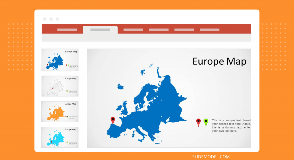
Go to Download Europe Map PowerPoint Template
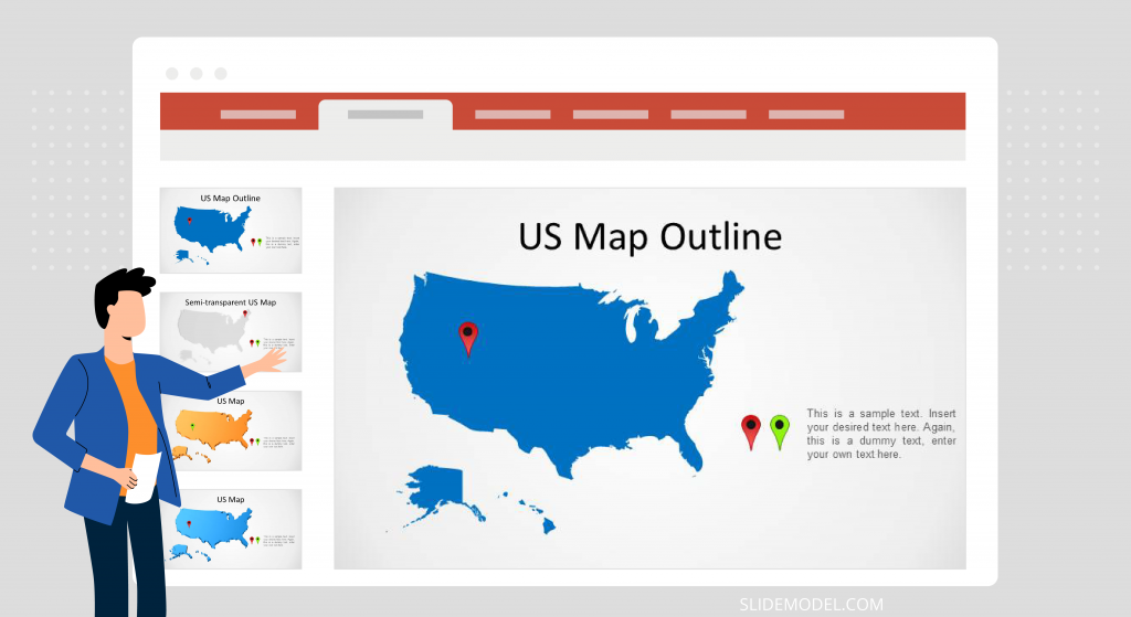
US Map PowerPoint Template
Among template for individual countries; the US Map PowerPoint Template delivers a complete map of the United States in different layouts with pointers to mark specific locations. You can download this template from the link given below and explore other such templates from our Map Templates Page .
Go to Download US Map PowerPoint Template
When you need to present a map to an audience, the editable map templates can suit well in a business presentation. Or if you are an educator and need to talk about a specific geographic area, maps can help to visually understand where certain region, area or country is located.
In this article, we reviewed some of the map templates available for PowerPoint presentations and how to use them to create business presentations in PowerPoint tor Google Slides.

Like this article? Please share
Business PowerPoint Templates, Diagram Templates, Map Templates, Maps, Templates
Related Articles

Filed under Design • December 1st, 2023
Best 23 PowerPoint Templates to Start 202
2023 is around the corner, and for that very reason we want to list a selection of PowerPoint templates to start your projects in style.

Filed under Presentation Ideas • November 10th, 2023
How To Make a Company Profile Presentation with Examples and Templates
In this article, we cover in detail how to create a professional company profile presentation, with the help of PowerPoint templates, and practical examples.

Filed under Presentation Ideas • October 7th, 2023
Venn Diagram Ideas for PowerPoint Presentations
In this article, you will learn the basics of Venn diagrams, how they can be used in presentations and what type of information they are recommended for.
Leave a Reply
Start A Free Trial Now
No Credit Card Required
Create Custom Maps For Your Presentations
Take your Powerpoint presentations (or any presentation) to the next level by translating your data into beautiful maps in your favorite colors and personalized with custom text, callout boxes, stickers, and annotations.
How do I Create a Map for a Presentation?

Are you looking to create presentation-ready maps from your Excel spreadsheet but feel boxed in its rows and columns? Break free with Maptive : a mapping software solution that lets you create an interactive, custom PowerPoint map from your data.
Maptive’s map creator is built on the geo-mapping powerhouse Google Maps. But Maptive takes your data a step further and pulls the location data from your Excel spreadsheet, showing corresponding pins for as many locations as you desire on your map.
You can also manually add pins anywhere in your presentation maps — marking your sites, outlets, sales territories , or pretty much anything. Create a map that is as visually clean or data-rich as you desire! And of course, after you add your map to your presentation, you can always go back into Maptive and edit maps for future use there.
Do More Than Mapping Locations for Presentations
In addition to giving you a zero-code way of mapping locations for your presentations, Maptive also offers powerful editing features, a loaded drawing toolbox, and filters to help you create high-quality presentation maps.

Add pins anywhere in your presentation maps
Either manually add pins to mark your locations on your map or upload your data set with location information, and your map pins will pop up automatically. You can even drag and drop your data set at the bottom of this page to get started.
Use text, stickers, and annotations.
Give context to your audience about what they see on your map with explanatory text, visual cues like stickers, annotations like arrows, etc., with Maptive’s drawing tool .

Preview using the presentation mode before exporting
Click the presentation view icon and see your map just as it would appear in your presentation on the big screen!
Export presentation-ready maps in high-resolution
Export your map using the “large” size — that’s ideal for presentations — and show your data’s minutest details in crisp, HD quality.

Collaborate on your presentation maps with your team
Invite people to view or collaborate with you on your maps. This helps you collect private feedback from them before your big presentation.
Repurpose your maps in many ways
Reuse your presentation maps as your website and blog graphics. Or, add them to your reports and marketing collateral. If you embed your maps instead of using static images, your maps will update all the places you embed them when you update your data. Learn more about how our interactive maps work here.
Create multiple custom presentation maps (using the same data)
Choose from Maptive’s powerful filtering options and save multiple views of your maps. Whether you want to zoom out to show a world map or narrow down your view to a specific county in the United States, you can alter your map to fit your presentation’s needs. Focus on sales density or group your pins using custom attributes. There are countless options.
A Presentation Map Maker Designed for You — the Excel Sheet Person
Not everyone who works with data comes with advanced coding, designing, or cartography skills. With Maptive, you don’t need any. Creating stunning presentation maps with your excel sheet is as easy as one, two, three with Maptive. Here’s how to get started:

STEP #1: Sign in and Upload (or copy+paste) your Excel or spreadsheet data.
STEP #2: Hit Create Map and watch your data come to life in an interactive map.
STEP #3: Use Maptive’s filters to get the data visualization you need and export.
If you get stuck anywhere, hit the chat button on the map, and we’ll help you find a solution.
Start mapping now!
Just follow these simple steps:
Copy & Paste OR Drag & Drop Your Data Set Here.
OR you can Upload your file
Important: Remember to include column headers in your data set. (like the example)
Date Security: Your data is transferred using encrypted https
Privacy Overview
How to create editable PowerPoint maps
- Written by: Richard Goring
- Categories: PowerPoint design , PowerPoint productivity
- Comments: 20

PowerPoint maps are great tools to tell visual stories – showing locations around the world and how they might all connect, global route maps for travel or logistics and different options, or really anything in the universe that you can show on some kind of map.
PowerPoint maps
What’s really neat, is that Office 365 has maps for PowerPoint built-in. But, as with many things Microsoft, they’re tricky to find. Head on over to the Insert tab on the ribbon, and then Charts, on the left of center. Half-way down the list, buried in the bars, lines, and radar charts, you find PowerPoint maps.
PowerPoint US map
You get a map template and an Excel sheet. Things get interesting here, because you can type places into the Excel, like Massachusetts and Florida, for instance, put a value next to them, and then PowerPoint generates a US map highlighting those two states with a color heatmap based on the numbers you put in the Excel. You can add in any state, or even specific zip codes, and you’ll highlight the areas on the PowerPoint map.
PowerPoint world map
If you type countries into the map, it expands, showing the appropriate geographical area, which might just focus on a region, or show the entire world map. Simply add the country name, add a number to the data series, and you’ll see it highlighted on the world map – all using the standard PowerPoint maps function.
Editable PowerPoint map
Once you have your map laid out, you have a couple of additional options, all of which are what you’d expect from a chart. You can click on the brush icon on the right of the chart to change the style, which is useful if you want to show the outlines of each state or country. You can also alter the color of the map, all of which is based on your color theme. As the map only has a single data series, choosing any of the colorful themes is somewhat pointless, and if you’d like to alter the color of the country highlights, then choose a monochromatic color theme for the map.
As an aside, and as a wish for future iterations of this, it would be great if the map supported multiple data series. At the moment, it’s only one, so you can’t have two color sets on the same map, which is a shame. There are some other quirks that we’ve found, that are at the bottom of the article, but this is probably more of a feature request, than an issue.
You can alter the general map color – everything that you’ve not selected as a highlight country – by using the fill color options. If you just select the map on the outside of the frame, changing the fill color will fill in the background – or, perhaps easier to understand, the ocean. If you click on the map itself, you’ll see the double selection box, showing that you’ve highlighted the actual map part within the chart, and now changing the fill color will alter the map – or land. That means you can choose something more pleasing, or help bring out the contrast of the heatmap countries better.
PowerPoint map chart elements
Click on the green plus icon on the right of the PowerPoint map, and you can alter the chart elements. The options for the title and legend are fairly straightforward, but data labels can be interesting. The default data label is the number you’ve used, but if you choose more data label options, you can choose the formatting of the number, or add in the category name, which is going to be the country, or state, that you’ve highlighted. So it’s a nice way to get an annotated map.
PowerPoint map type and heatmap color scheme
Finally, you can alter the chart options, by right clicking on the PowerPoint map and choosing Format Data Series from the pop-up menu. This brings up options for what type of map you get. PowerPoint tries to be smart about what it shows, but you can purposely set a Mercator style, to stretch everything out flat, a Miller map, which is a decent compromise between stretched poles and something flat, and a Robinson map, which is probably the most common map type you see. You can also choose the map area, with different options, depending on the content of your Excel table. You can show the map at the postal code level, state, country, or local region level, and also the entire world map. You can also focus in on the regions with data – just be careful that you don’t end up with odd-looking floating countries with no context.
Next on the list, you have more controls over the series color, using either the standard sequential system, with two colors, or a divergent three-color system. With either, you can set what those colors are, and also specify particular values for them, if you’d like a non-linear scale, which opens up the possibilities for more variety in heatmap color.
Editable US and world map for PowerPoint
But wait, what if you don’t have Office 365 and can’t access these maps? Never fear intrepid explorers, the world can still be your mollusk, you just have to ask nicely… You’re going to have to make do with non-live maps – that is, they’re not Excel-linked – but you can get editable PowerPoint maps with individual countries or US states. Download a free PowerPoint world map, PowerPoint country map, and PowerPoint US state map here . Each thing is just a standard PowerPoint shape, so you can format it however you like, and you can see the country names in the Selection Pane, which is on the Home tab on the ribbon, then Arrange, on the right-hand side, and down at the bottom of the list.
Using PowerPoint maps
Now you’ve got a PowerPoint map, what to do with it. Here’s one technique, which shows how a little layering and animation can go a long way:
- Get one, blank map, then copy the map, and line the two on top of each other using the alignment tools, which you can find in the Home tab on the ribbon, then the Arrange group of functions on the right, and under Align at the bottom.
- Select the top map and change the highlighting, choosing whatever counties you want to stand out – by right clicking on the live PowerPoint map, choosing Edit Data and altering the numbers in the Excel.
- Now add a simple Entrance animation to the top map, by going to the Animation tab on the ribbon, select Add Animation on the right, and choose your animation – fade is good.
- In show mode, you first see the entire world map, and then click to bring in the top layer with the selections, drawing attention to the highlighted countries.
- Go back, add in a third map, with other countries highlighted, or different values in the Excel for a new heatmap, add in another entrance animation, and you can now start to build up a picture of things changing over time.
You could also use this cool technique by my colleague, Chris, on creating the illusion of a 3D world map, using just flat graphics.
Remember, you don’t have to use this technique with just a world map. You can use the regional maps, such as the editable US map to show all the states, and highlight specific ones – perhaps showing your road trip adventures, or the places that you have locations to serve clients.
This new function is a great way to create a map in PowerPoint and use it to tell stories. So why not try it now, wherever you are.
PowerPoint map states, countries, and regions
In playing around with the specific functions, the mapping works with specific zip or postal codes in a few countries (USA, UK, France, and Germany all seem good). The problem is that you either get a specific zip code map, which isn’t very useful with no context, or the entire country, so the highlight is way too small to see properly. The exception seems to be the USA, where you can also do things at a state level with the 50 states PowerPoint map, and you can see everything pretty easily.
The next level up is to show individual country maps, which could be useful, particularly as a PowerPoint map template for you to add your own things on top.
After that, there are some geographic regional maps, which are probably reasonably obvious, but not quite. The UK is there as four separate countries, and then more generally useful macro views of North America, South America, Europe, Africa, Middle East, Middle East & Asia. Try any countries within these groups, and they’ll be highlighted in the same area. I couldn’t get Russia or any of the countries in Oceania to be part of a region though. Try anything outside of the specific region, and it’s then up to a world map. Overall, not too bad, with pretty decent flexibility and choice, although it would be great to have more control.
PowerPoint map glitches
Alright, what goes wrong? Well, depending on how much you push it, potentially quite a bit. The first thing to note is that this function relies on Bing Maps and being online. If you’re on a fast connection, it’s pretty instant, but on a slow connection, and you could find it takes a while. You can only create maps when online, but once created, you can still view them, and edit the numbers in the Excel to alter the heatmap. You can’t add any new countries when offline though.
The second issue is stability. PowerPoint maps crashed the program on several occasions – far more frequently than anything else ever has. It’s far from unusable, but make sure you’re saving regularly. To be fair, it’s largely happened when either on a slow connection, or I’ve been jumping all over the world, highlighting different countries, but never-the-less, an experience you need to be aware of.
Then there’s another issue that you can’t highlight more than 12 countries. Which is annoying, and I don’t understand why, as you can have more than 12 data points in other charts, and the countries are all there on the map too.
After these primary glitches, you then come onto others that are a tad odd. As mentioned before, the UK is available as a regional map with separate countries – England, Scotland, and Wales. Try Northern Ireland though, and you get nothing, but it does get highlighted if you type NI, which is interesting. Oh, and once you’ve got any of those four, no other country can be added. You have to change things back to UK before adding other countries in. To be fair, the same is true with zip codes, which you can’t mix and match with countries. But it just seems odd, as these are countries.
In other odd quirks, Papua New Guinea, New Zealand, and all the South Pacific Islands don’t appear, unless you manually type them into the Excel. So, to get a complete map, you need to type them in, and put a zero-value next to them. Antarctica does appear on the PowerPoint world map, but, can’t be highlighted. So it takes up a huge space at the bottom, but you can’t do anything with it.
But the weirdest thing is that, presumably for political reasons, Aksai Chin (disputed between China and India) and Western Sahara (disputed between Morocco and Sahrawi Arab Democratic Republic) don’t show up on the map at all. It seems bizarre to me that the solution to long running political tensions is just to deny the existence of the land itself. (In looking at this, it seems that Gibraltar is not only Spanish, but also highlights all of Spain too, so some politics likely to annoy at least some people out there).
These are the only ones of which the news has come to BrightCarbon, and there may be many others but they haven’t been discovered.

Richard Goring
Related articles, how to create powerpoint templates that work.
- PowerPoint design
Without a proper PowerPoint template, presentations can be a bit of a mess. Here are the building blocks for developing a PowerPoint template that works!

Presentation design principles for better PowerPoint design
- PowerPoint design / PowerPoint productivity
- Comments: 17
By applying some key principles of presentation design, you can make your PowerPoint design really standout and deliver both a more ‘popping’, but also more effective presentation.

How to create visual presentations and eLearning
- PowerPoint design / Visual communication
- Comments: 4
Most presentations are a cascade of text-heavy Death-by-PowerPoint slides. Online learners suffer the torture of brochures converted to click-through-eLearning. Most people now recognize that using visuals is the way to go. But how do you make visual presentations and eLearning that work? We think there are six steps you need to follow.

You can get plenty more than 12 countries if you right click, choose Select Data, and under Chart data range, enter a larger range than $A$1:$B$12
You’re right, thanks. I cant figure out whether I missed that, or it didn’t work when I first looked at this. A couple of other things have certainly been fixed since. I’ve also since met some of the PowerPoint development team and asked them to put New Zealand on the map. Here’s hoping! But I’ll probably chalk this one up to me missing it, and it being a ridiculously complex way of adding more countries to the map and not at all intuitive. Great spot and comment through. Thanks!
OMG. You made a Tom Lehrer joke! You are awesome!
What surprises me is that everyone else doesn’t.
This is awesome! 🙂
Much easier than copy a world map picture then cut out the country you wish to use then edit color with it to only repeat the process for the next country you wish to insert. I remember doing this with Publisher when I did some comparing stuff back in around 2005. Then I had a fat screen and a brick for a computer. 😛
Anyways, great work making this “guide”. 😀
Just too hard for me. I’m doing a presentation for friends and they want each country they have either lived or visited to be coloured and come up sequentially using set animations so they role out. I can’t add countries in Europe and of course New Zealand. I think they will have to make do with my dots on countries. I really wish I could figure this out as it would be a very powerful page. Many thanks, Eliz T from Australia.
Hi I am using Powerpoint 2016, however I am not able to find the Map in the ‘Insert-Chart’ list. What can I do? Thanks!
Thanks for the information.
Just knew that there is a map available in PPT, very useful information for me.
I am trying to enter data on a PowerPoint map for 24 different states but it will only plot 12 different states. What I am doing wrong?
Hi Robert, you’re not doing anything wrong. Annoyingly, this is a limitation of the tool. You can only highlight 12 fields as a time. I noted above as countries, but it applies to anything. We’ve made Microsoft aware of this and they’re looking into it, but I don’t know whether or when they’ll be able to update it.
Lovely – thanks
how can we add Bhutan map and its district map for powerpoint presentation…
I used your editable USA map to create a multivariate geographic heat map on the 2016 Presidential Election. Thank you for the great resource! See the Youtube video (my first!).
https://www.youtube.com/watch?v=1cIKfUt4pL4
Hey. Great explanation. I was frustrated for the same reason that it didn’t allow more than 12 data points. But then I found the solution.
The chart comes with a standard data range reference of A1:B13. So anything that you enter post that range is not reflected in the chart.
It’s very simple to change the data range of the chart. Right Click > Select Data > change your range. And the additional items after 12th one will start to appear in the chart.
This solves most of our issues, but yeah, the issues of different location spellings is still there. They should just give us the option to add the data point against the location that we select on the map. It gets very easy that way.
That was really helpfull. Thanks a lot.
Is it possible to animate individual countries?
Thank you for this great resource! It took me a little while to get a hold of all the basic functions on Power Point Maps but I was able to create my map and it looks great!
How do I get Country specific editable maps with counties like for Ethiopia?
Hi, thank you for the great article! Can I please check if it is possible to insert picture (jpeg/png) within the outlines of teh map? Many thanks!
hello how to present only african continent?
Leave a Reply Cancel reply
Save my name and email in this browser for the next time I comment.
Join the BrightCarbon mailing list for monthly invites and resources
This is awesome! You guys are great to work with and we will absolutely recommend you to others. John Capuano Lone Beacon


Create a custom map in Power Map
You can use Power Map to explore data with any type of map by creating or importing a custom map. For example, you might want to create a custom map to show traffic for transportation routes, like the ones on this fictional island.

To do this, you need to have:
A picture in .jpg, .bmp, or .png file format. For example, a picture of a floor plan or a public transit routes map.
Data that relates to the picture that Power Map can plot on your custom map by using an XY coordinate system.
Tip: If you don't have X and Y data yet, try using Microsoft Paint to record the pixel position of items in your picture and enter them in X and Y columns on your worksheet.
Here's how you can use those items to create your custom map:
In Excel, open the workbook that has the X and Y coordinates data for your image.
Click Insert > Map .

Click New Tour .

In Power Map, click Home > New Scene .

Pick New Custom Map .

Adjust the X and Y coordinates as needed.
You can also:
Flip the axes by checking the Swap the X and Y axis box.
Click AutoFit to get the best fit.
Check the Lock current coordinate values box if you don't want the values to be changed.
Click Apply to accept the selections you made, and click Next in the Layer Pane.
You're now ready to use Power Map as you would with any other geographical data.
6 cool ways to use Custom Maps
Get started with Power Map

Need more help?
Want more options.
Explore subscription benefits, browse training courses, learn how to secure your device, and more.

Microsoft 365 subscription benefits

Microsoft 365 training

Microsoft security

Accessibility center
Communities help you ask and answer questions, give feedback, and hear from experts with rich knowledge.

Ask the Microsoft Community

Microsoft Tech Community

Windows Insiders
Microsoft 365 Insiders
Was this information helpful?
Thank you for your feedback.
- About PresentationMall.com
- PresentationMall Blog

PowerPoint Maps
Microsoft PowerPoint(R) is a powerful presentation tool used by millions to provide compelling presentations design to sell, inform and demonstrate. At PresentationMall.com, we offer a wide range of presentation maps. Our editable powerpoint presentation maps offer a great solution when you need to demonstrate using a map. With our fully editable powerpoint maps, you can create sales territory maps, plot distribution centers and retail locations and much more!
We offer hundreds of Powerpoint maps of the United States (USA), individual US States, Countries, Continents and even the entire world!
Showing all 10 results

US States PowerPoint® State Map Collection

PowerPoint Map Collection – USA, US States, Continents & Counties (PPT)
United states county map – powerpoint.

World Map with Countries – PowerPoint

United States PowerPoint Map

Editable Australia PowerPoint Map

Editable Asia PowerPoint Map

Editable Europe PowerPoint Map

Editable South America PowerPoint Map

Editable Africa PowerPoint Map
Search products.
- United States Maps
- Country Maps
- Continent Maps
- Map Collections
- Skip to main content
- Skip to primary sidebar
- Skip to footer
Additional menu
10 Steps to Great Presentation Maps
February 20, 2009 by MindManager Blog
If you’re reading this blog, the odds are that you already know mind mapping is a great way to organize your thoughts to prepare presentations. While some people use MindManager it to ‘think out’ and create their PowerPoint slide decks, many others use MindManager to deliver presentations using maps. Like PowerPoint, there are many ways to screw up a map presentation! And like PowerPoint, we can learn a lot from PowerPoint presentation experts like Garr Reynolds on how to make great MindManager map presentations.
To kick off a series on making your presentations shine, I borrowed from Garr’s excellent post on his top ten slide tips . Here’s the mapping perspective:
1. Keep it Simple
Mapping is a new paradigm for many in your audience. Opening up a map may be initially distracting and you don’t want to spend a lot of time discussing mapping, taking away time from your presentation goals. Keeping it simple let’s you display information in your map that supports you, the speaker, and acts as a supplement to your presentation. Garr shares “People came to hear you and be moved or informed (or both) by you and your message. Don’t let your message and your ability to tell a story get derailed by slides that are unnecessarily complicated, busy, or full of what Edward Tufte calls “chart junk.” Nothing in your slide should be superfluous, ever.”
2. Limit Bullet Points & Text
Here’s a challenging aspect that I’ve witnessed for mappers. It’s a great relief to map out all your thoughts and the natural tendency is to want to share your brilliance with the world. Remeber, your presentation is for the benefit of the audience. It’s easy to overwhelm them with complicated maps containing all your detailed points. This will either bore them or put them in a catatonic state of overwhelm called ‘map shock’. Garr indicates that the best PowerPoint slides have no text at all. Can the same be true for map topics? This may sound crazy at first but remember that you are giving the presentation not the map. Let it support you, not the other way around.
Does your map need to be a standalone presentation that you can distribute to others if they missed the event? Worried that an image will not convey your thoughts as eloquently as all of your topics (formally known as bullets in the world of PowerPoint)? Another best practice suggested by Garr is to send a document that highlights your content. That’s easily accomplished with MindManager 8’s export to Microsoft Word.
3. Make Your Maps for Presentations
Garr’s original topic here is to avoid too many object builds and slide transitions in PowerPoint. While maps are visual representations of your thinking process, keep your audience in mind at all times and bridge the gap by making the content easy to view without getting lost in the layers of your beautiful, but complex thinking. The audience will get distracted if your map is constantly diving into deeper levels. Organize your content carefully, keeping your audience experience in mind. Use number of sup-topics and deeper levels of your map judiciously.
4. Use High-Quality Graphics
Map topics can contain images & text. In some cases, you may opt to use stand-alone images to convey your points. When you do so, always use high-quality graphics including photographs. Garr’s advice for slides also holds true for maps:
- You can take your own high-quality photographs with your digital camera, purchase professional stock photography, or use the plethora of high-quality images available on line (be cautious of copyright issues, however). Never simply stretch a small, low-resolution photo to make it fit your layout – doing so will degrade the resolution even further.
- Avoid using PowerPoint Clip Art or other cartoonish line art. Again, if it is included in the software, your audience has seen it a million times before. It may have been interesting in 1993, but today the inclusion of such clip art often undermines the professionalism of the presenter. There are exceptions, of course, and not all PowerPoint art is dreadful, but use carefully and judiciously.
One last point on using imagery within maps: map markers are great for managing content in your maps (show status, % complete, etc…) but are poor choices for graphics in map presentations. They appear too small when projected and may get lost if used on larger maps with many markers.
5. Have a Visual Theme
It doesn’t take long to create a map style that is either consistent with your branding or your client’s brand. Use it as your visual theme for your presentation instead of relying on MindManager’s default map styles. Map styles adjust your background as well as the default look and feel for map topics and fonts used throughout the map. These styles can be saved and reused for future presentations.
6. Use Appropriate Charts
Using MindManager’s embedded spreadsheets, Microsoft Excel integration or ability to cut and paste images into topics, you can display a variety of charts to support your presentation points. Here are a few tips from Garr on how to use the appropriate charts:
Pie Charts: Used to show percentages. Limit the slices to 4-6 and contrast the most important slice either with color or by exploding the slice.
Vertical Bar Charts: Used to show changes in quantity over time. Best if you limit the bars to 4-8.
Horizontal Bar Charts: Used to compare quantities. For example, comparing sales figures among the four regions of the company.
Line Charts: Used to demonstrate trends. For example, here is a simple line chart showing that our sales have gone up every year. The trend is good. The arrow comes in later to underscore the point: Our future looks good!
7. Use Color Well
Color can be a powerful part of your presentation. Colors evoke feelings and emotions. The right color choices help persuade, motivate, improve learning and retention.
Garr provides some great starter points to consider when building out your presentation map styles:
- You do not need to be an expert in color theory, but it’s good for business professionals to know at least a bit on the subject.
- Colors can be divided into two general categories: Cool (such as blue and green) and Warm (such as orange and red).
- Cool colors work best for backgrounds as they appear to recede away from us into the background.
- Warm colors generally work best for objects in the foreground (such as text) because they appear to be coming at us.
- If you will be presenting in a dark room (such as a large hall), then a dark background (dark blue, grey, etc.) with white or light text will work fine.
- But if you plan to keep most of the lights on (which is highly advisable) then a white background with black or dark text works much better.
- In rooms with a good deal of ambient light, a screen image with a dark background and light text tends to washout, but dark text on a light background will maintain its visual intensity a bit better.
8. Choose Your Fonts Well
This is another great presentation lesson. I’ve seen many presentations as well as documents that are overloaded with competing fonts. Your use of fonts should be deliberate, using a consistent set of fonts throughout the entire map.
Here are some other valuable tips from Garr:
- Serif fonts were designed to be used in documents filled with lots of text. Serif fonts are said to be easier to read at small point sizes, but for on screen presentations the serifs tend to get lost due to the relatively low resolution of projectors.
- San-serif fonts are generally best for presentations, but try to avoid the ubiquitous Helvetica. I often choose to use Gill Sans as it is somewhere in between a serif and a sans-serif font and is professional yet friendly and “conversational.”
- And perhaps one of my favorite font tips: Regardless of what font you choose, make sure the text can be read from the back of the room.
9. Use Video or Audio
Our CEO at Mindjet, Scott Raskin, is a huge fan of using videos to drive home key points or to kick off a presentation with a little humor. Garr recommends using video and audio when appropriate. With MindManager 8, you can use video clips without ever leaving the map. Just add a hyperlink to your video on the topic and launch it within the embedded browser. Using videos, according to Garr, not only will illustrate your point better, it will also serve as a change of pace thereby increasing the interest of your audience.
10. Spend Time in the Slide Sorter (or Better, in MindManager)
The Segmentation Principle of multimedia learning theory states that people comprehend better when information is presented in small chunks or segments. So if you’re using MindManager to plan out PowerPoint presentations or using it for presentations, you can open up your map to the various levels to see how information is presented to the audience. Verify that it flows naturally and logically. Could you reorganize your topics to make your points more persuasively? Use your map to capture the gestalt of your entire presentation — the holistic view or big picture can be best visualized with MindManager. Use this view to remove extraneous pieces of data and you’ll increase visual clarity and improve communication.
More Resources:
Here are a couple of other great resources from Chuck Frey’s mind mapping software blog to help you map out great presentations:
- 11 effective strategies for sharing mind maps
- 8 tips for effective presentations with mind mapping software
What presentation strategies and tips do you have to share? Add your comments below.
Ready to take the next step?
MindManager helps boost collaboration and productivity among remote and hybrid teams to achieve better results, faster.
Why choose MindManager?
MindManager® helps individuals, teams, and enterprises bring greater clarity and structure to plans, projects, and processes. It provides visual productivity tools and mind mapping software to help take you and your organization to where you want to be.
Explore MindManager
NTRS - NASA Technical Reports Server
Available downloads, related records.
Free Google Slides and PowerPoint templates & infographics for presentations

Pastel Bunnies Template

Symmetrical Flowchart

Neumorphic Dual-Side Network

Bitcoin Stone Template

1-2-3 Horizontal Hierarchy

Two-Way Converging Diagram

Leprechaun Gold Template

Clover Woodland Template

Data Shopping Cart

Coral Modern Bold Template

5-Step Interlock Process

Neon Tech Lines Template
Blog - ideas & resources.

Mastering Text Emphasis in Your Presentation: Tips and Techniques
Unlock the power of effective text presentation with expert tips on text quantity, font choices, slide design, and templates.

2023 Presentation Design Trends
You have prepared a rock-solid presentation. Now, it’s time to prepare a slide deck that matches your great ideas, products, and stories. In order to impress your audience and leave an unforgettable impression, you need to design brilliant visuals that ...

How to Ace Your Sales Presentation in 10 Steps
Some presentations are more important than others. The one you are going to give next week could be a game changer. You need to convince clients that your product or service is the one they need. You know that these ...
Popular searches
Search by steps (options), search templates by colors, presentationgo - 2,430 free google slides themes and powerpoint templates.
PresentationGO is an extensive and ever-expanding library of complimentary templates designed for PowerPoint and Google Slides. Our diverse collection encompasses a broad range of graphics tailored for presentations across various domains.
Our premium-quality, distinctive, and exclusive designs are the work of skilled designers who ensure that each graphic is optimized for slide formats and effective in enhancing presentations.
The PresentationGO library boasts a vast selection of 2,430 high-quality templates , encompassing themes and background , charts and diagrams , text and tables , timelines and planning , as well as graphics and metaphors and maps .
Moreover, our ready-made graphics and themes are fully editable , allowing for effortless customization to cater to your unique requirements. The templates are available in both standard and widescreen formats. Furthermore, our editable graphics and diagrams are optimized for both light and dark backgrounds, enabling immediate use without the need for additional adjustments.
In summary, PresentationGO offers an all-inclusive resource for Google Slides themes and PowerPoint templates, providing everything you need to craft an engaging, visually appealing, and professional presentation. Explore our remarkable collection of themes, templates, and graphics to find the perfect elements for your upcoming presentation.

Comprehensive Collection
Explore 2,430 free templates and graphics for captivating presentations, with new content added daily.

Premium-Quality Designs
Expertly crafted graphics by designers and fine-tuned by seasoned presenters for maximum impact.

Effortless Customization
Fully editable graphics for seamless modification, tailored to your specific needs.

Absolutely Free
Enjoy 100% free downloads without registration or social sharing requirements – just a direct link.
Free PowerPoint Templates and Google Slides Themes
© Copyright 2024 Ofeex | PRESENTATIONGO® is a registered trademark | All rights reserved.
To provide the best experiences, we and our partners use technologies like cookies to store and/or access device information. Consenting to these technologies will allow us and our partners to process personal data such as browsing behavior or unique IDs on this site and show (non-) personalized ads. Not consenting or withdrawing consent, may adversely affect certain features and functions.
Click below to consent to the above or make granular choices. Your choices will be applied to this site only. You can change your settings at any time, including withdrawing your consent, by using the toggles on the Cookie Policy, or by clicking on the manage consent button at the bottom of the screen.
Thank you for downloading this template!
Remember, you can use it for free but you have to attribute PresentationGO . For example, you can use the following text:
If you really like our free templates and want to thank/help us, you can:
Thank you for your support
COMMENTS
Maps. Browse our extensive collection of 108 maps for PowerPoint and Google Slides presentations. Our "Maps" category offers a wide range of editable maps for various geographical regions, including continents, countries, and specific regions. Maps are essential visual aids that help convey geographical information in a clear and concise ...
2. PresentationGo's free collection of editable maps and flags for PowerPoint. PresentationGo offers several maps PPT templates for free. In addition to world maps and continent maps, they also have some country-specific maps like Thailand, India, Canada, and more.
Click in the menu bar on Insert > Chart. A window pops up. Select Map and click OK. PowerPoint creates a default world map and opens a table in which you can write any other country names and values. PowerPoint will automatically change the map as soon as you change values.
A complete collection of fully editable maps of countries of the world being offered 100% free for personal and educational use. Our maps are editable in PowerPoint, Google Slides and Keynote.
PresentationMall's vector maps are provided in layered, fully editable format. You can use relevant editing software to change or delete any feature on the map, including text, lines, and color specs. Additionally our Windows MetaFile, or WMF formats can be used in presentations and reports and are editable using Microsoft's built-in ...
Download these maps for presentations and easily customize them in PowerPoint. 4. PowerPoint Maps Presentation (Map in PPT) This template makes it easy to create an animated map in PowerPoint. Use them to create an interactive map for presentation purposes. Easily insert a map in PowerPoint and use it to convey your ideas. 5.
To edit a map in PowerPoint: Get a SlideModel account and subscribe. Browse the map templates and content catalog to find the map you need (or contact support if you cannot find a specific map) Download the editable map as a .pptx file and open the map template in PowerPoint. For example, let's say you are preparing a business presentation ...
9 slides. South America Map PowerPoint Template. 9 slides. North American Map PowerPoint Template. 9 slides. Europe Map PowerPoint Template. 9 slides. Hundreds of free powerpoint templates updated weekly. Download free data driven, tables, graphs, corporate business model templates and more.
Start today and create stunning maps for presentations, websites, or print. Plot locations, display territories, and generate heatmaps. ... Plot Locations. Drop pins on your map one-by-one or plot pins in bulk by uploading a spreadsheet. Get started today with Mapline Mapping to upload up to 500 locations for free. Map Territories.
This template contains a lot of map diagrams for you. Some of them have been designed as neural networks; some others show hand-drawn elements, connections between different points or soft outlines. There is a style for every need. We have created 30 different ones with our usual colors: red, yellow, blue, gray and green.
Other contexts in which you can apply maps are languages; tourism, to draw a travel route; and to address territorial or international policies. Infographic maps bring great advantages to your presentation, since they represent the information more clearly. Being a visual resource they also make the slide easier to read and more attractive ...
Free Interactive Map Slide Templates for an Engaging Slideshow. Take your presentations to the next level with a map PowerPoint template. Whether you're a geography teacher, a travel enthusiast, or a business professional, these templates will help you visually represent data and engage your audience. With customizable slides featuring maps ...
This PowerPoint map for free will work for any type of finance presentation. 3. Digital World. Digital World is a free editable world map PowerPoint that features an eCommerce and touchscreen technology background design. This free editable maps for PowerPoint will work for any type of online business presentation.
For example, you can use this template to display the different outlets of a business or to demonstrate the connectivity of an infrastructure (e.g. Telecom Infrastructure) across different regions. This World Map template is suitable for any kind of presentation which may require showing the World Map, be it for academic, business or personal use.
Create multiple custom presentation maps (using the same data) Choose from Maptive's powerful filtering options and save multiple views of your maps. Whether you want to zoom out to show a world map or narrow down your view to a specific county in the United States, you can alter your map to fit your presentation's needs. Focus on sales ...
PowerPoint map chart elements. Click on the green plus icon on the right of the PowerPoint map, and you can alter the chart elements. The options for the title and legend are fairly straightforward, but data labels can be interesting. The default data label is the number you've used, but if you choose more data label options, you can choose ...
Click New Tour. In Power Map, click Home > New Scene. Pick New Custom Map. In the Custom Maps Options box, click Browse for the background picture , locate the picture you want to use, select it, and click Open. Adjust the X and Y coordinates as needed. You can also: Flip the axes by checking the Swap the X and Y axis box.
PowerPoint Maps. Microsoft PowerPoint (R) is a powerful presentation tool used by millions to provide compelling presentations design to sell, inform and demonstrate. At PresentationMall.com, we offer a wide range of presentation maps. Our editable powerpoint presentation maps offer a great solution when you need to demonstrate using a map.
Use Canva's free online map maker and create your maps you can add to infographics, documents, presentations, and even websites. Better data visualization with our easy-to-use map maker Canva's map creator is easy to use and highly intuitive so that anyone can create their own personalized maps, even with no design or cartography background!
Browse our extensive collection of world map templates for PowerPoint and Google Slides presentations. This category offers a wide range of editable global maps, allowing you to create visually appealing presentations that showcase the interconnected nature of our world. These high-quality templates are perfect for conveying complex information ...
Map of USA. Use this map for your infographic information, geographical data, to locate offices or some specific places, to show paths…. Shapes are 100% editable: each American State is an independent shape that can easily be separated, dragged, colored, outlined and labeled. Includes 2 slide option designs: Standard (4:3) and Widescreen (16:9).
Here's the mapping perspective: 1. Keep it Simple. Mapping is a new paradigm for many in your audience. Opening up a map may be initially distracting and you don't want to spend a lot of time discussing mapping, taking away time from your presentation goals.
This presentation will show two examples of accessing the GEOS-CF model through GEE. The first is an example application made in the GEE code editor which allows users to view time series plots and downscaled maps of surface level NO2. The second example exhibits using the GEE Python API to create a machine learning model to temporally gap-fill ...
In summary, PresentationGO offers an all-inclusive resource for Google Slides themes and PowerPoint templates, providing everything you need to craft an engaging, visually appealing, and professional presentation. Explore our remarkable collection of themes, templates, and graphics to find the perfect elements for your upcoming presentation.