
The Golden Rules of Presentation Design

You don’t have to be a professional graphic designer to master the ins and outs of what makes a visually enticing presentation. While building a super-polished template from scratch might seem daunting, all you really need to know are a few basic principles of presentation design to take your slides from messy and unprofessional to clean, informative, and on-brand.
These days, presentation slide templates and tools abound – from the default options in Powerpoint and Google Slides , to services like SlidesCarnival , Canva , Envato and more that specialize in compiling eclectic template options. While these resources can take the guesswork out of creating sleek and professional deck designs, it’s still up to you to optimize each slide to communicate your ideas as clearly as possible. Furthermore, just because a presentation template looks nice, doesn’t necessarily mean it fits your brand aesthetic and message – and seeing the same common templates reused repeatedly can make yours more forgettable.
No matter what program you use to build your presentations, there are a few principles of presentation design you should always bear in mind.
The Most Important Rule: Less is More
We’ve all heard this one before, yet it’s still tempting to try and cram as much information as you can onto a slide. Remember that the focus should always remain on the presenter and the story they’re telling – your presentation is an accompaniment to help you illustrate the ideas you’re communicating, not a textbook to be studied.
Let’s break down a few of the easiest ways to declutter your slides:
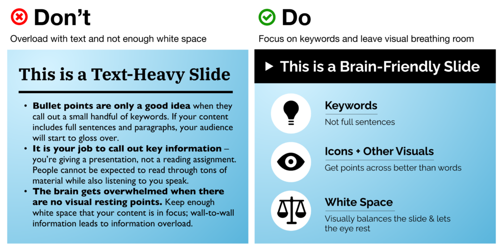
- Use key words, not full sentences What’s the main idea for each slide? Try to distill it into a single word or short phrase, rather than spelling out the complete thought as a sentence. When in doubt, use the 6×6 rule: no more than 6 bullet points per slide, with less than 6 words per line.
- Utilize white space – balance is your friend! Afraid that you’re wasting real estate by not filling every corner of your slide? The eye naturally needs a place of rest, so don’t be afraid of white space. This also helps funnel and direct the viewer’s attention where you want it to go. Avoid the temptation to blow your content up to fill all the available space on your slide. Even if it’s still just a couple sentences of information, this can make it look overwhelming.
- Break up your ideas if needed Don’t be shy about spreading out information between multiple slides, and pace yourself! A “title slide” to introduce a new topic can provide a nice (and necessary) breather that balances out the pace of your presentation, preventing audience exhaustion.
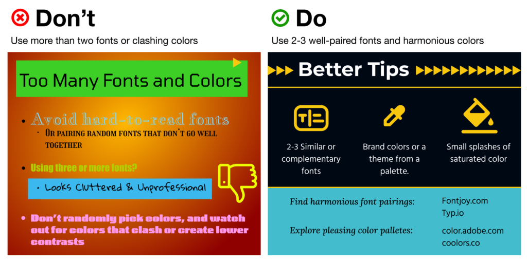
- Use fewer fonts (aim for 2 or maybe 3 max) Mixing and matching typefaces takes a fairly well-trained eye, but there are a couple of handy resources on the web to help: FontJoy and Typ.io will both auto-generate a pairing of fonts that go well together visually. Other rules of thumb: keep body copy typefaces simple and sans-serif (using too much of a display typeface hurts legibility), use caps lock only for emphasis and visual contrast, and understand how typefaces can help convey brand sentiments.
- Choose colors and fonts wisely You may be designing a presentation for work, in which case you likely have a couple established brand colors to use throughout your presentation. If you’re making up a color scheme from scratch, bear in mind: (A) Don’t use too many colors. Using too many different colors will make the presentation look messy, busy, or incoherent – so focus on one or two key, recurring colors that’ll lend a sense of cohesion throughout all your slides. (B) Try to get one or two vibrant, saturated colors to energize your presentation with a more youthful energy – muted and neutral tones run the risk of boring your audience or looking overly corporate.
Use Visual Hierarchy
Create a clear delineation between the most and the least important information. This can be done in a few ways:
- Contrast Don’t let your text or other elements disappear in a monochromatic fog; up the contrast to make things pop off the page.
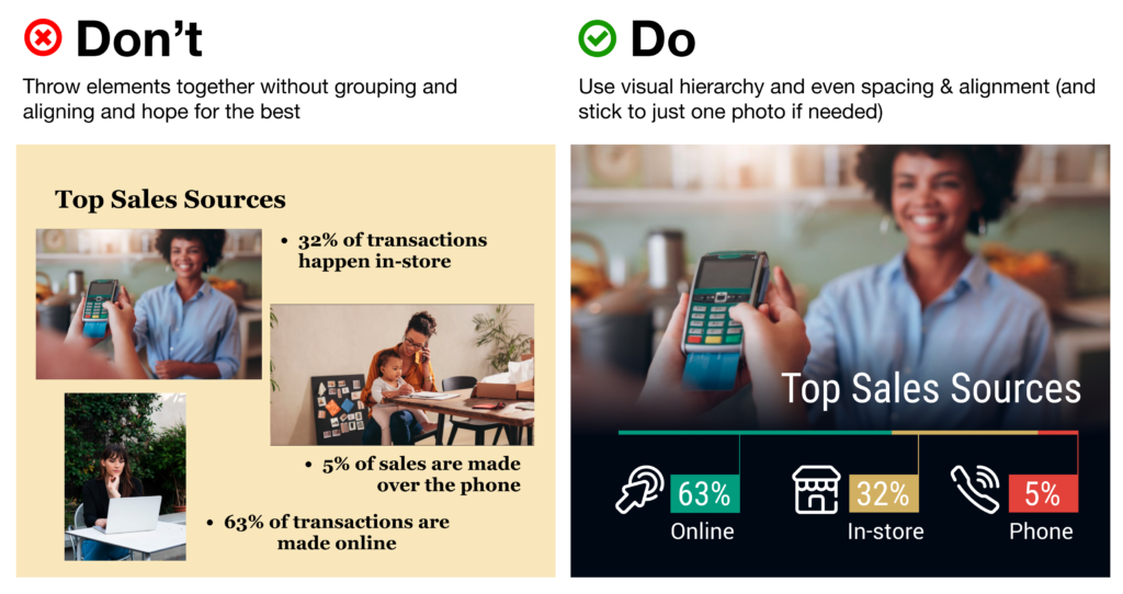
- Background vs. Foreground images If you want to overlay text on top of an image, make sure to use photos with copy space and more subtle, uncluttered background elements. Can’t find enough white space in the pic to give your text breathing room? Consider adding a photo filter, color block, or even a gentle and more subtle gradient block to put beneath your text.
- Size Use 30+ pt. text sizes to keep your copy legible even from a distance – and keep it bolder for titles, headings, and key words. Be sure that the size you use for headings is at least 50% larger than the size you’re using for body text to better call out your main ideas.
- Alignment One of the single biggest threats to legibility – and your professional credibility – is a “scattershot” slide with text and images thrown together with no rhyme or reason. Instead of combining alignments (center-aligned with left-aligned headers or body copy, for example), stick with left-alignment for quick scanning. Your best bet? Use a grid system instead of plopping elements on the page and hoping for the best. Align similar elements along vertical and horizontal lines to give each slide a sense of rhythm and repetition. Tidy groupings of similar items (e.g. having all your headings, descriptions, pictures and icons along the same lines) bolsters scannability.
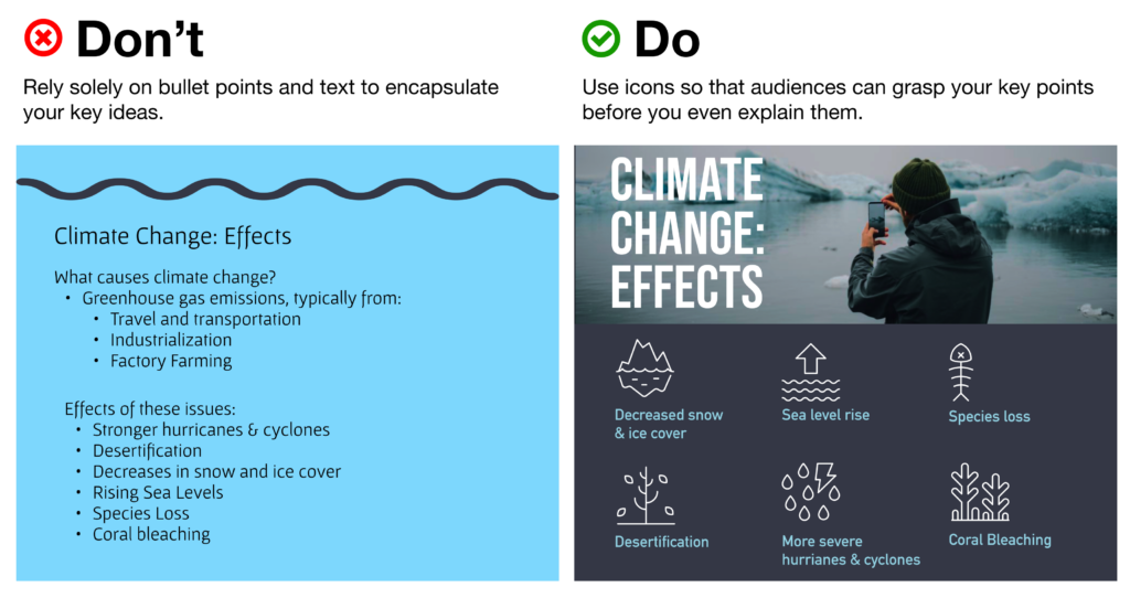
Use Icons to Get Your Message Across Faster (and More Beautifully)
Icons are a critical component of presentation design, as they help your audience digest the ideas you’re covering quicker than words alone. In fact, studies have shown that audiences will remember an image paired with a verbal cue 55% better than a verbal cue alone – a phenomenon known as the Picture Superiority Effect (and a critical component of Dual Coding Theory ).
Some may even argue that icons can (and should!) take the place of bullet points.
It’s especially critical to bring in visual aids like icons when you’re covering topics that are more abstract or technologically complex – consider how much words on a page can fall flat and fail to “click” in your audience’s minds, vs. bringing in a quick and concise visual that will help people place the key ideas in a clear, real-world context.
Visual cues like this “deliver the punchline” for your viewers before you even need to – so your ideas can not only jump off the page, but stay in your audience’s memories for longer.
Nonetheless, you’ll need to make sure you’re using your icons as effectively as possible.
Using Noun Project Icons in Your Presentations
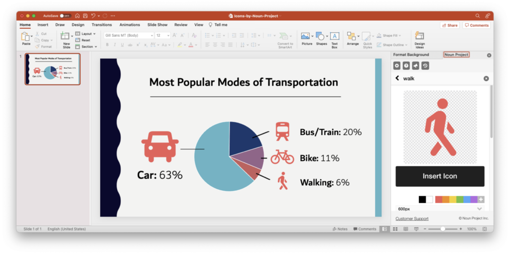
- Search Icons Get all the icons you could ever need from Noun Project . Our collection is literally millions of icons deep – and each one can be customized, colored, and downloaded as a PNG or SVG.
- Use Apps & Plugins Instantly insert icons without leaving your workflow – Noun Project has apps and plugins for Google Slides , Powerpoint , Adobe Products and more. (Plus, Noun Project apps now support SVG icons – so you can use and customize vectors directly inside apps like Powerpoint).
- Go Pro for Royalty-Free Downloads Customize and insert unlimited icons royalty-free with a Noun Pro account. When you go Pro, you can instantly recolor and click-and-drag icons straight from the Noun Project window without needing to worry about attributions.
Tip: Icons are essential to help an important point “click” in people’s brains more quickly. The Noun Project Add-On for Powerpoint lets you instantly search, recolor, click and drag icons instantly all without having to leave your window (and a Noun Pro account lets you insert unlimited icons).
Use Icons to Make Your (Bullet) Point
- Condense & Summarize Your Big Ideas with Icons Use icons as a direct translation of your information – or an obvious metaphor that won’t leave people guessing. Noun Project offers a dazzling range of icons, from the extremely literal (bar graphs, money, medical icons and more) to more broad and abstract concepts (gerrymandering, sanctuary city defunding, you name it)…. But with any icon you need, choose one that doesn’t need too much deciphering, or provide an explanatory caption where necessary. As with all things design, go by the famous maxim “ Don’t Make Me Think .”
- Aim for Visual Consistency Icons come in numerous styles: thin line icons, thick “glyph”-style icons, sharp, rounded, pixel-perfect or hand-drawn. Pick a style that suits your brand and message, then stick with it. Selecting icons from the same collection, or the same creator, will help maintain visual consistency – whereas a mixing and matching of styles will appear messier and less professional.
Tip: Try to select icons from the same collection so that they have a consistent visual style. ( Basic Interface icon collection by Caesar Rizky Kurniawan ).
- Use Icons to Accentuate Your Theme Icons don’t need to be used merely to reinforce your statistics – they can usher people through your narrative and play off your visual theme as well. Think about the stylistic possibilities of your overall presentation – e.g., bringing in a nostalgic ‘80s theme with 8-bit pixel icons or discussing holistic health with naturalistic, ecological icon collections.

Tip: Browse the latest topical icon collections on Noun Project .
Use Photos to Suit the Mood
Icons aren’t the only must-have in packing a visual punch. While we’ve already written dedicated articles about the best ways to use stock photos in Powerpoint or even in social media campaigns , here are a few quick rules of thumb:
- Use photos that are natural, authentic, diverse, and inclusive Ditch the overly-posed and unnatural corporate stock photoshoots of bygone eras. It’s important to make sure your photos feature a variety of ages, ethnicities, body types, sexualities and more so that no matter who your audience, they’ll feel included (Hint: check out photo collections like Diversity in Tech and Empowered Women on Noun Project).

Tip: Search for diverse stock photos that don’t feel too “stock-y.” Relaxed poses and natural lighting and textures will look more suitable than the overly staged corporate photo shoots of yore. Explore the Diversity in Tech or Empowered Women collections on Noun Project for inspiration.
- Focus on single background images – not a whole album. Usually one supporting image is enough – there’s no need to include multiple images on a single slide as this muddles your message. If, perhaps, you want to show multiple photos to recap an event or show steps in a process, be sure to align your photos, use a grid system, or give each one even dimensions through thoughtful cropping.
- Visually unify your photos using color overlays Apps like Powerpoint will typically let you adjust brightness and hue or overlay a color so that multiple disparate photos can appear unified – and reinforce your brand.

Tip: While a full-color photo may be eye-catching, consider using a color overlay (at right) with your brand or theme colors to give a stronger air of sophistication and cohesion to disparate photos. (In Powerpoint, with an image selected, go to Picture Format > Color > More Variations to set your own color).
Get Started on Your Next Presentation Design With Noun Project.
Explore icon and photo collections, and unlock unlimited royalty-free icon downloads with Noun Pro .
Ready to try out different types of presentation design apps? If you’re looking for friendly, web-based alternatives to the classic Powerpoint, try out free options like Google Slides or even Canva .
Hungry for more design tips? View more on our blog at blog.thenounproject.com .

Marketing Communications Manager at Noun Project, Designer and Illustrator.
Related Articles

Graphic Design Principles: Balance and White Space
by Jeremy Elliott | Apr 12, 2024 | DIY , Featured , Graphic Design
Learn how to use balance and white space in your designs by distributing your elements to promote visual flow.

The Principle of Hierarchy in Graphic Design
by Jeremy Elliott | Mar 11, 2024 | Creative Inspiration , Graphic Design , Top Featured
Learn how to effectively use the principle of hierarchy to direct the viewer’s focus.

How to Use Icons in Notion: A Guide to Visually Organizing Your Life
by Jeremy Elliott | Feb 7, 2024 | Creative Inspiration , DIY , Featured , Graphic Design
Learn how to use icons in Notion to visually organize tasks, projects, and notes for everyday use.
The Art of Timing: Timing Your Presentation for Maximum Impact
April 16, 2023 / Blog

When delivering a presentation, timing is more than just keeping track of minutes on a clock.
Timing is an art that can greatly impact the effectiveness of your message and your audience’s engagement. The right timing can captivate your audience, reinforce key points, and leave a lasting impression. However, poor timing can result in disinterested listeners, missed opportunities, and a lackluster presentation.
Need a Presentation Designed? Click Here To View Our Amazing Portfolio
The science of timing.
Timing is not just an abstract concept but has real psychological and physiological impacts on the presenter and the audience. Understanding the science behind timing can help presenters make informed decisions on structuring their presentations for maximum impact.
Psychological Impact
Timing plays a significant role in audience engagement and retention.
Studies have shown that attention spans are limited, and listeners tend to lose interest if a presentation drags on or feels rushed. Moreover, your presentation’s timing can affect your audience’s cognitive load—the amount of mental effort required to process information.
Too long or fast-paced presentations can overwhelm the audience and reduce their ability to retain and comprehend the information.
Physiological Impact
Timing can also impact the physiological responses of both the presenter and the audience.
When a presenter is rushed or anxious due to poor timing, it can affect their vocal tone, body language, and overall delivery. On the other hand, a well-timed presentation can create a sense of rhythm and flow, enhancing the speaker’s confidence and stage presence.
Similarly, the audience’s physiological response, such as their heart rate, can be influenced by the timing of the presentation, affecting their level of engagement and emotional connection with the content.
Optimal Presentation Lengths
Research suggests that the ideal presentation length may vary depending on the context and audience.
TED talks, known for their engaging and impactful presentations, are typically limited to 18 minutes or less since shorter presentations align better with the limited attention spans of today’s audiences. However, longer presentations may be appropriate in specific settings, such as academic lectures or training sessions.
Understanding the optimal presentation length for your audience and context can help you plan your timing accordingly.

Attention Spans
Attention spans vary depending on factors such as age, context, and level of interest.
On average, studies have shown that the attention span of adults ranges from 10 to 20 minutes, while children’s attention span is even shorter. This highlights the importance of structuring your presentation with engaging content and well-timed transitions to maintain audience attention throughout your presentation.
Techniques for Timing Your Presentation Effectively
Timing your presentation requires more than being aware of the factors that can impact your pacing; it also involves utilizing specific techniques to ensure your delivery is smooth, engaging, and impactful. Here are some techniques to help you time your presentation effectively:
Rehearse, Rehearse, Rehearse
Practice makes perfect when it comes to timing your presentation. Rehearsing your presentation multiple times can help you get familiar with your content, delivery style, and timing.
Time yourself during rehearsals to ensure you stay within your allotted time, and make adjustments as needed. Practicing also helps you build confidence, which can positively impact your delivery and timing during the actual presentation.
Use a Timer or Stopwatch
Utilize a timer or stopwatch during rehearsals and the actual presentation to track of your time. Set specific time limits for each section or slide of your presentation and stick to them to help you stay on track and avoid running over time.
Pace Yourself
Pay attention to your speaking rate and pace yourself accordingly .
Avoid speaking too quickly or too slowly, as both can affect the timing and comprehension of your presentation. Vary your speaking speed to add emphasis, create pauses, and engage your audience.
Use Visual Cues
Use visual cues, such as notes or slides, to guide your timing during your presentation.
Highlight key points, transitions, or cues for audience engagement to ensure you stay on track with your timing. However, be mindful not to rely too heavily on visual cues, as they may affect your connection with the audience.
Be Mindful of Time Signals
Keep an eye on any time signals provided by organizers or moderators during your presentation.
Time signals may include visual cues, such as time cards or hand signals, to indicate how much time you have left. Be attentive to these signals and adjust your pacing accordingly.
Practice Flexibility
Be prepared to adjust your timing on the spot if needed.
Unexpected situations may arise during your presentation that can affect your timing, such as technical issues, audience questions, or interruptions. Therefore, practice flexibility by having contingency plans, such as shortening or omitting certain content, to adapt to unexpected situations while maintaining effective timing.

Seek Feedback
Request feedback from a trusted colleague, mentor, or friend who can provide constructive feedback on your timing. They could identify areas where you can improve your pacing and suggest adjustments.
Mastering the art of timing is essential for delivering a presentation that captivates and resonates with your audience. Follow these strategies to ensure your presentation is well-timed for maximum impact, leading to a successful and memorable presentation experience.
Popular Posts
Save your deck: methods to recover an unsaved powerpoint file.

Twitter: Lessons from Social Media

Oscar Speech Sounds A Lot Like…..

Olympians Can Teach Presenters a Thing or Two

Overcoming a Public Speaking Disaster: A Lesson from Michael Bay

The Similarities Between Presentations and Advertisments : Super Bowl Edition
System Status:
- Faculty Resources
- Instructional Resources
- Instructional Technology Guide
- Instructional Videos
- Best Practices for Video
Research-Based Presentation Design Guidelines
Effective multimedia design is based on what we know about cognitive psychology. If you use visual aids like PowerPoint in your course videos, read the tips below.

This guide leverages relevant cognitive psychology research (discussed in our other article " Multimedia Learning Principles ") to provide specific, evidence-based recommendations for designing and delivering effective presentations. But your PowerPoint deck is only one part of your "educational performance," which, broadly speaking, is a fusion of pictures, text, and spoken words. To maximize learners' engagement, retention, and transfer of the material, all three elements must be strategically deployed.
This guide relies heavily on Richard Mayer's Multimedia Learning and Stephen Kosslyn's Clear and to the Point: 8 Psychological Principles for Compelling PowerPoint Presentations . Both authors apply similar foundations in cognitive psychology to generate best practices for designing effective multimedia learning materials.
We hope this guide will be particularly helpful to instructors creating lecture videos but should prove useful to those delivering synchronous or in-person presentations.
The Short Version
Use images instead of text when possible., use high-resolution, royalty-free images., use no more than 4 bullets per slide., make objects appear only when mentioned., dim objects after they're discussed., draw attention to salient information., avoid using decorative images., when distributing, add alt text to images..

Based on his experiments investigating the efficacy of multimedia messages, Richard Mayer defines what he calls the Redundancy Principle: "People learn better from graphics and narration than from graphics, narration, and printed text" (118). Duplicative images and onscreen text lead to extraneous cognitive processing by learners both because they have more to look at onscreen and because they'll spend unconscious effort trying to compare what they're hearing and what they're seeing.
So what comes from Mayer appears to be a suggestion to use either an image OR words, but not both (though labels are fine if they're important). But we also know from neurological research that images and words end up getting encoded in different places in the brain, and that encoding imagery uses less cognitive effort than encoding words (Grady et al, 2706). (This is probably an evolutionary phenomenon, given the importance of retaining visual information in one's immediate environment.) So in some ways, research has proved that a picture really can be worth a thousand words.
What this boils down to is if you have an image that can represent your material, use that image exclusively on your slide and remove any text that might accompany it unless it's necessary for your students' understanding. It'll be "stickier" in the students' minds.
The bottom line: If an image can represent your slide content, use it exclusively on your slide without any onscreen text.

When using images, try to find the highest resolution you can. "Resolution" refers to the number of pixels that comprise the image. The more pixels there are, the more quality - and the greater the file size.
You can always shrink an image without reducing its quality, but don't increase its size over 100% or the original. If you do, the quality of the image will visibly decrease as it pixelates, which can either make it more difficult to understand or even unconsciously communicate "low quality" to your viewers!
In addition, when recording videos you should be particularly careful about using copyrighted images in your visual aids. While most course materials aren't public, Fair Use doesn't provide instructors with blanket protection from infringement and it's possible your video could get out. Try to use royalty-free image sites (such as Pixabay) to find an image that could work for you. You could also leverage the surprisingly robust features of your presentation software to design your own images, even by piecing together shapes. (Note that all of the imagery in this article was created using royalty-free images and PowerPoint.)
If it's truly necessary to use a copyrighted image in your slide, you should attempt to contact the publisher to obtain the appropriate permissions. If you find images under a Creative Commons license, be sure to abide by the license and cite appropriately.
The bottom line : Use high-resolution images if possible, and don't enlarge them above 100% of their original size. Use royalty-free imagery, attribute appropriately, or create your own images if needed.

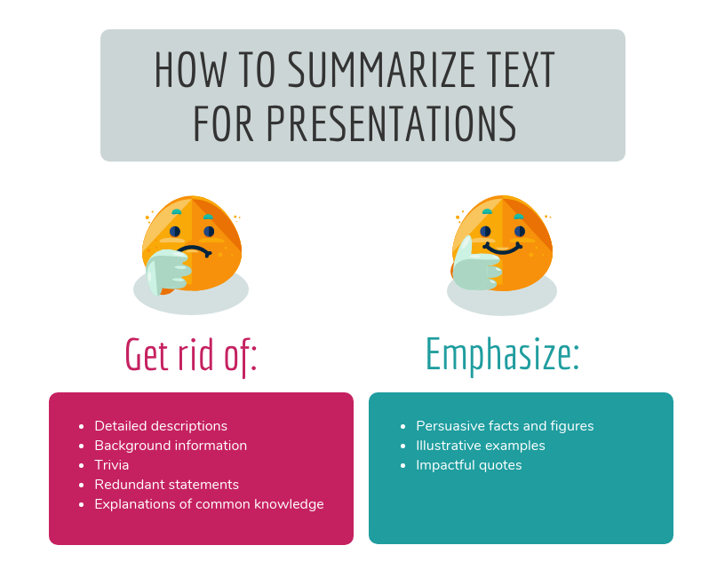
If you've ever suffered from "Death by PowerPoint," you've probably experienced slides crammed full of text: sub-sub-bullets, complete sentences, entire paragraphs, or worse. This is most often the result of instructors using visual presentations as memory aids rather than as instructional tools for learners. We've all heard about the value of taking a student-centered approach to pedagogy; presentation design can embody that methodology.
With respect to determining how much text is appropriate, there are several cognitive psychology principles at work. As we discussed in our Multimedia Learning Principles article, we have two channels for processing a multimedia message. When presented with a large amount of text, the visual channel is oversaturated, and learners' verbal channels struggle to attend effectively to your words as they try to read what's on screen. They also spend cognitive effort comparing the printed and spoken words.
Also in our article on Multimedia Learning Principles, we discussed what occurs during active processing as well as the various types of cognitive load that learners experience. Given that active learning first necessitates the selection of relevant information from an instructional message, providing succinct text will help reduce students' germane load since you're doing some of the selection work for them.
So now that we know why less text is important, is it possible to quantify a recommendation?
A variety of studies have shown that humans can reliably retain 4 concepts in working memory - the so-called "rule of four." The brain can "chunk" information to improve retention, however, so each of these 4 concepts can have up to 4 component pieces of information.
To see the rule of four and chunking principles in effect, check out the video below.
So - we can retain information better when there are four or fewer units, and using recognizable groupings of more than four units helps to improve retention. With all of this in mind, a good rule of thumb is to try to restrict yourself to four or fewer bullets per slide, with four or fewer units of information contained within each bullet.
One way to quantify these "units" of information is to count the number of verbs and nouns (Kosslyn, 77). For example, the phrase "Use four bullets per slide" has 3 units of information: "use," "bullets," and "slide."
Another way to think about this: just use less text in your slides. It may not always be possible, but can be an important goal for which to strive, especially if it helps you break your presentation into more slides. Ultimately, though, remember that your visual aid is intended for your students - not to help you remember what you need to discuss. If possible (or if necessary), use your presentation software's "notes" feature to make sure you don't forget to discuss anything.
Remember what we discussed earlier, though: images tend to be "stickier" than words in long-term memory. If you can find a meaningful image that can replace some or all of the text on your slide, use that instead (using labels as needed, of course).
The bottom line : Try to use four or fewer bullets on a slide, each with four or fewer concepts. Favor images over text whenever appropriate.

Mayer's multimedia messaging experiments led him to what he termed the Temporal Contiguity Principle: "Students learn better when corresponding words and pictures are presented simultaneously rather than successively" (153). Mayer discusses this principle largely in the context of whether to present narration after or during a corresponding animation. While common sense might suggest that encountering the information twice in succession (in two different forms) would lead to better transfer and retention, it was instead when the narration and animation were presented simultaneously.
Now, chances are that you're not planning on narrating over a series of silent animated movies as your presentation - but it's important to remember that presentation software is, in and of itself, a kind of animation tool. Moving to a new slide is essentially a simple animation.
But in the context of the Temporal Contiguity Principle, think about a learner arriving on a slide that already has all of its visual content present at the start. With so much information for your learners to look at, you risk cognitive overload as they read the entire slide - including all the parts that may not yet be relevant or comprehensible - while also trying to process your spoken words.
Building your bullets and images one at a time provides visual cues to your learners about where you are in the presentation and what's relevant to the current moment of knowledge construction. Making clear what specific visual elements are related to what's being discussed maximizes your learners' ability to integrate what they see and what they hear simultaneously.
So, add simple animations to your slides. Leverage build-ins or entrance effects to have objects appear on your slide only when you mention them - bullets, images, graphs, shapes - anything. Stick to subtle effects like fade-ins or even just appearing unless a particular animation offers additional impact to your message.
The bottom line : Make objects appear only when you discuss them.

As we discussed earlier, Mayer's Temporal Contiguity Principle implies that we should make information appear only when mentioned. Well, the converse is true as well: information that's already been discussed should be visually de-emphasized. In reinforcing where exactly you are within the visual information on your slide, you're reducing your learners' cognitive load by encouraging them to focus their efforts on a smaller set of visual information while also maintaining the conceptual connection with the previous information.
In his book providing detailed presentation design guidelines based on a similar set of cognitive psychology principles as Mayer, Stephen Kosslyn identifies seven high-level principles, one of which is the Principle of Salience: "Attention is drawn to large perceptible differences" (7). Given that our brains are wired to notice strong differences in contrast (such as this bold text ), de-emphasizing past information provides a cue to learners that you're moving on to other visual information on the slide and helps direct their attention appropriately.
You can de-emphasize objects onscreen by adding an "emphasis" (PowerPoint) or "action" (Keynote) animation to a bullet, such as reducing the opacity of the object to 25% (or increasing its transparency to 75%). Add the animation at the same time a new object appears.
The bottom line : Visually de-emphasize items that have already been discussed.

The Signaling Principle indicates that "People learn better when cues that highlight the organization of the essential material are added" (Mayer, 108). These cues, Mayer writes, "are intended to guide learners' attention to essential material and to guide learners' organization of the essential material into a coherent structure" (117). Leveraging what we discussed in our article about multimedia learning , signaling can reduce extraneous load, foster germane load, and assist with the selection and organization of materials that must occur during active learning.
While these cues can be verbal (such as explicitly stating where you are in your presentation based on an outline you presented at the start) the visual cues within your presentation play an extremely strong role in facilitating your students' understanding. For example, if you present a complex graph, do something either when designing your presentation (e.g. add arrows, labels, zoom in, etc.) or during your presentation (e.g. use your mouse as a pointer) to draw your learners' attention to the most important or relevant pieces of information.
While making objects appear and dim at the appropriate times highlights salient information as well, for more complex images it's important to draw learners' attention to the most relevant parts. As is often the case in effective presentation design, this helps reduce learners' extraneous load when presented with a surfeit of visual information.
The bottom line : design your slides with arrows, circles, or other visual cues that draw viewers' attention to particularly important details. Failing that, leverage pointers or other indicators during your recording.

Richard Mayer identifies three main categories of images that are helpful to learners: representational images, which portray an individual object; organizational images, which illustrate relationships between objects (or between parts of an object); and explanative images, which illustrate how a system works (236).
Decorative images, on the other hand, are "illustrations that are intended to interest the reader but that do not enhance the message of the passage" (Mayer, 236). They distract students from learning goals, add to their extraneous load, and squander their limited cognitive resources.
Now, on the surface, it may seem like adding some decorative imagery to your more text-heavy slides might be a good thing, to give them some visual interest and foster a little more engagement with your presentation. As Mayer points out, this is arousal theory: "the idea that students learn better when they are emotionally aroused by the material" (93). Unfortunately, decorative images end up becoming "seductive illustrations": images added solely to add some visual interest. Unfortunately research has confirmed that these details are retained better than the presentation's central points (Mayer, 97).
So, if an image - indeed, if any content - doesn't directly support the completion of your students' learning objectives, don't include it. While we do recommend using images instead of text when possible as well as using less text overall, don't include imagery for imagery's sake.
Remember - an effective multimedia message should be designed to create the conditions for maximal learning. Some of your slides may end up being less visually interesting, but especially when paired with our other tips, you'll be helping your learners spend their cognitive resources more effectively.
The bottom line : Don't add images that don't directly support your students' learning.

Given how deleterious decorative imagery can be to our cognitive resources, all the images you've included in your presentation should support your students' learning. If there are students who can't perceive that visual content, however, their learning is compromised compared to their classmates.
If you intend to distribute your presentation file digitally (for example, uploading it to your LMS for students to download), you should ensure that all the images included in the presentation have what's called "alt text": text-based metadata embedded into the image that displays onscreen when the image fails to load and that describes it for screen reader software. These image descriptions are essential in ensuring that your materials are accessible to learners with visual disabilities.
Adding alt text within many applications is often just a matter of right-clicking an image, clicking the appropriate menu option, and typing in a description. A good alt tag should be specific and concise. And while it should communicate the relevant part(s) of the image, it shouldn't require the learner to listen to a lengthy description.
The bottom line : Add alt tags to all images in presentations you intend to distribute digitally.
PowerPoint shouldn't be vilified or glorified. Presentation software is just a tool, and it could be used effectively or poorly to communicate a message. Kosslyn sums it up well in his book Clear and to the Point : "PowerPoint presentations can help people understand by making both memory and processing easier for them" (12).
It is true that presentations designed this way require more effort to produce. If you're struggling to devote the time needed in pre-production to make your slides more pedagogically effective, some low-hanging fruit you can bite off (so to speak) is to use tools during your presentation to draw your students' attention, such as turning your mouse cursor into a laser pointer. Let Kosslyn's principles of Salience and Discriminability remind you that "attention is drawn to large perceptible differences," and those differences "must differ by a large enough proportion or they will not be distinguished" (7-8).
It's important to note that if you abide by these research-based best practices, it's likely that your presentation won't work as effectively as a standalone artifact. It's not meant to. Your slide deck is part of a larger presentation that includes pictures, text, and spoken words, all employed strategically to maximize learning. If it's important that your presentation be legible on its own, consider developing an alternate version.
Fiorella, L., Stull, A. T., Kuhlmann, S., & Mayer, R. E. (2019). Instructor presence in video lectures: The role of dynamic drawings, eye contact, and instructor visibility. Journal of Educational Psychology , 111(7), 1162–1171. https://doi.org/10.1037/edu0000325
Grady, C. L., McIntosh, A. R., Rajah, M. N., & Craik, F. I. M. (1998). Neural correlates of the episodic encoding of pictures and words. Proc. Natl. Acad. Sci . USA, 95, 2703–2708.
Kosslyn, S. (2007). Clear and to the point: 8 psychological principles for compelling PowerPoint presentations . New York: Oxford University Press.
Mayer, R. E. (2009). Multimedia learning (2nd ed.). Cambridge, England: Cambridge University Press.
Interested in consulting with a member of the Multimedia Services team? Contact us at [email protected] .
- About Deck Sherpa
- Why Deck Sherpa
- Sherpa Wisdom
Presentation Design: Everything You Need to Know! [+Tips]
PowerPoint Design PowerPoint Presentation Presentation Design Professional Presentation Design

Whether you're new or experienced in making slides, it's important to learn how to make a great presentation. You must keep your audience interested and listening.
In this guide, we're going to dive into everything about making great presentations. You'll get to know what presentation design is all about, and we'll show you how it's both an art and a bit like science too.
This article is like your go-to guide for all things about designing presentations. We'll explain different presentation styles, offer simple slide tips, and share the newest design ideas.
Presentation design is always changing and growing. This means that there's a lot of important information you need to know. By the time you're done reading, you'll have all the tricks up your sleeve to create presentations that look amazing and get your point across.
What is Presentation Design?
Presentation design is about making slides with pictures, words, and colors that help share your ideas.
You pick just the right mix of these things to make slides that teach people and look great. A good presentation provides a clear message while keeping people interested from start to finish.
A skilled presentation designer is integral to this process. They work to understand the core message and the target audience to create a cohesive set of slides. There are special design principles put in place to organize information so it's easy to understand and make an impact. A presentation designer's job is two-fold. He or she must simplify information and make it interesting in a presentation.
In a world where attention spans are short, effective presentation design is crucial. It's not only about aesthetics; it's a critical tool for communication. Presentation designers turn your spoken ideas into compelling graphical stories. This way, they make sure your presentation connects with people and sticks in their minds.
Is Presentation Design Important?
Yes, presentation design is essential for several reasons:
Presentation design organises your thoughts and data visually, preventing confusion. It helps you simplify information into digestible pieces, ensures that your main points are easy to grasp, helping your audience understand your message quickly and accurately. This is especially helpful when you sit through business presentations or even financial presentations.
Engaging presentation design goes beyond words; it uses visuals, diagrams, and animations to keep your audience interested. A visually stimulating PowerPoint slide design can transform a mundane talk into a dynamic experience, encouraging viewers to pay attention from start to finish.
Brand Consistency
Consistent branding in your PowerPoint design reinforces your identity. It allows every slide to resonate with your corporate colors, logos, and themes, fostering brand recognition and professionalism in the minds of your audience.
Professionalism
A polished presentation design speaks volumes about your attention to detail and dedication. It suggests you value your audience's time by providing a well-thought-out, aesthetically pleasing, and organised presentation.
Humans are visual creatures or rather, lean towards visual thinking . A PowerPoint design that uses compelling imagery and key points is memorable, helping your audience remember the presented information long after they've left the room.
In a pitch deck design, every slide is an opportunity to persuade. When you show data and ideas in a way that's clear and attractive, you have a better chance of convincing your audience.
Differentiation
Unique presentation design sets you apart. It shows you're not another voice in the crowd but an innovator who takes the time to present creative and effective ideas.
Using various colors , pictures, and fonts in your slides can make people feel things, helping you connect with them better. This can help get your message across faster.
Presentation design conveys information fast. A well-designed chart or graph in your PowerPoint can simplify tricky data, giving you more time to talk and answer questions.
Storytelling
A great presentation tells a story. With a well-planned PowerPoint, you can take your audience on an adventure, telling your story in a way that sticks with them.
In summary, presentation design is an essential part of any presentation. Great presentation makes it easier to share what you want to say. It also makes your presentation more fun to watch. Plus, it makes your brand or business look professional. Taking time to make your PowerPoint or any presentation great is a smart move. Spending time on making your PowerPoint, pitch deck, or any presentation really good is worth it.
Types of Presentations
Various presentations exist, each designed with a distinct goal and approach. Here are a few of the most common types of presentations :
Demonstrative Presentations
These are hands-on, showing how things work. Crafting a presentation design that's detailed and clear, helps people better understand what you're showing them. This is especially useful during a product demo or a new launch.
Decision-driven Presentations
Here, presentation design helps lay out choices for a clear decision. For example, using an organized slide layout can guide a team during strategic business meetings.
Emotive Presentations
Emotive talks stir feelings with stories that resonate. When you design your slides to make people feel something, it can be really strong. Like when a charity uses slides with touching stories to help people want to give money.
Every kind of presentation has its special role in making your message click. When you get what each type does best, you can pick the perfect one to connect with your crowd and get your point across. Remember, the way you lay out your slides counts too. Nail that, and you'll whip up a presentation that’s both engaging and memorable. Want to see all the different kinds of presentations ? Just hit the link.
12 Simple Steps for Designing an Effective Presentation
Creating an engaging and effective presentation is both an art and a science. It involves careful planning, thoughtful design, and strategic execution. You can split presentation design into steps. These steps help you from the start of your idea to when you finish your presentation. Whether you're crafting a PowerPoint presentation design for a business meeting or an educational seminar, following these steps can help you communicate your message with clarity and impact. Here's how you can design a presentation that captures attention and achieves your goals.
Establish Your Goal
Understand your audience, draft your content, choose a design template, refine your slide layouts, incorporate visuals and graphics, review and edit your slides, practice your delivery, gather feedback, make final adjustments, prepare for questions, set up ahead of time, presentation design vs. presentation templates: what are the differences.
Two things are synonymous with presentations: presentation design and presentation templates. They may seem the same, but they do different things to make a great presentation. Understanding how they're different helps you make a presentation that people will remember. We'll show you what sets them apart and why that's important for a great presentation. We'll explain how these small differences can make your presentation stand out or not.
Presentation Design
Presentation design is about making a set of slides that help tell your message. You pick colors, fonts, and pictures that look good and explain the speaker's words.
Presentation Templates
On the other hand, presentation templates are pre-designed frameworks for slides. They help make your slides look the same with consistent colors and layouts. They have spots where you can easily add your words, pictures, and charts. Templates are like a ready-made start for your presentation.
Note: Keep in mind that Deck Sherpa makes custom templates you can use again later.
Here are the key differences laid out:
Creation vs. Usage
- Presentation design is about creating a unique visual narrative for a specific message.
- People use presentation templates to apply a standardized design across different presentations.
Customization
- You can customize your presentation design according to your message and audience.
- You can't change presentation templates since they are pre-designed.
Time and Effort
- Designing an effective presentation from scratch requires more time and design skills.
- Using templates saves time and effort, as the basic design elements are already in place.
Originality
- Presentation design is original and can be as creative and unique as you want it to be.
- A lot of people use presentation templates to save time. While it helps, it's important to understand these pre-designed slides are not original.
Functionality
- A well-designed presentation considers the following - the flow of information, - the importance of visuals - the way slides transition
- Templates provide a basic setup, but they might not be optimal for the flow of information
In short, presentation design helps you make slides that tell a story your way. Presentation templates help you make consistent-looking slides fast. Below you’ll find some amazing tips that could be of tremendous help in your slide design.
10 Tips You Need to Know for Stunning Slide Design
Creating a great presentation is part art, part smart thinking. Think of each slide as a piece of your story's puzzle. You might want to teach, inspire, or persuade your audience. No matter what, how your slides look is crucial for success.
Here are 10 top tips to polish your presentation and make your slides pop. They'll help make sure your next pitch or talk is both eye-catching and memorable.
Embrace White Space
Use high-quality images, consistent theme, contrast for clarity, limit text quantity, readable fonts, use charts and graphs, use color wisely, animate with purpose, end with a strong close.
These tips can make your slides go from okay to amazing, helping people remember your message. Keeping the above points in mind, let’s learn what 2024’s presentation design trends look like.
Exciting Presentation Design Trends That You'll Need in 2024
Back in 2023, we shared a list of amazing trends in presentation design that we hoped you used as much as you could. As 2024 is getting closer, the way we make presentations is changing. It's mixing new technology with cool design ideas. Some exciting new trends are coming up, and we've listed them for you. Let's see how you can use these to make your presentations stand out.
Minimalist Presentation Design
It’s no secret that most people today prefer to follow the less-is-more philosophy. You'll see slides that are simple and not too busy, with lots of space. This helps keep the focus on the main point. It makes your stories come alive and keeps your audience hooked all the way through.
Immersive Storytelling
PowerPoint’s animations and transitions capabilities are set to become more advanced. They'll liven up stories, keeping the audience interested and involved in the presentation. You can make your PowerPoint presentations easier and way more interesting.
AI-Enhanced Presentations
We're leaning into Artificial Intelligence (AI) more than ever these days. This technology is set to give our presentations a personal touch like never before. Imagine getting smart design tips from AI or having your slides tweak themselves automatically after sensing the audience's reactions. You’ll be able to streamline your PowerPoint designs, making them not only easier to create but also more engaging and impactful.
Bold Typography
Big, bold fonts are the most popular way to catch your audience's attention and make your point. As a bonus, bold fonts also make your slides instantly readable and more effective.
Data Visualisation
People are going to use cool, interactive data visualisation in the form of infographics, tables, charts, etc. a lot more. They make hard information easy and clear to remember. This helps your audience understand and remember the important information.
Inclusive Presentation Design
Making slides easy for everyone to see and understand will be important. This means creating accessible presentations so all kinds of people can follow, no matter their abilities.
Using the newest trends to design presentations can make your slides way better. They'll look great, be clear, grab attention, and include everyone. A well-made presentation is awesome for connecting with your audience. Staying up-to-date with these new ideas can make your connection even stronger in 2024.
8 Important Presentation Rules To Know and Follow
When it comes to presentation design, various rules can guide you to create effective and engaging slides. Here are some key ones:
The 10/20/30 Rule
The 5/5/5 rule, the rule of thirds, the 6x6 rule, the contrast rule, the picture superiority effect, the font consistency rule, the 7x7 rule.
Each of these rules serves as a guideline to make your presentation design more effective. While it’s important to know these rules, remember that the best PPT layout design is one that effectively communicates your message and engages your audience.
Presentation Design Prices: Choosing What's Better For You
When you look at prices for presentation design, they're different all over the world. In India, the prices are usually between $100 and $500 for packages. It's cheaper because living in India costs less. This lets the agencies offer good work at lower prices. But for really tough projects, they might charge more.
But in Western countries like the USA or UK, the prices for presentation design packages are higher. They often start at $500 and can go up to a few thousand dollars for really detailed or special designs. That's because living and working there costs more. People who choose these agencies often pay extra for their special knowledge about local styles or new design ideas.
So, when picking an agency, it depends on how much money you want to spend and what you need. Indian agencies are good for great work at lower prices. Agencies from the USA or UK might have more knowledge about local styles or new design methods. It's all about what you value more: saving money, local know-how, or a mix of both. That's why we've made a list of the best presentation design agencies from around the world for you to see.
The Most-Acclaimed Presentation Design Agencies Across the World
Lately, the presentation design industry has been booming and getting more creative. Using high-quality images and strong communication is crucial in the corporate and educational world. That's why more people are looking for expert help with their presentations. Today presentation design agencies create presentations from scratch, enhance corporate pitches, and even transform educational materials, turning simple slides into powerful narratives. We understand how necessary awesome presentations are, so we've gathered a list of top-notch presentation design agencies from everywhere. Each brings something unique to the table with their skills, covering all types of presentation needs. Let’s take a look at these standout presentation design experts.
Deck Sherpa
Deck Sherpa creates custom slides that fit right in with what your business wants to say. They're all about making presentations that not only look good but also get your message across clearly, whatever your business needs.
SlideGenius
SlideGenius is a presentation design agency based in the United States. Their goal is to inspire audience action through engaging, meaningful, and memorable presentations.
Buffalo 7 in the UK turns plain slides into something exciting. They're good at turning your ideas into nice-looking presentations that tell a story.
BrightCarbon
BrightCarbon works on both slide design and instructional design for eLearning content and training. They focus on using visual aids and animations to simplify complex topics, making them engaging for the audience.
Stinson Design
Stinson Design specializes in custom, professional presentations for all industries, focusing on effective storytelling and visuals. They focus on effective communication using storytelling and visual techniques.
24Slides offers quick presentation design services from custom templates to slide redesigns. Their focus is on providing accessible, high-quality designs to a diverse range of clients.
Is Your Presentation Design Holding You Back?
As we said before, making a great presentation is a mix of art and science. Deck Sherpa is excellent at turning your ideas into beautiful slides, making us the top choice for presentation design. We're in India and work with all kinds of companies, here and across the globe. Our team knows how to make presentations that different audiences will like and engage with.
Why pick Deck Sherpa? We know every presentation is special. Our designers and storytellers work with you to make sure your presentation is not only seen, but also felt and remembered. It could be for business, a big idea, or a class. We focus on the small things, are creative, and keep up with new styles to make sure your presentation is right.
Plus, our rates are reasonable and you get awesome designs without spending a lot. In short, we're great for anyone who wants to impress their audience without breaking the bank.
If you want to make your next presentation better, come to Deck Sherpa. We'll be your team to make presentations that catch people's eyes and stick in their minds. Check out our website to see our work and find out more. You can call, email, or message us to get started. Please find the details below.
Call: 1800 121 5955 (India) Email: [email protected] WhatsApp Contact Form
How Can I be a Good Presentation Designer?
What are the 3 rules of presentation design, related posts, sales deck: a simple and reliable guide for you, do’s and don’ts of designing powerpoint presentations – what’s important, product launch presentation: the ultimate guide.
Presentation Tips
How to Manage Your Time During a Presentation
You’ve been offered a 60-minute timeslot to present to a group of stakeholders but have 90 minutes of content you want to cover — or worse yet, only 30 minutes. How do you make your message resonate with your audience while not feeling rushed or pressed for time? We offer our best tips for managing your time during a presentation while keeping your audience engaged and talking points heard.
Rehearse and then rehearse again
At a minimum, you should be practicing your presentation between five and 10 times. The goal is not to repeat the same dialogue word for word each time but rather find ways to say something differently or more succinctly each time. You’ll want to not only figure out how long each slide will take to cover, but also when and where to pivot if things don’t go as planned. Stick to the rule of thirds: Spend one-third of your time planning, one-third designing, and one-third rehearsing.
Be ready to cut it short
Life happens, especially when others are in control. Maybe participants are late getting back from a session break, the presenter before you runs long, or the inevitable technical issue happens. If you outline your presentation with key points and sub-points, you should be able to skip along more quickly by only covering the key points when short on time. What’s more, it’s better to engage your audience and encourage questions throughout than finish the presentation. By coming across as the expert in the room, you open the door to scheduling time at a later date with those who want to discuss points not covered during the allotted time.
Arrive early
The best way to avoid the unavoidable is to show up early to your designated location so setup doesn’t factor into your presentation time, and if it doesn’t take that long, give that time to the next presenter for their setup. Simply put, if you’re arriving or finishing on time, you’re running late. Plus, the added bonus of arriving early is you get to know your audience a little bit and find out what’s at the top of their mind. These are golden moments you can integrate into your presentation.
Be realistic
During rehearsal, you’ll quickly get a sense if your presentation is too long or too short. Be realistic about your personal speaking habits. Do you tend to speed up when you’re actually presenting? Do you pause a lot? Do you know if this audience loves to ask questions? Consider those real-world situations as you try to edit your deck. Some extra tips: Don’t linger on a slide for too long; make your point and move on to keep your energy high. Along the same lines, don’t try and cram everything you know into the presentation. Stick to your key points and anecdotes to make sure people are really absorbing the content. Think quality, not quantity.
Never count on a clock being in the room to manage your time in the moment of your presentation. Have your phone (silenced, of course) on the podium ready to glance at, appoint someone in the back of the room to give you cues when you are running out of time, or even discretely glance at your watch while taking a sip of water. Even though you’ve rehearsed enough to know how the time will pan out, taking an obvious break to check the time can be a big distraction.
What time constraints do you run into when making a presentation?
A Beginner’s Guide To Presentation Design [+15 Stunning Templates]
![A Beginner’s Guide To Presentation Design [+15 Stunning Templates]](https://www.peppercontent.io/_next/image/?url=https%3A%2F%2Fwordpress.peppercontent.io%2Fwp-content%2Fuploads%2F2022%2F02%2FThe-beginners-guide-to-presentation-design.png&w=1536&q=75 "in presentation design maximum time is given to the")
Table of Contents
- What Is Presentation Design?
What Is the Significance of Presentation Design?
Understanding various forms of presentations.
- 10 Tips to Create a Compelling Presentation Design
5 Inspirational Presentation Design Trends
- 15 Best Presentation Design Templates to Consider
- Key Takeaways
- Conclusion
Once you’ve mapped out your presentation, it’s time to tackle the intimidating task of creating a visually stunning presentation design . Creating an excellent presentation design becomes simpler by learning and adhering to fundamental presentation design standards. Here is a presentation design guide to creating an engaging and well-designed presentation, regardless of the kind of project you are putting together.
What Is Presentation Design?
Presentation design focuses on the visual facet of your presentation to captivate your audience. An outstanding presentation design may significantly impact your target audience, whether it is investors, employees, collaborators, or potential customers. The design must ideally complement the material of your presentation to help get your views across and convince your audience.
Creating a presentation for the first time to present in a professional setting or to a large audience might feel challenging. This guide to presentation design will walk you through the elements required for building a visually appealing presentation.

A presentation is much more than just a layout of slides with text and graphics on them. You need to make sure it’s visually appealing too. It is mainly because visuals are much more engaging than written words in your presentation slides. Presentation design is crucial because it allows you to combine your ideas, narrative, graphics, facts, and statistics into one cohesive tale that drives your audience to the decision you desire.
A robust presentation design may unlock doors you never imagined could be opened. An effective design is much simpler to understand and earns a lot of credibility for your brand. You can communicate your message effectively, encourage your audience to take subsequent actions, and get them to engage with what you’re saying with excellent presentation design.
You have the potential to communicate your point of view, create a brand identity, and get your audience to see and hear you loud and clear when you build a presentation with impeccable design. The material of your presentation is crucial to your project’s success, but a poor design may divert the listener’s attention (and not for a good reason). Don’t let a lousy presentation design force you to lose out on a huge business opportunity.
Creating a winning presentation design involves combining design components to produce slides that will neither bore nor exhaust your audience. Instead, it will engage and inspire them effectively. So, instead of creating a lousy presentation using shoddy designs, it is significant to master the fundamentals of creating the best presentation design.
Presentations may be used for several purposes and can come in different forms. A quarterly sales presentation with your team will not be the same as a presentation focused on employee training.
In the first scenario, you’ll strive to advance your team to achieve targeted sales growth. In the second, you’ll focus on imparting essential knowledge and skills to your employees. Looking at some of the most prevalent presentation types can give you a better idea about presentation design and when to begin constructing your own.
1. Investor pitch presentation
Using facts to convince rather than enlighten is the primary goal of this presentation style, as indicated by the name. If you’re a startup or a small firm looking for investment, you’ll need to use this form of presentation to your advantage. An investor pitch presentation will be required when you’re explaining your company’s user acquisition growth rate to prospective investors. Such presentations are created using the classic pitch deck concept to make the perfect, thoroughly professional pitch.
2. Educational presentations
Educational presentations are sometimes misunderstood as informative presentations since they are designed to teach viewers new skills and educate them on a new subject. You may need to produce a presentation for a school for various reasons, such as presenting an idea or providing an academic report.
Academic and corporate training programs often employ this presentation format. A video tutorial with comments and suitable themes may be added to the slides to improve them. Educators are always looking for new and unique methods to provide engaging and enthralling presentations for their students. Using an educational presentation template may guarantee that your presentation is visually appealing as well as easily comprehensible.
3. Webinar presentations
Webinar presentations are the newest craze, and they’re a win-win for presenters and the audience alike. A webinar refers to an online presentation, but unlike a video posted elsewhere, the webinar takes place in real-time and with the active participation of the audience. There are several themes and settings for which webinar presentations might be utilized.
Short surveys, quizzes, and Q&A sessions let participants feel more involved in the webinar. Most commonly, a webinar is meant to disseminate information, but it may also act as a marketing tool, a source of leads, or a way to generate new sales and sign-ups.
4. Report presentations
A report presentation is intended to offer the necessary information to those engaged in a process or project. Report presentations are critical in ensuring these stakeholders that the procedures that must be followed for the project’s completion are effectively planned and executed. Sample reports are also accessible to these stakeholders.
A report presentation may take numerous forms, such as a business report or an infographic. Reports on sales and marketing performance, website statistics, income, or any other data that your team or supervisors wish to know about can be presented during the report presentation.
5. Sales presentations
Sales presentations are often the initial phase in the sales cycle, and are, therefore, critical. A sales presentation, often known as a sales pitch deck, is a form of presentation you would need to provide a prospective customer or client with when pitching a product or service.
Not every sales presentation is designed to close a deal right away. The goal might be to pique the curiosity of the people concerned. Sales presentations often include your company’s unique selling proposition (USP), product price points, and testimonials. Your sales presentation must be engaging and successful in influencing potential customers, using a well-thought-out approach.
6. Inspirational presentations
An inspiring presentation is a standard tool used by managers, team leaders, motivational speakers, and business owners to stimulate and encourage their audience. Inspirational presentations are essential to influencing others and achieving your individual and business goals.
To get a desirable result from this kind of presentation, elicit an emotional response from the audience and motivate them to act. Using a presentation template that has been professionally developed provides you with an advantage over others.
7. Keynote presentations
Keynote presentations are given in front of a larger audience. A good example can be those shown at TED Talks and other conferences. While the presenter gives the entire speech, there are advantages to using slides, such as keeping an audience engaged and on track.
10 Tips to Create a Compelling Presentation Design
If your presentation is lousy, you might come across as unprepared, uninterested, and lacking any credibility. A well-designed presentation makes you appear reliable and competent. Here are some fantastic points to help you develop the best presentation design.
1. Outline your content and fine-tune the message
It’s crucial to prepare your content and fine-tune your main message before you begin developing your presentation. Try to figure out what your target audience wants to know, what they may already know, and what will keep them engaged. Then, when you create your presentation’s content, keep those things in mind and furnish designs accordingly. It is vital to remember the key takeaway of each deck you create.
Too much information shown on a single slide is difficult for most viewers to comprehend. Make sure you don’t overwhelm your viewers; each presentation slide should include no more than one key point. Make your information as brief as possible, yet make it detailed enough and valuable.
2. Use more visuals and less text in your decks
Your audience recalls information considerably better when images complement it because they can better understand visual features than simple text. Presenters that employ images instead of words get more favorable feedback from their audience than those who rely only on text.
Using visual examples in slide decks increases audience engagement, encourages more questions, and registers your message in the minds of your audience. Remove any unnecessary text from your slides and replace it with visuals that will engage your audience.
You may use various methods for adding images, but the most common is using your data’s visual representation. It’s important to note that adding visuals does not mean sprinkling fancy images and symbols across your slides. Relevant images and iconography are a must.
3. Limit the use of fonts and colors
It is vital to pay attention to color schemes and other design components, such as fonts, to ensure your presentation succeeds. Although it may be thrilling to employ as many fonts and colors as possible, the best presentation design practices imply that you should only use two or three colors overall. Also, make sure the content in your slides is of a different font than the headers.
When it comes to color schemes, certain combinations work better than others. When choosing colors, keep in mind that they should not detract from the message you want to convey. Add an accent color to one or two of your primary hues for a cohesive look. It’s critical that the colors you choose complement one another and communicate your purpose effectively. Headers should be in one typeface, while body content should be in another. Add a third font for the accents, if you’d like.
4. Create a visual hierarchy
Visual hierarchy is an important consideration when including text in a presentation. Visual hierarchy is one of the most significant but underappreciated presentation design principles. Color, size, contrast, alignment, and other aspects of your slide’s elements should all depend on their value.
When creating a visual hierarchy, you must clearly understand the story and its structure. Your audience’s attention should be drawn to the most critical components first, then to the second-most essential aspects, and so on. When creating your presentation, think about the story you want to tell and the visual hierarchy you need to support it. If you do this, the essential ideas you wish to convey will not be lost on your audience.
5. Incorporate powerful visuals
It is important to use visual aids to make a compelling presentation: think images, icons, graphics, films, graphs, and charts. You should also ensure your slides’ aesthetics accurately portray the text they contain. Alternatively, if you don’t have words on the slide, make sure the visuals mirror the words you’re saying in your speech.
Visual aids should enhance your presentation. In addition, you’ll want to ensure that your slide has some form of visual representation so that you’re not just dumping a bunch of text onto a slide.
6. Avoid using bullet points
These days, any excellent presentation design instruction would encourage you to avoid bullet points as much as possible. They’re dull and old-fashioned, and there are more effective methods to display your material.
A slide consisting of icons, images, and infographics is more exciting and conversational than one written in list form. Using bullet points for each slide’s primary theme is a standard PowerPoint design recommendation that you should refrain from while designing your presentation.
7. In group presentations, segregate slides by theme
While making a group presentation, finding an appropriate balance of who should be demonstrating which presentation segment is often challenging. Arranging a group presentation by topic is the most natural technique to ensure that everyone has an opportunity to speak, without the presentation becoming incoherent. Your group presentation should be divided into sections based on the subject.
Prepare your presentation ahead of time so that everyone understands when it’s their turn to talk. It’s up to each person in the group to pick one thing to talk about when they give this presentation to investors or potential customers. For instance, the business model slide may be addressed by one person, while another can discuss the marketing approach.
8. Maintain consistency
Consistency is essential when you work on the design of your presentation. Your presentation is still one presentation, no matter how many slides it has. Design elements, color schemes, and similar illustrations can all be used to achieve design consistency.
Although some of the slides in your presentation may appear to be styled differently than the others, the overall presentation must be held together by a single color scheme. To ensure that your viewers don’t lose track of what you’re saying, make sure each of your slides is visually connected.
9. Emphasize important points
It is pertinent to use shapes, colorful fonts, and figures pointing to your material. They help emphasize vital information to make it stand out. This not only keeps the reader’s attention on the page but also makes your design more streamlined. Emphasizing the point you’re trying to put across with visual elements makes it easier for your audience to grasp what you’re saying.
10. Integrate data visualization
Consider utilizing a chart or data visualization to drive your argument home, especially if you have vital figures or trends you want your audience to remember. This might be a bar graph or a pie chart that displays various data points, a percentage indication, or an essential value pictogram.
Confident public speaking mixed with good visuals may greatly influence your audience, inspiring them to take action. The use of design features makes it simpler for your audience to grasp and recall both complex and fundamental data and statistics, and the presentation becomes much more enjoyable too.
Even though trends come and go, effective presentation design paired with some inspiration to get you started will always be in style. Think about what’s current in the world of graphic design before you create a staggering presentation deck for a creative proposal or a business report. To help you better, we’ve come up with a list of the most popular presentation design concepts.
1. Dark backdrops with neon colors
While white backgrounds have long dominated web design, the advent of “dark mode” is gradually altering that. Designers may use dark mode to play with contrast and make creative things stand out.
This is a great way to get your audience’s attention and keep them interested in what you have to say. The key is to pick one or two bright colors and utilize them as highlights against a dark backdrop, rather than using an abundance of them.
2. Monochromatic color schemes
In recent years, color schemes originating from one base hue, such as monochromatic color schemes, have been given a subdued pastel makeover. The usage of monochromatic color schemes in presentation design is always seen as clean and professional. It’s ideal for pitch decks and presentations since monochrome is generally utilized to assist people in concentrating on the text and message, rather than the colors inside a design.
3. Easy-to-understand data analysis
The fundamentals of data visualization should be restored. In other words, even the most complicated measurements may be made easy to grasp via effective design. Designers, marketers, and presenters are generating snackable stats in the same way infographics have found a place on visual-first social networks.
Create a dynamic proposal or presentation with the help of an infographic template that is easy to use. You can create distinctive slides with animations and transitions to explain your point more effectively. With the help of templates, you can convert your data into bar graphs, bar charts, and bubbles that represent your idea simply, guaranteeing that every data point is simple to comprehend.
4. Straightforward minimalism
Minimalism is a design trend that will probably never go out of style. It has always been a show-stopper. Each slide should offer just enough information to let the reader comprehend what’s going on. You should use a color palette that isn’t distracting. Your simple presentation will enthrall your audience if you boldly highlight your most significant points and use trendy fonts.
5. Geometric structures
There’s a good reason why designers are so fond of geometric patterns, 3D objects, and asymmetrical layouts. They’re basic yet stunning, making them perfect for times you want to make a lasting impression with the information you’re sharing.
More cutting-edge components, such as 3D shapes and floating objects, are used in presentation graphics these days. Go for a presentation template that contains editable slides that enable you to easily add your visuals and material to brighten your presentation.
15 Best Presentation Design Templates to Consider
In the case of presentation designs, you should never sacrifice quality. Ideally, you should have a design that improves your brand’s image, amplifies your message, and enables you to deliver various content forms efficiently.
The problem is, it’s pretty challenging to locate premade themes and templates of this merit. We’ve made it easy for you by putting together a list of the best 15 presentation design templates out there. These presentation design suggestions are a great place to start.
1. Business plan presentation template
This is a crucial business presentation template with a significant emphasis on visualizations and graphics. To create a business strategy, you need this presentation template. It consists of several crucial elements, such as a mind map, infographics, and bar graphics. Replace the placeholder text with your own to complete the presentation.

2. Pitch deck template
Startups seeking financing require a clean and eye-catching pitch deck design to impress investors. You may use it to present significant aspects and achievements of your company to investors. You can include slides for mockups, testimonials, business data like statistics, and case studies.
The pitch deck presentation template is excellent for your next client pitch, as it allows you to pick from a range of different startup tales to showcase the most crucial features of your firm.
3. Brand guidelines presentation template
Creating a bespoke presentation talking about the company dos and don’ts may be a terrific approach to discuss your brand rules with your team and stakeholders. You can easily show off your brand’s typeface and color schemes using this presentation template.
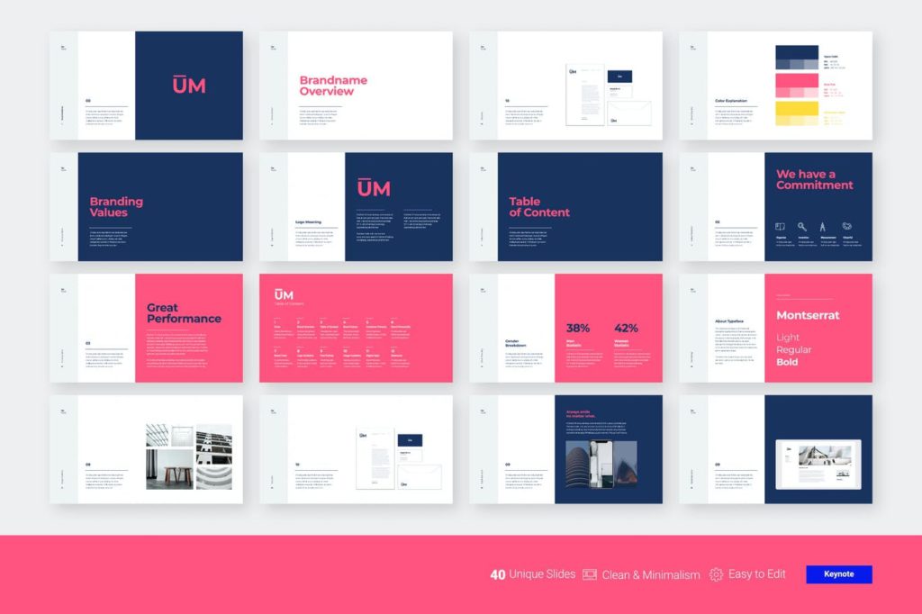
4. Marketing plan presentation template
Marketing is a vast concept, and the slides included in this design stock set reflect that broadness. A well-executed marketing strategy is essential to the success of any team. A marketing plan presentation template should ideally include slides for charts, timelines, and competition research. You can create executive summaries or mission statements with the below-mentioned presentation’s elegant and minimalistic slides.

5. Keynote presentation template
This keynote template has a lovely color scheme that is equal parts captivating and professional. You can employ a keynote presentation template if you’re going to be a keynote speaker at an upcoming event and want to ensure that your design stands out.
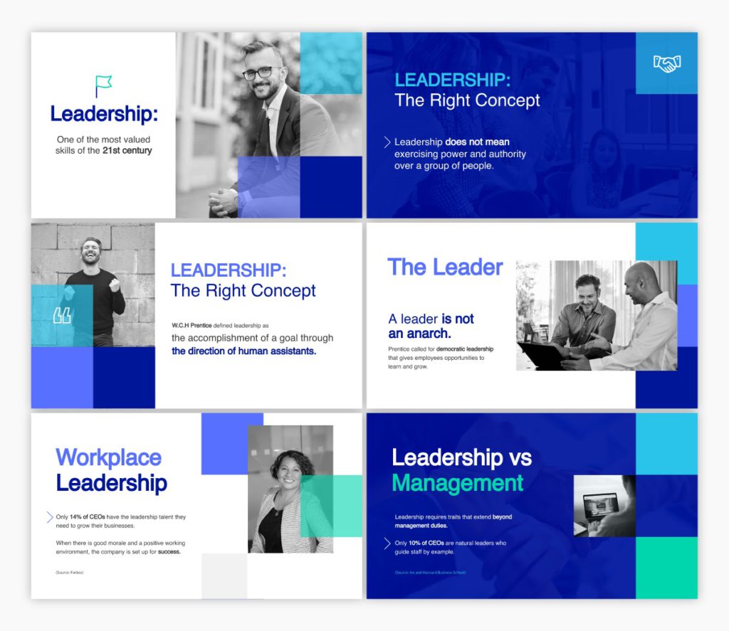
In addition to several slides, the template comes with various predefined color schemes. This template is perfect for any business presentation requiring a well-designed layout.
6. Training manual presentation template
A training manual presentation template may be used to convey new hire training to your workforce. It is essential for the design to be as clean and straightforward as possible.
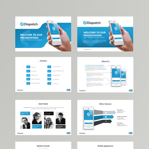
These training material decks created with a predesigned template make it easy for new employees to learn the ins and outs of their jobs.
7. Case study presentation template
A case study is an excellent way to illustrate a point in your presentation. The best way to attract new consumers using a case study presentation is to show them how your existing customers are using your product or service. Make sure to highlight how your product solved their pain points.
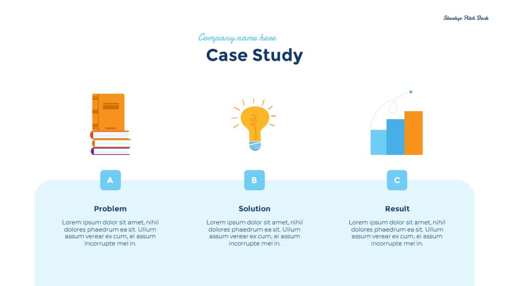
8. Interactive brief presentation template
It’s common to provide a creative brief when working with a contractor, freelancer, or designer to ensure everyone involved understands what the final product should look like.
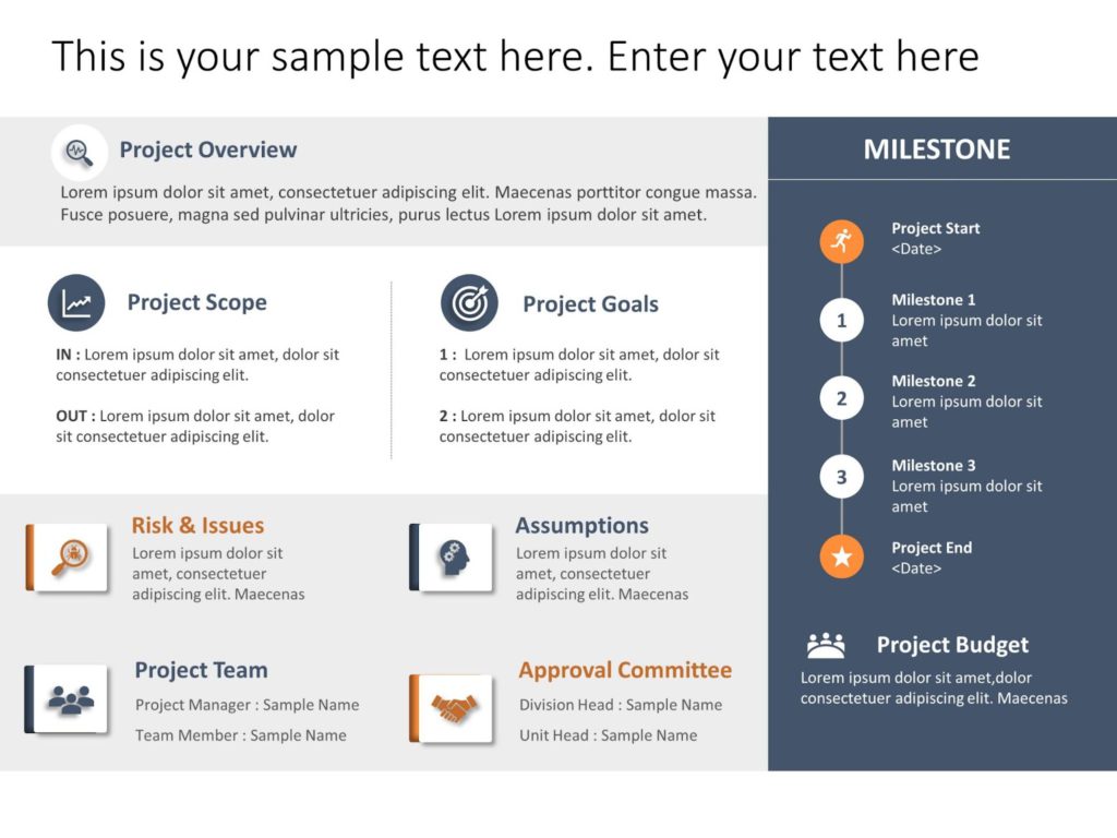
An interactive presentation template like a creative brief is a terrific concept for absorbing and memorizing that information.
9. Workforce handbook presentation template
When hiring a new employee, your company needs to create an employee handbook to ensure they know the company’s objective and general working norms. You may connect this presentation to your intranet or website, or just distribute the digital version through a password-protected or private link.
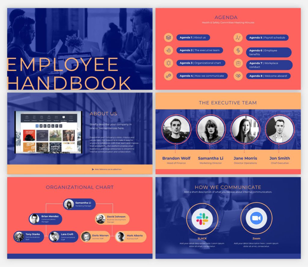
10. Ignite presentation template
Using this template as a starting point for an Ignite presentation would be ideal. An Ignite presentation is a five-minute presentation consisting of 20 slides, compelling the speaker to speak fast and concisely. As a result, an Ignite presentation template prevents you from using too much text on any slide.
11. Informative presentation template
The need to create an educational presentation may arise due to several reasons, such as onboarding new hires, explaining a concept to students, and more. An informative presentation template is a suitable solution in all cases.
Regardless of who they are meant for, presentations are the optimal format for sharing information with any audience. Create an educational presentation that you can embed in a blog post or publish on several platforms online. Make presentations to provide knowledge at conferences and other meetings.
12. SWOT analysis presentation template
A strength, weakness, opportunities, and threats (SWOT) analysis is a valuable tool for gauging where your business stands, and how your strategic planning measures are paying off. This presentation template is an excellent tool for SWOT analysis or refining your marketing strategy.
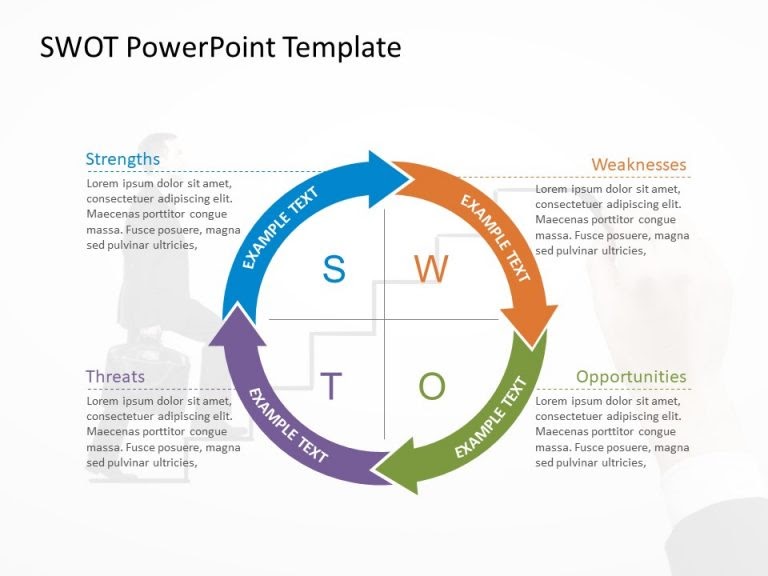
It comes in several formats; circular design and hexagonal shapes being two of them. You may modify the colors as desired.
13. Competitor analysis presentation template
Knowing your competition and what they offer is essential for a successful business. Competitor analysis means researching your competitors’ key strengths and weaknesses, which can, eventually, help you define your goals and USPs more clearly.
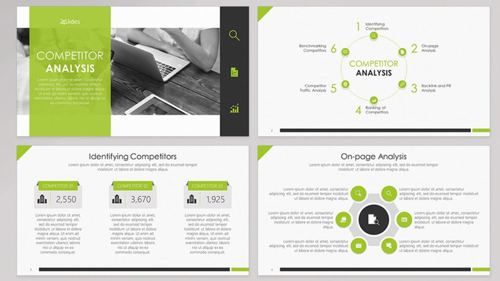
There are built-in interactive elements in this competitor analysis presentation template, which can help hook your audience.
14. Bold presentation template
Ideal for non-corporate sales presentations, a bold and daring presentation template includes slides with a vibrant, attention-grabbing theme that is neither overbearing nor distracting. The color combination is striking without being oppressive.
15. Company overview template
Creative presentation templates are all the rage today. Using a lot of negative space will allow your audience to take a breath and direct their attention to the most crucial parts of your presentation. It is suitable for corporate presentations, since it doesn’t stick out more than is necessary.
Key Takeaways
- Audiences tend to forget a large percentage of what was addressed before the presentation is through. This is why it is important to create a presentation design that is memorable.
- A presentation is much more than just a layout of slides with text and graphics on them. You need to make sure it’s visually appealing too.
- Use a wide range of best presentation design tools, components, and styles until you discover the one that resonates with your target audience.
- Consider the most recent trends and best practices, and dedicate time to thoroughly crafting every presentation.
- Fine-tuning your message, avoiding the use of bullet points, incorporating visual hierarchy, and incorporating data visualization are a few design tips to create a winning presentation.
Both your presentation style and design are crucial. You can deliver more dynamic, memorable presentations by creating visually pleasing decks. It’s advisable to create a resourceful presentation design if you want to elevate your personal as well as professional credibility.
Take cues from some popular presentation templates, and enhance one little aspect at a time. Now is the time to practice everything you’ve learned in this presentation design guide. As with any other visual communication, creating the best presentation design requires time, effort, and patience. Never be afraid to try something new; you’ll quickly see the benefits a strong presentation can have on your project.
A presentation design puts ideas, tales, words, and pictures into a series of slides that convey a narrative and engage your audience.
A presentation design template is used to achieve a uniform look for your slides. Templates are pre-made presentations into which you may insert your data.
People remember images and words better than just words. The design of your slides should be simple and consistent. This way, your audience will focus on the most important points.
Use high-quality images to back your message, but don’t use too many special effects. Make sure you don’t read from your slides.
A well-presented, memorable introduction and conclusion are two essential parts of a presentation. Don’t forget them when you write your outline.
Presentation design is essential, because it helps you weave your ideas, narrative, images, facts, and statistics into a unified story that leads your audience to the choice you want them to make.
Latest Blogs
In this blog, explore the golden rules of using AI marketing tools so you can leverage the benefits to their maximum potential.
In this blog, you’ll learn how to avoid the pitfalls of SEO over-optimization while enhancing your site’s performance.
In this article, we’ll take a look at what AMP is, its advantages and disadvantages, and how it affects SEO.
Get your hands on the latest news!
Similar posts.

7 mins read
15 Best Firms Offering Design Services in India

5 mins read
All You Need to Know About Data-Driven Design

6 mins read
Decoding Design Communities and Their Advantages
We use essential cookies to make Venngage work. By clicking “Accept All Cookies”, you agree to the storing of cookies on your device to enhance site navigation, analyze site usage, and assist in our marketing efforts.
Manage Cookies
Cookies and similar technologies collect certain information about how you’re using our website. Some of them are essential, and without them you wouldn’t be able to use Venngage. But others are optional, and you get to choose whether we use them or not.
Strictly Necessary Cookies
These cookies are always on, as they’re essential for making Venngage work, and making it safe. Without these cookies, services you’ve asked for can’t be provided.
Show cookie providers
- Google Login
Functionality Cookies
These cookies help us provide enhanced functionality and personalisation, and remember your settings. They may be set by us or by third party providers.
Performance Cookies
These cookies help us analyze how many people are using Venngage, where they come from and how they're using it. If you opt out of these cookies, we can’t get feedback to make Venngage better for you and all our users.
- Google Analytics
Targeting Cookies
These cookies are set by our advertising partners to track your activity and show you relevant Venngage ads on other sites as you browse the internet.
- Google Tag Manager
- Infographics
- Daily Infographics
- Template Lists
- Graphic Design
- Graphs and Charts
- Data Visualization
- Human Resources
- Beginner Guides
Blog Data Visualization
18 Presentation Design Tips For Success
By Midori Nediger , May 15, 2023

Bad presentations. We’ve all had to sit through them. Heck, we’ve probably all given one or two. I know I have.
You know the type: twice as long as they need to be, slides chock-full of text, no visuals in sight.
How can you ensure you don’t fall victim to these presentation faux-pas when designing your next presentation for your team, class, or clients?
In this blog, I’ll walk you through tips on how to design an impactful presentation along with presentation templates that can help you deliver it with style to leave a lasting impression.
Tips for designing and delivering an impactful presentation
What makes a presentation memorable?
It usually comes down to three things:
- The main idea.
- The presenter.
- The visuals.
All three elements work together to create a successful presentation. Just like how different presentation styles serve different purposes, having a good presentation idea will give the audience a purpose for listening.
Here are some top tips to consider to help you design and deliver an impactful presentation:
- Include less text and more visuals in your presentation design
- Identify one core message to center your presentation design around
- Eliminate any information that doesn’t immediately support the core message
- Create a strong presentation outline to keep you focused
- Use text to reinforce, not repeat, what you’re saying
- Design your presentation with one major takeaway per slide
- Use visuals to highlight the key message on each slide
- Use scaffolding slides to orient your audience and keep them engaged
- Use text size, weight, and color for emphasis
- Apply design choices consistently to avoid distraction
- Split a group presentation by topic
- Use a variety of page layouts to maintain your audience’s interest
- Use presentation templates to help you get started
- Include examples of inspiring people
- Dedicate slides to poignant questions
- Find quotes that will inspire your audience
- Emphasize key points with text and images
- Label your slides to prompt your memory
1. Include less text and more visuals in your presentation design
According to David Paradi’s annual presentation survey , the 3 things that annoy audiences most about presentations are:
- Speakers reading their slides
- Slides that include full sentences of text
- Text that is too small to read
The common thread that ties all of these presentation annoyances is text. Audiences are very picky about the text found in presentation slide decks .
In my experiences speaking at conferences and in webinars over the past few years, audiences respond much more positively to presentations that use visuals in place of text.
Audiences are more engaged, ask more questions, and find my talks more memorable when I include lots of visual examples in my slide decks.
I’m not the only one who has found this. We recently surveyed nearly 400 conference speakers about their presentation designs and found that 84.3% create presentations that are highly visual.
A great example of a high visual presentation is the iconic AirBnB pitch deck design , which includes no more than 40 words per slide. Instead of repeating the speaker’s script on the slides, it makes an impact with keywords, large numbers, and icons:

Learn how to customize this presentation template:
To help you take your presentations to the next level, I’d like to share my process for creating a visually-focused presentation like the one above. I’ll give you my top presentation design tips that I’ve learned over years of presenting:
- Class presentations
- Online courses
You can then apply this process to our professional presentation templates or pitch decks , creating unique presentation decks with ease! Our user-friendly editor tools make customizing these templates a breeze.
To leave a lasting impression on your audience, consider transforming your slides into an interactive presentation. Here are 15 interactive presentation ideas to enhance interactivity and engagement.
We’ll cover the most important steps for summarizing lengthy text into a presentation-friendly format. Then we’ll touch on some presentation design tips to help you get visual with your slide decks. Read on for the best creative presentation ideas .
2. Identify one core message to center your presentation design around
We know from David Paradi’s survey that audiences are easily overwhelmed with lots of text and data, especially when presentations are long.

(You when you see a presentation with lots of text and data and it’s long)
So unlike in a white paper , report , or essay , you can’t expect to tackle many complex ideas within a single presentation.
That would be a recipe for disaster.
Instead, identify a single central message that you would like to communicate to your audience. Then build your presentation around that core message.
By identifying that core message, you can ensure that everything you include in your presentation supports the goal of the presentation .
As seen below, a great presentation tells you exactly what you’re going to learn (the core message), then gets right to the facts (the supporting information).

To ensure you create an asset that’s clear, concise, impactful, and easy to follow, design your presentation around a single core message.
3. Create a strong presentation outline to keep you focused
Think of your outline as a roadmap for your presentation. Creating a strong presentation outline straight away helps make sure that you’re hitting all of the key points you need to cover to convey a persuasive presentation .
Take this presentation outline example:
- Introduction and hellos
- Vision and value proposition
- Financial profit
- Your investment
- Thanks and questions
These are all things that we know we need to talk about within the presentation.
Creating a presentation outline makes it much easier to know what to say when it comes to creating the actual presentation slides.

You could even include your presentation outline as a separate slide so that your audience knows what to expect:

The opening moments of your presentation hold immense power – check out these 15 ways to start a presentation to set the stage and captivate your audience.
4. Eliminate any information that doesn’t support the core message
Next, use that core message to identify everything that doesn’t belong in the presentation.
Aim to eliminate everything that isn’t immediately relevant to the topic at hand, and anything remotely redundant. Cut any information that isn’t absolutely essential to understanding the core message.
By cutting these extra details, you can transform forgettable text-heavy slides:

Into memorable slides with minimal text:

Here’s a quick checklist to help you cut out any extra detail:
Get rid of:
- Detailed descriptions
- Background information
- Redundant statements
- Explanations of common knowledge
- Persuasive facts and figures
- Illustrative examples
- Impactful quotes

This step may seem obvious, but when you’re presenting on a topic that you’re passionate about, it’s easy to get carried away with extraneous detail. Use the recommendations above to keep your text in check.
Clarity is key, especially if you’re presenting virtually rather than in-person. However, Lisa Schneider (Chief Growth Officer at Merriam-Webster) has had plenty of experience making that adjustment. She recently shared her tips for adapting in-person presentations into virtual presentations on Venngage that you can check out.
Watch: How to design a presentation [10 ESSENTIAL TIPS]
5. Use text to reinforce, not repeat, what you’re saying
According to presentation guru Nancy Duarte , your audience should be able to discern the meaning of your slides in 6 seconds or less.
Since your audience will tend to read every word you place on each slide, you must keep your text to an absolute minimum. The text on your slides should provide support for what you’re saying without being distracting.
Never write out, word for word, what you’re going to be saying out loud. If you’re relying on text to remember certain points, resist the urge to cram them into your slides. Instead, use a tool like Venngage’s speaker notes to highlight particular talking points. These can be imported into PowerPoint — along with the rest of your presentation — and will only be viewable to you, not your audience.

For the actual slides, text should only be used to reinforce what you’re saying. Like in the presentation design below, paraphrase long paragraphs into short bulleted lists or statements by eliminating adjectives and articles (like “the” and “a”).

Pull out quotes and important numbers, and make them a focus of each slide.

6. Design your presentation with one major takeaway per slide
As I mentioned above, audiences struggle when too much information is presented on a single slide.
To make sure you don’t overwhelm your audiences with too much information, spread out your content to cover one major takeaway per slide.
By limiting each slide to a single simple statement, you focus your audience’s attention on the topic at hand.
My favorite way to do this is to pick out the core message of whatever I’m talking about and express it in a few keywords, as seen in this presentation slide below.

This helps ensure that the visuals remain the focus of the slide.

Using the text in this way, to simply state a single fact per slide, is a sure-fire way to make an impact in your presentation.
Alternatively, pull out a significant statistic that you want to stick in your audience’s minds and make it a visual focus of the slide, as seen in this popular presentation by Officevibe .

This might mean you end up with a slide deck with a ton of slides. But that’s totally ok!
I’ve talked to many professionals who are pressured by their management teams to create presentations with a specific number of slides (usually as few as 10 or 15 slides for a 30-minute presentation).
If you ask me, this approach is completely flawed. In my mind, the longer I spend sitting on a single slide, the more likely I am to lose the interest of my audience.
How many slides should I use for a 10 minute presentation?
A good rule of thumb is to have at least as many slides as minutes in your presentation. So for a 10 minute presentation you should have at least 10 slides .
Use as many slides as you need, as long as you are presenting a single message on each slide, (as seen in the lengthy presentation template below). This is especially important if you’re presenting your business, or delivering a product presentation. You want to wow your audience, not bore them.

7. Use visuals to highlight the key message on each slide
As important as having one major takeaway per slide is having visuals that highlight the major takeaway on each slide.
Unique visuals will help make your message memorable.
Visuals are a great way to eliminate extra text, too.
You can add visuals by creating a timeline infographic to group and integrate information into visual frameworks like this:

Or create a flowchart and funnels:

Or by representing simple concepts with icons, as seen in the modern presentation design below. Using the same color for every icon helps create a polished look.
Using visuals in this way is perfect for when you have to convey messages quickly to audiences that you aren’t familiar with – such as at conferences. This would also make the ideal interview presentation template.
You can alternatively use icons in different colors, like in the presentation templates below. Just make sure the colors are complimentary, and style is consistent throughout the presentation (i.e. don’t use sleek, modern icons on one slide and whimsically illustrated icons on another). In this example, presentation clipart style icons have been used.

Any time you have important stats or trends you want your audience to remember, consider using a chart or data visualization to drive your point home. Confident public speaking combined with strong visualizations can really make an impact, encouraging your audience to act upon your message.
One of my personal favorite presentations (created by a professional designer) takes this “key message plus a visual” concept to the extreme, resulting in a slide deck that’s downright irresistible.

When applying this concept, don’t fall into the trap of using bad stock photos . Irrelevant or poorly chosen visuals can hurt you as much as they help you.
Below is an example of how to use stock photos effectively. They are more thematic than literal and are customized with fun, bright icons that set a playful tone.

The content and visual design of a presentation should be seamless.
It should never seem like your text and visuals are plopped onto a template. The format and design of the slides should contribute to and support the audience’s understanding of the content.

8. Use scaffolding slides to orient your audience and keep them engaged
It’s easy for audiences to get lost during long presentations, especially if you have lots of slides. And audiences zone out when they get lost.
To help reorient your audience every once in a while, you can use something I like to call scaffolding slides. Scaffolding slides appear throughout a presentation to denote the start and end of major sections.
The core scaffolding slide is the agenda slide, which should appear right after the introduction or title slide. It outlines the major sections of the presentation.
At the beginning of each section, you should show that agenda again but highlight the relevant section title, as seen below.

This gives audiences the sense that you’re making progress through the presentation and helps keep them anchored and engaged.
Alternatively, you can achieve a similar effect by numbering your sections and showing that number on every slide. Or use a progress bar at the bottom of each slide to indicate how far along you are in your presentation. Just make sure it doesn’t distract from the main content of the slides.

You can imagine using this “progress bar” idea for a research presentation, or any presentation where you have a lot of information to get through.
Leila Janah, founder of Sama Group, is great at this. Her Innovation and Inspire talk about Sama Group is an example of a presentation that is well organized and very easy to follow.
Her presentation follows a logical, steady stream of ideas. She seems comfortable talking in front of a crowd but doesn’t make any attempts to engage directly with them.
9. Use text size, weight and color for emphasis
Every slide should have a visual focal point. Something that immediately draws the eye at first glance.
That focal point should be whatever is most important on that slide, be it an important number, a keyword, or simply the slide title.

We can create visual focal points by varying the size, weight, and color of each element on the slide. Larger, brighter, bolder elements will command our audience’s attention, while smaller, lighter elements will tend to fade into the background.

As seen in the presentation template above, this technique can be especially useful for drawing attention to important words within a long passage of text. Consider using this technique whenever you have more than 5 words on a slide.
And if you really want your audience to pay attention, pick a high-contrast color scheme like the one below.

When picking fonts for your presentation, keep this technique in mind. Pick a font that has a noticeable difference between the “bold” font face and the “regular” font face. Source Sans Pro, Times New Roman, Montserrat, Arvo, Roboto, and Open Sans are all good options.

The last thing to remember when using size, weight, and color to create emphasis on a slide: don’t try to emphasize too many things on one slide.
If everything is highlighted, nothing is highlighted.
10. Apply design choices consistently to avoid distraction
Audiences are quick to pick out, and focus on, any inconsistencies in your presentation design. As a result, messy, inconsistent slide decks lead to distracted, disengaged audiences.
Design choices (fonts and colors, especially), must be applied consistently across a slide deck. The last thing you want is for your audience to pay attention to your design choices before your content.
To keep your design in check, it can be helpful to create a color palette and type hierarchy before you start creating your deck, and outline it in a basic style guide like this one:

I know it can sometimes be tempting to fiddle around with text sizes to fit longer bits of text on a slide, but don’t do it! If the text is too long to fit on a slide, it should be split up onto multiple slides anyway.
And remember, a consistent design isn’t necessarily a boring one. This social media marketing presentation applies a bright color scheme to a variety of 3-column and 2-column layouts, remaining consistent but still using creative presentation ideas.

11. Split a group presentation by topic
When giving a group presentation it’s always difficult to find the right balance of who should present which part.
Splitting a group presentation by topic is the most natural way to give everybody the chance to attempt without it seeming disjointed.

When presenting this slide deck to investors or potential clients, the team can easily take one topic each. One person can discuss the business model slide, and somebody else can talk about the marketing strategy.
Top tips for group presentations:
- Split your group presentation by topic
- Introduce the next speaker at the end of your slide
- Become an ‘expert’ in the slide that you are presenting
- Rehearse your presentation in advance so that everybody knows their cue to start speaking
12. Use a variety of page layouts to maintain your audience’s interest
Page after page of the same layout can become repetitive and boring. Mix up the layout of your slides to keep your audience interested.
In this example, the designer has used a variety of combinations of images, text, and icons to create an interesting and varied style.

There are hundreds of different combinations of presentation layers and presentation styles that you can use to help create an engaging presentation . This style is great for when you need to present a variety of information and statistics, like if you were presenting to financial investors, or you were giving a research presentation.
Using a variety of layouts to keep an audience engaged is something that Elon Musk is an expert in. An engaged audience is a hyped audience. Check out this Elon Musk presentation revealing a new model Tesla for a masterclass on how to vary your slides in an interesting way:
13. Use presentation templates to help you get started
It can be overwhelming to build your own presentation from scratch. Fortunately, my team at Venngage has created hundreds of professional presentation templates , which make it easy to implement these design principles and ensure your audience isn’t deterred by text-heavy slides.
Using a presentation template is a quick and easy way to create professional-looking presentation skills, without any design experience. You can edit all of the text easily, as well as change the colors, fonts, or photos. Plus you can download your work in a PowerPoint or PDF Presentation format.
After your presentation, consider summarizing your presentation in an engaging manner to r each a wider audience through a LinkedIn presentation .
14. Include examples of inspiring people
People like having role models to look up to. If you want to motivate your audience, include examples of people who demonstrate the traits or achievements, or who have found success through the topic you are presenting.
15. Dedicate slides to poignant questions
While you might be tempted to fill your slides with decorative visuals and splashes of color, consider that sometimes simplicity is more effective than complexity. The simpler your slide is, the more you can focus on one thought-provoking idea.

16. Find quotes that will inspire your audience
A really good quote can stick in a person’s mind for weeks after your presentation. Ending your presentation with a quote can be a nice way to either begin or finish your presentation.
A great example of this is Tim Ferriss’ TED talk:

Check out the full talk below.
17. Emphasize key points with text and images
When you pair concise text with an image, you’re presenting the information to your audience in two simultaneous ways. This can make the information easier to remember, and more memorable.
Use your images and text on slides to reinforce what you’re saying out loud.
Doing this achieves two things:
- When the audience hears a point and simultaneously read it on the screen, it’s easier to retain.
- Audience members can photograph/ screencap the slide and share it with their networks.
Don’t believe us? See this tip in action with a presentation our Chief Marketing Officer Nadya gave recently at Unbounce’s CTA Conference . The combination of text and images on screen leads to a memorable presentation.

18. Label your slides to prompt your memory
Often, presenters will write out an entire script for their presentation and read it off a teleprompter. The problem is, that can often make your presentation seem too rehearsed and wooden.
But even if you don’t write a complete script, you can still put key phrases on your slides to prompt jog your memory. The one thing you have to be wary of is looking back at your slides too much.
A good presentation gets things moving! Check out the top qualities of awesome presentations and learn all about how to make a good presentation to help you nail that captivating delivery.
Audiences don’t want to watch presentations with slide decks jam-packed with text. Too much text only hurts audience engagement and understanding. Your presentation design is as important as your presentation style.
By summarizing our text and creating slides with a visual focus, we can give more exciting, memorable and impactful presentations.
Give it a try with one of our popular presentation templates:

Module Three: Drafting Demonstration Speeches
Visual aids: design principles.
Slide and slide show design have a major impact on your ability to get your message across to your audience. Numerous books address various design fundamentals and slide design, but there isn’t always consensus on what is “best.” What research has shown, though, is that people have trouble grasping information when it comes at them simultaneously. “They will either listen to you or read your slides; they cannot do both.” [1] This leaves you, the presenter, with a lot of power to direct or scatter your audience’s attention. This section will serve as an overview of basic design considerations that even novices can use to improve their slides.
First and foremost, design with your audience in mind. Your slide show is not your outline. The show is also not your handout. As discussed earlier, you can make a significantly more meaningful, content-rich handout that complements your presentation if you do not try to save time by making a slide show that serves as both. Keep your slides short, create a separate handout if needed, and write as many notes for yourself as you need.
All decisions, from the images you use to their placement, should be done with a focus on your message, your medium, and your audience. Each slide should reinforce or enhance your message, so make conscious decisions about each element and concept you include [2] and edit mercilessly. Taken a step further, graphic designer Robin Williams [3] suggests each element be placed on the slide deliberately in relation to every other element on the slide.

Figure 13.1 by the Public Speaking Project. CC-BY-NC-ND .
Providing the right amount of information, neither too much nor too little, is one of the key aspects in effective communication. [4] See Figure 13.1 as an example of slides with too little or too much information. The foundation of this idea is that if the viewers have too little information, they must struggle to put the pieces of the presentation together. Most people, however, include too much information (e.g., slides full of text, meaningless images, overly complicated charts), which taxes the audience’s ability to process the message. “There is simply a limit to a person’s ability to process new information efficiently and effectively.” [5] As a presenter, reducing the amount of information directed at your audience (words, images, sounds, etc.) will help them to better remember your message. [6] In this case, less is actually more.
The first strategy to keeping it simple is to include only one concept or idea per slide. If you need more than one slide, use it, but don’t cram more than one idea on a slide. While many have tried to proscribe the number of slides you need based on the length of your talk, there is no formula that works for every presentation. Use only the number of slides necessary to communicate your message, and make sure the number of slides corresponds to the amount of time allotted for your speech. Practice with more and fewer slides and more and less content on each slide to find the balance between too much information and too little.
With simplicity in mind, the goal is to have a slide that can be understood in 3 seconds. Think of it like a billboard you are passing on the highway. [7] You can achieve this by reducing the amount of irrelevant information, also known as noise , in your slide as much as possible. This might include eliminating background images, using clear icons and images, or creating simplified graphs. Your approach should be to remove as much from your slide as possible until it no longer makes any sense if you remove more. [8]

Figure 13.2 by the Public Speaking Project. CC-BY-NC-ND .
Slide Layout

Figure 13.3 by the Public Speaking Project. CC-BY-NC-ND .
It is easy to simply open up your slideware and start typing in the bullet points that outline your talk. If you do this, you will likely fall into the traps for which PowerPoint is infamous. Presentation design experts Reynolds [9] and Duarte [10] both recommend starting with paper and pen. This will help you break away from the text-based, bullet-filled slide shows we all dread. Instead, consider how you can turn your words and concepts into images. Don’t let the software lead you into making a mediocre slide show.
Regarding slide design, focus on simplicity. Don’t over-crowd your slide with text and images. Cluttered slides are hard to understand (see Figure 13.2). Leaving empty space, also known as white space , gives breathing room to your design. The white space actually draws attention to your focus point and makes your slide appear more elegant and professional. Using repetition of color, font, images, and layout throughout your presentation will help tie all of your slides together. This is especially important if a group is putting visuals together collaboratively. If you have handouts, they should also match this formatting in order to convey a more professional look and tie all your pieces together. [11]

Figure 13.4 by the Public Speaking Project. CC-BY-NC-ND .
Another general principle is to use contrast to highlight your message. Contrast should not be subtle. Make type sizes significantly different. Make contrasting image placements, such as horizontal and vertical, glaringly obvious. A general principle to follow: if things are not the same, then make them very, very different, [12] as in Figure 13.3.
A common layout design is called the rule of thirds . If you divide the screen using two imaginary lines horizontally and two vertically, you end up with nine sections. The most visually interesting and pleasing portions of the screen will be at the points where the lines intersect.
Aligning your text and images with these points is preferred to centering everything on the screen. [13] [14] See Figure 13.4. Feel free to experiment with the right and left aligned content for contrast and interest. Sticking with a centered layout means more work trying to make the slide interesting. [15]

Figure 13.5 by the Public Speaking Project. CC-BY-NC-ND .
Understanding how people view images (and thus slides) can help you direct the viewer’s attention to the main point of your slide. In countries that read text from left to right and top to bottom, like English-speaking countries, people tend to also read images and slides the same way. Starting in the upper left of the screen, they read in a Z pattern , exiting the page in the bottom right corner unless their vision is side-tracked by the objects they are looking at (as in Figure 13.5).
Viewers’ eyes are scanning from focus point to focus point in an image, so you need to consciously create visual cues to direct them to the relevant information. Cues can be created subtly by the placement of objects in the slide, by showing movement, or more obviously by using a simple arrow. [16] Make sure all people and pets are facing into your slide and preferably at your main point, as in Figure 13.6. If your slide contains a road, path, car, plane, etc., have them also facing into your slide. When the natural motion or gaze of your images points away from your slide, your viewers look that way too. Being aware of this and addressing the natural tendencies of people when viewing images can help you select images and design slides that keep the viewer engaged in your message. [17]

Figure 13.6 by the Public Speaking Project. CC-BY-NC-ND .
Backgrounds and Effects
PowerPoint and other slideware has a variety of templates containing backgrounds that are easy to implement for a consistent slide show. Most of them, however, contain distracting graphics that are counter to the simplicity you are aiming for in order to produce a clear message. It is best to use solid colors, if you even need a background at all. For some slide shows, you can make the slides with full-screen images, thus eliminating the need for a background color.
Graphic design is the paradise of individuality, eccentricity, heresy, abnormality, hobbies and humors. ~ George Santayana
Should you choose to use a background color, make sure you are consistent throughout your presentation. Different colors portray different meanings, but much of this is cultural and contextual, so there are few hard and fast rules about the meaning of colors. One universal recommendation is to avoid the color red because it has been shown to reduce your ability to think clearly. Bright colors, such as yellow, pink, and orange, should also be avoided as background colors, as they are too distracting. Black, on the other hand, is generally associated with sophistication and can be a very effective background as long as there is sufficient contrast with the other elements on your slide. [18]
When designing your presentation, it is tempting to show off your tech skills with glitzy transitions, wipes, fades, moving text, sounds, and a variety of other actions. These are distracting to your audience and should be avoided. They draw attention away from you and your message, instead focusing the audience’s attention on the screen. Since people naturally look at what is moving and expect it to mean something, meaningless effects, no matter how subtle, distract your audience, and affect their ability to grasp the content. Make sure that all your changes are meaningful and reinforce your message [19] .
There are complicated and fascinating biological and psychological processes associated with color and color perception that are beyond the scope of this chapter. Because color can have such a huge impact on the ability to see and understand your visuals, this section will explore basic rules and recommendations for working with color.
Color does not add a pleasant quality to design — it reinforces it. ~ Pierre Bonnard
Much of what we perceive in terms of a color is based on what color is next to it. Be sure to use colors that contrast so they can be easily distinguished from each other (think yellow and dark blue for high contrast, not dark blue and purple).High contrast improves visibility, particularly at a distance. To ensure you have sufficient contrast, you can view your presentation in greyscale either in the software if available or by printing out your slides on a black and white printer. [20]

Figure 13.7 by the Public Speaking Project. CC-BY-NC-ND .
As seen in Figure 13.7, warm colors (reds, oranges, yellows) appear to come to the foreground when set next to a cool color (blues, grays, purples) which recede into the background. Tints (pure color mixed with white, think pink) stand out against a darker background. Shades (pure color mixed with black, think maroon ) recede into a light background. [21] If you want something to stand out, these color combination rules can act as a guide.

Figure 13.8 by the Public Speaking Project. CC-BY-NC-ND .
Avoid using red and green closely together. Red-green color blindness is the predominate form of color blindness, meaning that the person cannot distinguish between those two colors (Vorick, 2011). There are other forms of color blindness, and you can easily check to see if your visuals will be understandable to everyone using an online tool such as the Coblis Color Blindness Simulator to preview images as a color-blindperson would see it. Certain red-blue pairings can be difficult to look at for the non-color blind. These colors appear to vibrate when adjacent to each other and are distracting and sometimes unpleasant to view. [22]
With all these rules in place, selecting a color palette , the group of colors to use throughout your presentation, can be daunting. Some color pairs, like complementary colors or analogous colors as in Figure 13.8, are naturally pleasing to the eye and can be easy options for the color novice. There are also online tools for selecting pleasing color palettes using standard color pairings including Kuler and Color Scheme Designer . You can also use websites like Colorbrewer to help identify an appropriate palette of colors that are visually distinct, appropriate for the colorblind, and that will photocopy well, should you decide to also include this information in a handout.
I’m a visual thinker, not a language-based thinker. My brain is like Google Images. ~ Temple Grandin
There are thousands of fonts available today. One might even say there has been a renaissance in font design with the onset of the digital age. Despite many beautiful options, it is best to stick to standard fonts that are considered screen-friendly. These include the serif fonts Times New Roman, Georgia, and Palatino, and the sans serif fonts Ariel, Helvetica, Tahoma, and Veranda. [23] These fonts work well with the limitations of computer screens and are legible from a distance if sized appropriately. Other non-standard fonts, while attractive and eye-catching, may not display properly on all computers. If the font isn’t installed on the computer you are presenting from, the default font will be used which alters the text and design of the slide.

Figure 13.9 by the Public Speaking Project. CC-BY-NC-ND .
Readability is a top concern with font use, particularly for those at the back of your audience, furthest from the screen. After you have selected a font (see previous paragraph), make sure that the font size is large enough for everyone to read clearly. If you have the opportunity to use the presentation room before the event, view your slides from the back of the room. They should be clearly visible. This is not always possible and should not be done immediately preceding your talk, as you won’t have time to effectively edit your entire presentation. Presentation guru Duarte [24] describes an ingenious way to test visibility from your own computer. Measure your monitor diagonally in inches, display your slides, then step back the same number of feet as you measured on your monitor in inches. If you have a 17 inch screen, step back 17 feet to see what is legible.
Create your own visual style… let it be unique for yourself and yet identifiable for others. ~ Orson Welles
In addition to font style and size, there are other font “rules” to improve your slides. Don’t use decorative, script, or visually complex fonts. Never use the Comic Sans font if you want to retain any credibility with your audience. If you must use more than one font, use one serif font and one sansserif font. Use the same font(s) and size(s) consistently throughout your presentation. Don’t use all upper case or all bold. Avoid small caps and all word art, shadows, outlines, stretching text, and other visual effects. Use italics and underlines only for their intended purposes, not for design. While there are many rules listed here, they can be summarized as” keep it as simple as possible.” [25] See Figure 13.9 for examples of poor font choices.
Nothing is more hotly debated in slide design than the amount of text that should be on a slide. Godin says “no more than six words on a slide. EVER.” [26] Other common approaches include the 5×5 rule — 5 lines of text, 5 words per line—and similar 6×6 and 7×7 rules. [27] Even with these recommendations, it is still painfully common to see slides with so much text on them that they can’t be read by the audience. The type has to be so small to fit all the words on the slide that no one can read it. Duarte [28] keenly points out that if you have too many words, you no longer have a visual aid. You have either a paper or a teleprompter, and she recommends opting for a small number of words.
Once you understand that the words on the screen are competing for your audience’s attention, it will be easier to edit your slide text down to a minimum. The next time you are watching a presentation and the slide changes, notice how you aren’t really grasping what the speaker is saying, and you also aren’t really understanding what you are reading. Studies have proved this split-attention affects our ability to retain information; [29] so when presenting, you need to give your audience silent reading time when you display a new slide. That is: talk, advance to your next slide, wait for them to read the slide, and resume talking. If you consider how much time your audience is reading rather than listening, hopefully you will decide to reduce the text on your slide and return the focus back to you, the speaker, and your message.
There are several ways to reduce the number of words on your page, but don’t do it haphazardly. Tufte [30] warns against abbreviating your message just to make it fit. He says this dumbs down your message, which does a disservice to your purpose and insults your audience’s intelligence. Instead, Duarte [31] and Reynolds [32] recommend turning as many concepts as possible into images. Studies have shown that people retain more information when they see images that relate to the words they are hearing. [33] And when people are presented information for a very short time, they remember images better than words. [34]

Figure 13.10 by the Public Speaking Project. CC-BY-NC-ND .
The ubiquitous use of bulleted lists is also hotly debated. PowerPoint is practically designed around the bulleted-list format, even though is it regularly blamed for dull, tedious presentations with either overly dense or overly superficial content. [35] Mostly this format is used (incorrectly) as a presenter’s outline. “ No one can do a good presentation with slide after slide of bullet points. No One. ” [36] Reserve bulleted lists for specifications or explaining the order of processes. In all other cases, look for ways to use images, a short phrase, or even no visual at all.
Quotes, on the other hand, are not as offensive to design when they are short, legible, and infrequently used. They can be a very powerful way to hammer a point home or to launch into your next topic. [37] See Figure 13.10 for an example. If you do use a quote in your slide show, immediately stop and read it out loud or allow time for it to be read silently. If the quote is important enough for you to include it in the talk, the quote deserves the audience’s time to read and think about it. Alternately, use a photo of the speaker or of the subject with a phrase from the quote you will be reading them, making the slide enhance the point of the quote.

Figure 13.11 by the Public Speaking Project. CC-BY-NC-ND .
Images can be powerful and efficient ways to tap into your audience’s emotions. Use photographs to introduce an abstract idea, to evoke emotion, to present evidence, or to direct the audience attention, just make sure it is compatible with your message. [38] Photos aren’t the only images available. You might consider using simplified images like silhouettes , line art , diagrams, enlargements, or exploded views , but these should be high quality and relevant. Simplified can be easier to understand, particularly if you are showing something that has a lot of detail. Simple images also translate better than words to a multicultural audience. [39] In all cases, choose only images that enhance your spoken words and are professional-quality. This generally rules out the clip art that comes with slideware, whose use is a sign of amateurism. Select high-quality images and don’t be afraid to use your entire slide to display the image. Boldness with images often adds impact.
When using images, do not enlarge them to the point that the image becomes blurry, also known as pixelation . Pixelation, (Figure 13.11) is caused when the resolution of your image is too low for your output device (e.g. printer, monitor, projector). When selecting images, look for clear ones that can be placed in your presentation without enlarging them. A good rule of thumb is to use images over 1,000 pixels wide for filling an entire slide. If your images begin to pixelate, either reduce the size of the image or select a different image.

Figure 13.12 by the Public Speaking Project. CC-BY-NC-ND .
Never use an image that has a watermark on it, as in Figure 13.2. A watermark is text or a logo that is placed in a digital image to prevent people from re-using it. It is common for companies that sell images to have a preview available that has a watermark on it. This allows you, the potential customer, to see the image, but prevents you from using the image until you have paid for it. Using a watermarked image in your presentation is unprofessional. Select another image without a watermark, take a similar photo yourself, or pay to get the watermark-free version.
You can create images yourself, use free images, or pay for images from companies like iStockphoto for your presentations. Purchasing images can get expensive quickly, and searching for free images is time consuming. Be sure to only use images that you have permission or rights to use and give proper credit for their use. If you are looking for free images, try searching the Creative Commons database for images from places like Flickr, Google, and others. The creators of images with a Creative Commons License allow others to use their work, but with specific restrictions. What is and isn’t allowed is described in the license for each image. Generally, images can be used in educational or non-commercial settings at no cost as long as you give the photographer credit. Also, images created by the U.S. government and its agencies are copyright free and can be used at no cost.
One final consideration with using images: having the same image on every page, be it part of the slide background or your company logo, can be distracting and should be removed or minimized. As mentioned earlier, the more you can simplify your slide, the easier it will be for your message to be understood.
Graphs and Charts

Figure 13.13 by the Public Speaking Project. CC-BY-NC-ND .
If you have numerical data that you want to present, consider using a graph or chart. You are trying to make a specific point with the data on the slide, so make sure that the point—the conclusion you want your audience to draw — is clear. This may mean that you reduce the amount of data you present, even though it is tempting to include all of your data on your slide.
It is best to minimize the amount of information and focus instead on the simple and clear conclusion. [40] You can include the complete data set in your handout if you feel it is necessary. [41] Particularly when it comes to numerical data, identify the meaning in the numbers and exclude the rest. “Audiences are screaming ‘make it clear,’ not ‘cram more in.’ You won’t often hear an audience member say, ‘That presentation would have been so much better if it were longer.” [42] In some cases you can even ditch the graph altogether and display the one relevant fact that is your conclusion.

Figure 13.14 by the Public Speaking Project. CC-BY-NC-ND .
Different charts have different purposes, and it is important to select the one that puts your data in the appropriate context to be clearly understood. [43] Pie charts show how the parts relate to the whole and are suitable for up to eight segments, as long as they remain visually distinct. [44] Start your first slice of the pie at 12:00 with your smallest portion and continue around the circle clockwise as the sections increase in size. Usea line graph to show trends over time or how data relates or interacts. Bar charts are good for showing comparisons of size or magnitude [45] and for showing precise comparisons. [46] There are other types of charts and graphs available, but these are the most common.
When designing charts, one should use easily distinguishable colors with clear labels. Be consistent with your colors and data groupings. [47] For clarity, avoid using 3-D graphs and charts, and remove as much of the background noise (lines, shading, etc.) as possible. [48] All components of your graph, once the clutter is removed, should be distinct from any background color. Finally, don’t get too complex in any one graph, make sure your message is as clear as possible, and make sure to visually highlight the conclusion you want the audience to draw.
- Duarte, N. (2008). Slide:ology: The art and science of creating great presentations. Sebastopol, CA : O’Reilly Media. ↵
- Reynolds, G. (2008). Presentation Zen: Simple ideas on presentation design and delivery. Berkeley, CA: New Riders. ↵
- Williams, R. (2004). The nondesigner’s design book: Design and typographic principles for the visual novice (2nd ed.). Berkeley, CA: Peachpit Press. ↵
- Kosslyn, S. M. (2007). Clear and to the point: 8 psychological principles for compelling PowerPoint presentations. New York, NY: Oxford University Press. ↵
- Reynolds 2008 ↵
- Mayer, R. E. (2001). Multimedia learning . Cambridge, UK: Cambridge University Press. ↵
- Duarte, N. (2010). Resonate: Present visual stories that transform audiences. Hoboken, NJ: John Wiley & Sons. ↵
- Reynolds 2008 ↵
- Duarte 2010 ↵
- Williams 2004 ↵
- Kadavy, D. (2011). Design for hackers: Reverse-engineering beauty. West Sussex, UK : John Wiley & Sons ↵
- Williams 2004 ↵
- Malamed, C. (2009). Visual language for designers: Principles for creating graphics that people understand. Beverly, MA: Rockport Publishers. ↵
- Duarte 2008 ↵
- Kadavy 2011 ↵
- Duarte 2008; Kosslyn 2007 ↵
- Bajaj, G. (2007). Cutting edge PowerPoint 2007 for dummies . Hoboken, NJ: Wiley Publishing. ↵
- Kosslyn 2007 ↵
- Kadavy 2011; Kosslyn 2007 ↵
- Weaver, M. (1999). Reach out through technology: Make your point with effective A/V. Computers in Libraries , 19 (4), 62. ↵
- Mayer 2001 ↵
- Tufte, E. R. (2003). The cognitive style of PowerPoint . Cheshire, CT: Graphics Press. ↵
- Tufte 2003 ↵
- Malamad 2009 ↵
- Tufte 2003 ↵
- Chapter 13 Design Principles. Authored by : Sheila Kasperek, MLIS, MSIT. Provided by : Mansfield University, Mansfield, PA. Located at : http://publicspeakingproject.org/psvirtualtext.html . Project : The Public Speaking Project. License : CC BY-NC-ND: Attribution-NonCommercial-NoDerivatives
- Figures 13.1-13.14. Authored by : Sheila Kasperek and Tom Oswald . Located at : http://publicspeakingproject.org/psvirtualtext.html . Project : The Public Speaking Project. License : CC BY-NC-ND: Attribution-NonCommercial-NoDerivatives
Ace the Presentation

How to Effectively Manage Time During a Presentation? Short and Long Ones!
Slides are one of the best ways to engage an audience and nail a presentation. Nowadays, people use the most efficient and practical skills to make the slides clear, easy to understand. However, most people struggle to plan and manage time in their presentations.
How Many Slides are Suitable for Finishing a Presentation on Time?
The general rule says 1 to 2 slides per minute. However, it is critical to note that the presentation’s number of slides will vary according to the topic complexity, audience, available time, presentation structure and format, and goal. Good planning, rehearsal, and delivery skills are essential!
To be more specific, if you have too many slides in a presentation at the range of 3 to 15 minutes, you will end up confusing your audience or spending a significant part of your time explaining the slides. It does not mean you have to prepare a lot of information and squeeze it into few slides, and the best practice is to summarize your content to understand it easily.
From 25 minutes to 60 minutes, you can make a considerable number of slides. Some experts recommend 1 to 2 slides per minute, but as I said before, it will depend on the topic. Imagine that one of your slides contains graphs about some work you have been doing that can take more than 2 minutes, and it is important to explain it in detail to the audience.
It all starts with planning, researching, organizing all the collected data, prioritizing your key points, and making a structure. After this exercise, it will be easier to know how many slides you will have according to your given time.
To sum this up, there is no exact rule to set a number of slides for a given time frame, and it will vary according to the topic, your research, and your presentation skills. All you have to do is to balance the slides with your speech and time.
How many Slides for a 3-minute Presentation?
For a 3-minute presentation, the presenter should use four slides. Depending on how the slides are structured, 15 seconds to 2 minutes can be spent on each slide.
What really matters is not the amount of the slides but the quality. You can make three powerful slides and nail your presentation or make 5 with too much content and ending up having a boring presentation.
A good practice for a 3 minutes presentation is to keep it clean and straightforward. Keep in mind that slides are more engaging with visuals rather than texts. And on your speech, be as brief as possible, make a 15 to 20 seconds introduction, and do the same on the conclusion.
How many Slides for a 5-minute Presentation?
Five minutes is enough time to deliver your message and engage your audience with content that is straight to the point. The only thing you need to do is keep in mind that every second of your time counts a lot for your presentation.
How many Slides for a 10-minute Presentation?
The Rule of Thumb for a 10-minute presentation is having 10-12 slides. Presenters with good skills use up to 30 seconds per slide to keep it nice and engaging. This time frame is suitable for elaborately introducing the subject or topic, diving deep into it, and highlighting the key points.
According to your topic, you can even make eight slides considering the fact that slides are only the guide of your presentation. That is why it is essential to make an excellent structure to organize your content on the slides properly; this will help you to put aside unnecessary data and focus only on what is essential for the audience.
How many Slides for a 20-minute Presentation?
According to Guy Kawasaki , a 20-minute presentation should have ten slides where each slide utilizes a 30 point font. Using this rule of 10/20/30, the speaker would spend up to 1 minute per slide, which gives time for even allowing 1 or 2 questions from the audience.
To structure a 20 minutes presentation using the rule of 10/20/30 from Guy Kawasaki , you have to use the first slide to introduce your subject, case study, or others, and from the second slide, start diving deep until you get to the conclusion.
In some cases, each slide has a different theme, and you will need to approach them differently. Having different themes per slide will require you to summarize each slide’s content in under a minute.
Although the Rule of Guy Kawasaki is suitable for a 20-minute presentation, you can set your own number of slides according to your subject and how much time you spend on a single slide as long as you deliver the message properly and engage your audience.
How many Slides for a 25-minute Presentation?
For a 25-minute presentation, the general rule is to use 20 to 30 slides. By spending up to two minutes per slide and focusing on the main subject, the speaker can keep the audience engaged for this period of time.
Kawasaki believes that a human being can comprehend at least ten concepts in a meeting. In other words, you have to include in your topic or subject up to ten themes to be discussed. Any More than that can make your audience get confused or bored.
In this given time frame, you now have the opportunity to interact more with the audience, start with a quote, let them raise some clarification questions, and get more involved with them.
How many Slides for a 30-minute Presentation?
Experts recommend 30 to 40 slides to make a memorable presentation. With 30 minutes, the presenter has more options compared to when the given time frame is short. Consider making the content as straightforward as possible. Also, make two paragraphs per slide at the most.
This technique will allow the audience to read all the information on the slide easily and quickly and move to the next one alongside you. If you add too much content on one slide, the audience will likely read something that you are not explaining yet or the opposite.
But you can make more than 40 slides and still have a memorable presentation in just 30 minutes, and I will explain to you how. Well, if you want your audience to understand clearly each content of your slide, make it one paragraph or one sentence, and use more visuals.
Using this method, you will spend 1-2 seconds per slide, and the audience will understand way better seeing the visual (which counts more than text). The explanation is gradual from the beginning to the end.
How many Slides for a 45-minute presentation?
As a general rule, for a 45-minute presentation, between 20 and 50 slides would grant a memorable presentation. Spending 1-2 minutes per slide, the speaker will have time to make a great introduction, interact more with the audience and have a questions and answers session.
A 45-minutes presentation is in the range of long times ones, and in these cases, you have to use the slides very carefully, making them proportional to your presentation time. Consider having a wristwatch to control your time.
A good practice is to use the slides only to guide your speech during the presentation, but you will need to master them. Rehearse the most important of each slide to make sure you spend the right time, or even less. This time management will give you an advantage because you will have enough time to make a great conclusion.
How many Slides for an hour Presentation?
Experts recommend 30 to 60 slides for a 60-minutes presentation. This period of time gives the speaker two main options: summarize the content in 30 slides or make a structure that allows one theme per slide. These two options also give more time to interact with the audience make a great introduction and conclusion.
Both of them are OK. But there are aspects that you have to consider; if you are preparing few slides, you will need to train how to summarize content to make sure you don’t spend too much time explaining all the points or having your audience stuck on reading your slide.
And if you are planning to make one theme per slide to facilitate the understanding to the audience, make sure you spend 30 seconds at the most. But also consider having black screen slides to make pauses or small breaks and entertain or reengage your audience.
How many Slides for a 90-minute Presentation?
A 90-minutes presentation should have not more than 60 slides. In this situation, the speaker will need to know how to keep time on presentations. Experts recommend up to 2 minutes per slide, but depending on how the presentation is flowing, spending more than 2 minutes per slide is possible.
If you fail to make these pauses to double-check if the audience is on the same page with you, you will be running a risk of going back from almost the end of the slides to the first ones to explain something that the audience did not get very well.
How many Slides for a two-hour presentation?
A two-hour presentation would need 60-80 slides to deliver the message memorably. Some experts recommend one theme per slide to make it clear and easily understandable. Keep in mind that a presentation this long requires careful planning and a very well-organized structure.
Generally, a presentation with more than one hour of duration is for professional speakers who can deal with time management. The best way to not have your audience boring is to use the method of one idea per slide; it will make them easily understand each part of your content.
How many Slides for 2+ hours presentations?
Presentations with more than two hours should have not more than 80 slides. Long presentations with over 2 hours, the speaker can organize the information in order to spend 2-3 minutes per slide.
120+ minutes is considered an extended time frame; a good practice is to keep the slides brief and clean to ensure your audience won’t get exhausted.
What are the skills needed to Deliver Long Presentations or Speeches?
For long presentations, several skills are required to ensure successful delivery, such as:
- Time management;
- Engaging the audience
- Solid posture
- Good eye contact
- Controlling your voice, and more.
All these skills will keep your audience engaged and entertained, and make sure you reserve 15-20 minutes for questions and answers after a long presentation or speech.
How to keep time in your presentation?
First of all, to have complete control of your time on stage, you have to write the schedule of time you will spend on each part of your presentation, something like setting time for your opening, how long time you will spend on the introduction, how long time you reserve for questions and answers, etc.
Make sure you start your presentation on time. If you fail this step, then everything that comes ahead may also delay and end the presentation after the scheduled time. You also need to plan how long your speech will take and have a clock to control it.
Planning is also crucial to keep time on your presentation. The main thing in the plan to deliver your message is the structure of your content. A good structure will allow you to know how much time you will spend on each point.
I have an excellent article with a guide for outlining your speech , which should help you nail this part of the process. A good speech outline is key in managing presentation time.
And last but not least, you need to rehearse before you go on stage. It will allow you to know how much time you need for the presentation and practice to see if you need to remove or add something to your presentation to make it perfect.
Why do people usually fail to finish a presentation within the stipulated time?
Generally, people fail to finish a presentation on time because they do not make a good plan, underestimate rehearsing, and fail at an impromptu delivery attempt at the last minute. What commonly happens is that people make too many slides and fail to go from one to another on time. The rule of thumb says that 1-2 minutes per slide is enough using standards.
Another session that makes speakers fail to finish the presentation in time is the question and answers. This mistake happens when the speaker does not practice enough or predict questions that may come and end up thinking about the answer when the question is raised.
Not setting time for each session of your presentation also makes you not finish on time. This mistake will cause you to take longer at one point or another, especially if you don’t have a clock to keep track of the time.
How to keep your Presentation Brief and Clear
To keep a presentation brief and clear, organize your content to be only one theme per slide. To be more specific, consider having one paragraph or idea per slide, one that is concise, straightforward, and should also include minimalist visuals.
The design is also essential to help you get a clean design. Choose a layout that comfortably suits your text and image. Another detail is the color, which has to be neutral to help the reader focus on the content only.
For More Tips on Designing and Nailing a Presentation, open the recommended articles below.
Designing a Killer Presentation in 8 Steps

Planning and performing a presentation that meets expectations and involves the public requires a lot of care. The details involved in holding a talk will be super important to ensure her success and approval from those who participated. Therefore, we have prepared a post with a few crucial steps that you should follow to organize…
What Makes a Great Presenter? 9 Key Qualities to Look for!

Want to Stand Out? 15 Key Tips for an Awesome Presentation

In conclusion, the number of slides a presentation should have for a given time depends on who is presenting and the topic or subject. And also, it varies according to the methods that you use to deliver your message. As long as it reaches the audience properly and on time, the number of slides should be the least of your concerns.
But you can follow the standards that some experts recommend for a presentation from 3 minutes to 120+ minutes. For example, Guy Kawasaki recommends the rule of 10/20/30 for a 20 minutes presentation. This rule of thumb allows you to have ten slides to be presented in 20 minutes, and the font should be 30 points.
This example shows that you can follow the standards and still have a successful presentation. the main thing you have to do, is a good planning, a good structure, and make your content brief and clear, that will help them understand and enjoy your presentation
References and Further Reading
How to Create a Killer 5-Minute Presentation (hubspot.com)
How Many Slides For A Whatever-Minute Presentation? (slidecow.com)
https://www.soappresentations.com/how-many-slides-should-be-used-for-a-60-minute-presentation/
The ideal number of slides for an hour-long presentation, and other thoughts on preparing slides | I’d Rather Be Writing Blog (idratherbewriting.com)
Presentation Slide Counts (duarte.com)
3 Ways to Choose the Right Number of Slides for a Powerpoint Presentation (wikihow.com)
Brevity, Clarity and Wit: 10 Commandments for a 10-Minute Talk | Cath Lab Digest | HMP Global (hmpgloballearningnetwork.com)
How Many Slides to Use For a 5, 10, 15+ Minute Presentation (tutsplus.com)
The 10/20/30 Rule of PowerPoint – Guy Kawasaki
How Many Slides to Use in a Presentation? 5 Tips | Design Shack
Similar Posts

How to bring up salary during the job Interview? (And when?)
If bringing up the subject of salary poses a problem for you during an interview, tell yourself that you are one of the 95% of candidates embarrassed by the question. There is a good chance that your interlocutor has already experienced what you feel… When and how to broach the subject of remuneration during a…

17 Ways to Help Your Child Develop Public Speaking Skills (Public Speaking Tips for Kids)
Speaking in public can be nerve-wracking for a lot of people, and is one area many people shy away from a lot. But if this important skill can be learned at a very early age, kids stand to gain a lot of benefits from it that can serve them well into adulthood. Therefore, today we…

Extemporaneous Presentation: Definition and Actionable tips
There are several forms or methods of speech delivery out there and it can be impromptu (with no warning, more improvisation required), or the most common case: extemporaneous presentations. EXTEMPORANEOUS PRESENTATION DEFINITION We need to define this properly and make sure people don’t get confused here. Because from a literal sense extemporaneous and impromptu have…

3 KEY Things For Delivering a Successful Speech
Have you ever had to give a speech and have no idea how to direct their thoughts or start talking? In this article, we will discuss in a straightforward way how to work the oratory to develop the ability to speak well with different audiences, arousing their attention, respect, and provoking reflections. Speeches are moments…

How to Give An Effective Special Occasion Speech? 2 Main Tips
Almost every now and then we attend special occasions, some organized by our friends, associates, colleagues, family members and some by ourselves. Most times, these special occasions would require us or other colleagues to deliver the so-called ‘special occasion speech’ or sometimes, or we might need to help a friend write a speech. When we…

A 9 Step Guide to Using Humor in Speeches
During a presentation, small touches of humor, added to the main subject, can attract and captivate your audience, helping, including forming ideas of people who are participating. Compelling speakers don’t tell jokes to get laughs. Instead, they use humor to illustrate their message; in this article, we will give you some tips to help you…
- Pitch Decks & Investor Materials
- B2B Graphic Design
- Startup Consulting
- Trainings & Workshops
- Case studies
- Downloadable resources
Manage Your Presentation Time Efficiently With These Pro Tips
- Public speaking

Having a time restriction for your presentation delivery is a common feature of most public speaking engagements or business events. You are usually allotted a time for speaking and a time for questions or an overall time slot for both. Keeping to this presentation time shows respect for your audience and ensures that you deliver an organized presentation that transmits a message. It’s also a sign of respect to the other speakers that come after you.
After a number of presentations, you have probably had instances of finishing earlier than expected or running over time, and that’s only natural. As you gain more experience, you get a better feeling of how to prepare your presentation better for the allotted time and how to deliver it most efficiently.
However, giving a good talk and staying on time is a coachable skill. With our team’s experience and our clients’ accounts, we’ve learned some essential elements you can keep in sight as a presenter.
Here are some tips to help you keep to time in your presentation delivery:
1. Frame your content
When planning your presentation, be realistic about what can be achieved in the allocated time. You cannot communicate the same amount of information in a presentation that you can in a report or a white paper.
Try to conceive the presentation more like a story than a dry document. People are wired to listen to stories, and metaphors. This type of narrative structures work best to engage people. They’re also easier to time block.
If you decide to frame the presentation as a story, the biggest decisions are figuring out where to start and where to end. One of the most common error in designing presentations is that they try to cover too much ground. If you try to cram in everything you know, you won’t have time to include key details, your talk will lack clarity and you’ll probably run overtime.
Also read: 5 Pro Tips For Giving Better Presentations
Organize your presentation starting from a few key ideas. Include specific case studies and examples. You might be tempted to take a broader approach to them but the more you focus your ideas and go deeper into the ones you’ve chosen, the more clear and easy to organize your presentation will be.
2. Build a layered presentation
Once you have a foundation to your presentation with the key story elements and your main ideas, you can take each section and expand it. This way, you’ll be able to give the same presentation in a longer time frame or in a shorter one, depending on the time you have.
For example, if you’re creating a presentation on Digital Marketing Trends, you can organize it to have an Introductory section, 5 Main trends, each with its own section, and a Conclusion. Every section can have 2-3 fundamental slides that can make a short version of your presentation. You can also choose to include 2-3 more slides per each section, with details, sub-trends or case studies, that can be included in the longer version of your presentation.
This way you can use the same document in two different events, with two different presentation time requirements.
3. Practice it several times
Even the most experienced presenter knows the importance of practicing your presentation. And not once, but several times. Even though you have created the content, unless you spend the necessary time speaking it out loud, to include details or body language elements and even audience interactions, you won’t know how long the presentation takes to deliver. You want to master it before presenting it to others, not only to fit in the allotted time but also to exude confidence and connect with the audience.
We’ve all heard of at least one presenter who got stuck or who didn’t know what slide was next. That’s a major no-no. Here are some things you need to time box when planning your presentation delivery:
Getting settled in front of your audience in order to prepare your visual aids, notes etc. before you start talking;Distributing handouts at the start/during/end of your talk;Developing points in more detail if it appears that your audience hasn’t understood an area of your talk;Accommodating any slight deviations from your script that you might make ‘off the cuff’;Responding to questions whilst you’re speaking and after you’ve finished;Working with your visual aids (change slides, annotate images etc.);Accommodating any pauses whilst you review your notes / allow your audience time to think between main points.
Practice it in front of colleagues or friends. Try to replicate the actual delivery as closely as possible, don’t just read it several times or else you might not have a clear view of how much time it actually takes. It will also give you the chance to receive some constructive feedback.
4. Have someone to keep the time
We each have our own awareness of the passing of time but it’s usually not the same for everyone. Our perception of time is alo influenced by the specific situation we’re in at a certain moment. If you’re stressed, time might seem to slow down, whereas if you’re relaxed and engaged in a topic, you can easily think you have more time to present your ideas when, in fact, you don’t.
Also read: Use These Presentation Apps To Rehearse Anywhere
Have someone in the organizing team of the event or someone on your team hold up a sign every 15 min or so to let you know how much time you have left. You can also use a regular clock or an app that you put in front of you. If you realize you’ll soon be running out of time, pause for a moment to review what you can realistically achieve in the last moments, without rushing forcibly through the rest of the content.
Make sure you also plan for some spare time. Unexpected delays in the beginning or unforeseen audience interactions might take some of the time you’ve budgeted for your actual delivery.
The single most important thing to remember is that, in time, you’ll develop your own rhythm. Which is both a good thing and a bad one if you don’t adapt. If you’re still building up the experience, it’s a good thing; you’ll soon become more aware of how much time you need both to prepare and to deliver your presentation.
If you’re a seasoned public speaker, you might think you know all of this already. But it’s important that you always try new things and adapt to the ever changing world of presentations and public speaking. We now have a multitude of tools, apps and different types of events that might still catch you unprepared if you skip some of the steps we’ve mentioned today. You know what they say: never stop learning.

If you’re looking to step up your public speaking game, check out these 10 easy steps to becoming a keynote speaker!
Download the free guide
Top articles
- Infographics
- Personal branding
- Pitch deck design
- PowerPoint tutorial
- Presentation design
- Visual communication
Sign up for our monthly newsletter
Leave a reply cancel reply.
Save my name, email, and website in this browser for the next time I comment.
This site uses Akismet to reduce spam. Learn how your comment data is processed .
Managing Time Effectively in Your Presentation: 4 Expert Tips – How to Stay on Track!
We’ve all been there. Halfway through a presentation, you suddenly realise that you don‘t have enough time left! This despite the fact that you‘ve practiced the presentation again and again and have always come in under time.
Presentations are often time-limited. In particular, pitch presentations, and occasions where there are several speakers, generally have rigid time limits that you must stick to. This article will give you four great tips for managing time effectively.
How to keep your presentation to time – 4 expert tips
Here are our four best tips for managing time during your presentation effectively – why not give them a try?
Tip #1: Prepare thoroughly
You need to start thinking about the timing of your presentation from the beginning of your preparation . One way of doing this is to take a sheet of paper and sketch out your slides in sequence , making a note of the maximum presentation time you anticipate for each slide.
This helps you see which slides are essential, and which can be left out. You should end up with a coherent narrative line, where each slide adds to your argument.

How much speaking time should you allow per slide?
It would be great if we could calculate the speaking time per slide , adding up to the time you’re allowed for your presentation, thus solving the problem of time management. Unfortunately, there aren’t any hard and fast rules. The approximate speaking time per slide depends on the content of that slide and your presentation topic.
As a rule, however, aim to speak for no more than 3-4 minutes per slide. In general, keep it shorter rather than too long – this keeps your audience attentive.
Bonus tip: Keep in mind that your presentation will almost always take longer than when you rehearse it at home beforehand. This is because you are interacting with the audience and follow-up questions are asked. Allow about 20%-40% more time for the actual presentation.
Tip #2: Look at your subject from an outsider’s perspective, and present it accordingly
Think like an outsider. Instead of considering the individual points of your presentation from your own point of view, imagine how long it would take someone without your prior knowledge and background to understand them . Use the latter times as a guide. This way you allow as much room as possible for questions.
You know yourself and your strengths best. When is your energy level at its highest? Do you start strong or do you need a few minutes to get into flow? Tailor your presentation accordingly. Who is your audience and where are you going to give your presentation?
If you are presenting on the evening of the last day of a conference, for example, you need to be prepared for a tired audience. If you are introducing a conference, you may need to clarify terms first. Also, plan your presentation time carefully in light of your surroundings. T hat way, you won’t run out of time or breath.
As a general rule, make sure you meet the needs of your audience . Ask yourself what points you really want to include in your presentation to get your core message across. You can find further tips in our short article “ Focus on audience’s needs “.
Tip #3: Use PowerPoint Speaker View
Another simple trick you can use to keep your presentation time is the PowerPoint Speaker View. This handy PowerPoint feature offers lots of helpful options. For example, you could set it to show the next slide along in your presentation, or display notes that only you, and not your audience, can see.
A really useful feature here is the timer. It shows how much time of your presentation has already passed, allowing you to keep the presentation on time.
We go through how to set the timer in our article “ PowerPoint Presenter View” .
Tip #4: Use shortcuts for PowerPoint for managing time better!
With the right keyboard shortcuts, you can save a lot of time, whether in PowerPoint presentations or generally when working on the computer. The best thing is: they are easy to learn and work on every computer! You can find out exactly which shortcuts there are and how to get the most out of working with shortcuts in our blog post on “ Shortcuts .”
With the help of shortcuts, you can work much more efficiently in the future and invest more time in presenting itself . Not only you, but also your audience will thank you!
Extra Tip: Use add-ins from PresentationLoad!
Our customers often ask whether there is an add-in available that makes it possible to display time periods, countdowns or the current time in presentations . We listened, and developed such an add-in ourselves! With the help of our revolutionary time presentation tool, you can now incorporate time management and efficiency into your next presentation in a professional way.
Until now, the only way to get an overview of time in PowerPoint presentations was to use PowerPoint Speaker View. Unfortunately, this function is only visible to the presenter. That’s why our new Dynamic Time Add-In tool equips your current PowerPoint version with the features needed to show time, date and time periods in the way that best suits your presentation.
The add-in is compatible with:
- Microsoft Office 2010 (32bit & 64bit)
- Microsoft Office 2013 (32bit & 64bit)
- Windows 7 (32bit & 64bit)
- Windows 8.1 (32bit & 64bit)
Four for one: time, date, counter and countdown
Whether it’s a presentation, a lecture, self-running info screens, or trade fair presentations, showing the time, whether faded in or as a countdown, can be a great tool . For example, you could announce an upcoming deadline for an important product or the launch of your website by fading in a countdown.
By doing so, you not only add interest to your presentation, but also have the use of a unique tool known only to a few. To help you get started, we provide a short tutorial below, to help get you up to speed. Follow the simple instructions to get started!
Just install and go: instructions
The add-in is installed by executing the downloaded file (admin rights may be required) and is automatically integrated within your PowerPoint window as a tab.

To activate the range of functions, click the DynamicElements tab. Then select the Time button to open the Time Panel options window. The editing interface for Dynamic Time now appears on the right of the screen.
As soon as you create a new textbox and select a mode in the Time Panel, it will automatically include the date (or time/countdown) you want.
Any number of text fields can be assigned with time and date display. To do this, create a text field in the conventional way, then activate it via the Time Panel (on the right of the page) by assigning a new mode (the default is none).
We’ve put in four modes (functions with setting options) for this purpose:
- Clock for the time display
- Date to show the date
- Counter to display a counter
- Countdown to see a countdown
When choosing time- or date-based displays, you need to select a time zone if the one you want is not the default.
You can display any time or date using a single field, or split it into components (e.g. the time in hours, minutes and seconds).
To see what the dynamic element looks like once inserted, switch to presentation mode via the Slide Show tab and choose From current slide .
(For further instructions, please see the ReadMeFirst file included in the add-in).
Possible uses:
- Dynamic time display
- Show the current time (including seconds) on your PowerPoint slides during the presentation:

- Show a start screen with live time in digital format (for your event, lecture, self-running presentation/info screen):

- Display a world clock with different time zones. By setting different time zones you can, for example, display an individualized company world clock, including all your company locations:

Display the date in different formats . The days of the week can be automatically included if so desired. Combine the date and time for attractive calendar pages!

3. Dynamic Counter
Show the time which has elapsed since a specified point in time (giving the date and time). For example, show the time since the launch of a new product or of your website, the founding of your company or the opening of a particular location.
4. Dynamic Countdown
Show the time remaining until a particular event (in days, hours, minutes and seconds).

Click here to get to the add-in: Download
To sum up: Managing time in presentations the right way
The chances are that your next presentation is coming up. Using our expert tips, you can plan and achieve sticking to the time you’re given for your presentation . You should find it far easier to manage that time effectively.
If you have any further questions about managing presentation time, or indeed about PowerPoint in general, do feel free to email us at [email protected] . We’re always glad to help!
Looking for professionally designed slide templates for your presentation? Take a look around our store! We have a fabulous range of slides for download covering the business topics you need! ► Shop
You might also be interested in the following articles:
- PowerPoint Presenter View
- Concentrate on Audience’s Needs
- Preparing Presentatios: 11 tips
- Target Group Analysis
Share this post
- share
- save

Design Thinking: Problem Solving with a Difference

Why Corporate Mission Statements Are So Important

7 Tips & Learnings from the Apple Keynote
- PowerPoint Themes
- Latest PowerPoint Templates
- Best PowerPoint Templates
- Free PowerPoint Templates
- Simple PowerPoint Templates
- PowerPoint Backgrounds
- Project Charter
- Project Timeline
- Project Team
- Project Status
- Market Analysis
- Marketing Funnel
- Market Segmentation
- Target Customer
- Marketing Mix
- Digital Marketing Strategy
- Resource Planning
- Recruitment
- Employee Onboarding
- Company Profile
- Mission Vision
- Meet The Team
- Problem & Solution
- Business Model
- Business Case
- Business Strategy
- Business Review
- Leadership Team
- Balance Sheet
- Income Statement
- Cash Flow Statement
- Executive Summary
- 30 60 90 Day Plan
- SWOT Analysis
- Flow Charts
- Gantt Charts
- Text Tables
- Infographics
- Google Slides Templates
- Presentation Services
- Ask Us To Make Slides
- Data Visualization Services
- Business Presentation Tips
- PowerPoint Tutorials
- Google Slides Tutorials
- Presentation Resources
The Golden Rules of holding the audience attention in presentations

There are innumerable ways to structure PowerPoint presentations based on the context and the requirements. However, presentations, not unlike other forms of communication, do have some ground rules that are often considered cardinal regardless of what is being presented. Savvy presenters understand that they cannot take the audience’s attention span for granted and work smartly to get the most out of the time the audience gives them.
A lot of research has been done on the methods of presentation delivery. SlideUpLift has compiled a list of these rules for you to create an impact when you adopt these practices.
In this blog, you will learn
Importance Of Organizing For Attention Capture
10-20-30 Rule
Single Big Idea
The 15-75-10 Narrative
- SlideUpLift Templates For Business Presentations
Many forms of media and communication take the idea of attention capture very seriously- think about the last time you saw a TV ad the ad was likely a few seconds long and the creators worked very hard to get the message across in those few seconds- every aspect was optimized knowing fully well that precious attention from the audience is likely to wander off if anything goes off tangent in the advertisement. There is more: think of posters, of banner ads on websites- all of these are designed around constraints of space or time- limiting how much time and attention the audience could really give.
Now think of PowerPoint presentations: the audience behavior is likely to not deviate much: In fact, studies have indicated that the average duration of focused attention span is 8 seconds, down from 12 seconds in 2020; there are enough distractions in today’s digital world that drive these trends.
Bottom line is, presenters need to actively think about the topic of holding the attention of their audience. The ease of editing slides in tools like PowerPoint is a proverbial double-edged sword -since it is so easy to add slides, text, graphics, etc that the presenters often can do too much without seeing the slippery slope they are on when that occurs.
Presentation Rules To Maximize Attention Span
Each of the following rules presents powerful ideas towards capturing and holding the audience’s attention. These can be used in isolation or combined to cater to your specific requirements and objectives for a presentation.
Guy Kawasaki , a venture capitalist well versed in making and assessing presentations, came up with the 10-20-30 Rule. He created this rule in response to hundreds of entrepreneurs pitching their ideas to him using dense 60+ slides PowerPoint presentations to explain something that could have been explained in 10. While he made the rule in the realm of venture capitalism and start-up pitches , the 10-20-30 Rule can be applied pretty much unanimously for every business need.
The rule states that each presentation should have no more than 10 slides each. The total time taken for the presentation should not exceed 20 minutes. And the font size for all the text in the presentation should not be less than 30 px.
10 Slides – This is in reference to people’s attention spans and the power of retention. For the average human, the information given concisely and carefully is more effective, rather than long-winded explanations and detailed descriptions. Thus, 10 slides are the optimum number of slides to put relevant information that can actually be retained.
20 Minutes – This is the maximum time an audience is willing to give you after experiencing several bouts of attention loss. So, wrap up your presentation within 20 minutes to keep the audience interested and focused.
30 px font size – The dilemma of putting in more information at the expense of font size is a struggle every presenter’s faces. However, having the bottom line read 30 px for the font size constrains a presenter into making their information short and effective, rather than relying on long-winded explanations crammed onto a page in 10px font size.
Business Pitch Deck
Source: Business Pitch Deck by SlideUpLift
The 5-5-5 Rule follows the principles of the 10-20-30 Rule, in the sense that it seeks to quantify the structure of a presentation. However, it delves deeper into the details of PowerPoint presentations through the number 5 and talks about structuring information within a single slide.
The three 5s stand for
5 words – There should be no more than 5 words in one sentence (in a slide). This keeps the sentence focused only on the objectives, rather than creating a whole story around it.
5 sentences – There should be no more than 5 sentences or lines of text on a single slide. This makes each slide that much more approachable and readable for the audience.
5 slides – There should not be 5 text-heavy slides within a presentation in a row. Space them out as much as possible. Having text-heavy slides back to back can cause information overload and fatigue in the audience.
One of our guiding principles is the notion of a “Single Big Idea”. The premise of this idea is two-fold. The overall presentation should be focused on the main vision and goal of the presentation. For instance, if the goal is customer acquisition, the whole presentation, tonality, graphics, story flow, messaging should be focused on customer acquisition.
Moreover, each slide should also follow the concept of a “single big idea”. Treat each slide with the reverence given to the overall presentation, ensuring that each element, be it visual or textual, aligns with and reinforces the larger idea being presented on that slide.
One of the best tools in a presenter’s toolbox for making presentations is storytelling . We as human beings love stories and absorb messages without even realizing it.
One of the ways to structure your PowerPoint presentations is to narrativize them. The 15-75-10 rule is one way to do it
The 15% Introduction : This should be about 15% of the whole presentation, wherein you introduce yourself if needed, and the larger idea that you intend to convey within the presentation. You can also establish your touchpoints and objectives right at the beginning.
The 75% Body : Consisting of about 75% of the presentation, the body is where each of your touchpoints is elaborated on using anecdotes, examples, statistics, and information related to them. The body should answer the questions of what, why, and how for the topic.
The 10% Conclusion : The last 10% of your presentation should be the conclusion. A good conclusion is not just a conclusion slide with a thank you note on it. A solid conclusion summarises the presentation, talks about key points of focus, provides contact information, has a call-to-action, and prompts audience engagement to recall and revise everything said during the presentation. Conclusions are brief but powerful parts of a presentation.
Also learn a few tips on effective public speaking .
SlideUpLift Templates for PowerPoint Presentations
SlideUpLift consists of a team of visual design and business experts that are well-versed in both presentation structures, and business foundations for communication. As such, each presentation is made keeping in mind their impact and effectiveness for each topic.
All SlideUpLift presentations work with the rules of structuring that best fit that particular topic. From project reviews to SWOT analysis , each template is guided by the golden rules of presentation structuring to create a unified and cohesive template that fits all business requirements. Creating impactful, engaging, and effective PowerPoint presentations has never been easier.

Value Proposition PowerPoint
Source: Value Proposition powerPoint by SlideUpLift

Customer Journey Executive Summary
Source: Customer Journey Executive Summary by SlideUpLift

Ladder Diagram
Source: Ladder Diagram by SlideUpLift

Puzzle PowerPoint Template
Source: Puzzle PowerPoint Template by SlideUpLift
Project Kickoff
Source: Project KickOff Presentation by SlideUpLift
It’s a given that a good presentation needs a great structure. But understanding the rules that govern human psychology is extremely important to make an impact when presenting, whether to a group of people or an individual. Using presentation templates that pre-bake such insights and are created specifically to capture the audience’s attention is a smart thing to do.
Now you don’t have to scour the web to find out the right templates. Download our PowerPoint Templates from within PowerPoint. See how ?
Related Articles

Privacy Overview
Necessary cookies are absolutely essential for the website to function properly. This category only includes cookies that ensures basic functionalities and security features of the website. These cookies do not store any personal information
Any cookies that may not be particularly necessary for the website to function and is used specifically to collect user personal data via ads, other embedded contents are termed as non-necessary cookies. It is mandatory to procure user consent prior to running these cookies on your website.
Presentation Design and the Art of Visual Storytelling
Discover a practical approach to designing results-oriented presentations and learn the importance of crafting a compelling narrative.

By Micah Bowers
Micah helps businesses craft meaningful engagement through branding, illustration, and design.
Presentations Must Tell a Story
We’ve all been there, dutifully enduring a dull presentation at work or an event. The slides are packed with text, and the presenter feels obligated to read every single word. There are enough charts, graphs, and equations to fill a trigonometry book, and each screen is awash in the brightest colors imaginable.
As the presentation drags on, the lists get longer. “We do this, this, this, this, this, and oh yeah, this!” Unfortunately, everyone in the audience just wants it to be over.
This is a major opportunity missed for a business, and we designers may be part of the problem. No, it’s not our fault if a presenter is unprepared or uninspiring, but if we approach our clients’ presentations as nothing more than fancy lists, we’ve failed.
See, presentations are stories , not lists, and stories have a structure. They build towards an impact moment and unleash a wave of momentum that changes people’s perceptions and preconceived notions. Good stories aren’t boring and neither are good presentations.
But before we go any further, it’s important to ask why presentations exist in the first place. What’s their purpose? Why are they useful?
Presentations exist to…
Presentations impart new and sometimes life-changing knowledge to an audience.
Most presentations provide a practical method for using the knowledge that is shared.
If executed correctly, presentations are able to captivate an audience’s imagination and lead them to consider the worth of what they’re learning.
Well-crafted presentations have the power to arouse feelings that can influence an audience’s behavior.
Presentations ready people to move, to act on their feelings and internal analysis.
Ultimately, presentations make an appeal to an audience’s logic, emotions, or both in an attempt to convince the audience to act on the opportunity shared by the presenter.
With this kind of power, designers can’t afford to view presentations as “just another deck.” We shouldn’t use the same formulaic templates or fail to educate our clients about the importance of high-quality image assets.
Instead, we need to see presentation design as an opportunity to craft a compelling narrative that earns big wins for our clients.
Need more convincing? Let’s take a quick look at how a few big brands merge storytelling with world-class presentation design.
Salesforce – Write the Narrative First

The overarching emphasis of any presentation is its narrative. Before any flashy visuals are added, the presentation designer works hand-in-hand with the client to establish the narrative and asks big questions like:
- Who are we presenting to?
- Why are we presenting to them?
- How do we want them to respond?
The marketing team at Salesforce, the world’s leading customer relationship management platform, answers these questions by first writing presentations as rough essays with a beginning, middle, and end. As the essay is fleshed out, themes emerge and section titles are added.
From here, the presentation is broken into slides that present the most impactful topics and information the audience needs to know. Only a few select words and phrases will make it onto the screen, but the essay draft will be rich with insights for the presenter to further refine and share in their oral narrative.
Writing the narrative first prevents the chaos of slide shuffling that occurs when a presentation’s stories aren’t clearly mapped out. With no clear narrative in place, slides don’t transition smoothly, and the presentation’s momentum dissipates.
Deloitte – Establish Credibility

Within the first few moments of meeting someone new, we quickly assess whether or not we feel they’re trustworthy.
Presenters are typically afforded an initial level of trust by virtue of being deemed capable of talking in front of a large group of people. But if that trust isn’t solidified within the first minute of a presentation, it can vanish in an instant.
Deloitte is a global financial consultant for 80 percent of all Fortune 500 companies. Naturally, they understand the need to quickly establish credibility. The slide used in the example above is number five in a thirty-slide deck. Right from the outset, Deloitte establishes their authority on the topic, in essence saying, “We’ve been at this awhile.”
Including a slide like this in a client’s deck can be a real confidence booster because it allows them to quickly secure expert status. Establishing credibility also helps an audience relax and engage with what they’re learning.
iControl – Define the Problem Visually

It’s not always possible to express a complex problem or solution with a single visual, but when it happens, it can be a powerful experience for an audience.
iControl is a Swedish startup that built an iPad app designed to replace paper and create better documentation at construction sites. They aren’t a big brand, but their investor pitch deck powerfully identifies a huge audience problem with a single slide—too much paper wasted, too many documents to track. An image like this so clearly identifies the problem that it simultaneously intensifies the need for a solution.
Defining the problem visually is an awesome strategy, but use it with care because an image that’s confusing or overly specific to an industry can leave audience members feeling like outsiders.
Arrange a Compelling Narrative
“Storytelling” is everywhere these days. Social media platforms have cleverly packaged the promise that our every post, image, and interaction is part of an ongoing story, but most of what we call “stories” are loosely related moments strung together by the happenstance of time and technology.
So what’s the distinction between narrative and story? How do they relate, and how do they differ? And most importantly, how do they tie into a compelling presentation?
A story is bound by time. It has a beginning, a middle, and an end. It details events and orders them in a way that creates meaning. In a presentation, stories speak to specific accomplishments and inspire action—“We did this, and it was amazing!”
A narrative is not bound by time. It relates separate moments and events to a central theme but doesn’t seek resolution. In a presentation, the narrative encompasses the past, present, and future—“Where we’ve come from. Where we are. Where we’re headed.”
How does this information impact the presentation designer? Here’s a simple and practical example.
You have a client who makes amazing paper clips that always bend back to their intended shape no matter how much they’re twisted. They ask you to design a presentation that highlights the paper clips and their company vision to “forever change the world of office products.” How do you begin?

Start with the Narrative
The narrative is the overarching emphasis of a presentation.
In this example, you would shape the presentation around your client’s company vision of forever changing the world of office products.
Advance the Narrative with Stories
Use succinct stories that highlight challenges, improvements, big wins, and daily life.
Perhaps the paper clip company’s research and development team faced several setbacks before a eureka moment made mass production cheaper than traditional paper clips.
Use stories like this as brush strokes on a canvas, each one contributing towards a more complete picture of the narrative.
Support Stories with Visuals
This is where the simple, yet stunning slides you design come into play.
In this case, you could show a simple graph that compares the production cost of traditional paper clips to your client’s innovative paper clips. And, to make sure you’re reinforcing the narrative, you could add a short title to the slide: “Game. Changed.”
Conflict Is the Engine of Memorable Presentations
In his bestselling book Story , Hollywood screenwriting guru Robert McKee writes, “Nothing moves forward in a story except through conflict.” This advice is extremely valuable for the presentation designer.

An overly optimistic presentation packed with positive information simply crashes over an audience and sweeps away their enthusiasm. Each rosy insight is less impactful than the one prior. Before long, all the audience hears is, “Good, better, best. We’re just like all the rest.”
An effective presentation designer looks for ways to create internal conflict within an audience. This means they feel the weightiness of a problem and actively hope for the relief of a solution. The yin and yang of problem and solution is the presentation designer’s true north, the guiding principle of every piece of information included in a deck.
One tried and true way to ensure a healthy positive/negative balance, without overly dramatizing a presentation is withholding information.
For instance, in our example of the paperclip company, this could mean devoting an extra slide or two to the research and development process. These slides would hint at the soon-to-be-revealed production costs and build anticipation without providing actual numbers.
Then, when the cost comparison chart is finally shared, the audience is genuinely eager for the information it holds, and the payoff is far more rewarding and memorable.
Unlock the Power of Clear, Consistent, and Compelling Content
Content doesn’t exist apart from the narrative; it enhances it. Once the narrative is in tip-top shape, it’s time to make the content shine, but before we dive into slide design, let’s take a quick detour.
Imagine we’re reviewing an investor pitch deck and we take an elevator into the sky to observe the presentation from an aerial view. From this lofty position, the deck’s content should have a cohesive appearance that ties in with the brand, organization, or topic being presented.
If you’ve ever been hired to work on a company’s pitch deck design , you understand how challenging this can be.
Many times, clients already have some sort of skeleton deck in place before they hire a presentation designer. Sometimes, these decks are packed with a dizzying assortment of charts, graphs, fonts, and colors. Here, you have two unique responsibilities.

First, you must help your client understand how the disunity of their content detracts from the narrative. Then, you must provide a way forward and present them with a practical vision for remaking things in a cohesive style.
Be warned that you may have to sell this idea, especially if your client thinks that their visual content is presentation ready and only in need of some “design magic” to make it look good.
If this happens, remember to be gracious, and acknowledge the role that their expertise played in generating such valuable information. Then, bring the conversation back to results. “This is a compelling topic. I want your audience to be in awe as you present, but for that to happen, I need to recreate the visuals.”
This is a tough chore, but as designers, we’re hired to improve the way our clients communicate—not fill their heads with false affirmations of poor content.

Essential Slide Design Principles
Slide design is an important part of presentation design, and effective slides are rooted in visual simplicity. But the strange thing about simplicity is that it stems from a thorough grasp of complexity. If we know something well, we can explain it to someone who does not in just a few words or images.
In this section, we’ll look at hierarchy, typography, image selection, and color schemes, but know that these design elements are rooted in a proper understanding of a presentation’s narrative and content. If we start the design process with slides, we seriously risk equipping our clients with presentations that are unfocused and unimpactful.
Create Emphasis with Slide Hierarchy

Design hierarchy relates to the placement of visual elements in a way that creates emphasis. For the presentation designer, this means asking, “What two or three things do I want the audience to see on this slide?
Do’s and Don’ts
- Do create visual contrast through scale, color, and alignment.
- Don’t try to visually highlight more than three ideas per slide.
Whenever a really important idea comes up, be brave and only use a few words in bold type to communicate it. This kind of simplicity signals to an audience that it’s time to intensify their focus and really listen to what the presenter has to say.
Overcome Ambiguity with Thoughtful Typography

Most presentations are built on words, so it’s important to know which words to include and how to style them. This starts by choosing the right font, then knowing how big to make the words and where to include them.
- Do ask if your client has any designated fonts listed in their brand style guide.
- Don’t use more than two fonts in your presentation, and avoid text blocks and lengthy paragraphs like the plague.
Try not to use anything smaller in size than a 36 point font. Some designers believe it’s ok to use sizes as small as 24 point, but this often leads to packing slides with more text. Remember, slides are a speaking prompt, not promotional literature.
Communicate Authority Through Graphic Simplicity

Every chart, graph, icon, illustration, or photograph used in a presentation should be easy to see and understand. Images that are difficult to interpret or poor in quality can erode the trust of an audience.
- Do look for ways to use symbols, icons, or illustrations as they have a way of communicating ideas more quickly than photography.
- Don’t use more than one photograph per slide, and don’t use stock photography that conflicts with your client’s brand (e.g., too funny, serious, or ethereal).
During the consultation phase of a presentation design project, ask your potential client to see existing charts or graphs they’re hoping to include. If anything is confusing, pixelated, or inconsistent, tell them you’ll need to remake their graphics. Be prepared to show high-quality examples from well-known companies to sell your point.
Add Energy and Meaning with Bold Color Schemes

Color plays an important role in nearly every design discipline, and presentation design is no different. The colors used for a presentation affect the tone of the topic being shared and influence the mood of the audience.
- Do keep color schemes simple. Two or three colors should make up the majority of slides.
- Don’t use complementary colors for text and background (e.g., blue background with orange text). This has a way of making words vibrate with nauseating intensity.
Identify a few high-contrast accent colors to make strategic cameos for added impact.
The Mission of Every Presentation Designer
It can’t be overstated; presentations are huge opportunities for designers to positively impact their clients’ businesses. Innovation and advancements in culture and technology are occurring so rapidly that it’s become absolutely vital to be able to tell a good story. No one has time for poorly communicated ideas.
Here’s the simple truth: A bad presentation designer dresses up junk content with no thought for narrative and dumps a pile of slides into their client’s lap. Maybe the presentation looks pretty, but it doesn’t inspire, doesn’t activate, and certainly doesn’t sell.
To be effective, results-driven presentation designers means that we must empower our clients with an efficient tool. We carefully consider each slide, word, and visual for maximum impact, and we remember that presentations are intended for a human audience. Whether it’s a room of investors or a conference hall packed with consumers, it’s our job to provide our clients with opportunities to change minds and win business.
Understanding the basics
What is presentation design.
Presentation designers craft an array of ideas, stories, words, and images into a set of slides that are arranged to tell a story and persuade an audience.
Why is storytelling so important?
Where numbers, lists, and facts merely inform, storytelling has the power to make an audience care about and act on information that is being presented.
What are the basic elements of a slide?
The basic elements of a slide are its dimensions, text, images, layout, and color.
- SlideDesign
- VisualStorytelling
- PresentationDesign
Micah Bowers
Vancouver, WA, United States
Member since January 3, 2016
About the author
World-class articles, delivered weekly.
Subscription implies consent to our privacy policy
Toptal Designers
- Adobe Creative Suite Experts
- Agile Designers
- AI Designers
- Art Direction Experts
- Augmented Reality Designers
- Axure Experts
- Brand Designers
- Creative Directors
- Dashboard Designers
- Digital Product Designers
- E-commerce Website Designers
- Full-Stack Designers
- Information Architecture Experts
- Interactive Designers
- Mobile App Designers
- Mockup Designers
- Presentation Designers
- Prototype Designers
- SaaS Designers
- Sketch Experts
- Squarespace Designers
- User Flow Designers
- User Research Designers
- Virtual Reality Designers
- Visual Designers
- Wireframing Experts
- View More Freelance Designers
Join the Toptal ® community.
Mastering the Clock: 9 Time Management Tips for your Presentations
Guests and fish may stink after 3 days, but presentations start to stink already when they go over by more than 1 minute. If you want to be an impactful speaker and leave your audience wanting to hear more from you, you must make them feel appreciated. The most fundamental form of this is respecting the time frame they are expecting. These 9 time management tips will help you be a better speaker.
1. Know your time limit
This may seem obvious, but you need to know how much time you have and the absolute hard limit in case something goes wrong. Don’t accept the “around X minutes” as an answer. You need to work and plan your presentation to an exact period of time.
On the day of the presentation, please make sure to confirm with the organizer in case there are some schedule changes. If there was, you should also inform your audience of such changes. Be respectful.
2. Practice with a timer or Virtual Orator time limit setting on
Managing the presentation time is as vital as any other part of rehearsals. You need to practice it as well.
You can use a timer, a clock, or, of course, Virtual Orator. We have a couple of features that are of great help in your training.
3. Take time to prepare your message
Prepare your message carefully and as clearly as you can, and stick to it. Most of the audience will be sitting there looking at you blankly. This scares many speakers, and they start to improvise. They tend to rearrange the speech in the heat of the moment, leading to extra time spent.
Avoid this mistake by taking the time to prepare a great message. Just go to the presentation with the certainty that you have a good message. Then, deliver it in the best way possible. Keep it concise and organized.
4. Schedule ahead
When preparing a speech, you must prepare for everything, even failure. After preparing your message, divide it into introduction, 3 ideas (avoid more than 3), Q&A, and conclusion. Decide how much time you intend to spare with each of them, which helps you keep track of time.
It is tough to know if 30 minutes have passed, but you can have a more accurate idea of if 3 or 5 minutes have passed. By breaking your presentation into these parts you can maintain a feel for your timing.
Virtual Orator keeps track of how much time you spent on each slide, while you practice. This is a good way to have an idea on how much time has passed when you reach slide number X and were you can skip if you are going long.
5. Plan to cut!
Having an impeccable schedule of what you will say and for how long is amazing work, but things happen. There are interruptions or sudden interest in specific information or lots of questions. So many things can happen, and they are all normal, respectable, and not to fear – IF you have a plan in advance on what you can cut.
It is essential to listen to the audience and know what they want to hear, but you know there are essential points that can’t be left out. So plan ahead what’s vital, what can be cut in case of need, and how to do it smoothly (no one needs to know). If you have enough time, you can prepare different versions, but be sure to rehearse them all.
Again, don’t try to rearrange your speech or improve your message at the heat of the moment. Prepare, rehearse and make as many versions of your speech as you need to go on that stage confident and ready for everything.
6. Provide a detailed hand out
No matter how good you are, your audience will not memorize more than 3 or 4 main ideas. So you must focus on what’s more important and forget the details. Yet, this doesn’t mean that your audience can’t have them.
Think of your job as a speaker as a way to ignite that spark of curiosity in them. Prepare a detailed pdf or share a QR code that links to all the information somewhere online. All details, graphics and stats – everything you’d like to say to them, you can put into the hand out. Give it to them so they can read and study at their own speed in the comfort of their homes or office.
This way, you can focus on what it’s crucial and still give them all information. Trying to “say everything” is one of the main reasons speakers can’t keep up with the time.
8. Track your time
This is a tricky one. Looking at your watch constantly may give a bad impression, but you need to have an idea of how much time you have left. Some rooms have large clocks on the wall, making it easier to look without being noticed, but this is not always the case.
If you’re in this situation, try to lay the watch on the table or lectern. If you take this choice, rehearse this way. You can also flip the clock to the inside of your wrist, and with enough practice, you can peek at it more discretely than usual.
9. Meet them!
Meeting your audience and giving them time to talk to you and ask questions is good to help you keep the actual presentation on track.
So, are there a lot of questions? That’s great. It shows they felt your presentation was interesting and want to know more. Let them know the time is over, and make yourself available to talk after the event. It can be in person, or you can give them an email or even a phone number, if you’re comfortable with it. Make yourself approachable and make them feel comfortable to come to you.
The time is YOUR problem, not theirs.
Your audience signs up for a specific time, and you must respect it. The speaker’s job is to prepare and anticipate any issue that could disrupt the presentation and make them lose track of time.
Follow these tips to help you in this challenging task, and avoid mentioning time to your audience. You want them to be delighted with your presentation, not to be thinking about if it will be too long.

Cátia Isabel Silva
Cátia is a psychologist who is passionate about helping children develop and train social skills.
Leave a Reply Cancel reply
Your email address will not be published. Required fields are marked *
Sign me up for the newsletter!
Privacy Overview
Thank you for contacting us. We’ll reply to you as quickly as we can.
Timing Tips for Successful Presentations

Would you consider a presentation successful if the speaker went beyond the allotted time? It may have been a really good presentation, but because of the delay, you were late for some other important appointment. Remember, for the speaker to go over the allowed time is a big no-no.
In this article, DeckRobot examines the importance of finishing your presentation on time and gives tips for staying within your time constraints.
Know your time
The first thing to do is to determine how long your presentation is going to run . Consider that a 10-minute presentation needs to be prepared differently than a 30-minute one. No surprise that longer presentations require longer preparation. If you don’t prepare properly, then there is a risk of running out of things to say or show.
Know your talking time
If you are familiar with presenting basics then you probably know that your talking time is not the same as your presentation time. For instance, if your presentation is about 30 minutes, it doesn’t necessarily mean you’re going to speak for 30 minutes sharp. Depending on the nature of your presentation, you may need to allocate 10 minutes for a Q&A session. Thus, check with the presentation organizers and see how many minutes should be allotted for questions.
The number of slides
Determining the right amount of slides is a bit difficult. According to Guy Kawasaki , you should follow the 10/20/30 rule – 10 slides, 20 minutes, 30-point font. And this technique is one of the best, but truly it depends on the nature of your presentation. However, it shouldn’t technically matter how many slides you use as long as you make everything fit within your allotted time.
Time for your slides
The best timing tip for successful presentations is to figure out how many minutes you’re going to spend on each slide. You don’t need to spend a uniform number of minutes on each slide. Some slides may only take you a few seconds, others may take several minutes. As you go through each slide take note of how long each one is going to take. Use your phone’s stopwatch app for this. Tap on the ‘lap’ button once you finish a slide. The idea is to have each lap correspond to one slide, so you can figure out how long each slide takes.
One trick to make sure you’re timing your slides properly is by delivering your presentation as you would on presentation day – by doing it verbally! This means practicing your entire speech and actually saying it out loud. If you just say the words in your head, then you could mistime your presentation. We do read faster in our minds. Don’t forget about pauses. Every pause counts. In addition to helping you rest for a bit, you can also use pauses to emphasize certain points.
Speaking over your allowed time is disrespectful and will annoy at least some people in your audience. It’s a privilege to have their attention, whether it’s for 5 minutes or 5 hours. Your task as a presenter is not to abuse it! Following a strict timing schedule during rehearsal and your actual presentation are necessary steps to being a successful speaker. You’ll not only position yourself as an expert presenter but also as someone who respects people’s time.
If you liked this article make sure to check our News section for more interesting articles and follow our LinkedIn page to stay tuned about our company’s updates.


Make sure to remember your password. If you forget it there is no way for StudyStack to send you a reset link. You would need to create a new account. Your email address is only used to allow you to reset your password. See our Privacy Policy and Terms of Service .
Already a StudyStack user? Log In
Presentation skills
This quiz will test your knowledge on the importance of presentations.
Use these flashcards to help memorize information. Look at the large card and try to recall what is on the other side. Then click the card to flip it. If you knew the answer, click the green Know box. Otherwise, click the red Don't know box.
When you've placed seven or more cards in the Don't know box, click "retry" to try those cards again.
If you've accidentally put the card in the wrong box, just click on the card to take it out of the box.
You can also use your keyboard to move the cards as follows:
- SPACEBAR - flip the current card
- LEFT ARROW - move card to the Don't know pile
- RIGHT ARROW - move card to Know pile
- BACKSPACE - undo the previous action
If you are logged in to your account, this website will remember which cards you know and don't know so that they are in the same box the next time you log in.
When you need a break, try one of the other activities listed below the flashcards like Matching, Snowman, or Hungry Bug. Although it may feel like you're playing a game, your brain is still making more connections with the information to help you out.
To see how well you know the information, try the Quiz or Test activity.
- In presentation design, maximum time is...
In presentation design, maximum time is given to the:
In presentation design, maximum time is given to the: 1). introduction 2). questionanswer session 3). conclusion 4). main body
UGC NET Paper 1 Best Book
UGC NET Facebook Page
Join Telegram Group
Other Questions
1. Uttering with the force of breath is
2. Which of the three components are part of the human communication process?
3. Oral communication is the interchange of .......................... between the sender and receiver.
4. Interpersonal Communication occurs only when
5. Informative writing focuses primarily on the:
6. 1. Right environment is important because it will help the listener focus on what he is listening and avoid __________.2. When you are too _________ involved in listening you tend to hear what you want to hear & not what is actually said.
7. Every individual has particular preferences for managing information. Th ey
8. Holistic care requires consideration of the whole person as well as
9. All of the following are facets of the federal No Child Left Behind act EXCEPT.........................
10. Message is passing through the
General Knowledge Questions
Political Science
Enviornmental Science
Books & Authors
Computer Basics
Financial Awareness
International Organisations
Famous Personalities
English Language and Comprehension
Spoting Errors
Sentence Improvement
Fill In the Blanks
Idioms and Phrases
Voice (Active/ Passive)
Naration (Direct/ Indirect)
Reading Comprehension
Quantitative Aptitude
Mensuration
Simplification
Profit & Loss
Trigonometry
Ratio & Proportion
Time & Work
Simple & Compound Interest
Number System
Time & Distance
Surds and Indices
Mixture & Alligation
Co-Ordinate Geometry
Pipe & Cistern
Probability
Boat & Streams
Problem on Age
Permutation & Combination
Problem on Trains
ExamCompetition 2015-2021
IMAGES
VIDEO
COMMENTS
Tip #2: Stick to 2-3 Fonts and Colors. Our next tip focuses on your presentation's typography and color scheme. While it may be exciting to use as many different fonts and colors as possible, design best practices dictate that you should only utilize two or three total. Your fonts and colors should have jobs, as well.
So, here are 6 tips for better time management in presentations: Tip #1: Know your time limits. One of the first things you need to determine is how long your presentation is going to run for. This is because a 10-minute presentation will need to be prepared differently than a 30-minute one.
If you're making up a color scheme from scratch, bear in mind: (A) Don't use too many colors. Using too many different colors will make the presentation look messy, busy, or incoherent - so focus on one or two key, recurring colors that'll lend a sense of cohesion throughout all your slides.
The Art of Timing: Timing Your Presentation for Maximum Impact. April 16, 2023 / Blog. When delivering a presentation, timing is more than just keeping track of minutes on a clock. Timing is an art that can greatly impact the effectiveness of your message and your audience's engagement. The right timing can captivate your audience, reinforce ...
The Short Version. Use images instead of text when possible. Use high-resolution, royalty-free images. Use no more than 4 bullets per slide. Make objects appear only when mentioned. Dim objects after they're discussed. Draw attention to salient information. Avoid using decorative images. When distributing, add alt text to images.
The 7x7 Rule. Similar to the 5/5/5 and 6x6 rules, this one suggests no more than 7 words per line and 7 lines per slide. It's a bit more flexible but still keeps the focus on simplicity and readability in presentation design. Each of these rules serves as a guideline to make your presentation design more effective.
The Definitive Guide to Killer Presentation Design. This guide is divided into three parts: Part. 1: Presentation Design Principles. From choosing the perfect colors and fonts to leveraging simple design best practices (like "Grid systems"), you'll learn exactly how to start your presentations off the right foot. Part. 2: Presentation ...
Plan ahead. Never count on a clock being in the room to manage your time in the moment of your presentation. Have your phone (silenced, of course) on the podium ready to glance at, appoint someone in the back of the room to give you cues when you are running out of time, or even discretely glance at your watch while taking a sip of water.
1. Business plan presentation template. This is a crucial business presentation template with a significant emphasis on visualizations and graphics. To create a business strategy, you need this presentation template. It consists of several crucial elements, such as a mind map, infographics, and bar graphics.
Design Guide for Visual Presentations Heather Tobin, January 2020 o Use stock photography, illustrations, or icons as appropriate to help make sense of content o Use charts and graphs to explain complex relationships or reveal patterns and associations o Consider using infographics to convey large amounts of information Consider pictographs or simple
Emphasize key points with text and images. Label your slides to prompt your memory. 1. Include less text and more visuals in your presentation design. According to David Paradi's annual presentation survey, the 3 things that annoy audiences most about presentations are: Speakers reading their slides.
Make type sizes significantly different. Make contrasting image placements, such as horizontal and vertical, glaringly obvious. A general principle to follow: if things are not the same, then make them very, very different, [12] as in Figure 13.3. A common layout design is called the rule of thirds.
Experts recommend 30 to 60 slides for a 60-minutes presentation. This period of time gives the speaker two main options: summarize the content in 30 slides or make a structure that allows one theme per slide. These two options also give more time to interact with the audience make a great introduction and conclusion.
Here are some tips to help you keep to time in your presentation delivery: 1. Frame your content. When planning your presentation, be realistic about what can be achieved in the allocated time. You cannot communicate the same amount of information in a presentation that you can in a report or a white paper.
Tip #1: Prepare thoroughly. You need to start thinking about the timing of your presentation from the beginning of your preparation. One way of doing this is to take a sheet of paper and sketch out your slides in sequence, making a note of the maximum presentation time you anticipate for each slide.
20 Minutes - This is the maximum time an audience is willing to give you after experiencing several bouts of attention loss. So, wrap up your presentation within 20 minutes to keep the audience interested and focused. 30 px font size - The dilemma of putting in more information at the expense of font size is a struggle every presenter's ...
simple and active form of sentences. To select the content of your presentation, you should know: the audience's needs. In presentation design, maximum time is given to the: main body. Initially, a presentation is a form of: one-way communication. QUIZ Learn with flashcards, games, and more — for free.
Color plays an important role in nearly every design discipline, and presentation design is no different. The colors used for a presentation affect the tone of the topic being shared and influence the mood of the audience. Do's and Don'ts. Do keep color schemes simple. Two or three colors should make up the majority of slides.
Discover what presentation design involves, 13 guiding principles you can use to design a winning slide deck and tips for delivering a presentation like a pro. ... Use a minimum font size of 24 points and stick to a maximum of two fonts in your presentation. 6. Use high-quality visuals ... The human brain can only process a limited amount of ...
The most fundamental form of this is respecting the time frame they are expecting. These 9 time management tips will help you be a better speaker. 1. Know your time limit. This may seem obvious, but you need to know how much time you have and the absolute hard limit in case something goes wrong.
According to Guy Kawasaki, you should follow the 10/20/30 rule - 10 slides, 20 minutes, 30-point font. And this technique is one of the best, but truly it depends on the nature of your presentation. However, it shouldn't technically matter how many slides you use as long as you make everything fit within your allotted time.
In presentation design, maximum time is given to the: a. introduction b. question-answer session c. conclusion d. main body: d: Initially, a presentation is a form of: a. two way communication b. one way communication c. group communication d. intrapersonal communication: b:
In presentation design, maximum time is given to the: 1). introduction 2). questionanswer session 3). conclusion 4). main body In presentation design, maximum time is given to the: